In Web UI design mode, action buttons can be added to one or more types of screens and/or components. The following list is not an all-inclusive list.
For configuration of some of these action buttons that appear on a Node List, refer to the Action Button Configuration on a Node List topic.
Note: Some print-related actions may not be present on the list.
Important: A restriction has been made on Web UI toolbar actions that do not use a collection and a background process to handle the actions on the server. These actions are disabled when the number of selected nodes exceeds 10000.
| Action Title | Description | Screen / Component Configuration | Topics with additional Information |
|---|---|---|---|
|
Add Autopage Items Action |
This component adds items to an Autopage Publication. |
Child Action component on a Node List |
|
|
Add Selected Items To Collection |
This component adds selected nodes to the collection without query URL. |
Child Action component on a Node List |
|
|
Add To Basket Action |
When added to a PowerSearch screen, this action lets users add the selected items to the basket. |
Child Action component on a Node List |
|
|
Add to Batch Action |
When added to the Actions parameter of a Node List, this component allows the user to add the selected items to a batch. |
Child Action component on a Node List |
|
|
Assign Toolbar Action |
On the Task List screen, this component can assign and unassign tasks in bulk. The Assign toolbar action comes by default with two options: 'Release task' and 'Assign to.' Selecting the 'Release task' option will release the task to the user group to which the workflow is assigned. Selecting the 'Assign to' option results in a second dropdown that lists both the default user group to which the workflow has been assigned, and all users to which the task item can be assigned, including the user who has clicked the button. |
Child Action component on a Node List |
|
|
Attribute Add Valid Object Types Action |
This component adds valid object types to an attribute. The user can browse or search for the desired product object type. |
Child Action component on a Node List |
|
|
Attribute Remove Valid Object Types Action |
To remove a valid object type from a product, select the object types that need to be removed, then click on the 'Attribute remove valid object types.' |
Child Action component on a Node List |
|
|
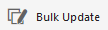
Bulk Update Action |
Allows the user to perform a bulk update of the selected items. |
Child Action component on a Node List |
|
|
Bulk Update List Action |
This component allows the user to perform bulk updates of the selected items using templates and root node parameters that house bulk update configurations. |
Child Action component on a Node List |
|
|
Bulk Update Template Action |
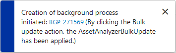
Allows users to select items in a Node List and update them all at once according to a pre-configured Bulk Update configuration. The title, icon, and help text for the action are configurable.
With this component, users can also configure the text that will display in the information popup when the bulk update action has been initiated. Background process pop ups can be configured to include not only a custom message, but also existing names and processes by adding braced words. The braced words are: {Action}, {Configuration}, {WorkflowID}, {WorkflowName}, {WorkflowState}, {StatusFlag}, {ItemCount} and {ImportFile}. Each of these will bring in the corresponding element name into the background process message. Below is an example of a valid 'Process Description' message added in the designer:
And below is how the background process popup would display:
|
Child Action component on a Node List |
|
|
Cancel Asynchronous Job Action |
When added to a job list screen, this component allows the user to cancel the selected asynchronous job(s). Note that this action button is designed to cancel only asynchronous translation jobs, not all background process (BGP) jobs. |
Child Action component on a Node List |
|
|
Change Reference Target Action |
This component changes the target of the selected reference(s) in a table. |
Child Action component on a Node List |
|
|
Confirm as Non-Duplicate Action |
This component, which can be used while merging confirmed matches or confirming a deduplication via clerical review, rejects the selected items in grid as duplicates. |
Child Action component on a Node List |
|
|
Confirm as Duplicate Action |
When performing a merge, this component confirms the selected items in a grid as duplicates. To perform a merge, choose which objects to merge with the selected node and click 'Confirm as Duplicate Action.' In the message that pops up, provide a reason for why they are duplicates, then click OK. Navigate to the 'Confirmed Matches' component screen and select which match to merge the currently selected node with. Then, click the 'Navigate to merge nodes screen' button. On the merge screen, choose which attributes and references will survive the merge by clicking the arrows next to them. Select the surviving node via the radio buttons displayed above the Merge button. |
Child Action component on a Node List |
|
|
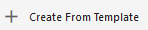
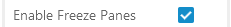
Create from Template |
Allows users to configure product-based templates that can be used to create new products. When one or more templates have been created, users can click on the 'Create from Template' toolbar action to create a new product. A 'Create New Item' window displays with a series of template options, each indicated by an image. Once created and a new name assigned to the new product, the selected template's attributes, attribute values, and references are applied to the new product. This component allows users to configure the new object's object type and placement in the hierarchy to be different than that of the template. It is important to note that an auto ID configuration must be setup for the relevant object type to enable this action.
|
Child Action component on a Node List |
|
|
Create Asset Action |
Allows the user to create a new asset. |
Child Action component on a Node Details Screen Child Action component on a Node List |
Action Button Configuration on a Node List Note: Configuration on Node Details is the same as Node List. |
|
Create Classification Action |
Allows the user to create new classifications. |
Child Action component on a Node Details Screen Child Action component on a Node List |
Action Button Configuration on a Node List Note: Configuration on a Node Details is the same as Node List. |
|
Create Collection Action |
Collections are containers for storing sets of objects. This action creates a collection from results of a search. |
Child Action component on a Node List |
|
|
Create Collection Action Automotive |
This action creates a collection from results of a search within the Application Manager Screen. |
Child Action component on a Node List |
|
|
Create Confirmed Match From Grid |
This action adds an additional confirmed match. Matches must be confirmed via the Potential Duplicates List or Deduplication List screens. |
Child Action component on a Node List |
|
|
Create Entity Action |
Allows the user to create a new object of the entity super type. |
Child Action component on a Node Details Screen Child Action component on a Node List |
Action Button Configuration on a Node List |
|
Create Product Action |
Allows the user to create a new product. |
Child Action component on a Node Details Screen Child Action component on a Node List |
Action Button Configuration on a Node List |
|
Create References Action |
Enables the user to create a reference or link between selected objects and one or more targets for the configured reference or link type. The available reference and link types include Classification, Entity, Image and Document (assets), or Product reference types, or the Product to Classification link type. The reference and link types applied can be displayed using the 'Reference Header' when configured as a Table Header in a table / grid Display Mode. |
Child Action component on a Node List |
|
|
Custom Export Action |
The Custom Export Action can be added to a toolbar on a given screen a Node List or Task List, enabling the user to export a selection of products, classifications, or entities. Supported export formats for Custom Export are Excel and CSV. This action was previously called the Simple Exporter Action. |
Child Action component on a Node List |
|
|
Delete Confirmed Match From Grid Action |
This action deletes a confirmed match. |
Child Action component on a Node List |
|
|
Delete From Collection Action |
This action deletes the selected item(s) from the collection. |
Child Action component on a Node List |
|
|
Delete From Grid Action |
This action deletes the selected item(s) in the grid. |
Child Action component on a Node List |
|
|
Download Asset Action |
Asset Download is an add-on component for STEP that enables users to provide a URL to an asset on a product and have STEP automatically download the asset. This functionality allows users—typically suppliers—to efficiently create and/or replace their business-critical assets in STEP, adding an additional layer of flexibility in how they can manage and store the assets and images that need to be linked to their products. The Asset Download component enables STEP to pull assets (e.g., images) from external URLs, store them in supplier asset classification structures, and link them to products in an automated operation. For asset representations on a Node Editor screen with the 'Direct download' option enabled in design mode, the link is opened in a new window while the download is preparing to start. This is especially helpful when connecting to an external DAM location since the process can take some time to start the download. |
Child Action component on a Node List |
|
|
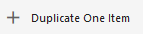
Duplicate Item Action |
Enables users to duplicate a single item in a Node List on a Display Children screen or a Children of Types screen. Once an object in a Node List (displayed in a tabular view style) is selected, this toolbar action button can be used to duplicate that object. The duplicated item is added to the same parent node as the original and retains all of the original object's information, including references. It is important to note that an auto ID configuration must be setup for the relevant object type to enable this action.
|
Child Action component on a Node List |
|
|
Edit Collection Search Criteria Action |
This action allows the user to edit the search criteria for a collection. |
Child Action component on a Node List |
|
|
Experian Email Validation |
Once all setup is complete, the Experian Email Validation integration allows users to perform email validations on a node list with one click of the 'Validate Emails' button. Users can choose one or more objects containing email account data that need to be validated, then click on the 'Validate Emails' button to run the 'Experian Email validation Job' background process. |
Node List component |
Configuring Experian Email Validation Integration for the Web UI |
|
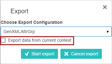
Export Action |
Downloads selected items using the selected saved export configuration.
|
Node List component on a:
|
|
|
Export Action Automotive |
This action can be added to a Node List within the Application Manager screen for downloading selected items in the current state using a saved export configuration. |
Child Action component on a Node List |
|
|
Export Current View |
With a single click, allows users to export selected Node List items directly to an Excel spreadsheet, using the same columns and column ordering of the exported table. |
Child Action component on a Node List |
|
|
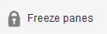
Freeze Panes |
Allows Node List tables viewed in either the Multi Edit or Comparison View modes to be locked vertically and horizontally on a selected cell. The parameter that enables Freeze Panes is available in the 'Advanced' section of the Multi Edit view mode in the designer.
|
Node List component in Multi Edit or Compare View |
|
|
Generate PDF |
This component generates PDF files for the mounted pages in the selected publication(s), section(s), or page(s). |
Child Action component on a Node List |
|
|
Golden Record Advanced Merge From Grid |
This action, when added to a Golden Record Clerical Review Task List screen, opens the Golden Record Advanced Merge Dialog, which allows the user to edit the golden records merged result. |
Child Action component on a Node List |
|
|
Golden Record Merge From Grid |
In the Golden Record Clerical Review Task List, this action merges the selected task(s) into a single surviving golden record (for each task selected). Which values get promoted to the surviving golden record are determined automatically by the survivorship rules specified on the corresponding matching algorithm. |
Child Action component on a Node List |
|
|
Golden Record Reassign From Grid |
In the Golden Record Clerical Review Task List, this action enables the user to reassign chosen task(s) to another user or user group configured in the workflow. The new assignee can be selected from the 'Select assignee' dialog box that pops up. |
Child Action component on a Node List |
|
|
Golden Record Reject From Grid |
In the Golden Record Clerical Review Task List, this action confirms golden records as non-duplicates and removes them from the workflow. |
Child Action component on a Node List |
|
|
Golden Record Submit From Grid |
This action submits the configured event to the chosen task(s) in the Golden Record Clerical Review Task List. |
Child Action component on a Node List |
|
|
Guided Data Entry |
This action will move selected items into Guided Data Entry. The Guided Data Entry window displays configured attributes, attribute groups, and reference types for the selected objects. Users may then add attribute values or references to complete the Guided Data Entry 'stepper.' |
Child Action component on a Node List |
|
|
Hide Equal |
When clicked, the Hide Equal button hides all rows / columns showing the same data. For instance, if all objects listed have the value 'Blue' for the attribute 'Primary color', clicking Hide Equal will hide the 'Primary color' attribute from the table. |
Child Action component on a Node List for Display Children, Task List, Collection List, Collection Content, Multi Selection screens; configurable via checkbox selection for Multi Revision, Multi Workspace, Deduplication Screen, and Potential Duplicates List |
|
|
Initiate Business Action |
Once configured, the Initiate Business action component can be used to start a business action on a data container. Below is an example of the Initiate Business Action button: |
Child Action component on a Node List |
|
|
Initiate Business Rule Action |
Action for invoking a business rule on a single selected entry. |
Child Action component on a Node List |
|
|
Mark Different |
When clicked, the Mark Different button highlights all rows / columns showing differing data. For instance, if one or more objects listed have different values for the attribute 'Primary color', clicking Mark Different will highlight the 'Primary color' attribute. |
Child Action component on a Node List for Display Children, Task List, Collection List, Collection Content, Multi Selection screens; configurable via checkbox selection for Multi Revision, Multi Workspace, Deduplication Screen, and Potential Duplicates List |
|
|
Menu Group |
Multiple toolbar action buttons can be configured to display in a single group using this component. Once configured, users can click the 'Menu Group' button and all included toolbar actions display in a dropdown menu.
|
Child Action component on a Node List |
|
|
Multi Context Edit |
This component enables users to view object information for multiple objects in multiple contexts in the same view. Once configured, users implement this editable view by selecting the objects to be viewed from the Node List, and then clicking the Multi Context Edit button. Users then select which headers should display in the view, and then which contexts should be included in display. The view shows all selected objects, once for each selected context, with all of the selected attribute information. |
Child Action component on a Node List |
|
|
New Item Action |
This action can be added to a Node List inside the Children Of Types screen. This allows the user to create new children below the selected product. |
Child Action component on a Node List |
|
|
Partial Approval Action |
This no-configuration button can be added to Node Editors and, when clicked, opens a full-screen overlay showing all unapproved changes made by the logged-in user as well as by other users. Users may create a selection of unapproved changes, and then approve them in the overlay. |
Child Button Component on a Node Editor |
|
|
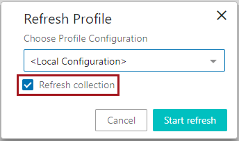
Refresh Profile Action |
Allows the user to manually generate / update a data profile for the currently selected collection. When clicked, the user is prompted to select a profile configuration. A 'Refresh collection' option is also available. Checking this box will refresh the collection before the profile is run:
A link to the background process is provided any time this action button is used. |
Child Action component on a Node List |
|
|
Remove From Basket Action |
This action can be added to the Basket screen. It allows the user to remove the selected items from the basket. |
Child Action component on a Node List |
|
|
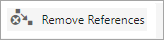
Remove References Action |
This component enables users to remove one or multiple references from one or multiple objects in a Node List. Once properly configured, initiating this action brings up a window displaying a menu of all configured reference types for which there are references, along with the objects referenced using that reference type. Users may then select one or more of the referenced objects and remove all references to that object in all selected Node List items in one action.
|
Child Action component on a Node List |
|
|
Run Business Action |
Enables users to execute a business rule when clicking a button in the Web UI. Can be used, for example, to streamline navigation through workflows in the Web UI. Because the Run Business Action component enables business actions to make changes in the Web UI, this component can be applied by admin users in a wide range of scenarios. |
Toolbar action button on a Node List Standard action button on a Node Details screen |
|
|
Run Business Condition |
Creates a button for initiating a business condition. |
Child Action component on a Node List |
|
|
Select |
This action can be added to a Planned Spread Navigator screen. This allows the user to choose the version for which to display the planned pages. |
Child Action component on a Node List |
|
|
Smart Sheet Export Action |
After enabling the Excel Smartsheet Format functionality, use this action to maintain data by allowing users to download Smartsheet maintenance files from objects in a workflow. |
Child Action component on a Node List |
|
|
Start Workflow From Grid |
When working with objects in Web UI, a Start Workflow Action button can be added to any Node Details screen. This allows users to work with object data and then initiate the object into a workflow by clicking the 'Start STEP Workflow' button at the bottom of the screen. The button is only enabled when initiation is possible. If disabled, the object may already exist as a task in the designated workflow. Process notes can be configured to appear via the submit dialog. Note: The button label for 'Start STEP Workflow' can be configured in the designer. |
Child Action component on a Node List |
|
|
Stateflow Filtering Action |
This action, when added to a Planned Spread Navigator screen, allows the user to filter pages by stateflow assignee. |
Child Action component on a Node List |
|
|
Submit Action |
This action button generates submit buttons for the events that are valid for a given product state and STEP workflow. One button will be inserted for each event. Note: If the submit message for the submit dialog exceeds 400 characters, a workflow variable should be used instead of the process note. When using a workflow variable, the "Show Submit Dialog" option should not be selected. |
Standard action button on a Node Details screen |
|
|
Submit From Grid Action |
This action submits the selected item(s) in a grid. Note: If the submit message for the submit dialog exceeds 400 characters, a workflow variable should be used instead of the process note. When using a workflow variable, the "Show Submit Dialog" option should not be selected. |
Child Action component on a Node List |
|
|
Unlink Duplicate From Grid Action |
This action unlinks the selected items in a grid. To use this action, select two source records and click the Unlink Duplicates button. This will unlink the two records and mark them as confirmed non-duplicates. Only one will survive and remain linked to the golden record. |
Child Action component on a Node List |
|
|
Unlink Single Record from Golden Action |
This action unlinks the selected record from the golden record. To use this action, select one source record and click the Unlink Single Record From Golden button. This will remove the source record reference from the golden record. |
Child Action component on a Node List |
|
|
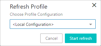
Update Profile Action |
Allows the user to manually generate / update a data profile for the currently selected node. When clicked, the user is prompted to select a profile configuration:
When updating a collection profile, a 'Refresh collection' option is also available. Checking this box will refresh the collection before the profile is run.
A link to the background process is provided any time this action button is used. |
Child Action component on a Node List |
|
|
Upload Asset Action |
The Upload Asset action, which can be added to a Folder screen or Asset Folder screen, allows the user to upload and create an asset in the current classification for the screen. Note: An asset importer configuration must be selected before uploading an asset. The configuration will apply its rules against the imported asset and make any necessary changes (or reject if it fails to meet minimum requirements). |
Child Action component on a Node List |