The Node Details screen type / component is a top-level component. It is used as a 'base' and configured to display other components (e.g., Node Editor, Multi-Reference Editor).
Prerequisites
It is expected that anyone configuring the Node Details component is familiar with the Web UI Designer, as basic concepts for working with the designer are not covered in this section. In addition, the user must have appropriate privileges to access the designer. Additional information can be found in the Designer Access topic.
Adding a New Node Details Screen
Steps for creating a new screen using the Node Details component are below.
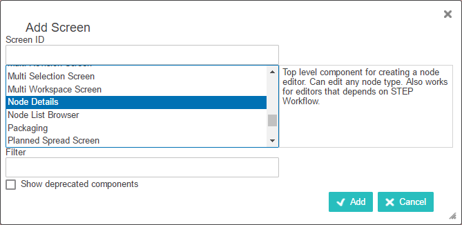
Steps for creating a new screen are outlined in the Design Mode Basics topic. Select 'Node Details' as the screen type (shown in the screenshot below).
After it has been added either close the designer and configure the screen at a later time, or continue on with the Node Details configuration.
Configuring Node Details Properties
Each parameter should be configured as needed. To guide you in your set up, help text is available for each parameter and is accessible by clicking the info icon to the right of each parameter name (displays upon mouse over).
Main Components
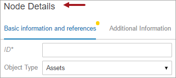
- If a title should display, determine if the default title should remain, or if a custom title is necessary. The default title will display as 'Node Details' on the screen in the top left corner (an example is shown below).
Important: Before entering a custom title, it is important to know the title parameter offers i18n key functionality. Presence of an i18n key indicates that the field can be included in extraction for external translation, and that a value has not been manually populated. Once a value has been manually populated within the designer, it is no longer available for extraction, unless the manual value is removed and the configuration saved, closed, and then reopened. Customers planning to pursue or utilize Web UI translations should not overwrite i18n values manually in the designer, and should instead populate texts within the Web UI locales files on the application server. For more information, refer to the Localization topic within the Administration Portal documentation.
- Determine if you want to display the title. Leave the Show Title parameter enabled if the Node Details Screen should display the title. Disable the parameter to hide the title and its associated white space
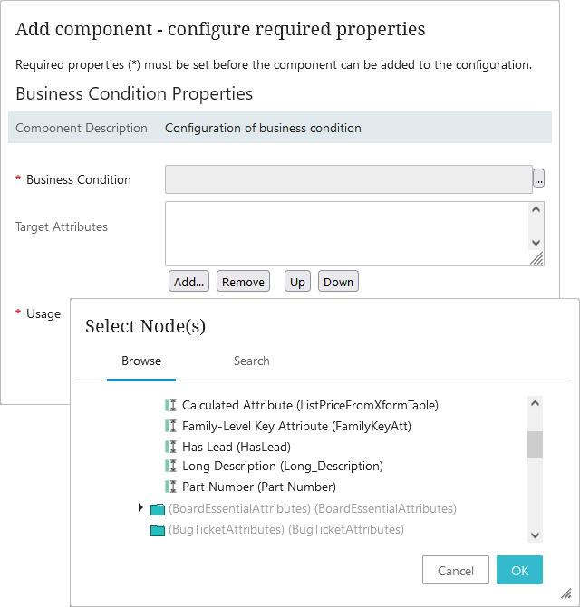
- Click on Validation to expand the following optional parameter:
- Business Conditions: The Business Conditions field tests against values updated in the database. To add a business condition, click Add... to select an existing business condition to be executed to validate attribute values being edited on the node. Multiple business conditions can be added, but all must succeed for the process to continue. For more information about business conditions, refer to the Business Conditions topic in the Business Rules documentation.
- Click on Multiple Target References to display the Show Warning parameter (disabled by default). When Show Warning is enabled / checked, a warning will display to end users when a shared object is edited and then saved, either through an actual Save action or implied save (e.g., Submit Action or Approve Action). For more details, refer to the Shared Data Handling topic.
Child Components
- From the dropdown menu for the Main parameter, choose a component. For example, you can add a Node Editor. Or, add a Tab Control component and configure different components and/or screens to display on different tabs all on a single Node Details screen. Additional configuration will be required depending on the selected component.
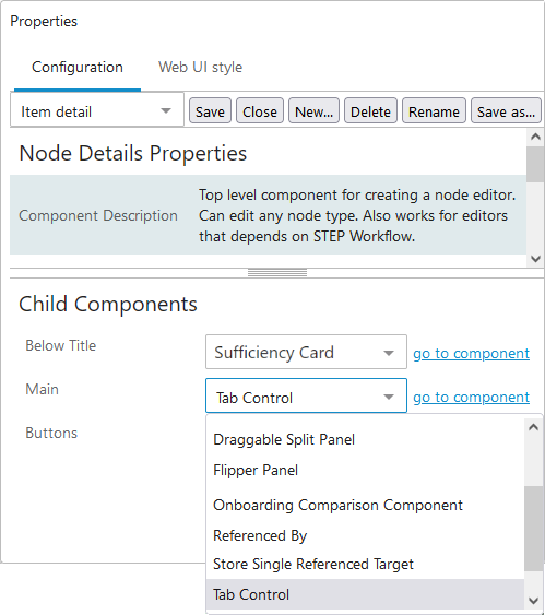
- Select Buttons from the Buttons parameter dropdown, then click go to component.
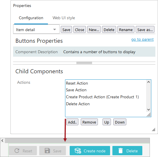
- On Buttons Properties, click the Add button below the Actions field, then select a component from the 'Add component' list and click Add. Additional configuration may be required depending on which action is selected.
Important: An example is the Save Action button—if you are placing a Node Editor on a Node Details screen, a Save button must be configured so that when object data is edited, it can be saved before the user navigates to another screen.
- Repeat the previous step as needed to add additional actions. The action buttons will display in the order they are listed in the Actions value field. Re-organize by using the Up and Down buttons.
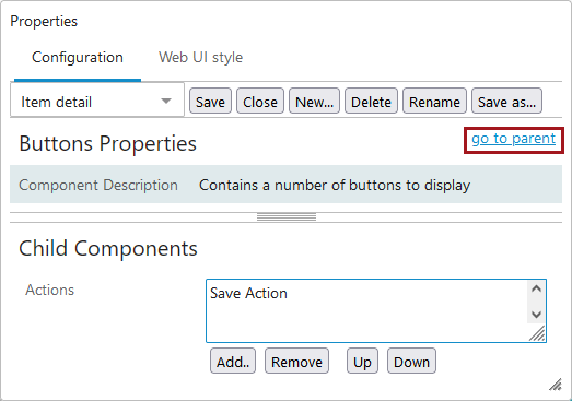
- When all actions are added, click go to parent to navigate back to Node Details Properties.
- If desired, set up the Below Title parameter by selecting Breadcrumb, Collection Summary, or Entity Summary Card from the dropdown. Once a selection is made, click go to component to configure the child component further.
For more information on the Below Title parameter options, refer to the Below Title Component topic.
- Click the Save button in the designer. Additional configuration can be performed on this Node Details screen, as desired. Additionally, multiple Node Details screens can be created and used for different objects / purposes.
- From the designer dropdown, select ---[MAIN]--- to configure the Mappings parameter. It is important to remember this step so you can set up the condition / results screen combinations that allow end users to view / use the Node Details screen(s). Refer to the Main Properties topic.
Example Node Details Screens
In the simple example below, a Node Details screen type has been used to create a new screen that has a 'Node Details' screen ID.
Note: The Node Details screen ID is used to simplify the example. The screen ID should have a descriptive name that better describes the purpose / usage of the screen and is easily identifiable.
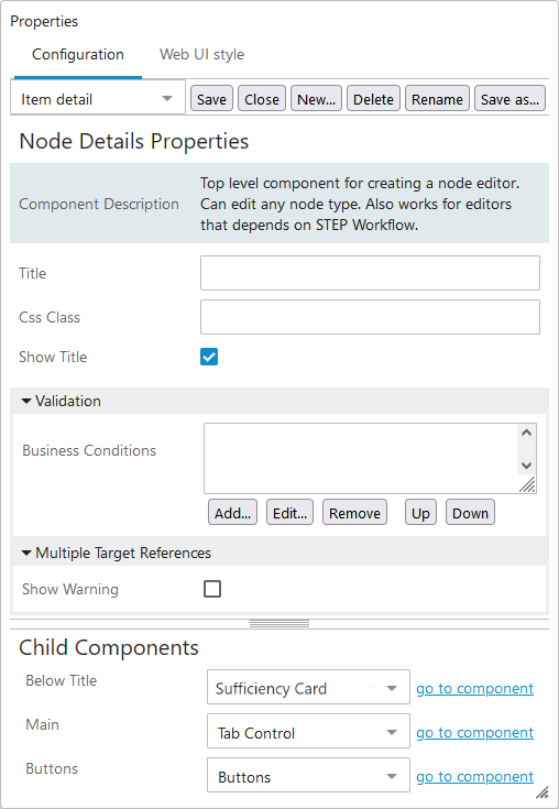
- Node Details Properties is configured as follows: Child Components > Main > Tab Control (as displayed in the screenshot under 'Child Components,' Step 1 of the 'Configuring Node Details Properties' section of this topic). For more information, refer to the Tab Pages topic.
- Tab Control Properties has Child Components > Tab Pages configured with Tab Page (Basic Information and references), Sub Screen Tab Page (Revisions), and Tab Page (Category Information) components.
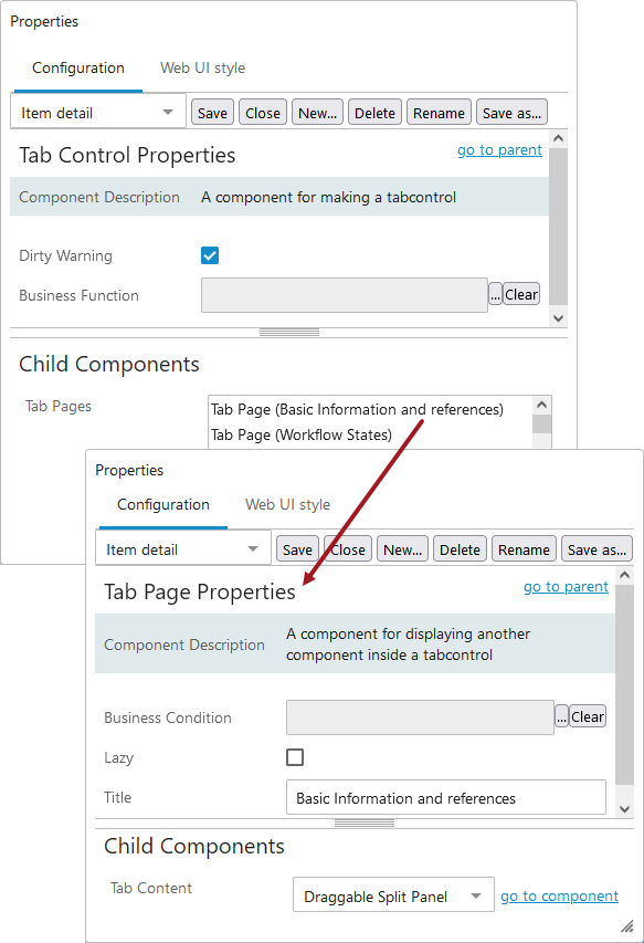
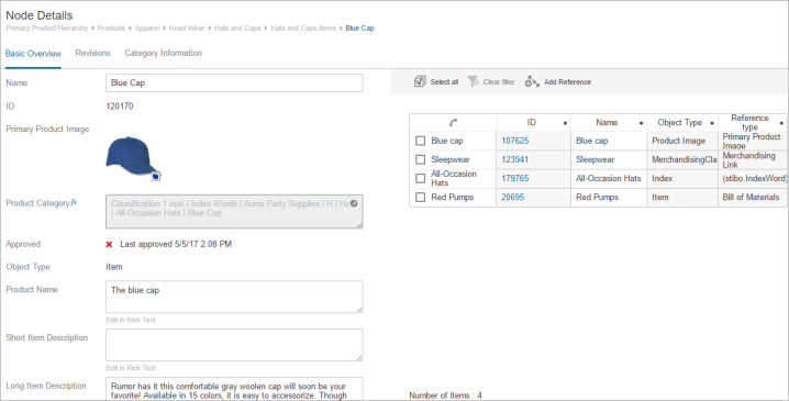
- The Node Editor is a child component of a Draggable Split Panel component.
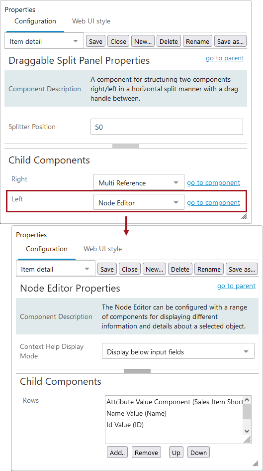
- The attributes (i.e., Name, ID, Primary Product Image) shown below are configured to display within the Node Editor component. Attribute Value and Attribute Value Group components are added within the Child Components section of the Node Editor Properties. They can be added and removed using the buttons below the Rows field, and the attribute values will display on screen based on how they are ordered within the field. They can be re-ordered using the Up and Down buttons. For more information, refer to the Node Editor Component topic.