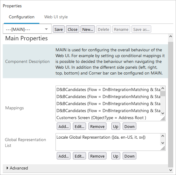
The Main Properties configuration determines the overall behavior of a Web UI. The Main Properties parameters are found within the three sections: Main, Advanced, and Child Components. Below is an overview and links to more details (when applicable) for each of the parameters listed in the order they appear on the Main Properties.
Prerequisites
All the steps provided in this topic assume the Web UI designer is in design mode and on Main Properties prior to starting the configuration process. For more information about getting started using a Web UI and details about design mode access / usage, refer to the Web UI Getting Started topic.
Configuring the Parameters
Main Parameters
Configure the parameters as needed.
-
Mappings: Screens display in Web UI based on the Mappings values. When a new screen is created, typically a mapping also needs to be set up. The mappings are shown as 'screen ID (condition)' for the Mappings parameter and are evaluated one-by-one in the order shown. When the first mapping condition is met, the evaluation stops, and the screen configured for that condition is displayed. If no mappings match, then the default target screen is the Homepage. For more information, refer to the Mappings topic.
-
Global Representation List: This parameter allows Web UI designers to add a global representation of specific functionality. Each global representation can only exist once in this list. Details for each of the available representations can be found below.
-
Alternate Node Appearance: This option allows users to configure nodes in the Tree Navigator to display with up to three visual indicators (i.e., colored dots or icons) to show that objects in that node contain specific attribute values on specific attributes. Hover text can also be configured for each trigger value to quickly inform users about the meaning of each indicator. For full details on how to configure this component, refer to the Configuring Alternate Node Appearance section of the Tree Navigator Component for Global Navigation Panel topic.
-
Context Global Representation: This component allows admin users to configure which contexts are available to appropriately privileged end users in the 'Select Context' menu, which is accessible via the 'Settings' menu. When the 'Context Global Representation' component is added to the Global Representation List, admin users can select from a list of all configured contexts (listed by name) which contexts are accessible for viewing and editing by end users in the Web UI. If the component is added but no contexts are selected, only the first context (as determined by alphabetical order) displays.
-
Data Visualization Representation: Data Visualization in Web UI allows users to view a visual representation of objects in STEP and how they relate to one another. If a Display Relations Screen type is not in use anywhere in the Web UI, then skip this parameter. For full details on how to configure this parameter and the subsequent component, refer to the Configuring Data Visualization topic.
-
Dynamic Table Layout Settings: The Dynamic Table Layout Settings component is used to define behavioral rules for a table using the display modes Multi Editor or Compare View. By setting a minimum and maximum value for 'row height' and 'column width' a range is defined within which a table is allowed to increase the height of rows and width of columns to display the most cell content. A table increases the width of a column before increasing the height of a row. When defined the settings apply globally for all tables in a Web UI configuration.
-
Global Address Typeahead Configurations: This component allows integration with an external address search service to display verified mailing address data. Selected entity address attributes are displayed in the Web UI with an address search field. For more information, refer to the Web UI Configure and Use Address Typeahead topic.
-
Global Data Container Representations: This component provides a centralized configuration for data container displays in Web UI. Multiple configurations can be stored for any number of different data container types within this component. For more information, refer to the Global Data Container Representations topic.
-
Global Orphan Attribute Representation: The setting configured using this component determines how orphan attribute errors display globally in the Web UI. Users can select between 'Information,' which notifies users that a given attribute is orphaned, 'Warning,' which presents the notification that a given attribute is orphaned using the warning styling, and 'Error,' which presents the notification that an attribute is orphaned using the error styling and prevents users from saving data until the value is either removed from the attribute field, or the attribute is relinked.
-
Global Reference Representations: This component provides a centralized configuration for reference displays in Web UI. Multiple configurations can be stored for any number of different reference types within this component. For more information, refer to the Global Reference Representations topic.
-
Globally Configured Data Validations: This option enables business conditions to be run for selected 'triggering data types' on any suitable Web UI screen. Attributes and references can trigger the business condition. For more information, refer to the Data Validation in Web UI topic.
-
Hierarchy Representation: This option is only displayed as part of the Company Data Visualization component and defines the representation of pairs of object types and reference types in the Hierarchy Screen. If a Hierarchy Screen type is not in use anywhere in the Web UI, then skip this parameter. For full details on how to configure this parameter and the subsequent component, refer to the Configuring a Company Hierarchy Screen topic.
-
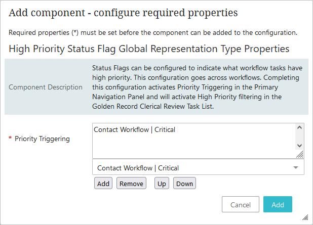
High Priority Status Flag Global Representation Type: Configuring this component activates priority triggering in the Global Navigation Panel. When high priority tasks exist in a clerical review workflow, a high priority alert appears beside the task list name in the Tasks child component. For more information, refer to the Global Navigation Panel topic.
Note: While multiple high priority flags are allowed for a single workflow, this is not recommended due to the negative impact on performance.
To configure this component, navigate to the Priority Triggering status flag parameter and use the dropdown to select the desired workflow / status flag combination, then click Add. When added to the list, any tasks flagged as such in the workflow display an alert next to the task list name in the Global Navigation Panel component. Likewise, when those tasks are present in the currently selected workflow state, a High Priority filter is displayed.
-
Golden Record Clerical Review Task List: The High Priority Status Flag Global Representation component activates High Priority filtering in the Golden Record Clerical Review Task List. The High Priority Status Flag Global Representation overrides the homepage widget status flag when the 'Status Flags Enabled' option is checked on the Status Selector Homepage Widget for the task list. For more information, refer to the Status Flags in Web UI topic and the Golden Record Clerical Review Task List topic of the Matching, Linking, and Merging documentation.
-
Locale Global Representation: Configuring this determines which locales are available to end users for selection on the Login Page and in the 'Select Locale' section of the 'User Settings' menu in the Global Navigation Panel. All locales display if this Local Global Representation component is not configured. The Login Page dropdown and the 'Select Locale' section of the 'User Settings' menu in the Global Navigation Panel does not show if the component is added, but no locales are selected. For more information and setup, refer to the Localization topic in the Administration Portal documentation.
-
Override Control Type Rule: Add the Override Control Type Rule component to globally change the appearance and behavior of attribute values that use the validation base types: List of Values (LOV), Numeric Text, Numeric Text (exclude tags), Text, and Text (exclude tags). For added flexibility, the Override Control Type Rule component can be overwritten when a local control type is set for the attribute definition on the Attribute Management screen type or on the Attribute Value component when configured on a Node Details screen.
-
Workspace Global Representation: This component allows admin users to configure which workspaces are available to appropriately privileged end users in the 'Select Workspace' menu, which is accessible via the 'Settings' menu. When the 'Workspace Global Representation' component is added to the Global Representation List, admin users can select from a list of all configured workspaces (listed by name) which workspaces are accessible for viewing and editing by end users in the Web UI. If the component is added but no workspaces are selected, only the first workspace (as determined by alphabetical order) displays.
Note: The Primary Navigation Panel has been replaced by the Global Navigation Panel. Users who upgrade to 10.1+ with the Primary Navigation Panel configured on their Web UI view their left navigation component switched automatically to the Global Navigation Panel. The 'High Priority Status Flag Global Representation Type' component is also available for the Global Navigation Panel and is carried over following a conversion.
-
Advanced Parameters
Click the arrowhead next to the Advanced heading to view the parameters available. A description of each parameter follows. Configure the parameters as needed.
-
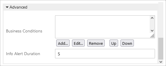
Business Conditions: Any business conditions added become global conditions. This means that the conditions are evaluated together, as applicable, with any additional business conditions configured for a screen, component, or parameter that you may be working with. For more information about business conditions, refer to the Configuring Business Conditions in Web UI topic.
-
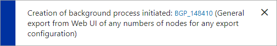
Info Alert Duration: Info alert boxes, like the acknowledgment and information notifications shown below, automatically close after the specified time (seconds). Respectively, they display when a user-prompted action has completed or when a system action or process has begun or when it is completed. The default value is 3 seconds. If you remove the 3 (or any value) from this field and save the designer changes without a value, a 3 automatically populates upon save. To set the alert box to remain on the screen until the user manually clicks the close button on the message box, set the value to 0 or a negative number.
-
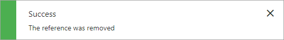
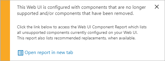
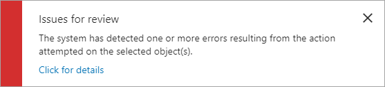
If an alert requires a user action such as clicking a button to make a decision or acknowledge a message, then the alert duration value does not apply. These alerts include warning notifications that display when a user-attempted action can proceed but aspects of the request may require additional caution, and error notifications that display when a user-attempted action cannot be completed. Examples of these alert types are below:
-
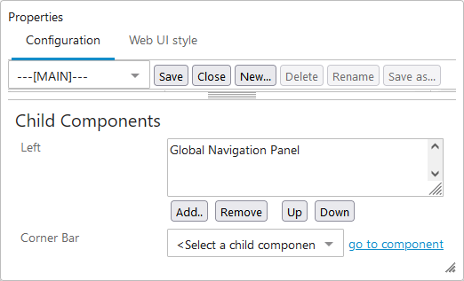
Child Components
Add components to all screens using the Child Components section of Main Properties. Once added, components can be reorganized and removed.
-
Left: Allows designers to add components designed to display on the left side of a Web UI screen. The default display width of the component is determined by the settings configured using the Left Width parameter (described in the Main parameters section above). Most of the same add component options are available for the Right child component, allowing designers to configure screen layouts to best fit the needs of their users. Common setup is to add a Tree Navigator component to a Global Navigation Panel.
For step-by-step instructions on how to add the Tree Navigator Component to display in the Web UI, refer to the Tree Navigator Component for Global Navigation Panel topic.