The Global Navigation Panel is a centralized task and navigation hub for the Web UI. Located to the left of the Web UI screen, the panel can display as a narrow column or be expanded, and it contains both default and user-selected buttons. For many of the Menu Items in the Global Navigation Panel, when a button is clicked, a secondary column slides out that allows the user to progress in the task associated with the clicked button. When the user begins work in the Web UI screen, the column retracts to give the user the maximum amount of working space.
Using the Global Navigation Panel, users can do the following:
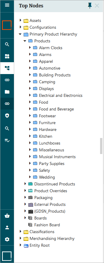
- navigate to any node in the hierarchy
- access Advanced Search
- display workflow states or the tasks within
- access design mode
- log out of the Web UI
- access user information
Additionally, users may select different contexts, workspaces, or users to impersonate using the Global Navigation Panel.
When the Global Navigation Panel is added, in the top right corner of Web UI, there are two side panels that are also added, the 'Recent background processes' side panel, and the 'Recent warning notifications' side panel. Either of these side panels can be opened or closed by clicking on the 'Recent background processes' icon,  , or clicking the 'Recent warning notification' icon,
  .
.
For more information on the 'Recent background processes' side panel, refer to the Recent Background Processes Side Panel topic.
For more information on the 'Recent warning notifications' side panel, refer to the Recent Warning Notifications Side Panel topic.
Note: If faceted search (powered by Elasticsearch) is enabled for your system and the ui-search component is installed, then two search buttons ( ) are displayed in the Global Navigation Panel. The first search button gives users access to the faceted search functionality regardless of how the Global Navigation Panel is configured. The next search button opens the standard search functionality. To specify which Web UIs include the faceted search option (and to remove it from other Web UIs), add the following case-sensitive property to the sharedconfig.properties file:
Elasticsearch.IncludeSearchScreen=[Web UI IDs]
For the bracketed part of this property, [Web UI IDs], add a comma-separated list of all Web UIs (by their ID) that should feature the faceted search functionality. Do not include spaces between the IDs, as shown below:
Elasticsearch.IncludeSearchScreen=CustomerWebUI,BuySideSellSide_Supplier,GDSNReceiver
Configuring the Global Navigation Panel
This section describes the steps admin users can take to fully configure the Global Navigation Panel.
Prerequisites
It is expected that anyone configuring the Global Navigation Panel is familiar with the Web UI designer, as basic concepts for working with the designer are not covered in this section. In addition, the user must have appropriate privileges to access the designer. Additional information can be found in the Designer Access topic.
The Global Navigation Panel includes many features that enable efficient navigation through the Web UI. Descriptions of those features and the steps required to configure those features are listed below.
Adding the Global Navigation Panel
The first step in configuring the Global Navigation Panel is to add the component to the Web UI. Follow the steps listed below to add this component.
- Enter the designer and navigate to 'MAIN'. Under the field for the 'Left' parameter and click 'Add.'
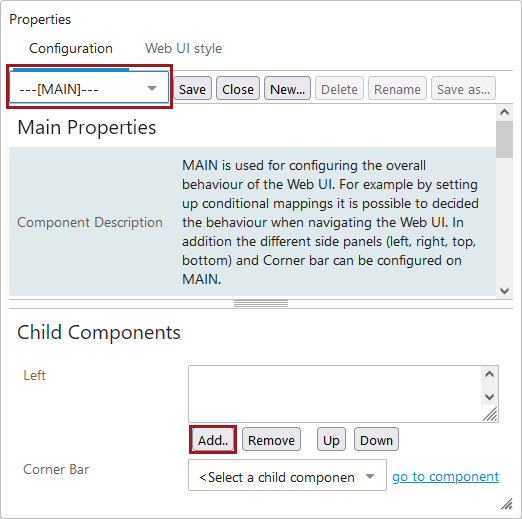
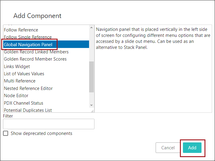
- In the 'Add Component' dialog, select 'Global Navigation Panel,' and click 'Add.'
Once the user saves the configuration and closes the designer, the Global Navigation Panel is added. Certain features are available without additional configuration, like the ability to change context, log out, access the designer, or impersonate other users. More on those features later in this topic.
Adding and configuring Global Navigation Panel Menu Items
The Global Navigation makes certain features accessible without configuration, while many others are only accessible by adding and configuring one of twelve available 'Menu Items' in the designer. This section describes each of the Menu Items and how to configure them.
Data Quality Operations - This component enables users to create collections and can be configured to provide quick access to existing collections.
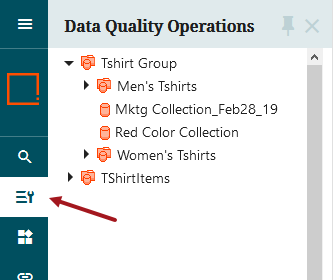
To configure, users must select the collection nodes that can be accessed via the Data Quality Operation button, as well as the screen that the user is navigated to when they select a collection, or click the 'Create Collection' button.
Direct Navigation - Enables one-click navigation to an external site or configured Web UI screen, though not to a specific node. Users may customize the name and icon for this button.
To configure, for the Result Screen parameter, select a configured Web UI screen that should be displayed when clicking the button. Also, an external URL may be added. If both a screen is selected and the external URL is added, the external link is honored and the selected screen ignored.
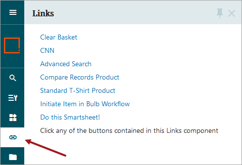
Links - Enables users to configure one of nine tasks that can be executed or initiated with the click of a button. Clicking on the Links button prompts a Links column to slide out displaying all configured tasks as text. Clicking the Links button again (or the 'X' button in the upper right-hand corner) causes the column to slide out of view.
Users can configure one or more of the following components for their Links button:
Note: Depending on what components or licenses you have installed / enabled on your system, you may not have all the options listed.
-
Clear Basket Function - When added, allows users to click the link and clear the contents of the Basket component. Requires the appropriate license.
-
External Navigation - Allows admin users to configure a link to a web page outside of the Web UI. The URL is only recognized if 'http://' is added to the beginning of the entered URL.
-
GDSN Create RFCIN Link Action - Enables configuration of a link that allows the user to create a GDSN RFCIN message. Requires the appropriate license.
-
Navigation - Inserts a link for navigation to an existing Web UI screen (e.g., Advanced Search), but not to a specific object in the hierarchy. Users can customize the button label, as well as the help text that displays when the user hovers their cursor over the link.
-
Node Navigation - Inserts a link that, when clicked, navigates the user directly to an object in the hierarchy. To configure, select the node to which users are navigated when they click the button. Users can customize the button label, as well as the help text that displays when the user hovers their cursor over the link.
-
Screen Navigation - Inserts a link for navigation to a screen. Unlike the 'Navigation' component, 'Screen Navigation' has no concept of selection. It is possible to supply an object type that can be sent to screens that support creation of new objects. This component is primarily intended for calling "static" screens or the Initiate Item screen type with overloading object types. Also, it supports optional configuration of workflows and allows initiation of items into workflows.
-
Smart Sheet Import Action - Action for initiating an Excel Smartsheet import. Shows a dialog and does not require the user to select an import configuration. Users can customize the link label, as well as most of the texts that show in the dialog that displays when the button is clicked.
-
Static HTML - The component is configurable to provide easy access to collections and provides the ability to create collections, for example via Advanced Search.
-
Static Text - Displays static text. In the screenshot above, the 'Static Text' example is the text that reads, 'Click any of the buttons contained in this Links component'.
Menu Group - A button that can expand vertically within the collapsed Global Navigation panel to show a series of configured buttons within the group. All configurable options are a mirror of the components available to configure on the Global Navigation Panel, enabling nested groups of selections. The icon and button label for the Menu Group component can also be customized.
Policies - Navigates to a Policy List screen. No configuration required; however you do need a Policy List screen created and mapped for the link navigation to work. Refer to the Web UI Configurations for Policies topic in the Data Governance documentation.
Search - When clicked, enables standard global search functionality directly from the Global Navigation Panel. Users may configure the following search plug-ins for this button: Below Search, Golden Record - Source Record ID, Name or ID or Attributes, or Object Type Search. The button label and the icon can be customized.
Search Panel - Enables quick access to a granular search component. The configurability available for this button brings much of the Advanced Search screen functionality into the Global Navigation Panel. By configuring various search criteria that can be used individually or in concert, and then labeling each of those various search types, users can select their desired search from a dropdown available in a secondary column that displays when the user clicks the 'Search Panel' button. Button label and icon may be customized.
Smartsheet Export - Widget used for starting a download of multi-level Smartsheets using a specified export configuration. Properties set in the configuration are applied to the export. These settings are derived from the current user's supplier classifications, so the component is excluded if the user is not a member of a supplier group. This component can only export Smartsheet templates (i.e., empty Smartsheets) that can be used to onboard new products.
Status Selector - Provides a display of selected workflow states in a secondary column, and how many objects are contained within each workflow state. If configured, clicking one of the states can navigate a user to a Task list screen showing detailed information about the nodes in the chosen state. The configuration for this component is similar to the configuration for the Status Selector Homepage Widget. For more information on this widget, refer to the Status Selector Homepage Widget topic.
Task - Workflow tasks from states belonging to different workflows can be configured to show together using the Task component. This can be useful as quick access for a user tasked with maintenance of various states in multiple workflows.
Tree Navigator - Enables display of tree components in a secondary column when the button is clicked. The title and icon are configurable.
Using the Global Navigation Panel
Though the customizable components of the Global Navigation Panel provide a lot of functionality, the default features accessible on the panel encompass an equally significant portion of task and navigation tasks in the Web UI. Described below are the buttons that display on the Global Navigation Panel by default:
Main Menu button - (  ) The trio of horizontal lines that displays at the top of the Global Navigation Panel. When clicked, the collapsed form of the Global Navigation Panel expands into a full column. When the Global Navigation Panel is in its expanded form, the button icons display with their button labels. To collapse the full column, click the left-pointing arrow in the upper right-hand corner of the expanded column.
Logo button - A configured logo displays just above the top of the configured Menu Items. The logo doubles as a button that navigates the user directly to the Web UI homepage. Whether a logo has been configured or not, clicking the space that the logo would occupy navigates a user to the homepage.
Basket - (  ) If required, the Basket button can be added as an add-on component. When installed on an instance of STEP, the Basket button displays. Users who do not require Product Data Exchange (PDX) integration and who do not have the add-on component added do not view button. For more information, refer to the Basket Component and Basket Screen topic.
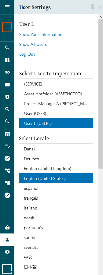
User Settings - (  ) When clicked, the User Settings button displays a full column containing user-focused features.
-
Show Your Information - Clicking 'Show Your Information' opens a User Details screen with details related to the logged-in user. A User Details screen already exists for newly created Web UIs. If not creating a Web UI from scratch, verify that the screen has been created, configured, and mapped to enable the functionality.
-
Log Out - Click the 'Log Out' button to log the current user out of the Web UI. Clicking this button has the effect of logging the user out of the current Web UI session, and any other Web UI sessions the user may also be logged into.
-
Select User to Impersonate - This option is available only if the logged-in user has the relevant privileges. To effectuate an impersonation of a different user, select one of the user names displayed in the list below the button. For more information on user impersonation, refer to the Web UI User Impersonation Setup and Reporting topic in the System Setup documentation.
-
Select Locale - The logged in user can change the locale. Thirteen locales come standard with each Web UI: Danish, German, English, Spanish, French, Italian, Norwegian, Portuguese, Finnish, Swedish, Chinese (simplified), Japanese, and Korean. Depending on user settings, all locales, some locales, or no locales may be present for the user to select.
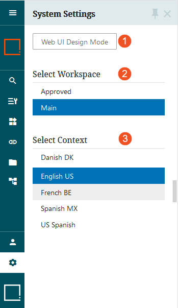
System Settings - (  ) When clicked, the System Settings button displays a full column containing features related to accessing the designer, selecting the workspace, and selecting the context.
-
Web UI Design Mode - To access the Web UI designer, users must access System Settings and then click 'Web UI Design Mode.' Doing so brings up the designer, where most Web UI configuration is done. For more information on accessing the designer, refer to the Designer Access topic. For more information on using the designer, refer to the Design Mode Basics topic.
-
Select Workspace - Allows users to toggle between the Approved workspace and the Main workspace. For more information on workspaces, refer to the Workspaces topic in the System Setup documentation.
-
Select Context - Allows users to select from any configured context in which to set their Web UI to. To change context, users can click any of the contexts displaying in the list inside the column.
Additionally, for any Global Navigation Panel features that enable a secondary column display, a pin (  ) can be applied. When the secondary column is displayed, the pin displays. When the pin is active (not grayed out), the column remains expanded while the user works in the Web UI screen. Further, the Web UI screen auto-fits into the available space. When the pin is disengaged, the Web UI screen expands to fit into the space behind the expanded column. When the user begins to work in the Web UI screen, the secondary column collapses.