The Global Data Container Representations component provides a centralized space for data container display configurations. Any number of configurations can be stored for different data container types and under various display conditions.
For more context about this component and its use, refer to the Data Containers in Web UI section of the Web User Interfaces documentation.
Note: LOV Cross-Validation can be applied to the Globally Configured Multi Edit Data Container, the Globally Configured Data Container component - Title with Dialog View, and the Globally Configured Unfolding Data Container - Title with Unfold View on Node Details when the condition has been configured for two editable LOV attributes inside the data containers. For details about LOV Cross-Validation, refer to the topic Business Condition: LOV Cross-Validation in the Business Rules documentation.
Important: The Title with Dialog View component has been superseded with the 2025.2 update. Users are instead encouraged to transition to the Title with Unfold View component for an enhanced user experience.
Prerequisites
It is expected that anyone configuring the Global Data Container Representations component is familiar with the Web UI Designer, as basic concepts for working with the designer are not covered in this section. In addition, the user must have appropriate privileges to access the designer. Additional information can be found in the Designer Access topic of the Web User Interfaces documentation.
Initial Setup
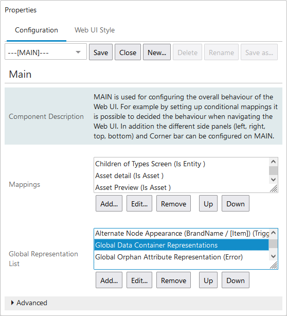
Before data container configurations can be created, the component must be configured in MAIN properties.
- Enter design mode and select --[MAIN]-- from the screen dropdown list.
- Go to the Global Representation List parameter.
- Click the Add... button under the value field.
- Select Global Data Container Representations from the Add Component dialog.
Creating a Configuration
Once the component has been added to MAIN properties, any number of data container representations can be created within it. A representation is a series of configuration settings tied to a data container type. Within each representation, the relevant data container type must be specified, along with its display settings.
If multiple data container types require configuration, a separate representation must be created for each one. Additionally, if display settings vary due to which screen they appear on, multiple views must be created within each representation.
Important: These configuration settings dictate the display of data containers for the Globally Configured Data Container and Advanced Merge Globally Configured Data Container Header components only. This configuration also applies to the Unmerge Wizard screen, so long as a Title with Unfold view is configured for the data container type in question. All other components that display data containers use their own native configuration settings.
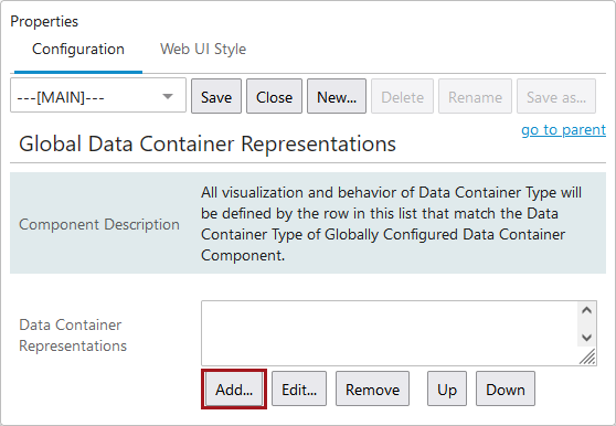
- Double-click on Global Data Container Representations from within the Global Representation List field.
- In the Global Data Container Representations Properties window, click Add... to add a new representation.
- When the Data Container Type Representation Properties window appears, specify the relevant data container type, along with its display options and the conditions in which this particular representation should be applied.
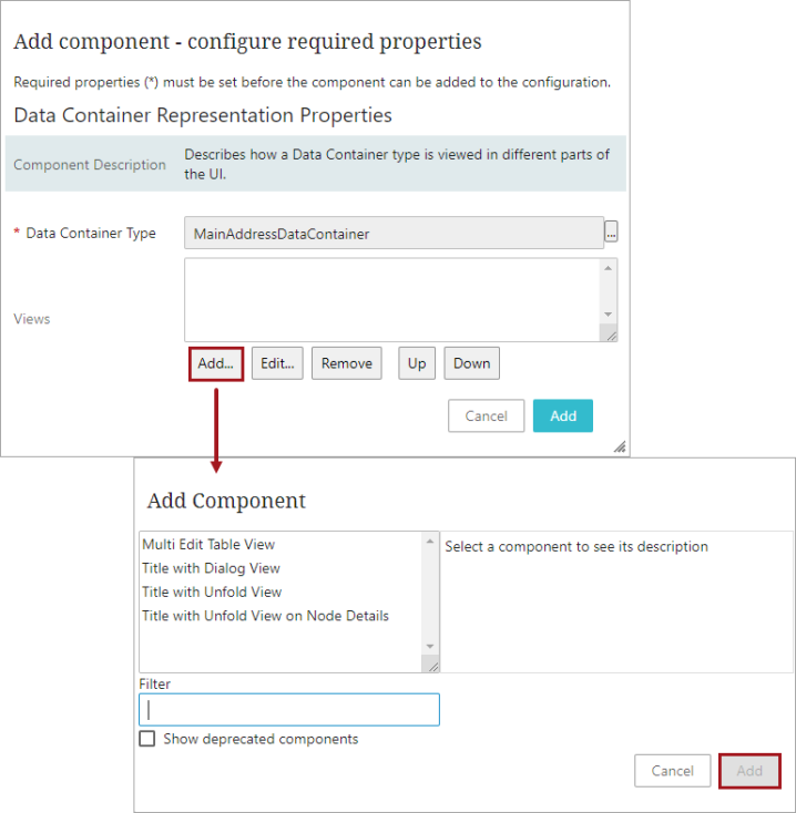
- To specify the data container type, click the ellipsis button (
 ) under the Data Container Type parameter. Browse or search for the relevant data container type, select it, and click OK.
 - Several different ways of displaying the specified data container type can be configured via the Views field. The view used to display the data is determined by conditions set on each view instance. If more than one view setting is valid for the specified data container type, the view that appears highest on this parameter's list is used.
To create a view configuration, click Add... under the Views parameter.
- Select the appropriate view. 'Title with Unfold View' should be chosen if the view is intended to be used on an Unmerge Screen, otherwise choose 'Title with Dialog View'.
For more information, refer to the Configuring and Using Match and Merge in Web UI section of the Matching, Linking, and Merging documentation.
The configuration options for these two view types are similar, however Title with Unfold View cannot be configured with editable attributes and references.
Configuring Title with Dialog View (superseded)
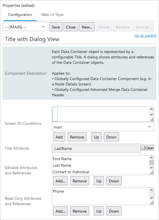
- Double-click the newly created view to access the Title with Dialog View Properties window.
Important: The Title with Dialog View does not support inherited data containers. They will not display in this view.
Configuration options for each view include:
- Screen ID Conditions - Select a screen mapping from the dropdown and click Add.... Mapping a screen ensures that these view settings are only valid for displaying the data of the relevant data container type on the specified Web UI screen. Not mapping a screen allows these view settings to apply to data containers on any screen in the Web UI.
- Title Attribute - Click the ellipsis button () and browse or search for the relevant attribute to display data containers listed in the corresponding data container component. This could be a calculated attribute that conveys the most important details for differentiating the individual data containers.
For more information on calculated attributes, refer to the Calculated Attributes section of the documentation.
When used to display address data, it is recommended to use a formatted address attribute. For more information, refer to the Address Formatting Functions topic of the Resource Materials online help documentation.
Note: It is not recommended to use LOVs that allow users to add values for the display attribute.
- Editable Attributes and References - Click Add... and browse or search for the attributes / references whose values should be editable within the corresponding data container components.
Note: Multi-valued attributes that are configured in this parameter cannot be edited.
- Read Only Attributes and References - Click Add... and browse or search for the attributes / references that should be displayed by the corresponding data container components, but whose values should not be editable.
- Once the view settings have been finalized, click Save.
Configuring Title with Unfold View
- Double-click the newly created view to access the Title with Unfold View Properties window.
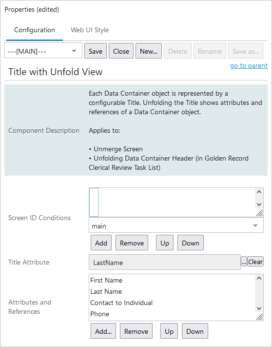
Configuration options for each view include:
- Screen ID Conditions - Select a screen mapping from the dropdown and click Add.... Mapping a screen ensures that these view settings are only valid for displaying the data of the relevant data container type on the specified Web UI screen. Not mapping a screen allows these view settings to apply to data containers on any screen in the Web UI.
- Title Attribute - Click the ellipsis button () and browse or search for the relevant attribute to display data containers listed in the corresponding data container component. This could be a calculated attribute that conveys the most important details for differentiating the individual data containers.
For more information on calculated attributes, refer to the Calculated Attributes section of the System Setup documentation.
When used to display address data, it is recommended to use a formatted address attribute. For more information, refer to the Address Formatting Functions topic of the Resource Materials online help documentation.
Note: It is not recommended to use LOVs that allow users to add values for the display attribute.
- Attributes and References - Click Add... and browse or search for the attributes / references that should be displayed by the corresponding components when unfolded.
- Once the view settings have been finalized, click Save.
Configuring Title with Unfold View on Node Details
-
Double-click the newly created view to access the Title with Unfold View on Node Details designer window.
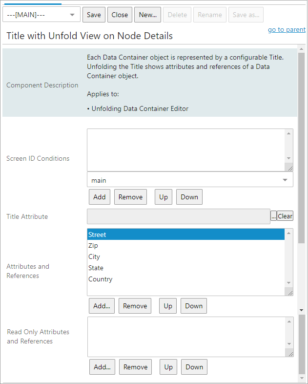
Configuration options for each view include:
- Screen ID Conditions - Select a screen mapping from the dropdown and click Add.... Mapping a screen ensures that these view settings are only valid for displaying the data of the relevant data container type on the specified Web UI screen. Not mapping a screen allows these view settings to apply to data containers on any screen in the Web UI.
- Title Attribute - Click the ellipsis button () and browse or search for the relevant attribute to display data containers listed in the corresponding data container component. This could be a calculated attribute that conveys the most important details for differentiating the individual data containers.
For more information on calculated attributes, refer to the Calculated Attributes section of the System Setup documentation.
When used to display address data, it is recommended to use a formatted address attribute. For more information, refer to the Address Formatting Functions topic of the Resource Materials documentation.
Note: It is not recommended to use LOVs that allow users to add values for the display attribute.
- Attributes and References - Click Add... and browse or search for the attributes / references that should be displayed by the corresponding components when unfolded.
- Read Only Attributes and References - Click Add... and browse or search for the attributes / references that should be displayed by the corresponding data container components when unfolded, but whose values should not be editable. Attributes and references added in this field will be displayed last. However, the display order can be changed by also adding them in the 'Attributes and References' field above. If the attributes and references are added in both fields, they will be displayed as read-only, but the display order is kept and can be sorted as required.
- Once the view settings have been finalized, click Save.