Data Visualization in Web UI allows users to view a visual representation of objects in STEP and how they relate to one another. The visualization of object types and their reference objects may help users better understand data and identify patterns, better organize objects, and ultimately build better data relationships. The customizable interface is interactive, allowing users to click on and mouse over graphical objects on the screen to get more information on an object, or navigate directly to it.
This topic addresses:
- Prerequisites
- Creating a New Display Relations Screen
- Configuring a Display Relations Screen
- Configuring Main Properties
Prerequisites
All of the configuration steps provided in this topic assume the Web UI designer is in design mode and that all users (designers and end users) have the proper privileges to work with these features. For more information about privileges and user setup, refer to the Users and Groups topic and the Adding User Privileges for a Group topic of the System Setup documentation.
Creating a New Display Relations Screen
The Display Relations Screen screen type is dedicated to visually display objects and references.
- In the designer window, click the New button in the action icon row.
- Choose Display Relations Screen from the screen list and type in a Screen ID. The screen ID should be something easily identifiable when it is time to configure the screen and/or set up screen mapping.
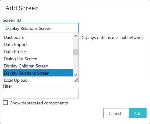
- Click Add.
- Click Save. At this point, either close designer and configure the screen at a later time, or continue on with the Display Relations Screen configuration.
Configuring a Display Relations Screen
Each parameter should be configured as needed and features help text, accessible by clicking the yellow information icon to the right of each parameter name.
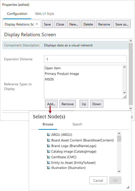
- Select the Display Relations Screen you just created by selecting the screen ID from the screen dropdown.
- Enter a number in the Expansion Distance parameter value field. This must be a whole integer and determines how far the display will branch out from the selected object (e.g., one reference 'step' away from the object or five reference 'steps' away from the object). This determines both the default number of 'steps' shown from the original selection, as well as the expansion distance when an object in the relations screen is clicked. Care should be taken in setting the expansion distance as a high number could cause performance issues. It is recommended to set this number between 1 and 3.
- Determine which reference types will be displayed. Click Add under the Reference Types to Display field, and make a selection from the Select Node(s) screen. Reorder or remove the Reference Types as needed. If no selection is made, then all reference types will be shown.
- Save the changes.
- As with any screen, it must be mapped appropriately in Main Properties > Mappings for end users to be able to access it. As an alternative to mapping, the Display Relations Screen can be added as a Sub Screen Tab Page on a Node Details screen.
- Close design mode to return to normal operation, or move on to the Configuring Main Properties section to continue the configuration steps.
Configuring Main Properties
Within the Main Properties, which are used for configuring the overall behavior of the Web UI, configuration can be done to set up the look of the graphical interface that users will view when using any Display Relations screen. Object type and reference styling only needs to be set up one time, and the selections will be applied to usage throughout a specific Web UI, regardless of how many Display Relations screens are used.
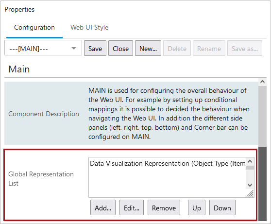
- Enter design mode and select ---[MAIN]--- from the screen dropdown list.
- Go down to the Global Representation List parameter.
- Click the Add... button under the value field.
- Select Data Visualization Representation from the Add Component dialog.
- Double click the Data Visualization Representation title that populates the value field and configure the Data Visualization Representation Properties.
- Click Save.
Next the Data Visualization Representation Properties value fields need to be populated.
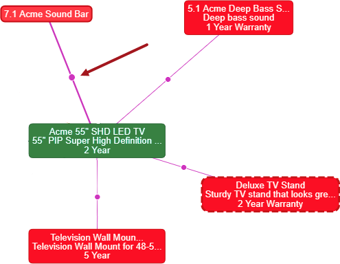
For easy identification, you can configure all nodes of the same type (e.g., all assets, all products, all entities, or all classifications) so that all object type nodes under that object structure hierarchy are represented by the same color and same attributes. You can configure display settings on a more granular level, too, or do a combination of both. For example, you can designate all products to display one color / attribute combo except for objects representing direct sellable units, which could be a different color and/or attribute combo). The display settings are highly configurable to fit the needs of your object structure. A sample configuration is shown below.
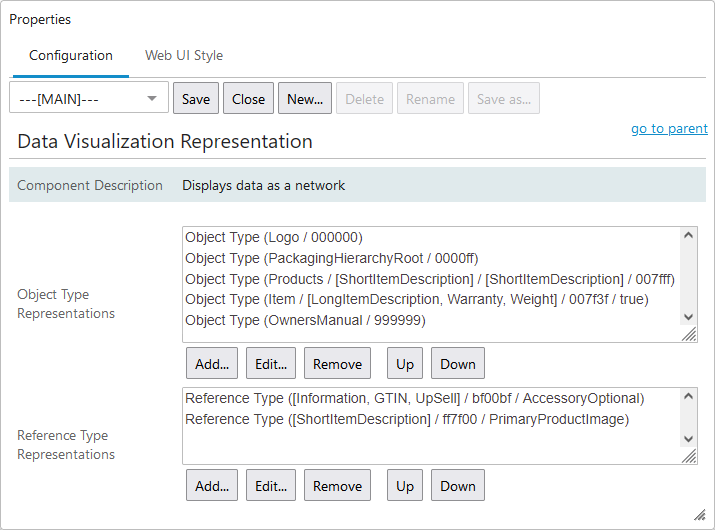
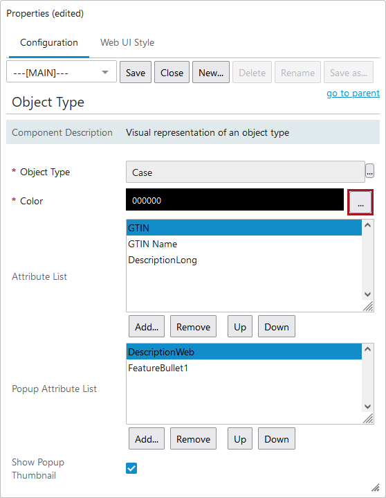
- Click the Add button under the Object Type Representations field.
- Click the ellipsis button (
 ) to select Object Type.
 - Enter a hex color code in the Color field, or click the ellipsis button () to the right of the field to select a color. If you choose to enter the hex color code yourself, the format is a six-digit hex color code. The '#' sign that is usually associated with hex color coding is applied automatically. Use this color coding to visually distinguish between different types of data.
- Add individual attributes to the Attribute List field. The attribute values will display on the object in the interface. The name of the object displays by default and is not a configurable setting.
- Make Popup Attribute List selections. The attribute values will display on the hover information that displays when mousing over the nodes within the interface. The name of the object displays by default along with a link to the object.
- The primary product image will also display on the hover popup if the Show Popup Thumbnail parameter is enabled / checked.
- When done, click Add to save the selections.
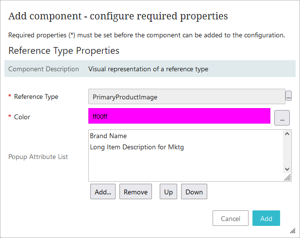
- Next, click the Add button under the Reference Type Representations field.
- Click the ellipsis button () to make Reference Type selections.
- Enter a hex color code in the Color field or, click the ellipsis button () to the right of the field to select a color. If you choose to enter the hex color code yourself, the format is a six-digit hex color code. The '#' sign that is usually associated with hex color coding is applied automatically. Use this color coding to visually distinguish between different types of data.
- If desired, enter the metadata attributes that you want to display when you hover over the Reference Type. These are the metadata attributes that are on the object to the target.
- Click Add to save the settings.
- Click Save and Close design mode to return to normal Web UI operation.