Summary
The following enhancements have been made to the Web User Interface:
-
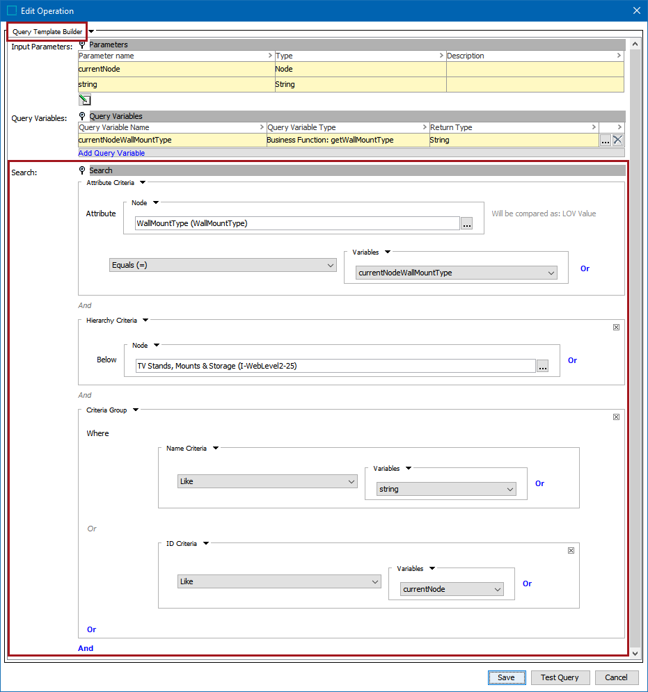
Business functions for custom reference target search can now be configured without JavaScript by using the new user-friendly Query Template Builder interface.
-
A few styling improvements were made for an easier user experience.
-
A number of visual improvements have been implemented that result in a more efficient user experience.
-
The email field on the Forgot Password screen is no longer case-sensitive.
-
Users can now view language-dependent attributes translated for different contexts when using the Search from List option in the Advanced Search screen.
-
The Approved workspace now has a clear indicator to better notify users what workspace they are in.
-
There is a new Locale Global Representation component that controls which locales are available to end users.
-
Updates were made to allow users to save searches more efficiently in Advanced Search, enabling them to quickly navigate to previous searches and share important searches with colleagues.
-
Users are now able to configure List Of Values (LOV) filters on the Attribute Management screen.
-
Visual improvements have been implemented on Asset icons.
-
Select Node(s) dialog now displays both the name and ID of the objects in Add Reference Action.
-
Visual improvements have been implemented on help messages and notifications.
-
Excel exports now supports Node List sort order.
Details
Custom Reference Target Search now enhanced with Query Template Builder
The configuration of a custom reference target search (introduced with 10.2) is now simplified with the new Query Template Builder interface, which allows creating and visualizing search queries from a business function. This allows a high degree of control over which options are presented to the user when selecting the target of a reference. Removing the need for JavaScript makes it easier to optimize the user experience of reference selections across all of Web UI by generating a custom search that includes only the required reference types for a Web UI reference selector. The Query Template Builder includes input parameters (such as the current node and search string) and query variables (for example, a business function to get a node's parent or object type), and it allows searching via a number of criteria. The full list of search criteria options, which can be grouped as needed, includes attribute, hierarchy, ID, name, and object type. Additionally, further restrictions are set on search results using the Node Picker or Variable options. The query can be validated against live data using the Test Query button.
For more information, refer to the Custom Reference Target Search topic in the Web User Interfaces documentation here. Also, refer to the Query Template Builder Operation topic in the Business Functions section of the Business Rules documentation here.
Enhanced Web UI styling improvements
A number of styling improvements in Web UI have been implemented, enabling users to have a better user experience and an increase in productivity. They include the following:
-
The full workflow state name is now visible when status flags are enabled using the Status Selector on the Global Navigation panel. This enables the user to quickly view which states have tasks that need attention.
-
Table headers have been updated with sans-serif font that is smaller in size, which provides for better readability. The image below displays an example of a Task List screen.
Enhanced visual improvements throughout Web UI
A number of updates have been implemented that result in an improved and more efficient user experience while working in Web UI and when accessing other Stibo Systems Enterprise Platform (STEP) login screens. These updates include:
-
The Web UI Title parameter has been removed from the designer on the login screen as it is no longer necessary with the System.Display.Type configuration property introduced in 10.2.
-
There is now more space allowance on the login screen to accommodate larger logos.
-
There is consistency in the look and feel when adding multiple values to tables and dialogs, such as in the Advanced Search screen, Multi Edit Display Mode, and the Application Manager Screen for Automotive.
-
Informational and disabled texts now display consistently according to their types across Web UI.
-
The Start Page has been updated to include a specific section titled 'Workbench' to separate workbench link(s) from Resources for better visibility.
-
The Node Details page displays read only text more concisely.
-
Help text in the Web UI designer on the Web Style tab has been updated.
Additionally, the following items have been updated in accordance with new branding guidelines and to better align with Product Data Exchange (PDX) login screens:
-
Technical Documentation login screen
-
STEP Documentation login screen
-
System Administration login screen
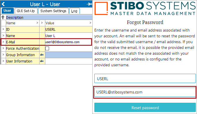
Forgot Password settings are no longer case sensitive
The email field on the Forgot Password screen is no longer case sensitive. After the user enters their username and email to retrieve their login credentials, the user will now receive the reset email based on email address correctness and not its case sensitivity. This enables users to regain access to their accounts faster and resume productivity.
For more information, refer to the Accessing a Web UI topic in the Web User Interfaces documentation here.
Improved attribute translation for Search from List in Advanced Search
Users can now view language-dependent attributes translated for different contexts when using the Search from List option in the Advanced Search screen. Previously, after saving a search, changing contexts, and starting a new or using a saved search using the Search from List option, the newly selected context was not honored. This update ensures accuracy of shared information and searches within a business but also eliminates the need for inconvenient actions, such as having to log out and log back in, to view the proper context.

For more information on how to use Advanced Search and saving searches, refer to the Using Advanced Search topic in the Using a Web UI section of the Web User Interfaces documentation here.
Updated indicator for Approved workspace in Web UI
The Approved workspace indicator in Web UI is now clearly highlighted to notify users that they are working in the Approved workspace. This updated indicator will benefit users who need to easily distinguish between workspaces while working in multiple workspaces simultaneously.

For more information, refer to the Web UI Settings topic in the System Setup documentation here.
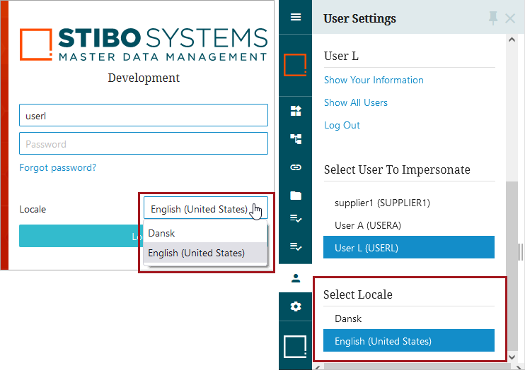
New Locale Global Representation component to replace Locales Selector child component
There is a new Locale Global Representation component that controls which locales are available to end users. Previously, the Locale Selector child component on the Login Screen in Web UI controlled which locales appeared in the dropdown list on the Web UI login page but did not control the Select Locale section of the User Settings menu on the Global Navigation Panel. This created confusion for end users who saw different options in each area. This problem has been fixed with the new Locale Global Representation component, which replaces the Locale Selector child component. Administrators can configure this component to control the allowable locales for end users in both the dropdown on the login page and in the Select Locale section of the User Settings menu in the Global Navigation Panel, thus alleviating confusion.
In the example below, the locales for English and Danish were configured using the new Locale Global Representation component.
For backwards compatibility, users who have already configured the old Locale Selector child component on the Login Screen will still be able to use it as designed but are encouraged to use the new Locale Global Representation component. If both the old Locale Selector child component on the Login Screen and the new Locale Global Representation component are configured, the Locale Global Representation component will take precedence.
For more information on setup and how to use the Locale Global Representation component, refer to the Localization topic in the Administration Portal documentation here.
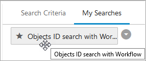
Enhancements to saving searches in Advanced Search
The following enhancements enable users to save searches more efficiently in Advanced Search allowing them to quickly navigate to previous searches and share important searches with colleagues.
-
The full name of a saved search is now visible when hovering over a long name that is truncated with ellipsis.
-
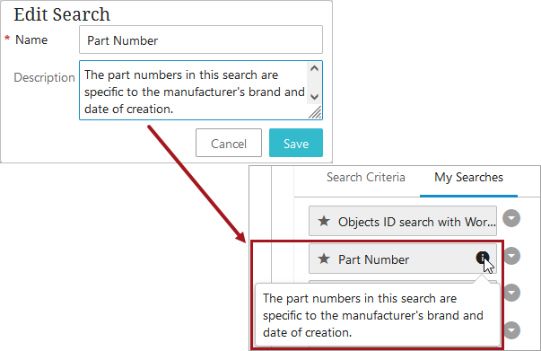
The Name parameter was always mandatory when saving a search, but there is now an indicator notifying the user that it is a mandatory field. Also, a new description field displays under the name when saving a search. Users can add additional information about the search, which is displayed by clicking on the information icon. The information icon only displays when a description is present.
-
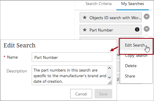
The Rename button that allowed a user to update a saved search's name has been renamed to Edit Search. This new name reflects that a user can now edit the Name and Description fields of a previously saved search.
-
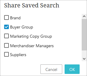
When selecting to share a saved search with other user groups, the Share Saved Search dialog now displays a scroll bar whenever the size of the list exceeds the user's screen height. Additionally, the OK and Cancel buttons are now always visible and able to be selected.
-
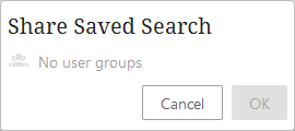
A message displays if there are no user groups available to share a saved search.
-
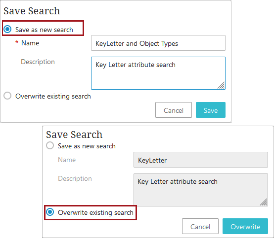
If a user modifies an existing search, it is now very clear to the user which option they are choosing. They can save the search as a new search, and the buttons will reflect Cancel or Save, or they can Overwrite the existing search, and the buttons will reflect Cancel or Overwrite. Additionally, to prevent from accidentally overwriting an existing search, the default for the Save Search dialog when opened is to Save it as a new search.
-
The Clear button on the Advanced Search screen fully clears all current searches without having to refresh the page.
For more information on Advanced Search, refer to the Advanced Search topic in the Using Web UI section of the Web User Interfaces documentation here.
New LOV filtering available on the Attribute Management Screen
It is now possible to filter List Of Value (LOV) attributes on the Attribute Management Screen. On the Attribute Details tab on the Attribute Management Screen, there is a new filter that displays next to the List of Values parameter. A user can click on the filter and further define from the main LOVs which values are to be used.
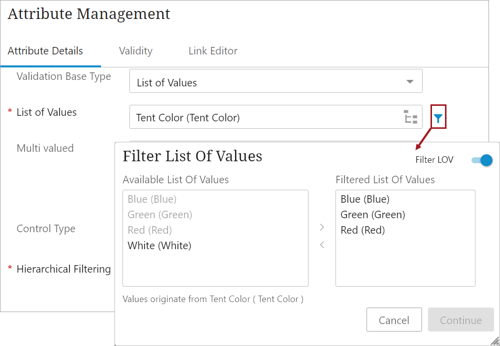
Additionally, under child component in the designer, the user can now add the 'Hierarchical Filtering' child component. This Hierarchical Filtering child component enables the user to specify if it should be possible to filter the LOV for Product and Classification hierarchies, just Product hierarchies, or no hierarchies.
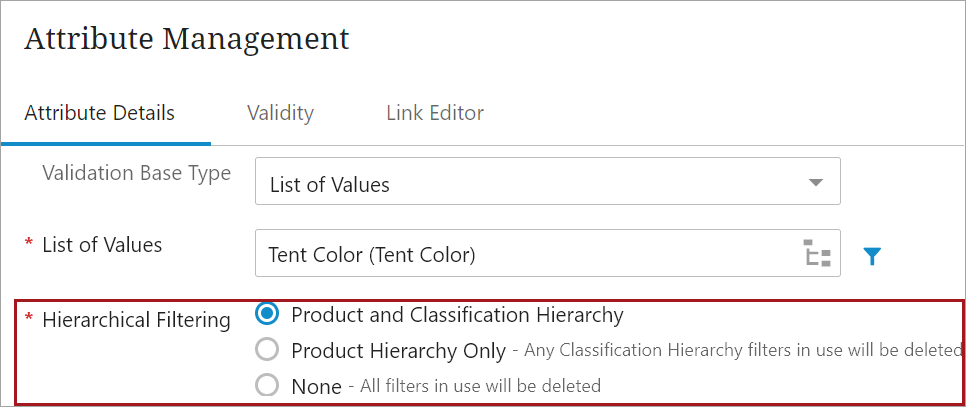
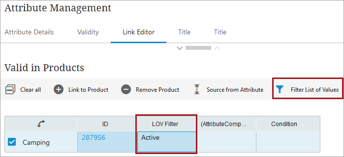
If selected for either the Product or Classification hierarchies, the 'Filter List of Values' button on the Link Editor tab is available in the appropriate Product and/or Classification table. Based on the Hierarchical Filtering selection, a new LOV Filter column will display to notify the user if filters are in use for any linked product(s) or classification(s).
Having the ability to now efficiently manage each LOV attribute value saves the user productivity time and allows them to stay focused in Web UI.
For more information, on maintaining attributes and LOVs in Web UI, refer to the Attribute and LOV Creation and Maintenance in Web UI topic in the Using a Web UI section of the Web User Interfaces documentation here.
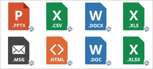
New icons for assets
Standard icons for the file formats of Excel, Word, text (such as .CSV or .TXT), PowerPoint, HTML, email (such as .MSG), and media files (such as .MP4) are now displayed for assets in both workbench and Web UI. The file format icons are shown as the asset's thumbnail in workbench and in the Web UI image viewer. These icons make it easier for a user to confirm the type of asset being reviewed and selected. Previously, these file format indicators were not rendered in workbench or Web UI.
For more information, refer to the Assets topic in the Getting Started / Object Maintenance in Tree documentation here.
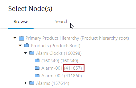
Add Reference Action now includes IDs
In Web UI, the Select Node(s) dialog (shown when clicking on the Add Reference Action button) now displays both the name and ID of the objects in the displayed hierarchy. The ID will be displayed within the parentheses. Including the object ID by default gives users one more way to confirm they are choosing the intended item from a hierarchy. Previously, the Select Node(s) Web UI dialog only displayed the name of the object in the Web UI.
For more information, refer to the Add Reference Action topic in the Web User Interfaces / Using a Web UI documentation here.
Enhancements to notification and help messages
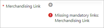
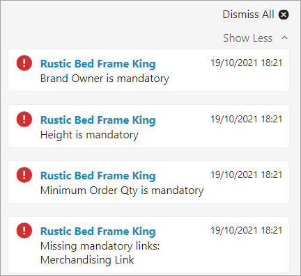
The presentation of warnings and errors in the Web UI has been updated to improve how the user is notified of relevant information, allowing data stewards and other key data stakeholders the ability to identify and clear product data issues efficiently. All updates described are applicable to mandatory attribute errors and product-to-classification references. Previously, the error and warning messages only displayed the ID of the missing mandatory attribute or product-to-classification references but now title is shown.
Error and warning messages generated from missing mandatory attributes on Node Details screens now display beneath the relevant field.
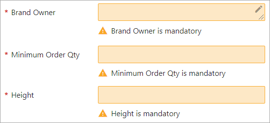
Additionally, error and warning messages generated from missing product-to-classification links are now displayed beneath the relevant field.
In the Notification panel, the error and warning messages are now displayed separately with each attribute details.
For more information on mandatory attributes in the Web UI, refer to the Mandatory Attributes in Web UI topic in the Web User Interfaces / Using Web UI documentation here.
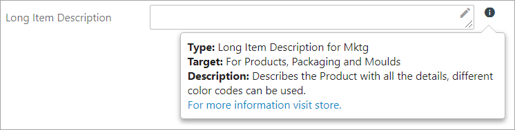
The help text attributes added in workbench now renders with styled content on the screens in the Web UI. The attribute help text displays styled content (i.e., bolded, italicized, shaded, etc.) and render working hyperlinks. Previously, the attribute help text showed without any styling, and the hyperlinks were considered as standard text.
Workflow variable header can now configure help text, unlike other attribute help text. Previously, the workflow variable header was not rendering any help text.
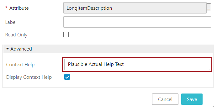
Users can now override the help text in Context help and add custom messages.
For more information on configuring help text on attributes in the Web UI, refer to the Attribute Help Text in Web UI topic in the Web User Interfaces documentation here.
Web UI Excel Exports in Node List Sort Order
In the Web UI, the functionality of the toolbar menu actions Custom Export, Export Current View, and Export Action has been expanded to make the sorting between the Node List, and the exported spreadsheets consistent. When a sort action is applied to one or multiple columns, that sorting is also applied to the exported spreadsheet using the three export options listed above. Now, data stewards can more effectively share product data between stakeholders, ensuring the sorting applied in the Web UI carries over into the shareable document. Previously, the exported spreadsheet did not fully reflect the applied filtering and sorting applied to the Node List. Listed below are the Node List columns that, when filtered / sorted, will enable sort- and filter-accurate display.
-
ID Header
-
Title Header
-
Name Header
-
Object Type Header
-
Unique Key Header
-
Attribute Value Header
-
Attribute Group Value Header
-
Reference Header
-
Workflow Variable Header
-
Workflow Deadline Header
-
Workflow Status Header
With respect to columns containing cells with multiple values (i.e., attribute values, references), the sort order is determined by the first value encountered. When using the options available in the Custom Export toolbar action, It is applied only to 'Export only selected objects' in the node list. If the user chooses 'Export including below objects' or 'Export only leaf objects,' then these objects are not included in the Node List and sorting cannot be applied.
The Workflow Variable Header, Workflow Deadline Header and Workflow Status Header are supported sort columns in the Node List, but these are not supported in the Excel that is generated using Export Actions. If the user sort on any of these columns in the Node List in the Web UI, that sort order will not be honored in the exported Excel.
For more information, refer to the Custom Export Action topic in the Web User Interfaces documentation here.
Also, refer to the Data Exchange Enhancements and Changes release note for additional data exchange updates for 10.3 here.