Help texts can be used to provide information to end users about an attribute and how it should be populated.
Help texts can be added to individual object editors (Node Editors) or to multi-object editors and grid views (Node Lists), as shown below.
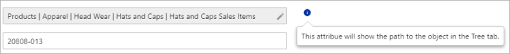
Node Editor example:
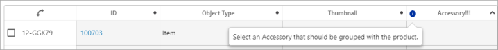
Node List example:
Additionally, the information icon provides access to the 'Go to Wiki' link used to display Metadata Wiki pages when installed. For more information, refer to the topic Wiki Metadata (Data Catalog Connector) in the System Setup documentation.
This section describes the steps necessary to provide attribute help texts in Web UI.
Prerequisites
To configure attribute help text, it is expected that the user has knowledge of System Setup functions and Web UI Designer.
Attribute help texts can be entered individually in Web UI, per attribute and screen / component configuration, but this is a time-consuming process. Instead, it is recommended to apply global attribute help texts using the workbench, and then to provide local overrides in Web UI only as needed. For this approach, the system must first have a metadata attribute available to house the global help texts. Refer to the Attribute Metadata on Attributes section in the System Setup documentation for instructions on how to complete this setup. Once complete, follow the below steps to enable attribute help text in Web UI.
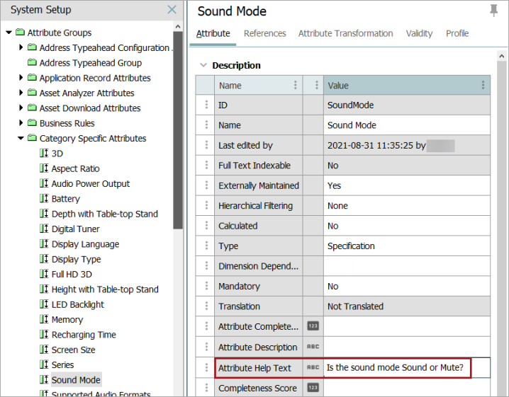
Identify the metadata attribute used for help texts in System Settings
A metadata attribute must exist as valid on attribute object types, to be used to populate help text for individual attributes. For this example, an attribute with ID=AttributeHelpText is used. On any given attribute, text (and hyperlinks) can be populated in the help text attribute.
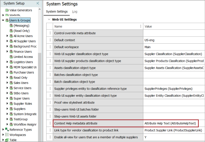
In order to inform the Web UI where to pull help texts from, the help text attribute must be specified. In System Setup, navigate to the Users & Groups root node, open the Web UI Settings flipper, and in Context Help metadata attribute, type the ID of the metadata attribute.
Set Component Properties in Web UI
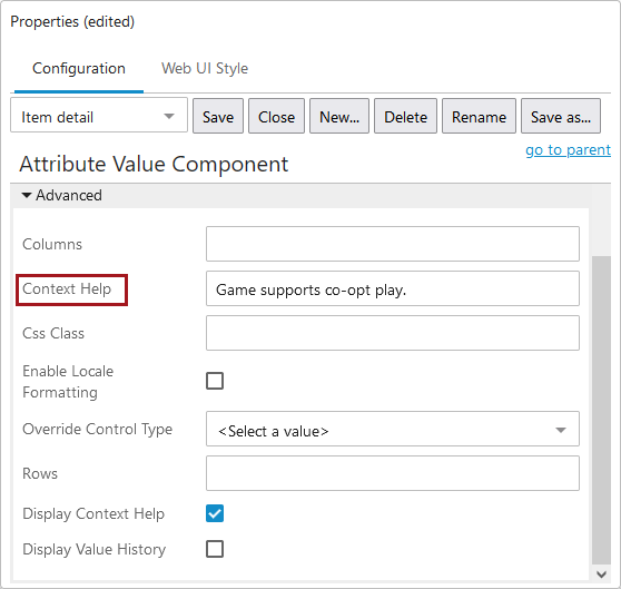
Once the workbench setup is complete, help texts must be enabled in Web UI. This is done using the Display Context Help parameter, which is available on attribute-related components (e.g., Attribute Value, Attribute Value Group) and attribute-related table header components (e.g., Attribute Value Header, Attribute Value Group Header, Variants Header) — all of which can be configured using a Node List with any of the following display modes: Multi Edit Display Mode, Compare View, Sequence View, and List View.
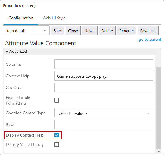
When end users access a component in which help text is enabled, the configured help text will display beneath the field if the field is set as editable.
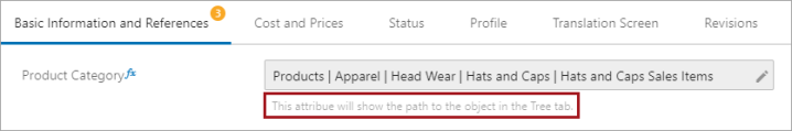
If the attribute is set as 'Read Only,' the blue information button displays when the user hovers over the attribute, and the help text is shown when the user clicks the information button.

If an override to the attribute help text from the workbench is required, it can be done in Web UI by entering a new value in the 'Context Help' parameter, as found in the example below. This can be useful when some additional instruction is needed only in a particular context. For example, when introducing a new object instructions for data population may differ slightly from those for established objects. In this case, Web UI designers could populate local help text that would only be available in an item initiation screen.
Change Help Text Display Mode
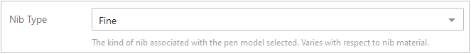
Rather than being accessed via an icon, help text can be configured to appear below relevant attributes at all times.
To configure this option, navigate to Node Editor Properties, and under the Context Help Display Mode parameter, select 'Display below input fields'.
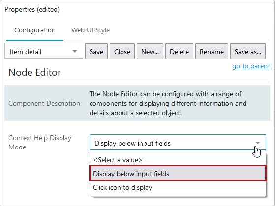
Note: This option is only available with the Node Editor component. Additionally, read-only attributes will display help text via an icon regardless of what is selected in this parameter.