The Add Reference Action functionality can be configured beyond the basic Browse / Search functionality described in the Multi-Reference Editor topic.
If configured to do so, the Add Reference Action dialog can also include the Create and Create From Template tabs to allow users to create new objects to reference rather than having to choose from existing objects only. Additionally, Find Similar functionality allows users to search for and identify similar objects on a more granular level prior to adding references and creating target objects. These tabs are all omitted by default but can be enabled within the Add References Action Properties.
All the steps provided in this topic assume the Web UI designer is in design mode and on the Add Reference Action Properties screen prior to starting the configuration process. It is also assumed that all users (designers and end users) have the proper privilege to work with the Multi-Reference Editor and its features. For more information about privileges and user setup, refer to the Users and Groups topic and the Adding User Privileges for a Group topic of the System Setup documentation.
Add Reference Action Properties
Each parameter is explained following the image below. Also, the parameters required to set up the Create, Create From Template, and Find Similar tabs are described as a whole in the applicable section. Anyone designing the Web UI can determine what features or combination of features are preferred and set them up based on the descriptive information below.
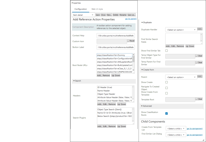
The Add Reference Action component is highly configurable. Each parameter features help text, accessible by clicking the information icon to the right of each parameter name. An expanded description of each parameter is available below.
|
Parameter |
Description |
|---|---|
|
Context Help |
The name of the action when displayed. |
|
Custom Icon |
Adding a custom icon will override the default icon displayed. The recommended size in pixels is 20 high x 35 wide. The recommended colors should be jewel toned, deep colors that will fade well when the item is disabled. |
|
Button Label |
The name of the action, shown as hover text on the toolbar action. |
|
Root Node URLs |
This parameter allows users to select which nodes will be available in the node picker when adding a reference. Regardless of the selected reference type, only the nodes added will be available to pick a source / target object to reference. If no nodes are added, all available nodes will display. |
| Headers |
Add configurable headers that will display information in the Search tab on the Node Picker following initiation of a search. |
| Search Plugins |
Search types that can be applied to a Node Picker when running a search in the Search tab include Below Search, Golden Record - Source Record ID search, Name or Id Or Attributes search, and Object Type Search. |
|
Duplicate Handler |
A parameter / option required when using Find Similar; works with Find Similar functionality to return potential duplicate objects based on search values and a matching algorithm |
|
Find Similar Search Fields |
The object attribute or referenced object attribute fields that end users can search upon to determine if a similar object already exists in STEP; Find Similar functionality |
|
Show Find Similar Tab |
The selection that determines if the Find Similar tab should be shown in the node picker dialog; if enabled, then Duplicate Handler, Find Similar Search Fields, Temp Object Type for Find Similar, Temp Parent for Find Similar, and the Child Component > Find Similar List Dialog also need to be configured |
|
Temp Object Type for Find Similar |
The temporary object type for objects that are stored while the Find Similar functionality is being used |
|
Temp Parent for Find Similar |
The location that temporary objects reside when searching with the Find Similar functionality |
|
Parent |
This setting allows the designer to determine a single parent under which all new objects will be created; used with Create and Create From Template |
|
Show Create |
The Create tab will be shown in the node picker dialog |
|
Navigate to Created Object |
The parameter that decides if the 'Go to created object' option on the Create tab is enabled by default; when enabled, the end user will be auto-navigated to the new object upon creation (using Create) |
|
Show Create From Template |
The Create From Template tab will be shown in the node picker dialog |
|
Template Root |
The root node from which child objects can be used as templates (Create From Template) |
|
Show Classification Roots |
This parameter allows users to view classification root nodes on the Browse tab in the Node Picker, if the classification nodes are configured, and the reference type selected is a Product Reference type. |
|
Create From Template List |
The configurable results list when using the Create From Template functionality; List Dialog must be selected from the dropdown; a Dialog List Screen needs to be created, selected, and configured |
|
Find Similar List Dialog |
The configurable results list when using the Find Similar functionality; List Dialog must be selected from the dropdown; a Dialog List Screen needs to be created, selected, and configured |
Create
Follow these configuration steps to display the Create tab when adding references:
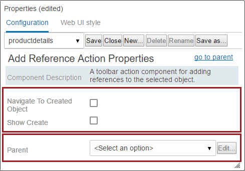
- Enable Navigate to Created Object if the 'Go to created object' option on the Create tab should be enabled by default (shown as disabled in the screenshot in Step 3 below).
- Enable the Show Create parameter.
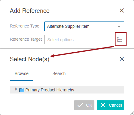
- Select a Parent, if desired. Choose Configured Parent Handler from the dropdown in the value field. In the Configured Parent Handler Properties that pops-up, click the ellipsis button (
 ) to the right of the Parent value field to browse or search to select a single parent under which all new objects will be created.
When the Show Create parameter is selected (checked), users are able to create new objects when building references.
Users must select a valid object type and parent combination, and the object type selection must align with the reference type selected.
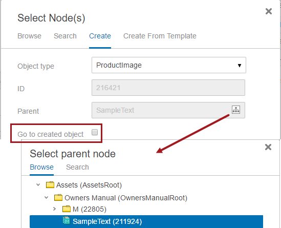
If the Parent parameter is left not configured, end users will have the option to select any valid parent from existing objects. Choosing a Parent is useful if the Multi-Reference Editor will only be used to create a single object type which will reside in a flat hierarchy structure. In this case, end users are not presented with a parent selection option.
When creating new objects from the Multi-Reference Editor, the ID field is editable unless the objects being created utilize auto-generated IDs.
Configuring the Node Picker
Follow these steps to configure which nodes are available in the Node Picker when adding a reference.
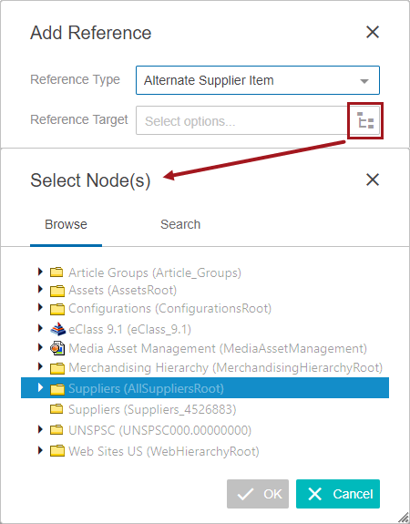
- On the Root Node URLs parameter, click Add....
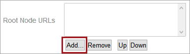
- From the Node Picker, select the node or nodes that should appear in the Node Picker when a user has clicked the Add Reference button. Users may multi-select by holding CTRL (or CMD for Mac users) while making selections (multi-select is shown in the screenshot below). When the relevant nodes are selected, click OK.
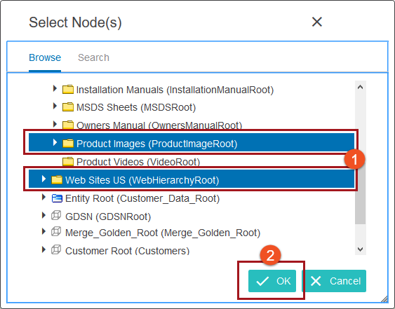
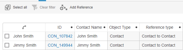
Objects that are of an object type that is invalid for the configured reference type will display in gray text and cannot be referenced. Objects that can be referenced will display in black text.
Additionally, as shown in the screenshot below, objects that have already been referenced will display in gray text with a green checkmark, and cannot be selected.
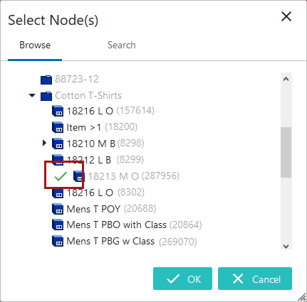
Target objects in inherited references will show with a green checkmark to indicate that they are already referenced, but will display in black text because they can be referenced again.
The Headers and Search Plugins parameters allows users to configure the Search tab in the Node Picker. Configurable headers added to the Headers field define which information displays in the Search tab, and the kinds of searches run when the 'Search' button is clicked can be configured and added using the Search Plugins parameter. For more information on the Node Picker component and configuring the Search tab, refer to the Node Picker Dialog topic.
- Click Save and Close design mode to return to normal Web UI mode.
Configuration of which nodes display in the Add Reference Action's node picker can be set only once per Multi-Reference Editor screen. This means that if a user configures a restricted list of nodes to appear in the node picker, this list will appear regardless of the selected reference type. For example, if a user has selected only product image nodes to appear in the node picker when adding a reference, even if that user selects a Product to Product reference type, only the configured product image nodes will be available. For some users, particularly those who maintain references of a single reference type per Multi-Reference Editor screen, this may represent a limitation.
To configure the UI to remove this limitation, users may add multiple Multi-Reference Editor screens via secondary tabs, and configure the node picker for each screen so that when the Add Reference toolbar action is clicked, only the objects relevant to that Multi-Reference Editor screen's designated reference type will display.
Displaying Classification Roots with Product References
By default, if no root nodes are specified, the Primary Product Hierarchy will be the only selectable root node for Product reference types. Even if classification folders are configured for the Root Node URLs parameter, they will not display within the node picker unless the 'Show Classification Roots' option is enabled as described below.
In systems with a lot of objects where classification folders are used to organize products, the 'Show Classification Roots' option needs to be selected under the Advanced section of the 'Add Reference Action' properties screen.
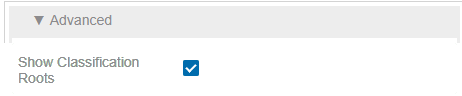
Once this option is selected and the node picker is activated, the classification roots and product nodes are available.
Create From Template
Template objects can be whatever the Web UI designer chooses for them to be. They can be ‘live’ objects or a set of configured objects that exist only for selection as templates. When a user selects a template object, a new object is created with the same attribute links and values as the selected template object and references it to the selected source. Users then need only to populate the subset of data that differs between the template and the new object.
When creating a new object from a template and following the dialog path of options, users are ultimately presented with a Pick a Template option that has three tabs: List, Browse, and Search. In addition to displaying a list of templates (similar to the Browse tab), the List tab is configurable and users can choose to include attributes within the tab view, making it easier to identify the template that best fits the new object.
Follow these configuration steps to display the Create From Template tab when adding references:
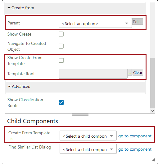
- Enable the Show Create From Template parameter.
- Click the ellipsis button () to the right of the value field to select a Template Root. Any objects under the root are available for selection as a template for new object creation. This creates a new object with the same attribute links and values as the selected template object and references it to the selected source so that users need only to populate the subset of data that differs between the template and the new object. It is a good idea to use a specific, limited set of objects, easily identifiable, as templates for an end user to choose from.
Note: The selected template must be valid for the selected reference type, and only a single Template Root may be selected. It is therefore recommended that a separate area be created for this purpose and that all existing objects that are allowed to be used as templates be linked into that area.
- Select a Parent, if desired. Choose Configured Parent Handler from the dropdown in the value field. In the Configured Parent Handler Properties dialog that displays, click the ellipsis button () to the right of the Parent value field to browse or search to select a single parent under which all new objects will be created. If the Parent parameter is left unconfigured, end users will have the option to select any valid parent from existing objects.
- Under Child Components > Create From Template List, select List Dialog from the dropdown menu.
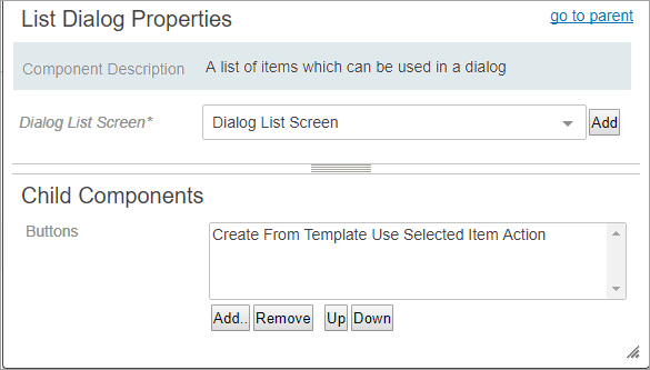
- When presented with the List Dialog Properties, click the Add button to the right of the Dialog List Screen field.
- Create a new screen by selecting Dialog List Screen from the list of available screen types / components. Enter an easily identifiable Screen ID, click Add. The screen ID will automatically populate in the Dialog List Screen value field.
- If a Dialog List Screen already exists, skip the previous two steps and select the screen using the dropdown.
- Back on the List Dialog Properties screen, in the Child Components > Buttons field, click Add and select Create From Template Use Selected Item Action. Click Add, and then click Save in the Designer window.
- Before exiting design mode, select the Dialog List Screen ID of the screen you just created from the dropdown menu. In the example above, the screen ID is Dialog List Screen - Create from Template.
- Configure the Child Components > Headers section of the Dialog List Screen Properties. Click Add under the value field to set up the attributes that will display in the Create From Template tab for the results list. The Help Text is editable and will display at the top of the template results list.
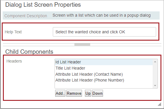
- Select the headers for the columns to be displayed to end users. If you are using an Attribute List or Attribute Group List, make sure you fill in the Label for the attribute to be displayed in the results list.
- Click Save and Close design mode to return to normal Web UI mode.
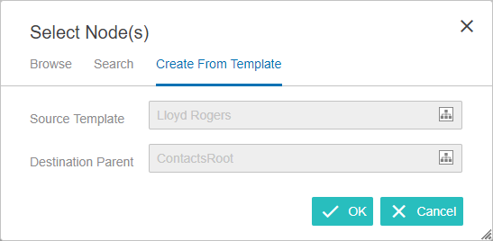
Create From Template Example
This is an example of a configured Create From Template tab. While using a Multi-Reference Editor component, the end user clicked 'Add reference' and then clicked the node picker icon on the 'Add reference' dialog that appeared. The Create From Template tab is displayed in the 'Select Node(s)' dialog. By clicking the node picker icon for the Source Template field, the end users gets a Pick a Template Node dialog that displays the List screen based on the headers / attributes configured to display.
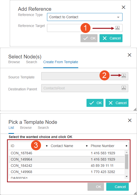
A maximum of fifty (50) template objects are shown at one time on the results list. The end user selects a single template to use. Once a selection is made, the OK button will be available. The end user clicks OK and continues through the remaining dialog screens. The end result will be a new reference that can be edited (the ID field is editable unless the object being created utilizes an auto-generated ID).
Considerations and Limitations
- Create From Template functionality is available for Product and Entity object types only.
- Care must be taken in the configuration of the Add Reference Action component (and in particular of the Create From Template option) to ensure that end users are provided with valid selection options. The selections for object type of the template (if used), object type of the object being created, parent, and reference type must all align to yield valid results based on the data model and configurations.
Find Similar Search
To help prevent users from creating duplicate objects in the STEP system, users can now use Find Similar functionality to search for and identify similar objects prior to adding references and creating target objects within a Multi-Reference Editor. When using the Add References Action, the Find Similar functionality can be configured to display on a new Find Similar Search tab. Attribute values of both direct objects and target objects (based on a specific reference type) can be configured as searchable fields. If similar objects are found, a configurable results list will display attribute values for the direct objects. This allows users to compare the results to determine if they can use an existing object.
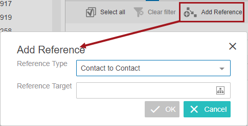
The key to Find Similar functionality is the matching setup that the customer creates and uses for duplicate handling. Every time a user enters data into the search fields and clicks OK, the Find Similar search checks the match code values involved, executes the relevant matching algorithm, and provides a set of results, if any are found. If a user is not getting the results set they expect, then the first place to check is the algorithm configured in the Duplicate Handler parameter in the Add Reference Action Properties. Two bind types work with the Find Similar functionality. They are: First Match Object and Second Match Object. A relevant Match Code and Matching Algorithm needs to be set up before attempting to use the Find Similar Search tab. For more information about setting up and using matching algorithms, refer to the Configuring Matching Algorithms Overview section of the Matching, Linking, and Merging documentation
Find Similar functionality is also available using a Find Similar Action Button on an Initiate Item screen type. This functionality is explained in the Find Similar in Web UI topic.
To configure the Find Similar Search tab:
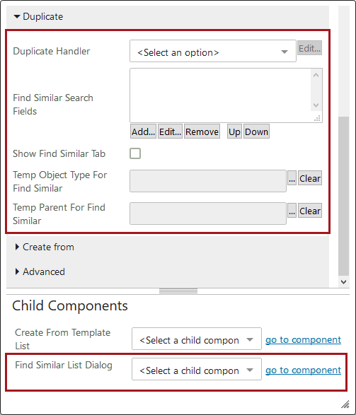
- Select Duplicate Handler in the dropdown for the Duplicate Handler parameter.
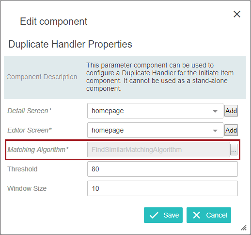
- The Duplicate Handler Properties screen will display. Select the Detail and Editor screen from the dropdown. Then, select the desired Matching Algorithm parameter. Click the ellipsis button () to the right of the value field, and select a matching algorithm. Click Save.
For more information on matching algorithm, threshold, and window size, refer to the Matching, Linking, and Merging Configuration topic in the Matching, Linking, and Merging documentation.
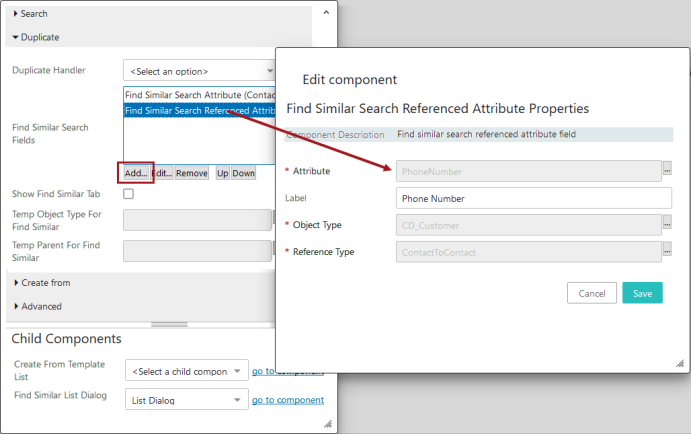
- Back on Add Reference Action Properties, click Add under the Find Similar Search Fields value box. Add, remove, and re-order Attribute and Referenced Attributes as desired. Remember that these search fields will need to be incorporated into the matching algorithm configured in the Duplicate Handler parameter.
- It is important to fill in the Label fields during the Find Similar Search Fields configuration. These labels will appear on the Find Similar Search tab. If adding a Find Similar Search Referenced Attribute, fill in the Attribute, Label, Object Type, and Reference Type values. Save all changes.
- Enable the Show Find Similar Tab setting back on the Add Reference Action Properties.
- Click the ellipsis button () to make a selection for the Temp Object Type For Find Similar parameter and the Temp Parent For Find Similar parameter. (When the matching algorithm is run, it creates temporary objects based on the input in the search fields. These objects are then used in the algorithm to compare and find similar objects. The temporary objects need a parent and object type to be created. After the user finishes the operation, the temporary objects are deleted by the system. These parameters have to be configured for the functionality to work. The object types of both the direct objects and the referenced objects need to be made valid under the location used for the Temp Parent For Find Similar parameter.)
- Under Child Components > Find Similar List Dialog, select List Dialog from the dropdown menu.
- On List Dialog Properties, click Add to the right of the Dialog List Screen value field.
- Create a new screen by selecting Dialog List Screen from the list of available screen types / components. Enter an easily identifiable Screen ID, click Add. The screen ID will automatically populate in the Dialog List Screen value field.
- If a Dialog List Screen already exists, skip the previous two steps and on the List Dialog Properties, select the Dialog List Screen using the dropdown.
- Also on the List Dialog Properties screen, in the Child Components > Buttons field, click Add and select Use Selected Item Action. Click Add, and then click Save in the Designer window.
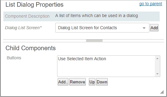
- Before exiting design mode, select the Dialog List Screen ID of the screen you just created from the dropdown menu. In the example above, the screen ID is Dialog List Screen for Contacts.
- Configure the Child Components > Headers section of the Dialog List Screen Properties. Click Add under the value field to set up the attributes that will display in the Find Similar Search tab for the results list. The Help Text is editable and will display at the top of the template results list.
- Click Save and Close design mode to return to normal Web UI mode.
Find Similar Search Example
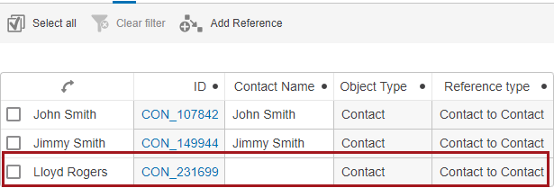
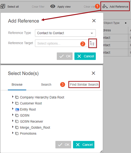
This is an example of a configured Find Similar Search tab. While using a Multi-Reference Editor component, the end user clicked 'Add reference' and then clicked the node picker icon on the 'Add reference' dialog that appeared. The Find Similar Search tab is displayed in the 'Select Node(s)' dialog. The end user enters data into the configured attribute fields and clicks OK. The algorithm runs in the background and the configured Dialog List Screen displays. Remember that this is not a standard search and results are based on the matching algorithm running in the background.
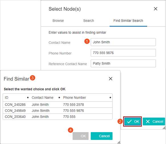
A maximum of fifty (50) objects are shown at one time on the results list. If the end user finds a reference on the results list that they want to use, they click in the row they want. When that selection is made, the OK button will be available. The end user clicks OK and now that reference is saved. If the user does not find a result to use, they can click cancel and create a new reference using the Create or Create From Template functions (both described previously in this topic).
For additional information about the Multi-Reference Editor and its features, refer to the Multi-Reference Editor topic.