Once Advanced Search has been configured (e.g., criteria renamed, unused criteria removed, hierarchy nodes pre-selected and added), the search is ready to use.
Performing an Advanced Search
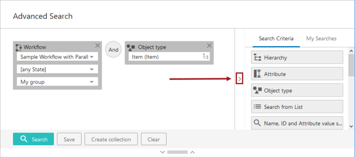
Drag and drop each search criteria button and operator button over to left side of the page. Or click on each search criteria button to build the search. Building search queries visually helps the user better understand the data.
Building a Search Query
-
Choose the Search Criteria by dragging and dropping each search criterion over to the left side of the screen or by clicking the desired search criteria button.
-
Click / drag and drop the Or and Not Exclude operators as needed. The default operator is And.
-
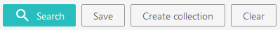
When all the criteria are set up, click 'Search'. Results will show at the bottom of the page. The 'Search' button will display as gray-shaded when the search area is either blank or if the added search elements are insufficient to initiate a search. When a search has been built that will allow a search to be initiated, the 'Search' button will display with the configured 'Accent' color, which can be set in the designer's Web UI style tab.
-
Users may save any search by clicking 'Save'. More information on saving new searches and using existing searches is available later in this same topic.
-
Users may create a collection from the search results by clicking the 'Create collection' button. More information on this functionality is available in the Creating a collection from search results section of this topic.
-
Users may clear all search criteria and operators from the search area by clicking 'Clear.'
Attribute Search Considerations
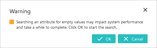
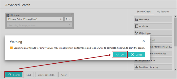
Searching for Empty Values: Using the Attribute criterion for searching (! and !! operators) attributes that have empty values is an easy way to identify objects in STEP that are not yet complete. However, performing these searches can be time consuming depending on the number of attribute values being searched and the complexity of the assembled search criteria. Because of this, when starting an empty-value search (either alone or with other criteria), users are presented with a message asking them to confirm that they want to move ahead given the potential resource and time constraints. When the end user clicks OK, the search is performed. The maximum number of search results returned is 10,000. This value can be edited to be less than 10,000 via the Portal.MaxResultCount config property, which can be set on the server by advanced users or by Stibo Systems technical support. Refer to Example 4 below.
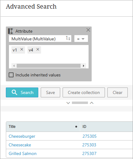
Searching for Multiple Values on Multivalued Attributes: By default, the Attribute criterion assumes an OR operator for the multiple values the user inputs. This means that the search result will include a product or entity having any one of the input values. This also applies to attributes searched within data containers. Refer to Example 5 below.
Examples
The following examples with screenshots that show basic searches with different operators: AND, OR, and NOT. The example screenshots do not show every search criteria available. For more information on adding / removing criteria shown to users, refer to Advanced Search Initial Configuration topic.
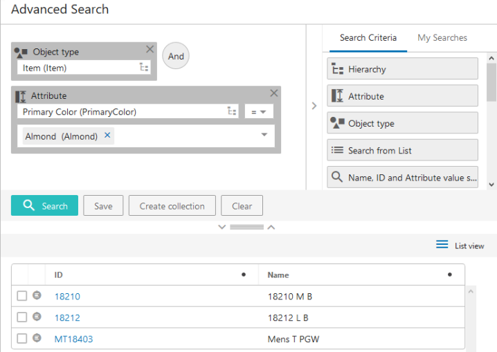
Example 1: Object Type with Attribute Value
Object type (Item) AND Attribute (Primary Color)=Almond
Results include items that have the color 'Almond' as an attribute value.
While only one value is being searched, multiple values can be searched at one time (if applicable to the search). And, if searching an LOV-based attribute, users can use the dropdown to access the actual list of values to enter an attribute value.
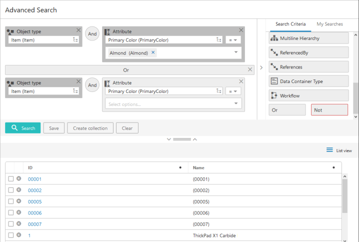
Example 2: Object Type with Attribute Value 1 OR Value 2
[Object type (Item) AND Attribute (Primary Color=Almond)] OR [Object type (Item) AND Attribute (Primary Color=Apricot)]
The search identifies items that have the primary color 'Almond' as an attribute value and combines those results with items that have the primary color 'Apricot' as an attribute value.
Example 3: Object Type with Attribute Value 1 OR Value 2 and Not Approved
[Object type (Item) AND Attribute (Primary Color=Almond)] OR [Object type (Item) AND Attribute (Primary Color=Apricot)] NOT Approval status (Never approved or modified)]
The search pulls items that have the primary color 'Almond' as an attribute value. It combines those results with items that have the primary color 'Apricot' as an attribute value, with any object types that have never been approved excluded from the Item / Primary Color= Apricot results.
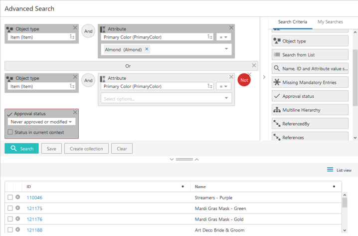
In Example 3, if the user also wants to exclude unapproved object types from the Item / Primary Color=Almond portion of the query, they would go back and add the NOT operator and the 'Approval status (Never approved)' criteria in front of the OR operator.
Example 4: Attribute with Empty Value
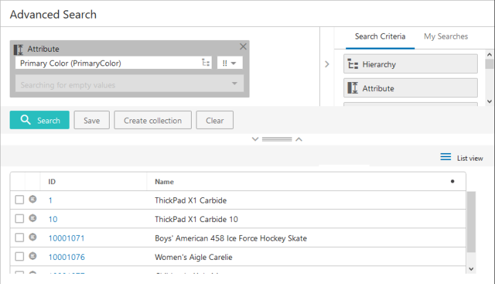
Empty value search for [Attribute (Primary Color)]
The search pulls objects that do not have a value for the Primary Color attribute within the current context (English US). A warning dialog is presented upon clicking the Search button. After pressing OK to confirm you want to continue, the search will process.
Example 5: Multiple Values on Multivalued Attributes
This example applies to individual attributes and also attributes searched within a data container. In this example, the following values exist in the 'MultiValue (MultiValue)' attribute:
-
Cheesecake (275303) has value 'v1'
-
Grilled Salmon (275307) has value 'v4'
-
Cheeseburger (275305) has value 'v1' and 'v4'
The default operator for multiple values is OR and the search results include all three objects as shown below.
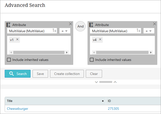
To identify only objects with BOTH values, add the attribute once for each desired value, as shown below.
Example 6.1: Data Container Type
Data Container Type search for [Main Address]
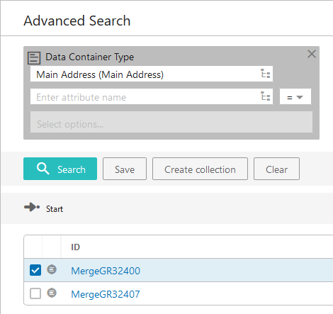
By clicking the Node Picker icon (  ) in the 'Enter data container type' field (in the screenshot above, the data container type 'Main Address (MainAddress)' displays in this field), users may either browse through or search for the data container types that have been created in the system. Once a selection is made and Search is clicked, a list of all applicable entities for which a data container has been created / added of the data container type specified will populate.
Example 6.2: Data Container Type and Attribute Value
Data Container Type search for [MainAddress] and [Attribute (City)]
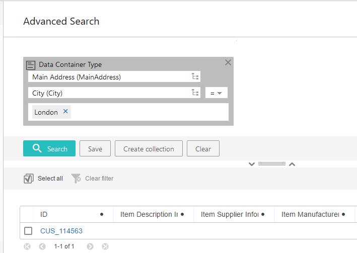
Users may narrow the search further by also selecting an attribute linked to a data container of the specified data container type. To execute this kind of search, users must select an attribute by clicking the Node Picker icon in the 'Enter attribute name' field, or by typing the attribute into the field. Once the user makes their attribute selection, selects a search operator (equals (=), in this example), enters an attribute value, and then clicks Search, a list of all entities that have a data container added of the type specified, which also contain the selected attribute / attribute value combination, will populate.
Example 6.3: Data Container Value
Data Container Type search for [Attribute (City)]
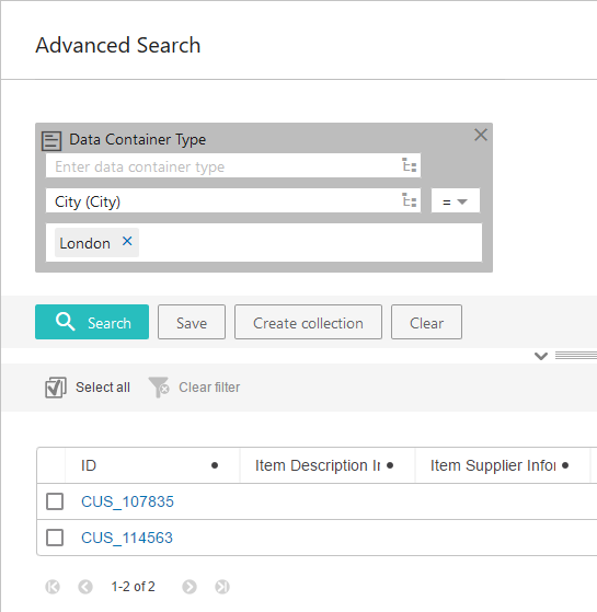
Users can elect to search for attribute values that exist in attributes contained in any data container, irrespective of type. To execute this kind of search, user must select an attribute by clicking the Node Picker icon in the 'Enter attribute name' field, or by typing the attribute into the field. Once the user makes their attribute selection, selects a search operator ('less than or equals ( )', in this example), enters an attribute value in the 'Select options' field, and then clicks Search, a list of all entities with an attribute value that matches the value specified for the selected data container-linked attribute will populate. By leaving the 'Enter data container type' field blank, the user is searching for attribute values within any existing data container.
Example 7: Objects Linked to Different Classifications
To find products linked in two different classifications, add a [Hierarchy] search criteria to the search panel, and set it to the first classification to be searched. In this example, the classification is 'Receivers (Acme)'. Then add a second [Hierarchy] search criteria, and set it to the second classification to be searched, which is 'Stereos (Acme_2)'. Then click ' Search'.
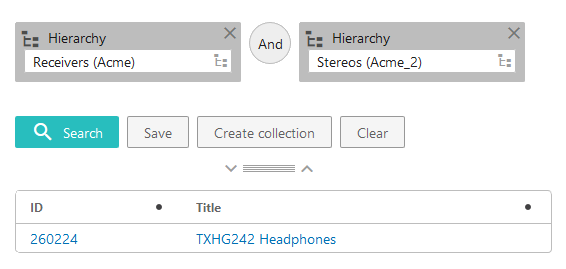
When this search is run, only those objects linked to both classifications will display in the results. In this example, the only product linked to both classifications is 'TXHG242 Headphones'.
Note: When a user clicks on the 'x' to remove a 'Not' or 'Or' operator symbol, the system changes it to 'And'. To entirely remove a particular operator, remove the search parameters that come after that operator.
Building searches within the Web UI is very similar to the functionality found within the STEP Workbench Advanced Search tab. For additional information on this process, refer to the Navigating and Searching topic of the Getting Started documentation.
Saving a Search
When an Advanced Search is built, a user may want to save the search to use again. Searches can be saved once parameters have been added. There is no need to run a search before saving it. However, it is a good idea to make sure the designated criteria are set up effectively and meet data / business needs prior to saving.
Values may be pre-populated for each search parameter prior to saving.
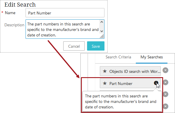
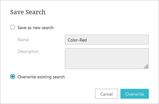
Click Save, name the search, and add a description if needed. Click OK to save it.
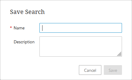
If a description was added, an information icon displays next to the name. The information icon only displays when a description is present.
If saving a new search using a name that is already used by an existing saved search, an overwrite notification will appear and require user action. If overwriting a search that has been previously shared, the search is overwritten for all users.

Using Saved Searches
Access saved searches by clicking on the 'My Searches' tab.
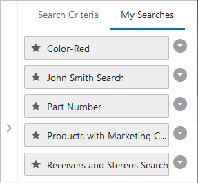
To initiate a saved search, drag and drop any of the saved searches listed under the 'My Searches' tab from the right side of the screen into the search area. Users may also click on the desired search to bring the configured criteria into the search area. To complete the search, click 'Search'. The results will show at the bottom of the page. If no results are returned, a zero (0) will display at the bottom left-hand corner of the page.
Users in unrestricted user groups can overwrite existing saved searches within Advanced Search. After opening an existing saved search from the My Searches tab, modifying it, and then clicking the Save button, a notification dialog appears in which the user can choose save the search with a new name or overwrite the existing search. If the search is overwritten and has previously been shared with other users, then the search will also be overwritten for those users.
Creating a Collection from Search Results
The Advanced Search screen enables users to create collections from the generated search results by clicking the 'Create collection' button.
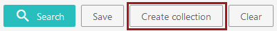
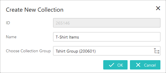
Following a completed search with one or more generated results, users may create a collection that includes all items in the search result. When a user clicks 'Create collection', a 'Create New Collection' window displays:
-
ID -- In this field, a read-only automatically generated ID displays.
-
Name -- Users can select the name for the new collection.
-
Choose Collection Group -- By either typing the name of the collection group in the field or by selecting it from a Node Picker after clicking the hierarchy icon, users must select the collection group into which the new collection will be added.
Once the fields are filled out, click 'OK' and the objects contained in the search results will be saved as a collection.
For more information on collections, refer to the Collections topic of the Getting Started documentation.
Collapsible splitter feature
The individual panels on the Advanced Search screen are collapsible and expandable through the use of a collapsible splitter feature, which consists of a drag handle element and two arrows, one pointing up and one down. This feature is shown below:

When the screen is configured with a horizontal split panel, the drag handle divides the panels / components on the screen. To the left of the drag handle is a down arrow, and to the right, an up arrow.
Clicking the up arrow removes the main component (Advanced Search build / criteria) from display, providing more screen space to focus on the Node List. This is useful if the user wants to focus on the results set only. For example, a user may choose to display the results set in Multi Edit Display Mode to make edits and no longer needs to view the criteria or the way the search was built.
Clicking the down arrow returns the hidden component back to the screen display.
Similarly, if the user first clicks the down arrow, the child component is hidden from display so the user can focus on using the criteria and setting up an Advanced Search.
Note: By default, the collapsible splitter is typically in the middle of the screen and the Search Criteria panel / tab is automatically displayed once a user is on the Advanced Search screen. However, if the Advanced Search Task List is used as a result screen for any Status Selector Homepage Widget, the criteria panel is collapsed and the splitter moves up under the search criteria used in the search. This allows more room to view the Task List once a user gets on the Advanced Search page. The Search Criteria panel can be expanded by clicking the arrowhead on the right of the screen (shown expanded in the following screenshot) and the splitter can manually be dragged down to expand the Search Criteria list and area, if desired.
Considerations and Limitations
-
Unrestricted user groups will view two tabs - 'Search Criteria' and 'My Searches.' Restricted users who have been set up to receive shared searches will only have the 'My Searches' tab. Read more in the Restricting and Sharing Advanced Searches topic.
-
Only one search can be used at a time. Saved searches cannot be combined on the screen in any way.
-
Non-admin users cannot change or move the parameters of a saved search. However, they may change the values within a search, even if the search is already pre-configured with values.
-
When a Node List contains more than the configured number of objects (the default maximum being 5,000), sorting and filtering is disabled. This is because when Node Lists contain more than the configured maximum for display, all objects above that maximum will not display. Because sorting and filtering actions applied to the displayed objects will not also apply to non-displayed objects, sorting and filtering is disabled. For example, if an advanced search result contains 10,000 results, and the user clicks a header to sort and filter the Node List based on the values in the column, it will not be obvious that all objects after 5,000 are not included in the filtering, and so the resulting list will not be accurate. When users initiate sorting and filtering on a Node List with more than the configured maximum number of objects, an informational dialog displays that reads, 'Sorting and filtering on this subset of data would display inaccurate results, so they have been disabled.' This restriction is applied to all display modes that support sorting and filtering, i.e., Multi Edit, Table, and Compare views.