A Node Editor component is used to display different information and details about a selected object. A Node Editor can be added as a child component of other components such as Node Details, Split Panel, Tab Page, and Draggable Split Panel.
As the Node Editor name suggests, most of the information / values displayed is editable data. However, if the end user should be restricted in regards to changing data, components (where applicable) can be made read only during configuration.
For information on inheritance indicators, refer to the Display of inheritance in reference and attributes in tabular views section of the Node List Component topic.
Prerequisites
It is expected that anyone configuring the Node Editor component is familiar with the Web UI Designer, as basic concepts for working with the designer are not covered in this section. In addition, the user must have appropriate privileges to access the designer. Additional information can be found in the Designer Access topic.
Configuring Node Editor Properties
The Node Editor Properties consists of a Rows child component, which allows for the selection of various components to be used to display needed information.
Note: When a numeric value displays for an attribute value component, default Web UI configuration will not display the commas separating the thousands. To enable display of the thousand separators in attribute value components, contact Stibo Systems support.
The example below shows a configuration of a Node Editor Screen on a Node Details:
- Select a Node Details screen if it already exist, if not then create it new. Navigate to the child components section of the Node Details screen and under the Main field, select Node Editor from the dropdown.
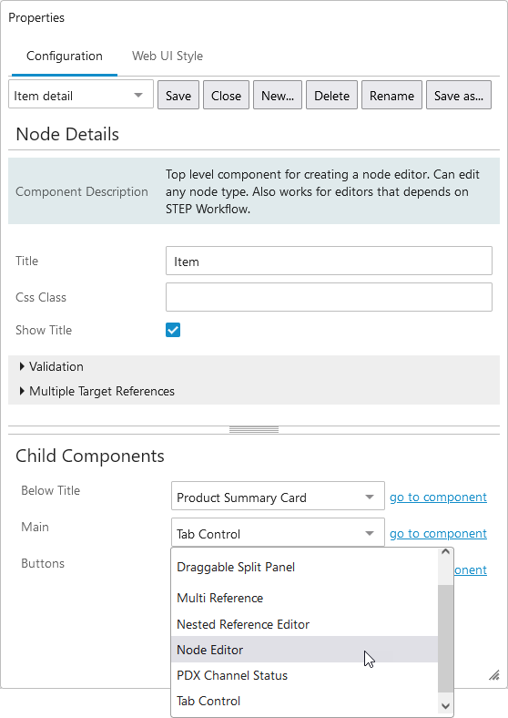
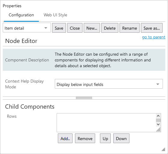
- Click on 'go to component' next to Node Editor to display the Node Editor Properties.
- On Node Editor Properties, define how user-configured help text should display in the Node Editor by making a selection from the 'Context Help Display Mode' dropdown. By selecting 'Display below input fields', all configured help text will display beneath the input field for that attribute at all times. By selecting 'Click icon to display', configured help text will display for an attribute when a user clicks on the information icon to the right of the input field (
 ).
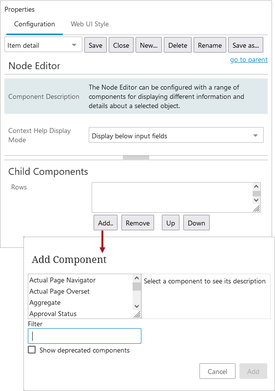
). - Under 'Child Components', click the Add button under the 'Rows' field, and make a selection from within the 'Add component' dialog. Clicking on the component name displays a description of the component.
Note: Two main components used for displaying and editing attribute values are Attribute Value and Attribute Value Group. When displaying different objects of the same object type that have different valid attributes, a useful feature of these two components is that invalid attributes are automatically hidden and not displayed on screen.
- Once a selection is made, click Add.
- Configure the added component, if applicable. As an example, adding an Attribute Value Component automatically brings up an additional properties screen with a required Attribute parameter. If you are adding Name Value or Id Value components, no additional configuration is needed.
- Components can be added and removed using the buttons below the Rows field, and the components will display on-screen based on how they are ordered within the field. They can be re-ordered using the Up and Down buttons and can be edited by double clicking the component name.
- Once the configuration is complete, click Save in the designer and Close to return to normal Web UI operation.
Note: Node Editor Component can be configured under Node Details screen if user likes to display the information without tab control.
For additional information on using a Node Editor, refer to the following topics:
Configuring the Node Editor in a Tab Page
Sometimes it is useful to display a split screen in a tab page, with one side being the Node Editor component. To do so, follow the steps below:
- Select a Node Details screen if it already exists, if not then create a new one.
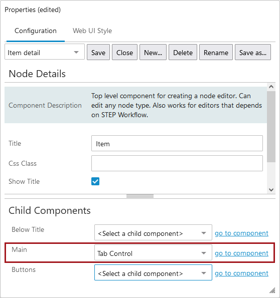
- On the Node Details Properties go to Child Components > Main > select Tab Control > go to components.
- On the Tab Control Properties screen under Child Components in the Tab Pages field, click the Add button.
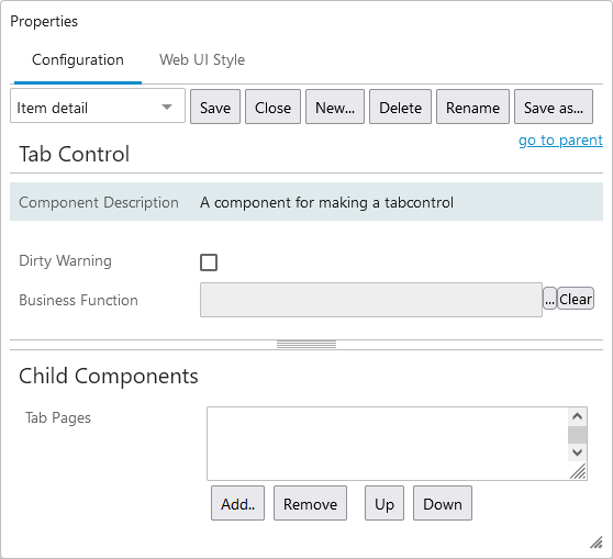
- Select Tab Page and click on Add.
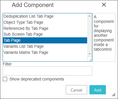
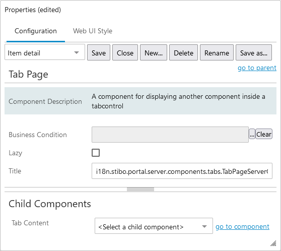
- Double click the newly added 'Tab Page', and on the Tab Page Properties go to Child Components > Tab content > select Node Editor from the dropdown menu > go to component.
-
Add any required components to display product information.
- Once the configuration is complete, click Save and close the designer.
Note: Tab Page component is available under Tab Control. For more information, refer to the Tab Pages topic in the Web User Interfaces documentation.
Configuration of Node Editor Screen in a Split Panel
- Select Node Details screen if already exist, if not create a new Node Details.
-
Select Split Panel option from Main dropdown under Child Component area.
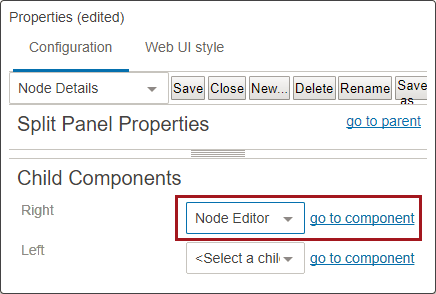
- On Split Panel Properties, select either the Right or Left field and choose Node Editor from the dropdown. Then click on go to component.
- Add any needed components needed to display product information.
- Once the configuration is complete, click Save and close the designer.
Note that the above steps can be used to configure the Node Editor component for a Draggable Split Panel as well, which is available in the Main dropdown under child components area of Node Details Properties.
Note: If Node Editor Screen is used in the Right side of the page, users can select Node editor option from Right dropdown. Left side user can select other options, for example References or a Multi reference.
Examples of Configured Node Editor Components
Below are examples of Node Editors that are configured to fit different purposes and screenshots of how they would display to end users.
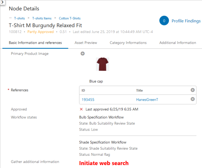
Example 1: A Node Editor configured to display sellable product information. A Summary Card component of the 'Description Card' type has been added at the top of the screen. This displays a breadcrumb (in blue text), and then the name, ID, approval status, version, and information related to when the product was last updated. Data profiling is enabled, resulting in display of the 'Profile Findings' component showing to the left of the Summary Card. Components added to the Rows field (and shown below, in order from top to bottom) are Referenced Asset Representation (which displays the thumbnail image), References, Approval Status, Workflow States, and HTML Function, which uses a business function to render HTML in the Web UI. In this example, HTML Function enables a web search to gather additional information about the product.
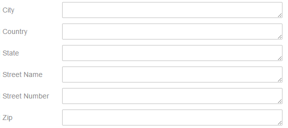
Example 2: A Node Editor configured to display customer address information. The address attributes are configured to display via the Attribute Value Group Component as the only component in the Node Editor Properties > Child Components > Rows field.
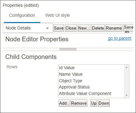
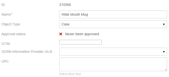
Example 3: A Node Editor configured to display GDSN details. Components added to the Rows field (and shown below) are ID, Name, Object Type, Approval Status, and three Attribute Value components.
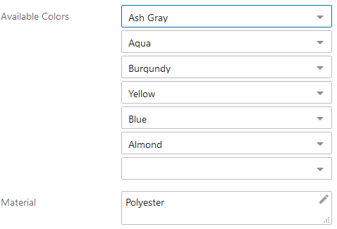
Example 4: An Attribute Value Component configured with a multi-valued attribute. Multi-valued attributes configured on Node Editor screens will, if multiple values are present, display with a double-arrow icon ( ). By clicking this icon, a 'Sequence Values' pop-up displays that allows users to change the ordering of the values. In the screenshot below, the multi-valued attribute is labeled as 'Available Colors'. The second screenshot depicts the 'Sequence Values' pop-up. The values can be re-ordered using either the drag-handles to the left of each value, or the arrow icons to the right, which can move a selected value to the top of the list (
  ), up one position (
  ), down one position (
  ), or to the bottom of the list (
  ).
).
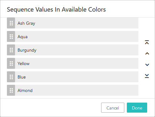
Note: The functionality to re-order values on multi-valued attributes is also available in Node Lists.