When viewing objects in Web UI, it is often helpful to have tab pages configured so that users can access all relevant information in a single screen, while also sectioning it into meaningful groupings that provide a user-friendly and more efficient work stream.
Adding Tab Pages
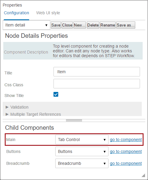
To add tab pages, a Node Details screen must be configured.
- Open an existing Node Details screen type, or create a new one. Select Tab Control for the Main parameter under Child Components. Click the go to component link.
- On Tab Control Properties, add a Tab Page to the Tab Pages parameter in Child Components. Double click on Tab Page once it is added.
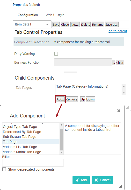
- On the Tab Page Properties screen in the designer, there are three parameters:
- Business Condition - Select a preconfigured business condition that determines whether the tab will display. If the condition returns true, the tab displays. If it returns false, the tab does not display. The business condition is evaluated when a screen is saved or refreshed.
The most common application for this feature is to use the 'Attribute Value Comparison' type business condition. This business condition can be used to determine display of a tab page based on whether an attribute value on a given attribute meets the configured business condition. For example, if a business condition is written to state that the condition is only met if the value for the attribute 'HAZMAT' is equal to 'Yes', and this business condition is selected for a configured tab page with HAZMAT-related attributes, then that tab will only display if the value for the attribute 'HAZMAT' is 'Yes'.
Important: Admin users should take care not to hide tabs configured as default tabs because errors are likely to result. If using both the 'Business Function' feature to determine default tabs in tandem with the 'Business Condition' parameter to determine display of tabs, admin users should thoroughly test the combinations to ensure the configuration does not result in end users being unable to access data. To avoid these issues, admin users can use the 'Reference other Business Condition'-type business condition. This allows users to configure their tabs so the default tab condition references the show / hide condition and then, based on that evaluation, determines which default tab to display.
For more information on configuring Attribute Value Comparison-type business conditions, refer to the Business Condition: Attribute Value Comparison topic in the Business Rules documentation.
- Lazy - Check this box to take advantage of lazy loading functionality, if / when applicable. Components will be 'lazy' loaded from STEP and rendered only when needed (i.e., when a tab is selected). This can reduce screen load time (e.g., a Node Details screen configured to display multiple Tab Pages) since only the needed components are loaded and visible to the user. It is important to note that any components that are not loaded yet due to lazy loading will not be able to be evaluated as part of a set of mandatory / invalid components in combination with the Save and the Submit buttons.
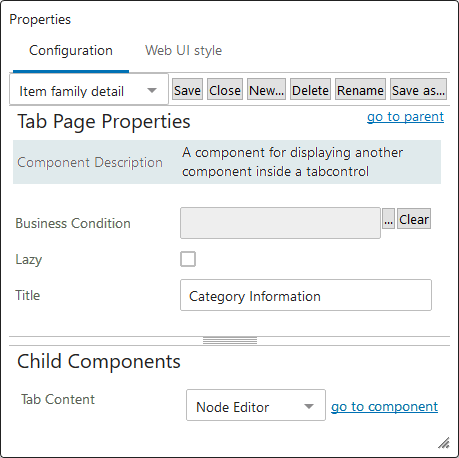
- Title- Enter a title that will display as the tab page name.
- Under Child Components, add the desired component(s) to the Tab Content parameter. In many cases, this will be a Node Editor, and that example will be followed in the next steps. However, any component can be used and the proper selection is determined only by the layout the designer wishes to provide for the end user. If more than one component should be accessible on a single tab, oftentimes a Draggable Split Panel component will be added in this step, with individual components subsequently being added as children to the Split Panel. Regardless of the component selected, click the go to component link after it has been added to configure the child component.
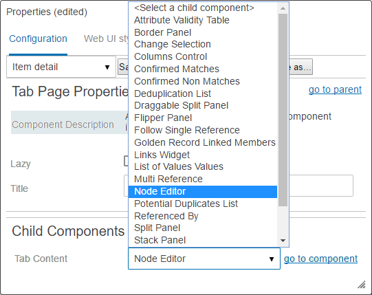
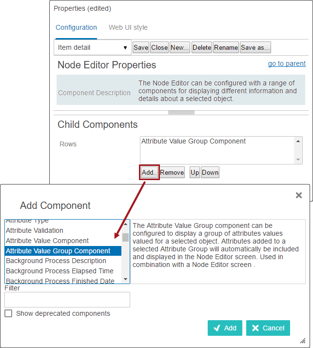
- As mentioned above, any component could have been selected in the previous step, but this example will continue using a Node Editor. On the Node Editor, add the desired child components to the Rows parameter, such as an Attribute Value Group Component or Value Section. Depending on the component selected in the previous step, different child components may be available, and any number of them can be selected to build the appropriate interface for the end user. It is likely that each selected child component will require additional configuration, which users are prompted to complete as the components are added.
- The above steps can be repeated as needed to add additional tabs. To do this, click on the go to parent link in each properties window until the Tab Control Properties are shown again. From there, steps 2-5 can be repeated as many times as needed to complete the configuration.
Configuring secondary tabs
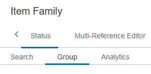
Users may add additional sets of tabs to organize their Web UI screens.
To create a secondary set of tabs, users must first add a new tab to the primary set of tabs on a Node Details screen. When selecting the child component for that tab, select Tab Control and then go to component. Then follow steps 2-6, described above, to configure the new row of tabs. Multiple tab rows may be added, but use caution when configuring more than two rows, as usability can be negatively impacted by an expansive display of tabs.
When complete, your Web UI tabs may resemble this configuration:
Note: To configure certain tab pages or secondary tabs to open as default when objects are clicked on during different circumstances, refer to the Designating a Default Tab topic.
Tab Page Data Error Indicator
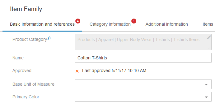
When using tab pages, if there is any type of error that impacts the data displayed on a tab (e.g., a validation error or missing mandatory value), a red circle containing a white-colored number value displays to the right of the tab name. The red circle serves as a simple visual notification that attention is required on one or multiple tab pages, and the number inside the circle refers to the number of detected errors on the tab. No configuration is needed to turn on this feature.
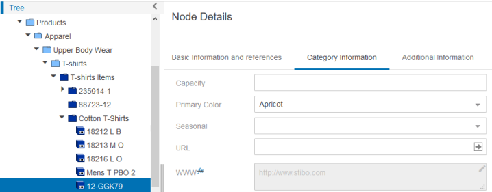
In the screenshot below, the 'Basic Information and references' tab and 'Category Information' tabs display with a red circle because errors have been detected in those tabs: four in 'Basic Information and references' and one in 'Category Information'.
Adding Sub Screen Tab Pages
Sub Screen Tab Pages can also be added as child components under Tab Control Properties. Instead of configuring components to display on the tab, you select a screen to display. No additional mapping is required since the end user will view the screen as a tab option when clicking on the Node Details screen.
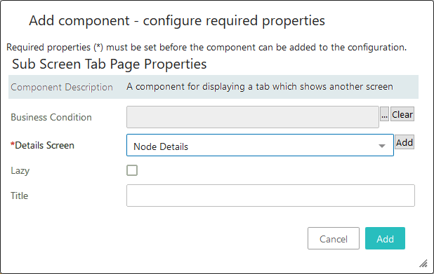
The functionality of the parameters for Sub Screen Tab Pages is identical to those described in step three of this topic in the Adding Tab Pages section.
Note: To configure certain sub tab pages to open as default when objects are clicked on during different circumstances, refer to the Designating a Default Tab topic.