The Attribute Value Group component can be added to a Node Editor component to display the values for each attribute within a chosen attribute group.
One major benefit to using an Attribute Value Group component (versus multiple Attribute Value components) is that when attributes are added to the chosen attribute group, then the newly added attribute values automatically appear on the screen without additional Web UI configuration. If certain attributes or attribute groups within the chosen attribute group do not need to display, then the attribute value group component has several options to properly display only the desired attributes within the chosen attribute group.
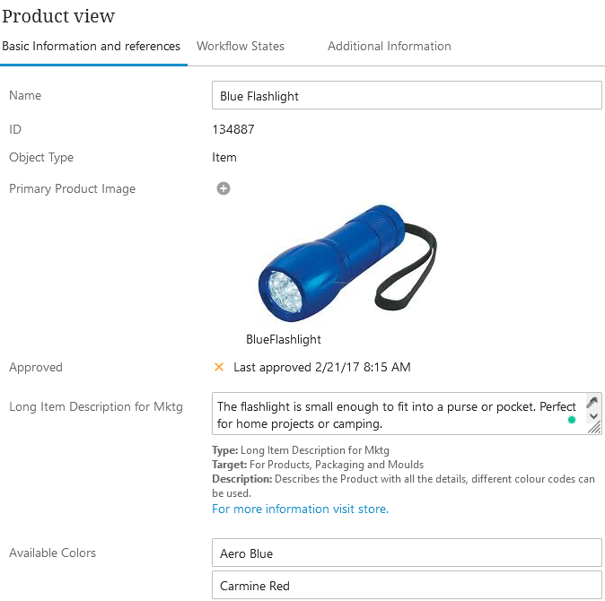
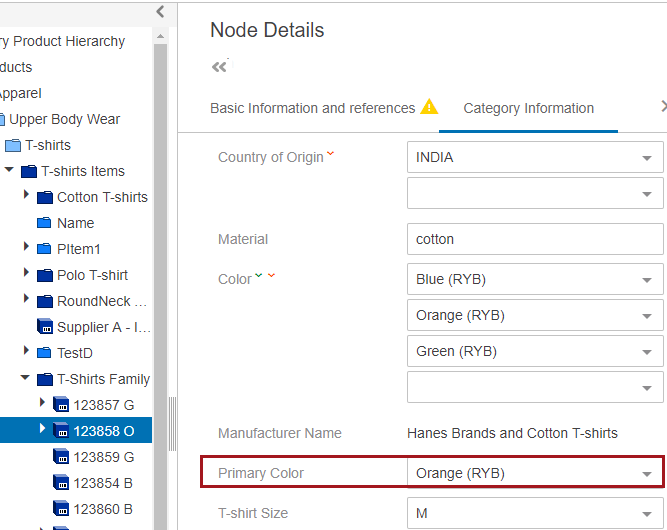
In the example below, the Name, ID, Primary Product Image, and attributes from a chosen attribute group are displayed within a Node Editor on a Node Details screen.
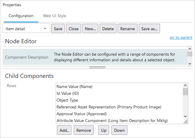
The screenshot below displays the Web UI designer settings used for the example given above.
Prerequisites
It is expected that anyone configuring the Attribute Value Group component is familiar with the Web UI Designer, as basic concepts for working with the designer are not covered in this section. In addition, users must have appropriate privileges to access the designer. Additional information can be found in the Designer Access section of the Web User Interfaces documentation.
It is possible to not display certain attributes within an attribute group. For more information, refer to the Handling Duplicated Attributes in Web UI topic in the System Setup documentation.
Within this component are options related to the use of STEP Tags. Prior to making changes to the default settings related to STEP Tags and Tag Conversion, it is recommended to review the complete Tags documentation within System Setup.
Adding an Attribute Value Group Component to a Node Editor
Attribute Value Group components are added within the Child Components section of the Node Editor Properties. They can be added, removed, and re-ordered using the buttons below the Rows parameter. The Node Editor Child Components Rows will display in the order listed within the Rows parameter. Once added, the components can be reordered using the Up and Down buttons.
Recommended practice when displaying attributes within Web UI is to use the Attribute Value Group component and then manage the display behavior of the validation base types using one or more global rules created using the Override Control Type component. For more information, refer to the Override Control Type Rule topic within the Web User Interfaces documentation.
Steps for adding an Attribute Value Group Component to a Node Editor are below. Information for all the Attribute Value Group Component Properties dialog parameters are available in the Configuring an Attribute Value Group Component section below.
- With the designer open, select your Node Details screen, navigate to your Node Editor component, and the Node Editor Properties will display.
- Click the Add button, and the add component dialog will display.
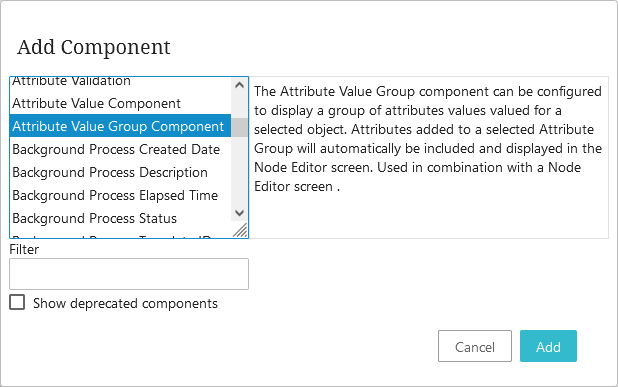
- Select the Attribute Value Group Component, click the Add button, and the Attribute Value Group Component Properties dialog will display.
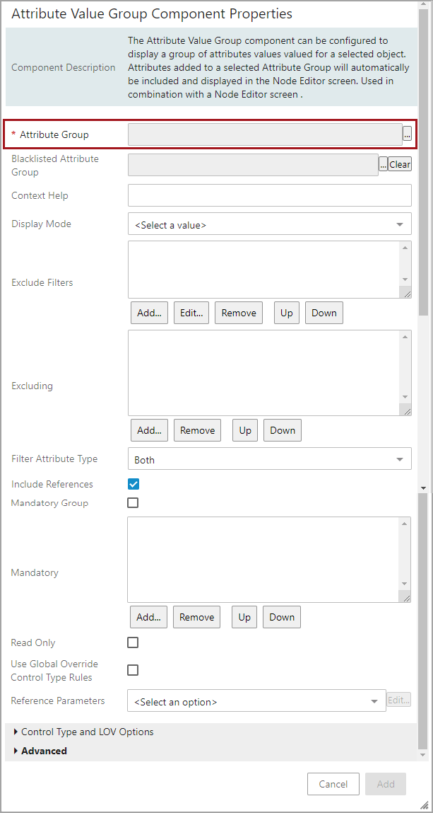
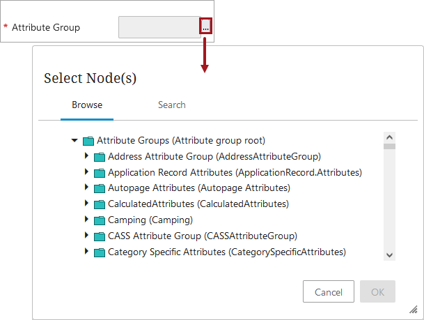
- The only mandatory parameter is Attribute Group. To select an attribute group, click the ellipsis button (
 ) to the right of the Attribute Group field. A Select Node(s) dialog will appear and an attribute group can be selected by browsing and navigating down to the desired attribute group or by using the search feature.
- Once the appropriate attribute group has been selected, click the OK button to close the Select Nodes dialog, and return to the Attribute Value Group Component Properties dialog now displaying the selected attribute and the enabled Add button.
- Click the Add button, the dialog will close, and the newly added Attribute Value Group component will display as the last row of the Node Editor Child Components Rows.
- Optionally, use the Up and Down buttons to properly order the display of the newly added Attribute Value Group component.
- Click the Save and Close buttons for the designer.
Configuring an Attribute Value Group Component
An Attribute Value Group component is highly configurable, and its parameters are found within the three sections: 'Main', 'Control Types and LOV Options', and 'Advanced'. Information for each of the parameters available for the Attribute Value Group Component Properties can be found below.
Main Parameters
Configure the parameters as needed.
- Attribute Group: The only mandatory parameter for this component. An attribute group is selected when the component is added. To select a different attribute group, click the ellipsis button () to the right of the Attribute Group value field. A Select Node(s) dialog will appear and an attribute group can be selected by browsing and navigating down to the desired attribute or by using the search feature.
- Blacklisted Attribute Group: Click the ellipsis button () and add a Blacklisted Attribute Group to hide attributes that should not be displayed on the Web UI screen. More information about the Blacklisted Attribute Group parameter can be found in the Setting up Blacklisted Attribute Groups in Web UI section of the Handling Duplicated Attributes in Web UI documentation.
- Context Help: Enter help text to display when a user hovers over the attribute group name. Requires that the Display Context Help parameter below is enabled. More information about the Context Help parameter can be found in the Set Component Properties in Web UI section of the Attribute Help Text in Web UI documentation.
- Display Mode: Determines how attributes within the attribute group are displayed to the end user.
- Merged: Attributes below the selected attribute group and sub groups are displayed together alphabetically without attribute group as headers.
Note: In Merged display mode, the attributes are displayed in alphabetic ascending order. Manual sorting order is not respected, because sub groups could also have the manual sorting order. Therefore, the merged attribute list cannot be sorted manually
- Partitioned: Attributes are displayed alphabetically (based on the attribute name) within their attribute groups. Attribute Group names are not displayed as headers.
- Hierarchical: Attribute group titles are shown with attribute titles indented below, according to the attribute group structure.
- Sectioned: Attributes are presented in sections; one section per attribute group; collapse and expand by clicking on the attribute group title.
Note: The attribute group title will be highlighted only when the mouse is hovered over the attribute group title.
- Exclude Filters: Hides or displays attributes based upon attribute values or fixed text by adding one or more filters. Each filter component will be applied to the collection of attributes in the group. The two filter component types to choose from are:
- Meta Data Lookup Filter Component: Used for filtering attribute values in an attribute group by looking up the value of another attribute on the node and comparing that value to the value of the metadata attribute.
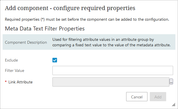
- Meta Data Text Filter Component: Used for filtering attribute values in an attribute group by comparing a fixed text value to the value of the metadata attribute.
Setting the Meta Data Text Filter Component
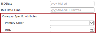
The attribute Primary Color will be filtered from the group Category Specific Attributes in Web UI.
Before any setup in Web UI can take place, the following setup needs to be in place in the workbench first.
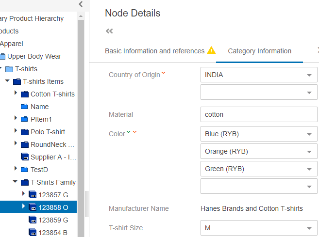
In the example below, the attribute group, Category Specific Attributes, has been added on a product, and a specific attribute, in this case Primary Color, needs to be filtered from the group.
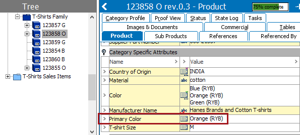
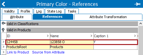
A metadata attribute, in this case Caption 1, with an LOV base type needs to be valid on the same object type that the attribute is used on, in this case product types. Select the attribute that needs to be excluded from the Web UI screen (Primary Color), and click on the References tab. Specify a value for Caption 1, in this case 'Y.'
In the Web UI the setup of Meta Data Text filters can be configured by following the steps below:
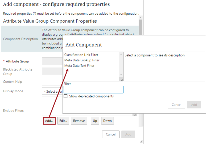
On Attribute Value Group Component Properties > Exclude Filters > click on the Add button to display the filter options.
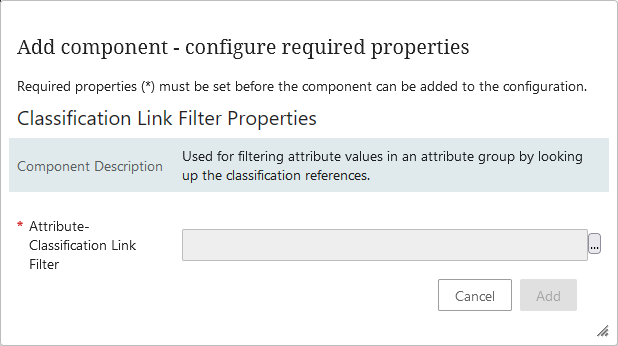
When using the classification link filter option, in the Classification Link Filter Properties dialog, click the ellipsis button () to display the Select Node(s) dialog. Browse or search for the desired classification and click OK to close the Select Node dialog. Then click the Add button to close the Classification Link Filter Properties dialog.
When using the metadata options, in the Meta Data Text Filter Properties or the Meta Data Lookup Filter Properties, fill out the two fields:
- Filter Value: a metadata attribute value to use in the filter condition (the value of Caption 1 in this example)
- Link Attribute: a metadata attribute that specifies whose values to filter attributes by.
Save the screen and close the Web UI designer. The attribute Primary Color will be filtered from displaying within the attribute group Category Specific Attributes in Web UI.
Important: The Meta Data Lookup Filter and Meta Data Text Filter components feature an Exclude parameter that is enabled by default, however, disabling this parameter allows the filters to become inclusive, instead of exclusive.
- Excluding: Prevents specified attributes (within the attribute group) from displaying for this particular Node Editor screen by adding specific attributes to the parameter.
- Filter Attribute Type: Determines if only Specification or Description attributes within an attribute should display.
- Include References: Determines if references should be displayed with the respective attributes if reference types exist in the attribute group.
- Mandatory Group: When enabled, users are visually prompted to add a value to all attributes in the attribute group. If 'Enforce Validity' is enabled on any of the action buttons (Save, Submit, or Approve), users must provide a value for all attributes in the group before any of the action buttons will be activated. This setting will override any attributes listed in the Mandatory parameter, described below.
- Mandatory: When enabled, users are visually prompted to add a value to specific attributes from the attribute group that are added to the 'Mandatory' field. If the 'Mandatory Group' parameter is enabled, attributes added to this field will be overridden and all attributes in the group will display as mandatory. If 'Enforce Validity' is enabled on any of the action buttons (Save, Submit, or Approve), users must provide a value for the attributes listed in this field before any of the action buttons will be activated.
- Add specific attributes to the parameter that should display the attribute name with an asterisk (*), and when tab pages are used, a yellow warning icon will display for each tab that contains unpopulated mandatory attribute fields.
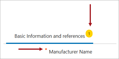
In the example below, the Manufacturer Name attribute value displays with an asterisk, and because the attribute value field has not been populated, the yellow warning icon indicator appears in the right upper corner of the tab.
- Read Only: Determines if all attribute values within the group should be editable or read-only.
- If disabled (default), then users can edit the field.
- If enabled, the attribute value on the screen will be locked so end users cannot make edits.
- Use Global Override Control Type Rules: Determines if global or local control types are used.
- If enabled, global Attribute Control Type Rules will be used for overriding the default control types for attributes with the following validation base types: List of Values, Numeric Text, Numeric Text (exclude tags), Text, and Text (exclude tags).
- If disabled, then the local configuration will be used.
- Reference Parameters: Determines how references pertaining to attributes within the group are displayed. Also at least one editor screen must be specified for the References to work as hyperlinks to the target.
Note: Include References option should be enabled along with Reference Parameters setting.
Configuring Reference Parameters
In the attribute value group properties, go to Reference Parameters field > select Value Group Reference Parameter > click on Edit.

In the Value Group Reference Parameter set the below fields:
Editor Screens - select the screen to be displayed when the hyperlink to the target is clicked. While one screen must be selected, multiple screens can be selected.
Show Visibility Controls - the component controls the context visibility of references. It has no effect if legacy view is used however.
-
If the option is disabled (default), then adjusting context visibility controls will not be displayed.
-
If this option is enabled, then adjusting context visibility controls will be displayed, and the reference type should be dimension dependent.
Note: The Legacy View option should be disabled when Show Visibility Controls option has to be configured for the reference parameters.
- Rich Text Editing: Determines when Rich Text editing should be applied to all attribute values within the group.
- Never: All attribute values within the group will never display with Rich Text Editing.
- Always: All attribute values within the group will always display with Rich Text Editing.
- Long Text: Only attributes with validation length longer than 100 will display with Rich Text Editing.
For details on the classification-specific parameters ('Classification Link Type', 'Unit Metadata Attribute', and 'Display FValue Details') refer to the Classification-Specific Attribute Value Components topic.
Control Type and LOV Options Parameters
Click the arrowhead next to the 'Control Type and LOV Options' heading to view the parameters available. Configure the parameters as needed.
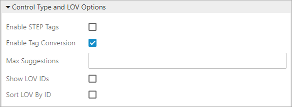
- Enable STEP Tags: Determines if users should be able to edit STEP tags.
- If disabled (default) and the content contains a tag (other than <lt/> or <gt/>), then the component will be read-only based on the Override Control Type selected.
Note: If the Override Control Type is a rich text editor, then the component will be editable with the rich text editor.
- If enabled, STEP tags are shown in the value and it is possible to edit the tags.
- Enable Tag Conversion: By default this parameter is enabled when adding new instances of Attribute Value Group components.
- If enabled (default), then users can more easily use the less than (<) and greater than (>) symbols in attribute values without having to do additional configuring because the control type for Text, Text (exclude tags), Numeric Text, and Numeric Text (exclude tags) attribute fields will default to Rich Text.
The Override Control Type parameter (below) will not override the Text and Numeric Text validation base types, and the ‘Edit formatted value’ icon  will be present for attributes with Text, Text (exclude tags), Numeric Text, and Numeric Text (exclude tags) validation base types.
Note: If the Enable Tag Conversion is set to true, then the Override Control Type will not be taken into consideration, and the Rich Text Box will always be created. Additionally, the 'Enable Tag Conversion' always takes precedence. If the Text Box is desired instead of the Rich Text, then the Enable Tag Conversion parameter should be set to false.
- If disabled, and users enter the < and / or > symbols into an attribute value field or a style is applied to a value (e.g., bold or italic), upon save, the field will become locked. The field can only be unlocked by accessing the workbench.
Important: There is more information to be aware of when enabling and disabling this parameter. Refer to the Enable Tag Conversion section at the end of this topic. Also, working with tags may require setup in the workbench. Refer to the Tags topic in the System Setup documentation.
-
Max Suggestions: Determines the maximum number of suggestions that will display before a scroll bar is used when the attribute is set to (or automatically uses) the LOV base type and typeahead control type.
- Show LOV IDs: Determines if the attribute's LOV ID displays for the end user.
- If enabled (not default), and the attribute's LOV has IDs enabled, then the LOV ID will display next to the value.
- Sort LOV By ID: Determines if the LOV displays in ascending order using the LOV name or ID.
- If enabled (not default), and the attribute's LOV has IDs enabled, then the LOV ID will display by the IDs ascending order. It is recommended to also enable the 'Show LOV IDs' parameter, because the list will appear to be sorted incorrectly if the IDs are not displayed.
Advanced Parameters
Click the arrowhead next to the Advanced heading to view the parameters available. Configure the parameters as needed.
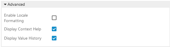
- Enable Locale Formatting: Determines if the 'ISO Date' or 'ISO Date and Time' attribute values are displayed per the locale selection.
- If enabled (not default), the 'ISO Date' or 'ISO Date and Time' attribute values will be displayed in the manner defined by the locale selection made during login.
Important: Additional setup is required. For more information, refer to the Localizable Dates in Web UI section of the Web User Interfaces documentation.
- Display Context Help: Determines if the help text should be available to users. Help texts can be used to provide information to end users about an attribute and how it should be populated. For more information, refer to the Attribute Help Text in Web UI section of the Using a Web UI documentation. This is where the 'Go to Wiki' link is displayed when the Wiki Metadata feature is installed. For more information, refer to theWiki Metadata (Data Catalog Connector) topic in the System Setup documentation.
- Display Value History: Determines if the history icon should appear displaying the attribute's historic data and information on how the value has changed over time within the Web UI. For more information, refer to the Attribute Value History section of the Using a Web UI documentation.
Enable Tag Conversion
If Enable Tag Conversion is disabled / unchecked and a style is applied to a value (e.g., bold or italic), the field locks and you must use Rich Text Editor to edit the values.