Summary
The following enhancements and changes have been made to the Web User Interface as part of the 2023.4 release:
-
The Instrument User Interface is now generally available to customers. There are prerequisites required; refer to the details section for more information.
-
Assets displaying in the Referenced Asset Representation component can now be ordered by configuring a metadata attribute.
-
Image assets displaying in a hierarchy (in the Tree Navigator or in a Node Picker) will display a thumbnail when the user places their cursor over the asset name in the hierarchy.
-
Notification pop-up messages presented to the user in the Web UI now display with an icon in the pop-up's color band.
-
The Web UI designer now has an automatic purge feature that will delete older Web UI revisions. Revisions will automatically purge upon daily saves, allowing users more space to customize and make changes to the Web UI without compromising memory.
-
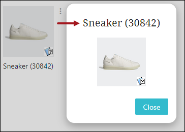
The name of the image asset is now displayed when viewed in the popup dialog of the Thumbnail Header and Referenced Asset Representation components. This should help users quickly identify the asset being displayed.
-
Several UI improvements have been made to the Status Selector components. These components now better align with other similar components in the Web UI.
-
The Submit Dialog section of multiple Web UI components has been updated to align the functionality across components.
-
LOV Cross-Validation has been enabled for the Globally Configured Unfolding Data Container component.
Details
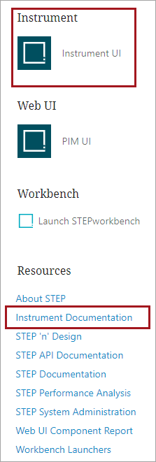
Instrument User Interface now generally available
The Instrument UI is now generally available. While Instrument is generally available, it still must be enabled for your system. Additionally, these prerequisites must be met:
-
Be on the most recent STEP version. Going forward, update to the latest version when available. Instrument updates will not be backported.
-
Have the Elasticsearch license and Elasticsearch server configuration setup. For more information, go to the Elasticsearch Setup in the System Setup documentation.
-
Have the In-Memory license and setup. For more information, refer to In-Memory Database Component for STEP in the Resource Materials documentation.
Contact Stibo Systems to determine how best to meet these requirements and get started.
Once activated for your system, the Instrument UI icon will appear on your system's Start Page or directly via https://[your system name]/instrument/. Along with the UI, Instrument-specific documentation is available on the Start Page under Resources.
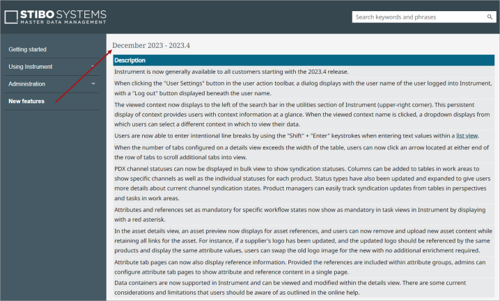
Refer to the Instrument Documentation for new feature information and online help, which details the functionality as well as any applicable considerations and limitations. Highlights for 2023.4 include:
-
Data container support
-
PDX channel statuses to track syndication
-
User settings updates
-
Asset details view improvements
-
And, much more!
Explore further by clicking the video below. If it does not play as expected, it is also available in the Customer / Partner Communities and may also be accessible within Stibo Systems Service Portal.
Defining sort ordering for asset tiles
The Referenced Asset Representation component now allows admin users the ability to determine the ordering for asset tiles displaying in the Web UI. A new parameter, 'Sorting Metadata Attribute', has been added to the configuration settings for the component. By configuring a metadata attribute on the relevant asset reference type, and then assigning an alphanumeric value to each asset referenced by the product, the assets will display in alphanumeric order in the Web UI based on those assigned values.
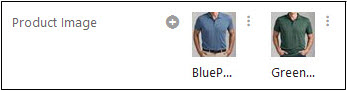
Additionally, if no attribute has been selected for 'Sorting Metadata Attribute', the default sorting for assets displayed using the Referenced Asset Representation component will be alphanumeric, by asset name.
For more information on the Referenced Asset Representation component, refer to the Referenced Asset Representation topic in the Web User Interfaces documentation.
Asset thumbnails display in pop-ups
Assets now display a pop-up thumbnail image when users hover their cursor over asset names in the hierarchy.
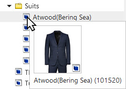
The thumbnail pop-up displays when users hover over an asset in a Tree Navigator component in the Global Navigation Panel or in the 'Browse' tab in a Node Picker component. When an image asset's pop-up displays, a small thumbnail of the image asset is shown; when a non-image asset's pop-up displays, an icon of the asset type is displayed. Additionally, when users hover their cursor over any other object in the hierarchy, a pop-up displays with the object's name and ID. This update, aimed primarily at users locating product images to reference, will speed image reference selection by allowing users to more easily browse image assets without clicking each image to review.
Updates to notification pop-ups
Pop-up notification messages in the Web UI have been visually updated to include informational icons. These updates apply to system-generated messages as well as user-configured messages triggered by business rules. Adding icons to the pop-up's color bands improves the user's ability to quickly understand the nature of the presented message and aids accessibility by accommodating those with color blindness.
For general information on pop-up notifications, an informational 'i' displays in the gray color band:

For error notifications, an exclamation point displays in the red color band:

For warning notifications, a warning triangle displays in the yellow color band:

For notifications indicating a successful action or operation has been completed, a checkmark displays in a green color band:

For more information on creating Web UI notifications in business rules, refer to the Writing User Notification Messages for Business Rules topic in the Business Rules documentation.
New automatic Web UI revision purge
A new automatic purge feature has been implemented to allow for automated cleanup of Web UI revisions. In the Web UI designer, older Web UI revisions will execute an automatic purge when the user saves a new Web UI configuration. Users will no longer have the manual task of deleting previous Web UI revisions in the workbench to save their most recent configurations, further preventing the STEP system from running into memory issues. The automatic purging mechanism executes in the background without any user actions. However, a user intervention might be required if the number of Web UI revisions exceeds the configured maximum revisions after the purging mechanism has been executed.
For more information, refer to the 'Purging Web UI Configuration Revisions' section of the Managing Web UI Configurations topic in the Web User Interfaces documentation.
Display thumbnail asset name and ID
The name of the image asset is now displayed beside its ID when viewed in the popup dialog of the Thumbnail Header and Referenced Asset Representation components in Web UI. Previously, only the ID would display in the popup dialog. This change should make it easier for users to quickly identify the asset being referenced.
For more information, refer to the Thumbnail Header and Referenced Asset Representation topics in Web User Interfaces documentation.
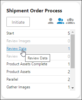
Improved display of links in the Status Selector
A number of improvements have been made to the display of the Status Selector Homepage Widget, Status Selector Global Navigation Panel, and the Tasks Global Navigation Panel Component. The 'Initiate Label' text link has been changed into a button and can be found to the left of the group filter icons. To improve visual parity across components, some text colors were changed, and the active workflow state names no longer appear in bold.
Additionally, when hovering over a clickable text link, an underline will appear.
For more information on the Status Selector Homepage Widget, refer to the Status Selector Homepage Widget topic in the Web User Interfaces documentation.
For more information on the Status Selector component in the Global Navigation Panel, refer to the Status Selector in the Global Navigation Panel topic in the Web User Interfaces documentation.
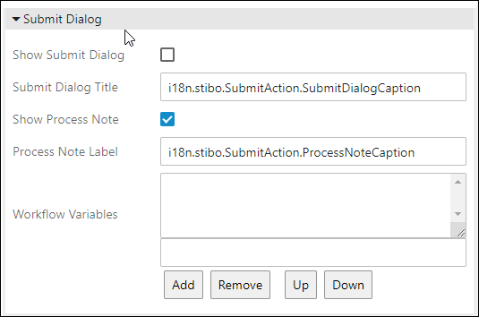
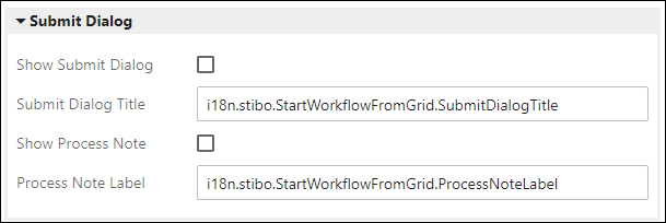
Updated Submit Dialog parameters
Multiple actions have been updated to better align their behavior across Web UI.
For the Submit Action, configurable in Node Details, a new parameter called Show Process Note has been created, which controls the display of the process note field. Previously, the Show Submit Dialog parameter controlled the display of both the process note field and the submit dialog. These functions have been split between the two parameters. Additionally, the Process Note Caption parameter has been renamed to Process Note Label and the Submit Dialog Caption parameter has been renamed to Submit Dialog Title.
For the Submit from Grid Action, configurable on a Task List, two new parameters have been added: Show Submit Dialog and Show Process Note. As with the Submit Action, the Show Submit Dialog parameter controls the display of the submit dialog and the Show Process Note parameter controls the display of the process note field. The Process Note Caption and Submit Dialog Caption parameters have also been renamed to align with the Submit Action.
For the toolbar action Start Workflow from Grid, none of the parameters described above previously existed. All four parameters have been added under the Submit Dialog section of the Start Workflow From Grid properties.
For more information, refer to the Action Buttons and Submit Action topics in the Web User Interfaces documentation.
LOV Cross-Validation is now supported by the Globally Configured Unfolding Data Container
The LOV Cross-Validation business condition, which specifies relationships between the values in two Lists of Values (LOV) attributes, is now supported by the Globally Configured Unfolding Data Container component when the condition has been configured for two editable attributes inside the data container.
This enables the user to limit the LOV values available for selection in a data container by setting a ‘Defining attribute’ LOV and comparing it to a ‘Dependent attribute’ LOV. For example, for a ‘Defining attribute’ LOV named ‘List Colors’ with values, ‘Blue’, ‘Black’, and ‘Red’ and another ‘Dependent attribute’ LOV named ‘List Size’ with values ‘M’, ‘L’, ‘XL’, or ‘XXL’, it is possible to use the LOV Cross-Validation business condition to specify the relationships between the two LOV attributes, like ‘Blue’ is only available in size 'L', while ‘Black’ is available in size 'L' and ‘XXL’, etc.
For more information about LOV Cross-Validation, refer to the topic Business Condition: LOV Cross-Validation in the Business Rules documentation. For details on the Globally Configured Unfolding Data Container, refer to the Globally Configured Unfolding Data Container View topic in the Web User Interfaces documentation.