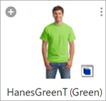
The Referenced Asset Representation component displays one or multiple thumbnails that represent the asset or assets linked to the currently selected product, and allows for the creation of additional asset references on the product.
With the Referenced Asset Representation component, users can:
-
Upload new assets or add existing assets to the product by clicking the 'plus' (
 ) button. When clicked, two options are made available via the dropdown: 'Insert asset(s)' and 'Upload and insert asset(s)'. 'Insert asset(s)' allows users to add one or multiple existing assets to the product via a node selector. 'Upload and insert image(s)' allows users to import one or multiple assets via a file selector, and if necessary, specify an object type, and a classification folder where the assets will be saved.
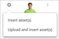
-
Open the asset content in a new browser tab by clicking the View asset button.
Prerequisites
It is expected that anyone configuring the Referenced Asset Representation component is familiar with the Web UI Designer, as basic concepts for working with the designer are not covered in this section. In addition, the user must have appropriate privileges to access the designer. Additional information can be found in the Designer Access section of the Web User Interfaces documentation.
Configuring Referenced Asset Representation Component
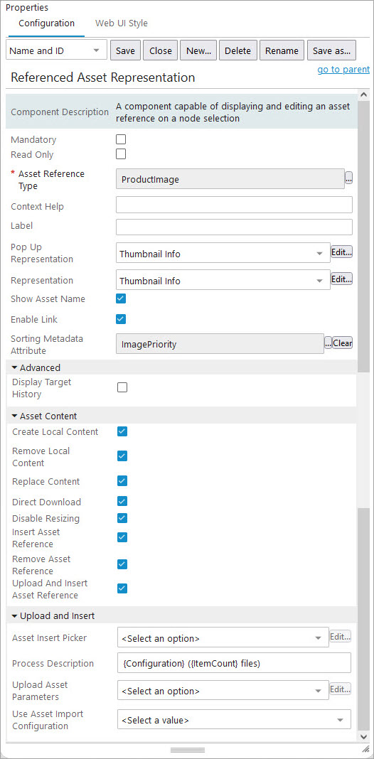
Included in the configuration settings for this component are options to predefine a classification folder into which assets can be imported, and to specify the reference type for those assets. What follows is a comprehensive list of all configuration options available for this component.
-
Mandatory: Checking the box for this parameter indicates that at least one asset must be referenced by the product.
-
Read Only: Check the box for this parameter to make the component read-only. In this state, the component cannot be used to upload, insert, or remove asset references. When unchecked, meaning users may make changes, a plus icon (
 ) displays. This is the 'Add' button. When the 'Add' button is clicked, a dropdown displays that allows users to either 'Insert asset(s)' or 'Upload and insert asset(s).' 'Insert asset(s)' allows users to link one or multiple assets already present in STEP to the product via a node selector. 'Upload and insert image(s)' allows users to import one or multiple assets that are not in STEP via a file selector and, if necessary, specify a classification folder where the non-STEP assets will be saved in STEP.
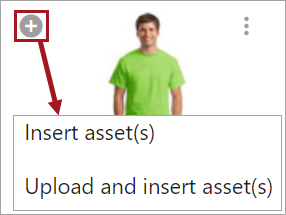
Further, when the 'Read Only' parameter is checked, the 'Remove asset content', 'Remove local content' and 'Replace content' do not display, which means that all options are dependent on 'Read Only' parameter.
-
Asset Reference Type: For this mandatory parameter, click the ellipsis button (
 ) and specify the reference type that should be used when linking assets to the product via the node selector.
 -
Context Help: In this parameter, enter the help text that will display when the user clicks the help icon to the right of the field label.
-
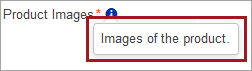
Label: In this parameter, enter the label that will display for this field in the Web UI. Defaults to 'Image.'
-
Pop Up Representation: In this parameter, specify how to present the image representing the current asset by selecting a sub-component from the dropdown. This sub-component displays in a pop-up window when the asset thumbnail is clicked.
Valid sub-components include: 'ConversionConfigurationInfo,' 'ConversionScriptInfo,' 'NoConversionInfo,' 'PipelineInfo,' and 'ThumbnailInfo' which are all described below in further detail.
-
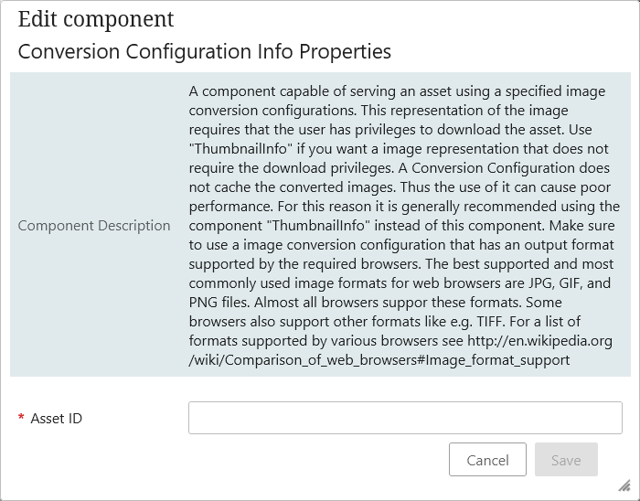
Conversion Configuration Info: Selecting this component shows the image with the predefined conversion configurations in a pop up window. For example, if there is a need to view the selected asset in grayscale view / less resolution view / in any converted format, this pop up representation can be used.
To enable this, the user should have created an Image conversion configuration, and the ID of the Image conversion configuration should be known. For more information, refer to the Image Conversion Configuration topic in the Digital Assets documentation.
This representation of the image also requires that the user has privileges to download the asset. A Conversion Configuration does not cache the converted images. Thus the use of it can cause poor performance. For this reason it is generally recommended using the component 'Thumbnail Info' instead of this component.
-
Asset ID: ID is mandatory for the required Image conversion configuration.
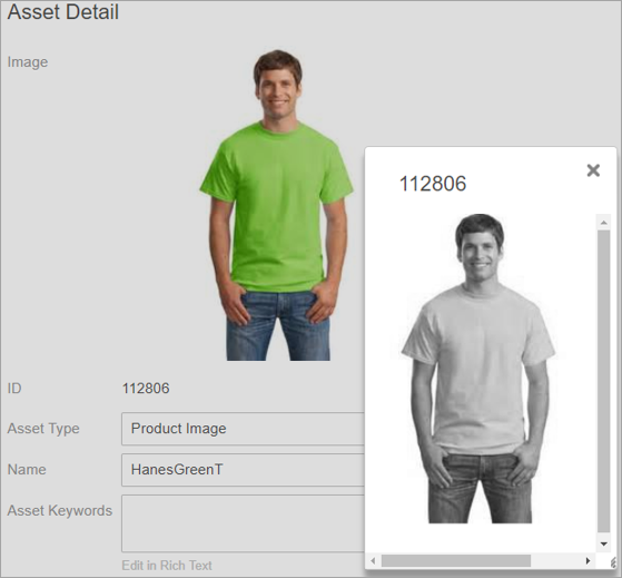
Below is an example of the asset image with the pop up view converted into grayscale.
-
No Conversion Info Properties: Selecting this component will let the user view the image in a pop up window, same as the original image is, without any conversions / change in asset (no conversion / pipeline / scripts used). No configuration is necessary.
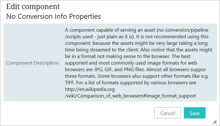
It is not recommended to use this component, because if the asset is very large it can take a long time to render. Further, the assets might be in a format incompatible with the browser being used.
-
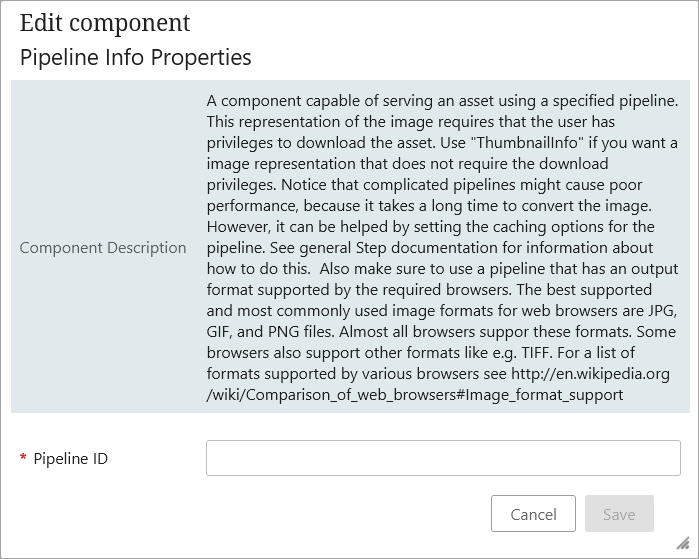
Pipeline Info: A component capable of serving an asset using a specified pipeline. This representation of the image requires that the user has privileges to download the asset. Use 'ThumbnailInfo' if you want a image representation that does not require the download privileges.
Notice that complicated pipelines might cause poor performance, because it takes a long time to convert the image. However, this delay can be shortened by setting the caching options for the pipeline. Ensure you use a pipeline that has an output format supported by the required browsers. For more pipeline information, refer to the Image Conversion Configuration topic in the Digital Assets documentation.
In the designer, 'Pipeline ID' is the only field that needs to be set.
-
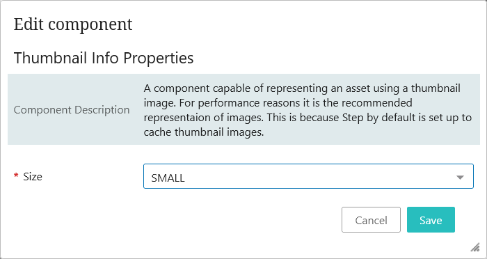
Thumbnail Info: Selecting this component will let the user view the image in a pop up window using a thumbnail image. For performance reasons, this is the recommended representation of images. This is because the default is set up to cache thumbnail images.
The 'Size' field is the only mandatory field for configuration. The user can choose the size of the thumbnail, as either SMALL, MEDIUM, or FULL. Note that while using the FULL option, the images are not cached in this version, and this require users to have download privileges.
-
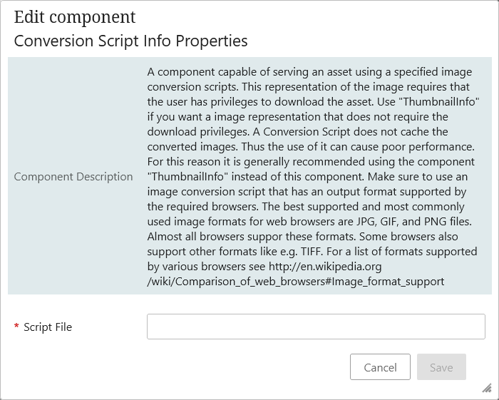
Conversion Script Info: A component capable of serving an asset using a specified image conversion scripts. This representation of the image requires that the user has privileges to download the asset. Use 'ThumbnailInfo' if you want an image representation that does not require the download privileges. A Conversion Script does not cache the converted images, thus the use of it can cause poor performance. For this reason it is generally recommended using the component 'ThumbnailInfo' instead of this component. Make sure to use an image conversion script that has an output format supported by the required browsers.
The only mandatory field for configuration is the 'Script file.'
-
-
-
Representation: In this parameter, specify how to present the image representing the current asset by selecting a sub-component from the dropdown.
Valid sub-components include: 'ConversionConfigurationInfo', 'ConversionScriptInfo', 'NoConversionInfo', 'PipelineInfo', and 'ThumbnailInfo'. The sub-components work the same way as explained in the above component Pop Up Representation.
-
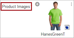
Show Asset Name: This determines whether the image name displays beneath the asset thumbnail. When the box for this parameter is checked, the image name will display. When the box is unchecked, the image will not display.
-
Enable Link: In this parameter, the user can navigate to the pre-configured screen showing the details of the asset. This allows users to inspect additional details and/or metadata, and also provides consistency across the UI as most places allow a clickable navigation link.
-
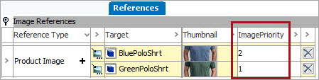
Sorting Metadata Attribute: Users can determine the ordering of the assets by selecting a metadata attribute linked to the asset reference type. In the workbench, assign an alphanumeric value to the metadata attribute for each asset referenced on the product. The added values should reflect the desired order of the assets. For example, the metadata attribute 'ImageOrdering' is linked to the 'Product Images' asset reference type, and ordering values are assigned to each image on the product in the workbench as shown in the screenshot below.
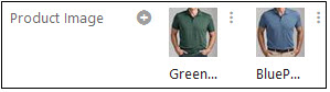
When properly configured, the assets will display in the desired order in the Web UI, as shown in the screenshot below:
Advanced Section
The following parameter displays in the 'Advanced' section of the Referenced Asset Representation properties screen in the designer.
-
Display Target History: When enabled, you will be able to view the history icon and access the 'Target history' pop-up. By clicking on the hyperlinked Target values, you will navigate to the configured screen for that target object.
Asset Content Section
The following parameters display in the 'Asset Content' section of the Referenced Asset Representation properties screen in the designer. These parameters determine which icons display to the right of the thumbnail, and which options are available when those icons are clicked:
-
Create Local Content: When checked, the 'Make content local' option will be available in the menu that displays when the vertical ellipsis button is clicked. This option allows users to set a new asset as the local content in the current context.
-
Remove Local Content : When this parameter is checked, the 'Remove local content' option will be available in the menu that displays when the vertical ellipsis button is clicked. This option allows users to delete local asset content from a specific context.
-
Replace Content: When checked, the 'Replace content' option will be available in the menu that displays when the vertical ellipsis button is clicked. This option allows users to replace the asset content with newly imported content in the current context.
-
Direct Download: When checked, a 'Download asset' option will be available in the menu that displays when the vertical ellipsis button (located to the right of the asset thumbnail) is clicked. This option allows the user to download the referenced asset.
-
Disable Resizing: Check the box to prevent the asset from being resized to fit the screen. Scroll bars are displayed if required.
-
Insert Asset Reference: When checked, the menu accessed by clicking the button (located to the left of the asset thumbnail) will include the 'Insert Asset Reference' option. By enabling this option, users can insert an asset reference.
Note: Note: If 'Read Only' is also checked, the button will not display, and this option will not be accessible.
-
Remove Asset Reference: When checked, the menu accessed by clicking the vertical ellipsis button (located to the right of the asset thumbnail) will include the 'Remove asset reference' option. By enabling this option, users with the 'Delete asset reference User Action' privilege can remove the asset reference.
-
Upload and Insert Asset Reference: When checked, the menu accessed by clicking the button (located to the left of the asset thumbnail) will include the 'New Asset Upload and Insert Reference' option. By enabling this option, users can upload new assets to STEP and insert a reference to that asset.
Note: Note: If 'Read Only' is also checked, the button will not display, and this option will not be accessible.
Upload and Insert Section
The following parameters display in the 'Upload and Insert' section of the Referenced Asset Representation properties screen in the designer. These parameters control how assets can be brought in using this component:
-
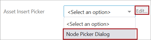
Asset Insert Picker: Configuration of this parameter enables users to configure which nodes are available when selecting a new asset reference.
-
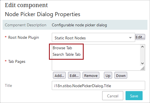
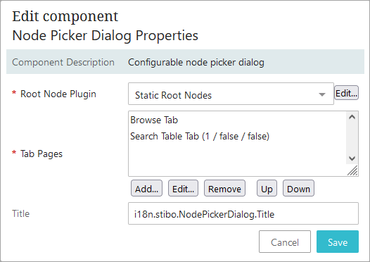
First, select the 'Node Picker Dialog' option from the dropdown. Then click the 'Edit...' button.
-
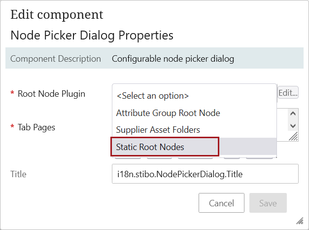
Second, select the appropriate root node from the dropdown. For this example, 'Static Root Nodes' is selected.
-
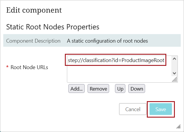
In the 'Static Root Nodes Properties' dialog that displays, click 'Add...' and then select the node or nodes that should display when a user is selecting assets to reference. Then click 'Save.'
-
Then, in the 'Tab Pages' field, click 'Add...' to select the tabs that will display in the Node Picker. Common choices are 'Browse' and 'Search.'
-
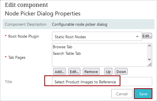
In the 'Title' tab, add any text that should display as the title for the Node Picker. If no text is added, the title defaults to 'Select Node(s).'
-
When configured, the Node Picker will display like this when the 'Insert Asset(s)' option is selected from the dropdown that displays when the
is clicked.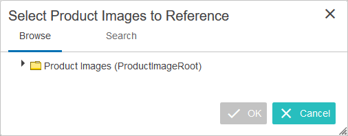
-
-
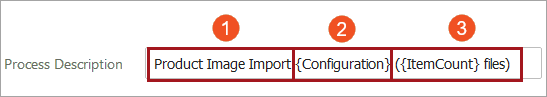
Process Description: In this parameter, create a template for the background process description. The template contains placeholders that are populated when the background process is started. The available placeholders include:
-
[Configuration]: The asset importer configuration.
-
[ItemCount]: The number of files to import.
The default template is: {Configuration} ({ItemCount} files). This template displays in this field automatically.
Below is a sample template as it might appear in the designer. The elements that make up the template are divided and numbered. The description of each element is listed below the screenshot.
-
Additional text added by an admin user to further define the background process for the end user. Any text may be added and will display first in the resulting description.
-
This placeholder will cause the name of the asset import configuration selected in the 'Use Asset Import Configuration' parameter to display in the background process description. In this example, the name of the asset import configuration is 'Image Importer.'
-
This placeholder will cause the number of imported files to display in the background process description. In this example, one file is being imported.
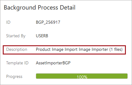
Using this example template, the background process description will display like this in the background process screen:
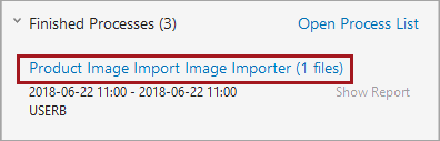
And like this in the 'Recent background processes' side panel:
Any values added to the Process Description field will only be applied to a background process if the 'Asset Import Compatibility Mode' setting on Users & Groups is set to 'Advanced,' and an import configuration has been selected for the 'Use Asset Import Configuration' parameter (described below).
-
-
-
Upload Asset Parameters: If import parameters are required, select 'Upload Asset Parameters' from the dropdown in this field.
For more information on configuring this parameter, refer to the 'Upload Asset Parameters Configuration' section at the end of this topic.
For more information on using asset importer configurations with this component, refer to the Asset Importer in Web UI section of the Digital Assets documentation.
-
Use Asset Import Configuration: In this parameter, select an asset importer configuration to use from the dropdown. This configuration will be applied when any asset content is imported via this component.
Any asset import configuration selected for this parameter will be applied to imported assets provided the 'Asset Import Compatibility Mode' setting on Users & Groups is set to 'Advanced.'
For more information on using asset importer configurations with this component, refer to the Asset Importer in Web UI section of the Digital Assets documentation.
Upload Asset Parameters Configuration
-
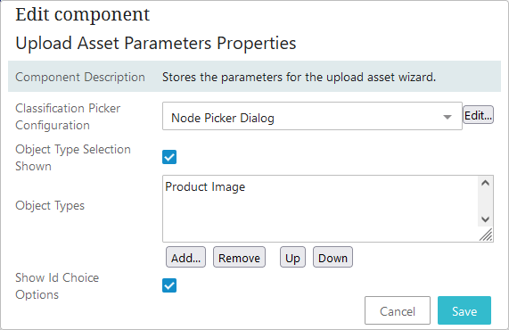
To set upload parameters for the component, click the Edit... button next to the Upload Asset Parameters field to display the 'Upload Asset Parameter Properties' dialog.
-
In the 'Classification Picker Configuration' optional parameter, select 'Node Picker Dialog' to enable a node picker that prompts the user to specify which classification folder to upload assets to.
When selected (or when you click the Edit... button) the Node Picker Dialog Properties window displays.
-
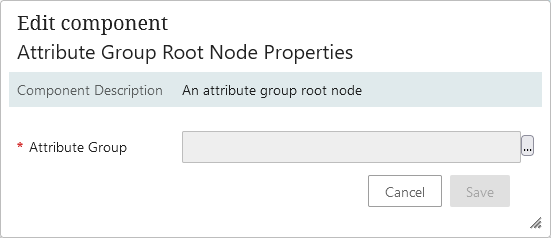
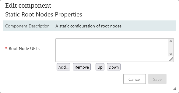
Root Node Plugin: In this mandatory parameter, select the plugin that provides the relevant root nodes from the dropdown. The three options include 'Attribute Group Root Node', 'Supplier Asset Folders', and 'Static Root Nodes', and may require additional configurations of their own.
If Attribute Group Root Node is selected, specify an attribute group to act as top root node for the node picker dialog via the 'Attribute Group' parameter. Click Save when the selecting is made.
If Static Root Nodes is selected, specify the root nodes the node picker will use via the 'Root Node URLs' parameter.
-
Tab Pages: In this mandatory parameter, use the Add... (or Edit...) button to specify which tab pages should be available in the node picker dialog.
-
Title: In this optional parameter, enter a title for the dialog.
-
-
Object Type Selection Shown: In this optional parameter, check the box to add two radio buttons to the dialog which allow users to choose whether to manually specify the object type of the asset, or have the system detect it automatically.
-
Object Types: In this optional parameter, specify the valid object types for imported assets via the Add... button. Object types listed appear as options when manually specifying the object type of an asset. If no object types are specified, all asset object types will be listed. If only one single object type is valid as target type for the reference type, then this will be used in place of content detection based on MIME type. Object Types requires 'Object Type Selection Shown' to be enabled.
-
Show Id Choice Options: In this optional parameter, check the box to add two radio buttons to the dialog which allow users to choose whether to use Filename as the ID, or Auto ID.
When configured, clicking the
 will bring up a dialog that may resemble the screenshot below, dependent on how the options described above were configured:
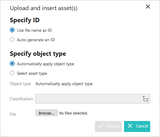
-