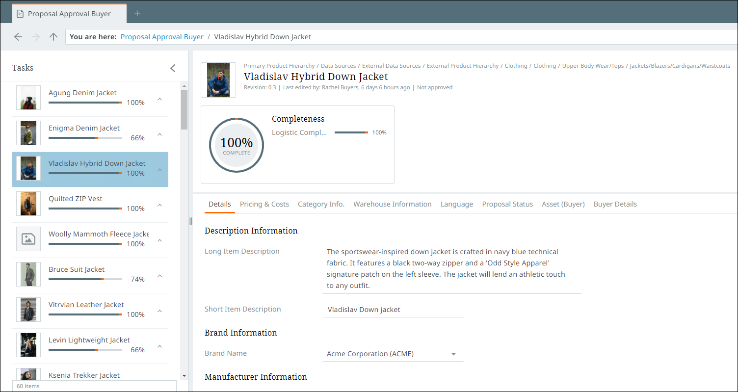
Details view
The details view focuses on the details of a specific item. The details view can be accessed by clicking the "Details" button found in the toolbar near the right-hand side of the screen.
In the "Tasks" perspective, for example, the list view shows the details of an item contained in a workflow, thus representing a workflow task. Details for an item in this perspective (shown below) are presented to the user in configurable tabs that can display referenced images and other assets, attributes, attributes groups, languages, and more.
Additionally, items accessed via a "Browse" perspective hierarchy can also be shown via the "Details" view. If, for instance, the user adds a "Browse" perspective to view their assets, they can select an asset, click the "Details" view, and attributes for that asset will display beneath a summary of that asset. For asset attributes that can be edited, users can add and update those values.
The tabs can be added in the configuration tool. It should be noted that if users add, for instance, a "Languages" tab to their details view, the default "Details" tab will no longer be available. Best practice is to re-add the "Details" tab and ensure it displays first in the order of tabs.
For more information on the configuration tool, see the Configuration tool topic.
Note: When you are in the details view, you will have a breadcrumb bar as described in Navigating perspectives. Another breadcrumb bar with read-only breadcrumbs is shown above the product name to indicate where you are in the hierarchy. If using the details view, the system uses these breadcrumbs to mark your position within each perspective when you log out, and will return you to the same view when you enter each perspective upon your next login.
Details tab
The details tab is divided into three primary areas: Item list pane, details pane, and section bar. In addition to viewing objects and their attributes, you can also view and manage product-to-product references from the details view.
Item list
All items within the currently selected perspective are listed in a pane on the left-hand side of the screen called the item list pane. From this pane, objects can be selected from the task list in order to view their details.
If the product has a primary image associated with it, the image will display with the name of the product. Any additional information that appears on the product card is determined by the sequence of columns in the list view.
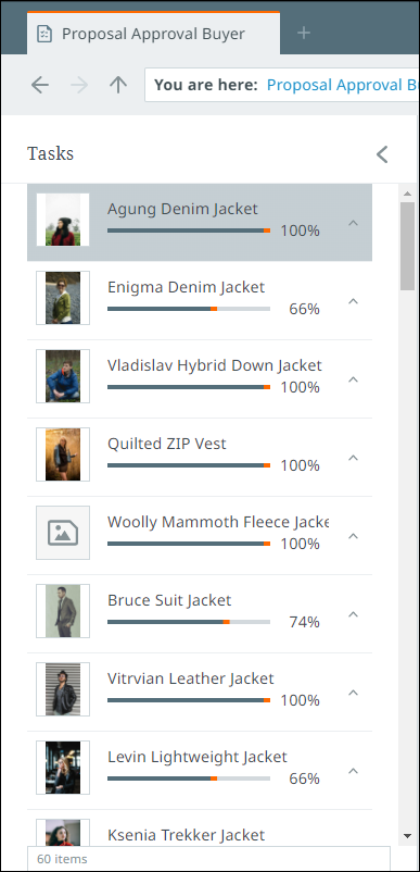
The item list pane can also be used to perform a number of actions on a product. Select the desired product and select the relevant action from the toolbar. Go to Managing tasks for more information.
You can also view and edit product-to-product references and classification links via the item list. Refer to Product references and classification links for more information.
Details pane
The details pane is the primary focus of the details view, and displays all of a product's important details.
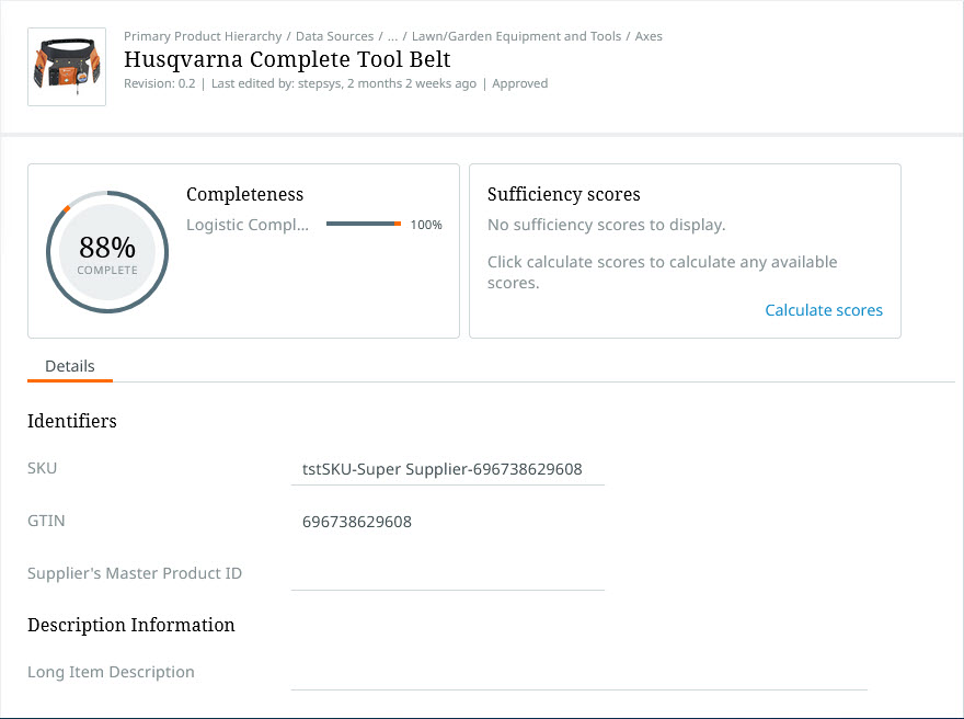
Information found within the details pane includes: attributes, attributes groups, references (provided they are in attribute groups), primary image, last edit date, Completeness card, Sufficiency scores card, and product hierarchy breadcrumbs. Attributes and references can be edited by clicking into the text field.
For your convenience, if an attribute needs your attention, you can click the applicable link to an attribute in a Completeness card, Sufficiency scores card, or in the side panel (described more below). The page will still auto-scroll to focus on the attribute in question.
For more information, refer to Managing data.
References tab
The "References" tab enables a configured view of references in the details pane. When configured, the "References" tab is split between a list of valid reference types on the left, and a tabular view of the references of the selected reference type on the right.
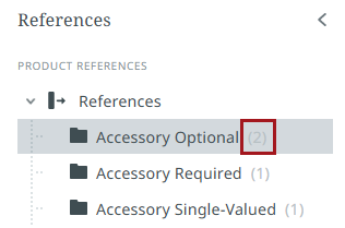
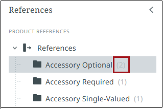
Each reference type containing references displays a gray numeral in parentheses (1-9) to the right of the reference type name indicating how many references there are for that reference type for that object. If there are more than 9 references, a '9+' will display.
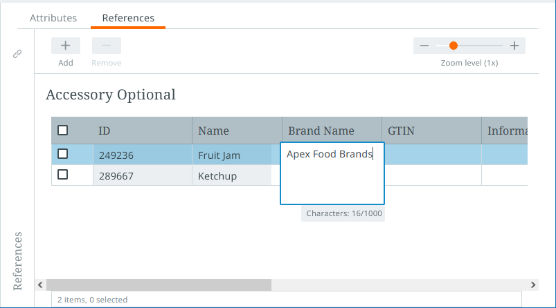
In the table that displays the references for each reference type, information on the referenced object can be edited. The buttons above the table in the secondary toolbar allow users to add new references by clicking the "Add" button and remove existing references by selecting the relevant reference and clicking the "Remove" button. A zoom slider is accessible above the table that expands table rows to display all relevant content.
Focus view
To quickly access a broader range of attributes on a referenced object, click the blue arrow button located to the right of the checkbox on the referenced object.

This opens a "Focus view".
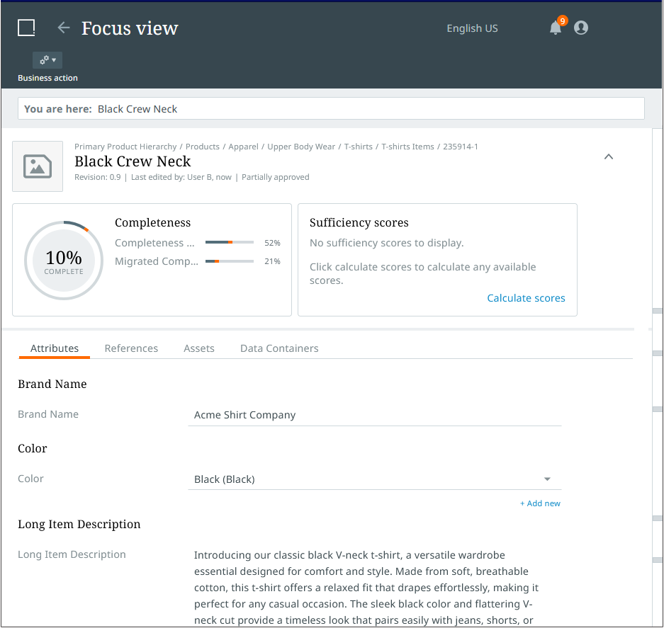
In the focus view, users can edit a referenced object using the attribute tab page configured for the referenced object's object type. If the user then wants to navigate to an object referenced by the referenced object, they can do so by, once again, clicking the blue arrow button for the referenced item on the configured reference tab page.
At the top of the screen in focus view is a field with the text "You are here" inside.

Displayed in this field is a list of the referenced objects viewed within a focus view session. To navigate to any of the objects viewed in the session, click the relevant object shown in the field.
To go all the way back to the original object, click the arrow in the top left-hand corner of the screen, next to the "Focus view" title.

For more information on how to configure a "References" tab, refer to the Configuration tool tabs setup topic in the Administration documentation.
Compare tab
The "Compare" tab allows appropriately privileged users to both view and manage product information. The tab is accessible by clicking the "Compare" tab, which is located to the right of the "Details" tab.
Display
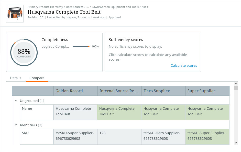
This tab displays a table showing the various records that contributed to a given product's product data described on the "Details" tab.
The records displayed on the tab include the golden record, the internal record, and the external record(s) associated with the product. Each record displays in its own column. The golden record and internal source records are displayed in the "Golden Record" and "Internal Source Record" columns, respectively, and the external records are displayed in columns named with the ID of the supplier that submitted the record. If multiple suppliers submitted product data for the same product, multiple external records will display in multiple columns, each named with the supplier ID.
All attributes display in collapsible attribute groups, display of which can be expanded or collapsed by clicking on the arrow button to the left of the attribute group name, as shown in the screenshot below.
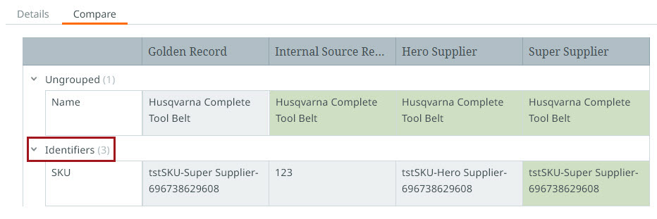
To help users see which data from external records have been promoted to the golden record, values in the internal source record and external record column(s) cells matching those found in the Golden Record column will be shaded green. Examples of these cells can be seen in the screenshot above.
Internal source record and external record columns can be manually moved by clicking on the column header and dragging the column to the desired place in the table.
A slider that controls the height of the rows in the comparison table is available just above the table to the far right of the screen.

The "Zoom level" slider can expand the height of columns to make longer values more readable.
Editing
Data in white-shaded cells in the internal source record column can be edited by clicking into the relevant cell. Once edits are made, clicking outside of the cell saves the updates. Gray- and green-shaded cells are read-only and cannot be edited.
If no golden records exist for the product, when the "Compare" tab is clicked, no information will display.
If the user wants to update values displaying in the golden record column, they can make the needed edits to the internal source record data. Once the internal source record is approved, those values are promoted to the golden record.
Languages tab
The Languages tab features a table presenting product information for the languages the user is privileged to see. Each column in the table displays translated product information for the language shown in the header. The information presented includes default aspects (like name and ID), as well as attribute values. Based on how the tab is configured, the table can display one or multiple attribute groups, which can be collapsed or expanded by clicking the arrow icon to the left of the parent attribute. If no attribute or attribute groups are configured, the table will display all valid attributes presented in their attribute groups.
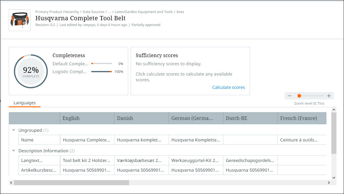
All attributes showing in the Languages tab display in attribute groups. All columns can be clicked and dragged to the desired place in the table by clicking on the gray-shaded header and dragging the column to a new table location.
A slider that controls the height of the rows in the languages table is available just above the table to the far right of the screen.

The "Zoom level" slider can expand the height of columns to make longer values more readable.
Assets tab
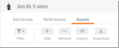
The "Assets" tab, available in the details view, presents all referenced assets in a gallery view. The assets display as tiles that show either thumbnails or icons to represent the asset. The functionality available in the tab enables users to view, filter, expand, download, upload, add, and remove assets associated with the viewed product.
Above the gallery are four buttons: "Filter," "Add," "Remove," "Import," and "Download."
Filter
When the "Filter" button is clicked, a dialog displays that allows users to select the reference type they want to filter by. When users click into the "Select reference type" field, a dropdown displays listing all reference types the referenced assets use. By selecting one of the listed reference types, the page will only display assets that use the selected reference type.
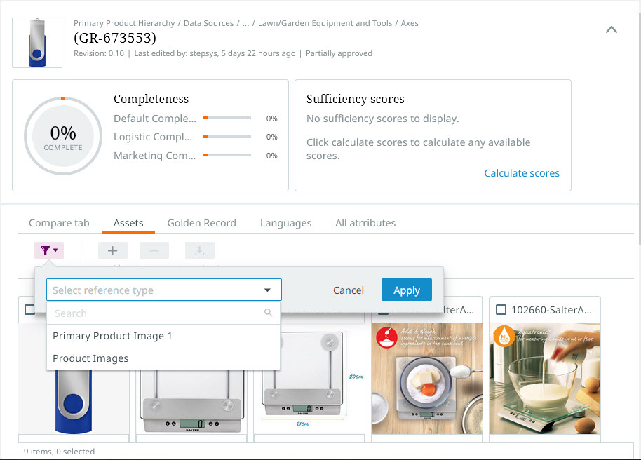
For instance, if the user only wants to see the referenced assets of the "Product image" reference type, users can select "Product image" from the list of reference types and restrict the tiles that display to only those assets that use the "Product image" reference type.
Add
The "Add" button enables users to add references to assets from the object being viewed. When the "Add" button is clicked, a dialog displays with two fields: "Reference type" and "Items".
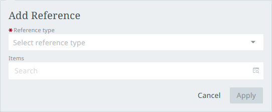
To add a new asset reference, first, click the arrow in the "Reference type" field to display the dropdown. A list of available asset reference types will display. Select the reference type of the asset you want to reference.
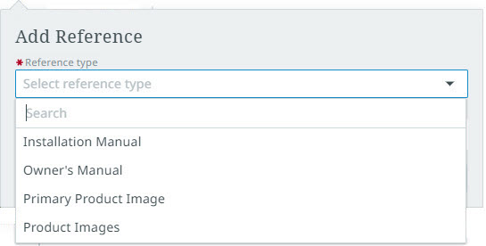
Once you have selected the desired reference type, a list of all currently referenced assets will display in the "Assets" field.
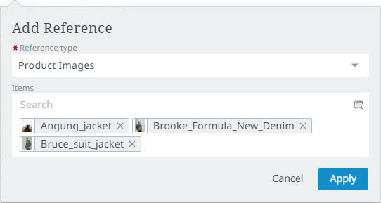
The dialog provides two ways to select the asset to reference. In the "Search" bar, found at the top of the "Assets" field, start typing the desired asset and the typeahead feature will display a list of relevant assets to select. To navigate to the desired asset, click the "Item Picker" icon in the right side of the "Search" bar. The Item Picker supports multi-selection of assets. (For more information on using the Item Picker functionality, review the Item picker topic.)
Remove
By clicking the "Remove" button, users can remove assets from the referenced product. To remove references to assets, users can click the checkbox at the top of the tile to select it. With the tile(s) selected, clicking the "Remove" button deletes the reference to the selected asset(s).
A footer displays at the bottom of the table that states how many assets are in the gallery, and how many of those are currently selected.

If no assets are associated with the viewed product, text will display in the place of tiles that reads, "There were no results for your selection."
Import
The "Import" button allows users to import assets for the viewed object and create an asset reference between the object and the asset. When clicked, an "Import asset" dialog displays.
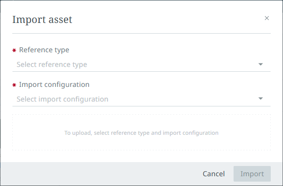
For the "Reference type" parameter, click the arrow to show a dropdown displaying all reference types valid for the object. Once selected, the "Import configuration" field auto-populates with an import configuration whose name matches either completely or partially with the name of the selected reference type. If this import configuration is not the desired configuration, users can click the arrow at the far right of the "Import configuration" field to display a dropdown containing all import configurations valid for the selected reference type. With both selections made, any restrictions associated with the selected import configuration (e.g., file size or file type) display in the upload area.
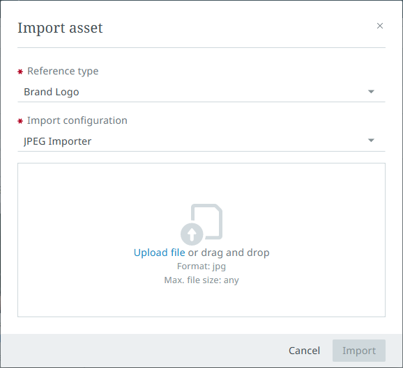
To import a file, click the "Upload file" text button that displays in the upload area. When a file is selected, click the "Import" button at the bottom of the "Import Asset" dialog. A notification displays first to indicate the import has begun. A second notification displays to indicate whether the import was successful or if the import failed.
If successful, a refresh of the browser will display the newly created asset reference on the "Assets" tab.
Download
Assets can be downloaded from the "Assets" tab via the "Download" button. To download assets, first select the asset(s) you want to download, then click the "Download" button. The browser will initiate a download of the asset to your local machine.
Packaging tab
The "Packaging" tab, available in the details view, presents the packaging hierarchies of the currently selected object. Each hierarchy is displayed in the left pane in a tree view, and as a table in the right pane. A zoom slider is accessible above the table that expands table rows to display all relevant content.
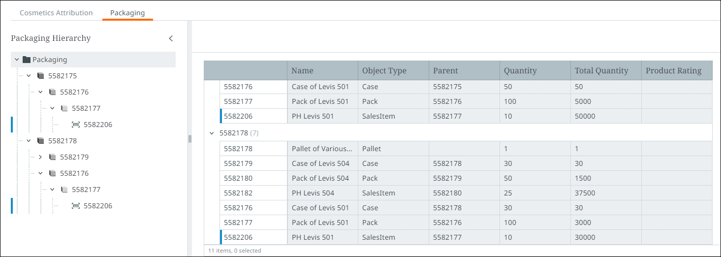
Selecting a lower lever packaging object in the hierarchy will narrow down the displayed data in the table(s) to only display child objects. The number that displays beside the header of each table indicates how many packaging objects and products are currently being displayed.

In both panes, the blue line indicates the location of the currently selected object in the packaging hierarchy.

Asset preview
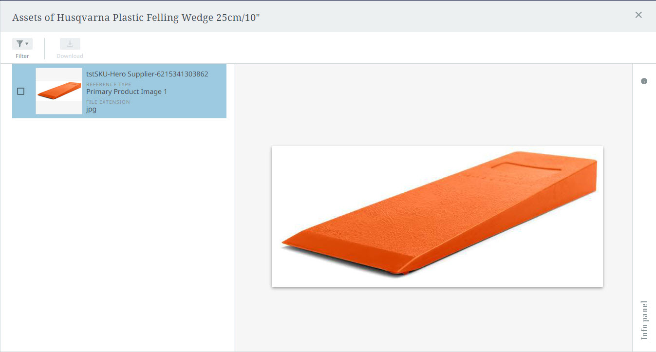
To display a preview of an asset, hover your cursor over the thumbnail for that asset in the asset tile. An ellipsis displays in the upper right-hand corner of the thumbnail. When you click the ellipsis, a pop-up displays with two options: "Preview asset", and "Inspect".
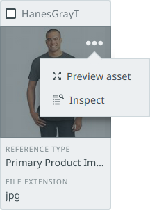
When you click "Preview asset", a full-screen overlay displays that presents:
-
a tile (or tiles) in a column that lists all assets referenced by the object (on the left side of the screen)
-
an expanded view of the asset in the asset panel (on the right side of the screen)
If the checkbox in the tile is checked, you may download the checked asset via the "Download" button, found directly above the column. If downloading multiple assets at once, the assets will be placed into a zip file onto your local machine.
When a user selects "Inspect", the asset details view is displayed. From here, users can review the asset specifications, the relationship information (i.e., the objects the asset is referenced by), and remove or replace the asset content.
For more information on managing assets in the asset details view, refer to the "Assets" section of the Product references and classification links topic.
Section bar
The section bar, located to the left of the scroll bar, is a non-scrolling quick-navigation tool that enables easy access to attribute groups, as well as potential errors, found on the product.
The short gray horizontal markers that display at intervals along the section bar each represent a set of product data; the gray marker's placement in the section bar indicates the data set's relative location on the page. For instance, by clicking the first gray marker at the top of the section bar pictured below, a list of attribute groups nearest the top of the list of product data displays in a dialog. When an attribute group from the list is clicked, the page auto-scrolls until the selected attribute group displays at the top of the page. In this way, a page of product data containing a thousand or more attributes can be navigated with a single click, without scrolling.
Errors
Errors on an item will display as exclamation points inside of red circles in the section bar, corresponding to the placement of the affected attribute. Warnings display as yellow triangles in the section bar, also corresponding to the placement of the affected attribute.
Clicking on the warning icon will auto-scroll down the product details pane to the relevant attribute. Additionally, the data quality measuring capabilities, available in both the Sufficiency and Completeness cards, can be set to display blue flag icons to indicate where a given sufficiency requires additional data enrichment. When the flag is clicked, the page auto-scrolls to the relevant attribute.

Errors on an item will also be denoted on the tab label itself. An exclamation point inside a red circle or yellow warning triangle icon displays to the left of the tab label if there are errors are warnings on that tab. These errors and warnings are generated when attributes and references are affected by business rules applied to a given item. If attributes related to the Sufficiency or Completeness cards are missing values, a blue circle displays to the right of the tab label. Inside the circle is a number indicating how many missing attributes or references need to be added as required by the Sufficiency and Completeness configurations.

For more information on Sufficiency and Completeness, refer to the Sufficiency scores card and Completeness card topics.
