This topic provides an overview of the STEP Workflow Designer, including descriptions of the various sub-editors and visual indicators within the designer. It is intended to orient you with the interface and provide general information for where to accomplish things in the designer, rather than to complete any specific task itself. When applicable, links to more detailed task-oriented materials are provided.
Prerequisites
The reader should be familiar with the Creating a Workflow topic.
Overview
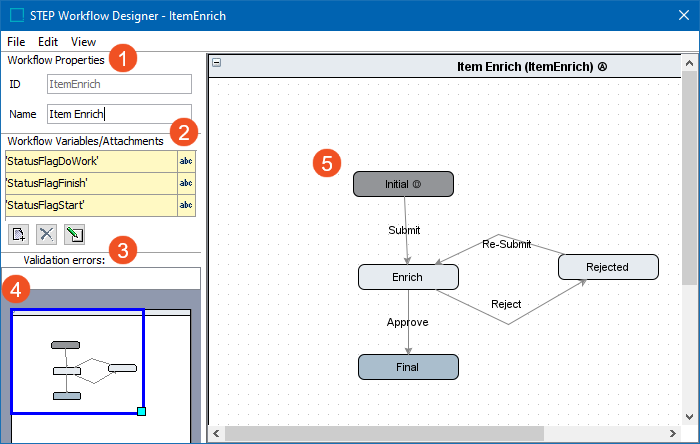
The STEP Workflow Designer has the following primary areas as identified in the image below:
-
Workflow Properties panel for setting ID and Name
-
Workflow Variables/Attachments for add-ons
-
Validation errors and warnings when needed
-
Overview / zoom for canvas
-
Canvas where States and Transitions are defined
Dialogs
Users can edit workflows with the dialogs and functionality described below.
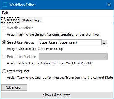
Workflow Editor
To open in the Workflow Editor, double click the canvas region. Use the workflow editor to make global changes for the workflow, including setting the default assignee for the workflow and enabling status flags for the workflow.
|
Tab |
Available Functions |
|---|---|
|
Assignee |
Modify the assignee for the entire workflow. Refer to the Workflow State Editor Assignee Tab Options topic. |
|
Status Flags |
Status flags can be added and/or removed. Refer to the Status Flags topic. |
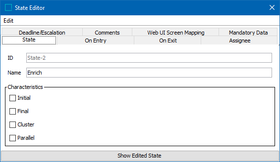
State Editor
The State Editor displays when the user right-clicks on the canvas to add a state, or when a user double-clicks on an existing state. This editor enables users to make changes specific to a particular state. The 'more tabs' button  indicates additional properties are available. Use the 'move back' and 'move forward' buttons (
 and
and  ) display additional tabs.
|
Tab |
Description |
|---|---|
|
Assignee |
Assignees can be added / removed / modified per state. Refer to Assignees in Workflows. |
|
Comments |
Comments can be added / removed / modified. Comments have no explicit function and cannot be viewed outside of the designer. However, they can be useful to make notes such as intended function, considerations when modifying for designers regarding a particular state. |
|
Deadline/Escalation |
Set deadlines and add / modify / delete associated escalation business rules. Refer to Deadlines and Escalations in Workflows. |
|
Mandatory Data |
Set attributes, attribute groups, and/or references that are required to be populated before a task can leave the state. Refer to Mandatory Attributes, References, and Variables in Workflows. |
|
On Entry |
Add / modify / delete business actions that are run on entry to the state. Refer to Business Rules and Workflows. |
|
On Exit |
Add / modify / delete business actions that are run on exit from the state. Refer to Business Rules and Workflows. |
|
State |
Change the name or characteristics of the state. Refer to State Characteristics in Workflows. |
|
Web UI Screen Mapping |
Provides a link to the Web UI to map the state to a specific Web UI screen. From the dropdown, select the Web UI that should have access to the workflow, and click the Edit button. This will launch the login page of the Web UI. The user must have privileges to edit Web UI configurations and if so, logging in will open the designer to the Screen Mapping properties with conditions to map to the workflow state pre-populated. The user can then select an existing screen to map the state to. For more information on mapping Web UI screens, refer to the Main Properties topic of the Web User Interfaces documentation. |
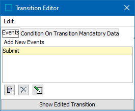
Transition Editor
The Transition Editor is displayed when the user double-clicks on an existing transition. This editor enables users to make changes specific to a particular transition.
|
Tab |
Description |
|---|---|
|
Condition |
Add / remove / modify business conditions on the transition. Refer to Business Rules and Workflows. |
|
Events |
Add / remove / modify events on the transition. Refer to Auto-Routing Tasks in a Workflow. |
|
Mandatory Data |
Set attributes, attribute groups, and/or references that are required to be populated before a task can take the transition. Refer to Mandatory Attributes, References, and Variables in Workflows. |
|
On Transition |
Add / remove / modify business actions on the transition. Refer to Business Rules and Workflows. |
Visual Indicators
Visual indicators allow users to quickly gather information about the workflow without opening a particular state or transition.
|
Indicator |
Description |
|---|---|
|
A |
A assignee has been specified for the workflow or state. Refer to Assignees in Workflows. |
|
D |
A deadline has been selected for the state. Refer to Deadlines and Escalations in Workflows. |
|
I |
An 'On Entry' action is present on the state. 'I' stands for 'In' (into the state). Refer to Business Rules and Workflows. |
|
O |
An 'On Exit' action is present on the state. 'O' stands for 'Out' (out of the state). Refer to Business Rules and Workflows. |
|
P |
Specific user privileges have been granted for the state. Refer to Editing Privilege Rules in the System Setup documentation. |
|
Dotted transition line |
A condition exists on the transition. Refer to Business Rules and Workflows. |
|
Rounded end on transition |
An action exists on the transition. Refer to Business Rules and Workflows. |
|
Blue color |
The state has the Final characteristic. Refer to State Characteristics in Workflows. |
|
Dark gray color |
The state has the Initial characteristic. Refer to State Characteristics in Workflows. |
|
Light blue / gray color |
The state has the Cluster characteristic, or no characteristics (e.g., standard state). Refer to State Characteristics in Workflows. |