The Power Search Screen allows users to quickly generate search results based on criteria. The Power Search component functions as a component accessible via the Global Navigation Panel. For more information, refer to the Global Navigation Panel topic.
Prerequisites
It is expected that anyone configuring the Power Search Screen component is familiar with the Web UI Designer as basic concepts for working with the designer are not covered in this section. In addition, the user must have appropriate privileges to access the designer. Additional information can be found in the Designer Access topic.
Configuration
To configure the Power Search screen, follow the directions below:
-
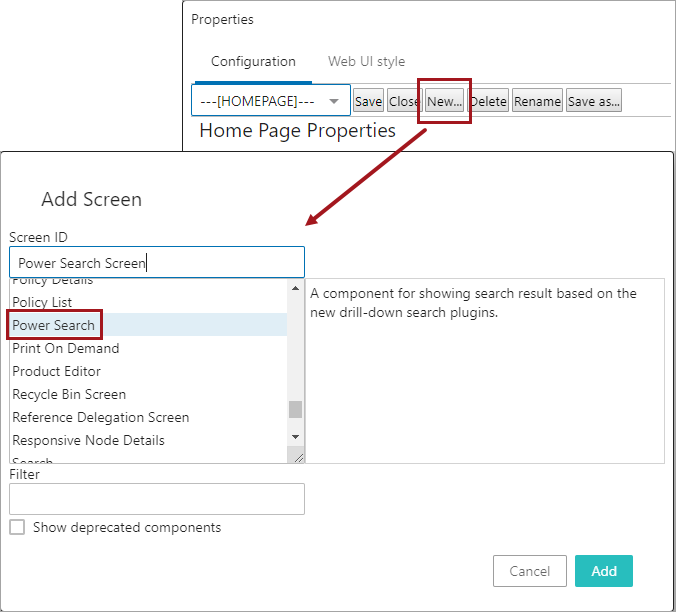
In the designer, create a new screen by selecting New. Select the Power Search option for a new screen, and create a name for the Screen ID field. In the example below, the Screen ID is named 'Power Search Screen.' Click Add.
-
Once this screen is created, in the Power Search Properties, select the go to component link on the Node List option under Child Components.
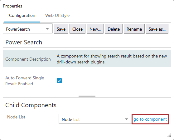
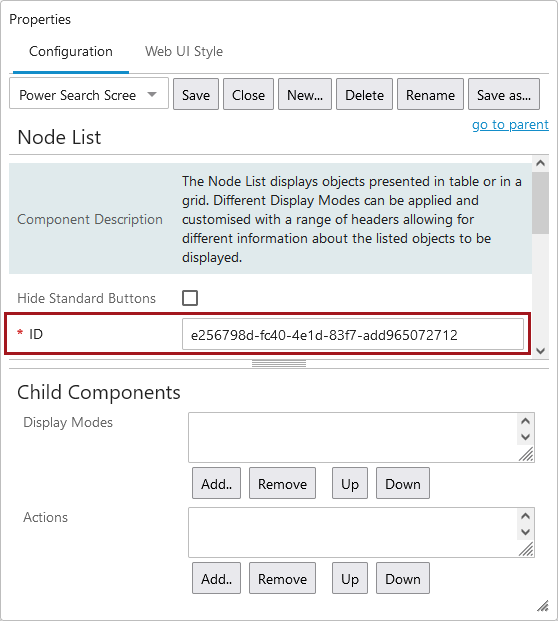
This opens up the Node List component, which contains several options for configuration. The only required parameter on a Node List for the Power Search screen to work is the ID field, which is auto-populated to a unique value but may be changed as desired.
Configuring other parameters on the Node List will allow expanded functionality of the Power Search component. For more on configuring a Node List, refer to the Node List Component topic.
-
An optional action button can be added to the Node List called, Add to Basket.
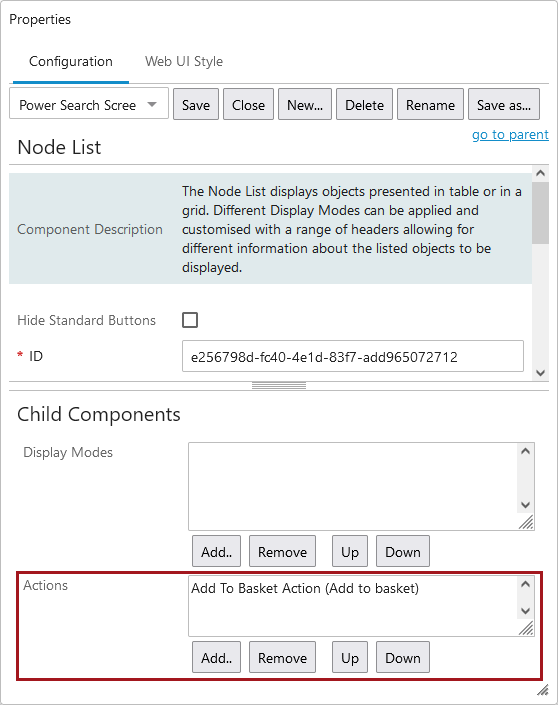
This allows the user to add items to a basket that they can then open and perform actions on.
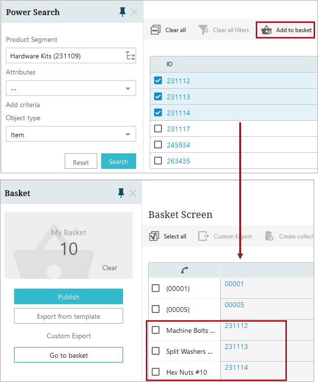
To learn more on how to setup and use the 'Add to Basket' action button, refer to the Basket Component and Basket Screen topic.
Implementing the Power Search Screen
Once the Power Search screen is created, a Search Panel component must be added to the Global Navigation Panel.
-
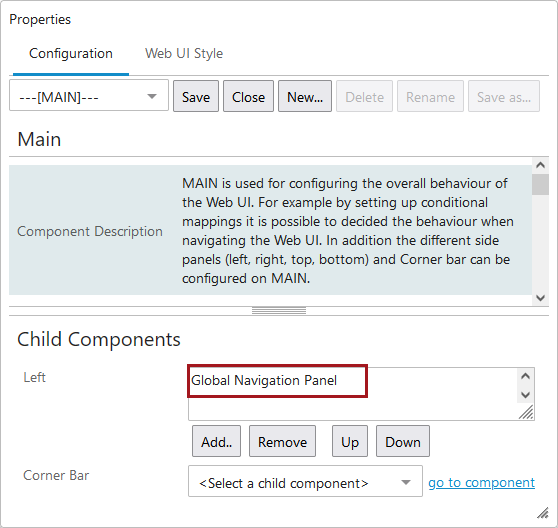
From the Main Properties screen, go to Child Components > Left > and add a Global Navigation Panel component. Once added, double-click the Global Navigation Panel component.
For more information on the Global Navigation Panel, refer to the Global Navigation Panel topic.
-
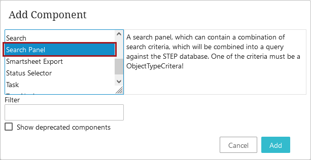
On the Global Navigation Panel, go to Child Components > Menu Items > and select Search Panel. Click Add.
-
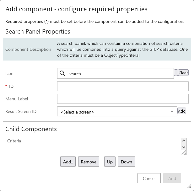
The 'Search Panel Properties' displays with the ID being the only mandatory parameter. Add values to the parameter fields, and click Add. Each of the parameters is described below.
-
Icon: Determines which icon will display on the 'Search Panel' button in the Global Navigation Panel. Defaults to a magnifying glass icon but can be changed to a different icon.
-
ID: The value entered in this field determines the ID of the 'Search Panel' component being configured.
-
Menu Label: The value entered in this field displays when a user hovers their cursor over the Search Panel button. This value also displays as the header in the secondary column when the Search Panel button is clicked.
-
Result Screen ID: Select the screen that the Web UI will navigate to when a user clicks on any search results. To enable the Power Search screen, select the Power Search screen created in the first section of this topic in this field.
-
-
Under Child Components is a 'Criteria' field. In this field, users can configure what kind of searches will be available in the secondary column when the Search Panel button is clicked.
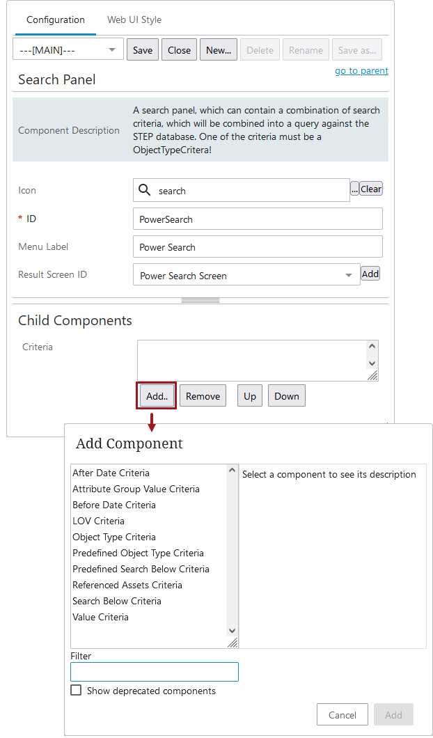
The criteria component options are as follows and can be added in many combinations:
Important: The 'Object Type Criteria' MUST be added for the Power Search to work.
-
After Data Criteria: Search criteria for locating items based on an after date criteria.
Note: Configuring multiple components of this type on the same query panel with the same attribute will result in an error.
-
Attribute Group Value Criteria: Search criteria for finding items by attribute values found in a specific attribute group. The attribute group must be set.
-
Before Data Criteria: Search criteria for locating items based on the before date criteria.
Note: Configuring multiple components of this type on the same query panel with the same attribute will result in an error.
-
LOV Criteria: A component used to restrict the criteria in a modular search depending on values in a List of Values based attribute.
-
Object Type Criteria: A component used to restrict the criteria in a modular search depending on the object type.
Important: The 'Object Type Criteria' MUST be added for the Power Search to work.
-
Predefined Object Type Criteria: A component used to restrict the criteria in a modular search from a list of predefined object types.
-
Predefined Search Below Criteria: A component used to restrict the criteria in a modular search from a list of predefined root nodes.
-
Referenced Assets Criteria: Search criteria for finding assets referenced by a product.
-
Search Below Criteria: Search criteria for restricting search to only search below the indicated node.
-
Value Criteria: Search criteria for finding items by ID, name, or attribute values. If neither Attribute, Match ID, or Match Name is specified, it will try to match any item that has a value, ID, or name matching the pattern.
For more information on configuring search criteria in the field and examples, refer to the Advanced Search Initial Configuration topic. Specifically, review the section entitled 'Editing Advanced Search Screen Properties.'
-
-
Once the desired criteria is added, save and close the designer.
-
From the Web UI homepage, select the newly added 'Power Search' component from the Global Navigation Panel. In this example, a 'Primary Item' object type is configured. The results will display as follows:
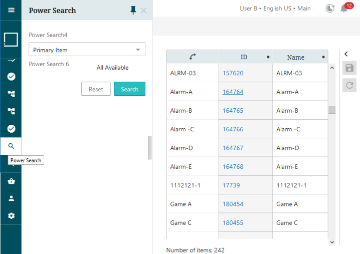
Note: Ensure that no other screen is configured for the object type at a higher order than the Power Search screen in the Main Properties screen mappings. For example, if an 'ID and Name' screen is configured to show on Items, that screen will instead show the Power Search results screen. For more information, refer to the Mappings topic.