The Multi Context Screen is a screen type designed to show attribute values and outbound references of an object in multiple contexts on the same Web UI screen. Working across different contexts, comprised of a variety of dimension points (e.g., language, country), allows customers to specify data valid for each of the contexts. Using a Multi Context screen means that users do not need to switch contexts manually to evaluate attribute values one context at a time.
The Multi Context screen needs to be configured to display attributes and reference types. If configuration allows it, end users can set up their own customizable views, including deciding which attributes and references to display. Plus, there are on-screen data filtering options to hide equal values or highlight differences in the data. This can be especially useful to evaluate data between multiple contexts, quickly identifying which values differ across the displayed contexts.
Additionally, users can suppress references and remove suppression of references, when the functionality is enabled. A reference may be suppressed for various reasons. One example is an image—what may be acceptable in one country may not be acceptable in or may not be relevant to another country or there may be licensing restrictions. Another example is product documentation that is translated into various languages but applicable to only certain countries in which a product is sold.
Prerequisites
It is expected that anyone configuring the Multi Context Screen component is familiar with the Web UI designer as basic concepts for working with the designer are not covered in this section. In addition, the user must have appropriate privileges to access the designer. Additional information can be found in the Designer Access topic.
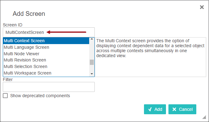
Adding a New Multi Context Screen
Steps for creating a new screen are outlined in the Creating a New Screen section of the Design Mode Basics topic. Select 'Multi Context Screen' as the screen type (shown in the screenshot below).
At this point, either close the designer and configure the screen at a later time, or continue on with the steps in the next section.
Configuring a Multi Context Screen
Each parameter should be configured as needed. To guide you in your setup, help text is available for each parameter and is accessible by clicking the information icon to the right of each parameter name (displays upon mouse over).
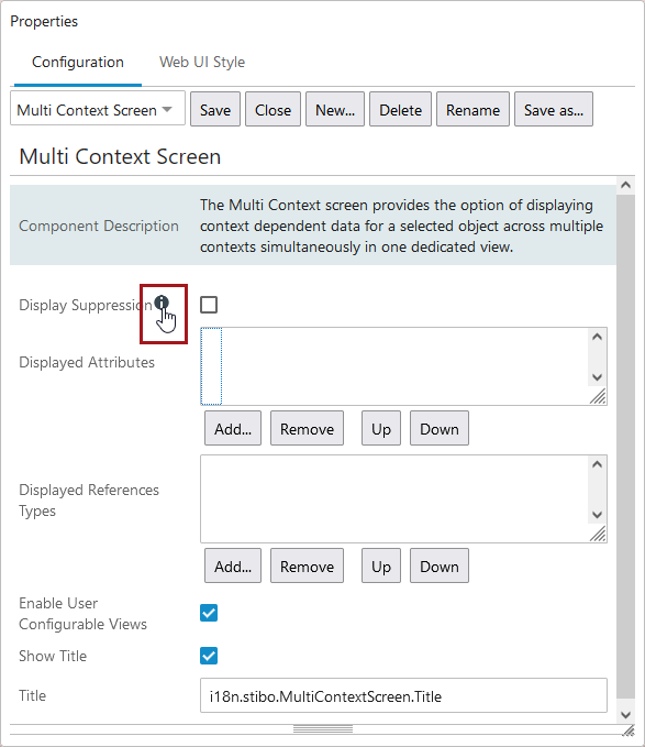
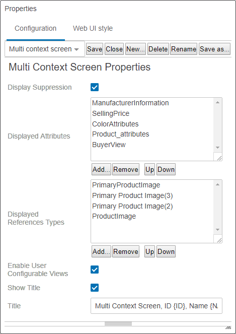
- With the designer window open, select the screen ID for the MultiContextScreen using the screen dropdown list. If continuing on after creating a new Multi Context screen, Multi Context Screen Properties should already be displayed.
- Enable Display Suppression if users should have the option to suppress dimension-dependent references. When enabled, a Suppression header (for displaying the suppression status) is added to the tables within the reference type tabs together with the actions for suppressing and removing a suppression of a reference.
- Click Add under the Displayed Attributes value field. Select attributes or attribute groups from the Select Node(s) dialog. These will display in columns on the Attributes tab. Click OK when done. In addition to the selected attributes, ID and Name display as columns within the grid.
- Click Add under the Displayed References Types value field. Select reference types from the Select Node(s) dialog. Each reference type displays as its own tab on the Multi Context screen. Click OK when done. In addition to the metadata attributes valid for each reference type displaying in the grid, Title also displays as a column and displays the referenced object name.
- Enable User Configurable Views gives end users an option to create and save their own customized views by adding and removing attribute columns within the table on the Attributes tab. This parameter is enabled by default. Click the checkbox to disable and users will no longer view the Apply view / Clear view icons.
- Determine if you want to display the title. Leave the Show Title parameter enabled if the Multi Revision Screen should display the title. Disable the parameter to hide the title and its associated white space.
- If a title should display, determine if the default title should remain, or if a custom or descriptive title is necessary. The default title will display as 'Multi Context' on the screen in the top left corner. Adding a descriptive Title is optional. Static text can be entered and/or placeholders ({ID}, {NAME}) can be used for including the ID and Name of the selected object. If text is entered, the title will be displayed in the upper left corner of the screen.
As an example, this is the text / placeholders entered as part of the configuration:

This is the resulting title:
- Click Save in the designer window. Close the window or complete the next step before existing design mode.
- Determine how the user will access the Multi Context Screen. It can either be mapped using Main Properties or added to a sub screen tab page on a Node Details Screen. For more information about mapping, refer to the Main Properties topic, and for more information about sub screen tab pages, refer to the Tab Pages topic.
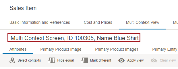
This is an example of a Multi Context Screen configured to display as a sub screen tab page on a Node Details screen.
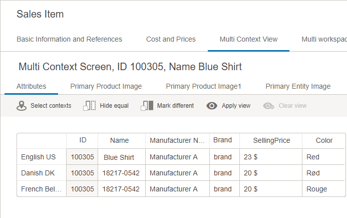
The parameters are set as follows:
In this example, the attribute 'Price' is not valid for the object type and therefore does not display in the table.
As with any screen, the Multi Context screen must be mapped appropriately in Main Properties > Mappings for end users to be able to access it. As an alternative to mapping, the Multi Revision screen can be added as a Sub Screen Tab Page on a Node Details screen (as shown in the examples within this topic).
For more information about mapping, refer to Configuring the Parameters in the Main Properties topic, and for more information about sub screen tab pages, refer to the Tab Pages topic.
Using a Multi Context Screen
There are a number of reasons that working with data in different contexts is a fundamental part of most business models, such as doing business across international markets. Certain attributes (e.g., price) may be different depending on the context and references also may differ per country / language.
Instead of users manually switching Web UI to different contexts when editing attributes, the Multi Context screen displays attributes in multiple contexts all on the same screen. The screen is designed to also display references for an object, organized by reference type. Users can also edit reference attributes, add / remove references, and suppress / remove suppression on references (if enabled).
Attributes
The attributes displayed and the actions available on the Attributes tab may be different than outlined below depending on how the administrator configured the Multi Context Screen Properties. If disabled by an admin user, end users will not have configurable view options (Apply view / Clear view).
Using the actions or clicking within the cells of the table, users can:
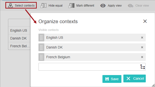
- Select Contexts - Select the contexts to display and determine the display order (via the drag handle for each context); selections apply to all tabs.
The first time a user enters a Multi Context screen only the current context is displayed. The user then selects the desired contexts to display for the attributes / reference types on the screen. On subsequent visits, Web UI displays the user's last applied view within Multi Context.
- Edit attributes - Editing is available in unshaded cells in the table on each tab. After making edits, users need to click the Save icon to the right of the table. The reset button allows users to discard any changes they have made. While users must save changes—or lose edits—before moving to another tab / screen outside of Multi Context, users can navigate between the Attributes tab and the Reference Type tabs without losing the edits. Users need to click save before navigating outside of the Multi Context screen to retain edits.
All editable attributes values for the selected object can be edited regardless of the settings for Dimension Dependencies. Values for attributes not configured to be dimension dependent will be updated across all contexts upon save, similar to other screens such as Multi Language. Copying and pasting can be done into a single cell or in multiple cells if the number and order of cells copied from matches the number of cells pasted into.
Note that on attributes not dimension dependent, if the user pastes three new values in three different contexts (a cell per context) for an attribute that is not dimension dependent, it is the value of the last cell that was be paste in with populate all contexts upon save. For example, three cells with the values 98, 99, 100 are copied from Excel and pasted into three cells in the Multi Context grid, then the value 100 is the one that populates all three cells upon save. Similarly, if a user enters three values manually for three different contexts, the third value will be the one that populates all the contexts when saved.
- Compare contexts using the Hide equal / Mark different actions - Click these actions to compare the attributes. Aspects (ID, Name) are not used for the comparison.
- Apply and maintain user views - Clicking Apply view allows users to create and save their own views and work with only the columns that they need. Chose from a saved view or create a new one. For more details about the functionality, refer to the User Configurable Views topic.
- Clear an applied view - Clear the current view to return to the default configuration by clicking the Clear view icon.
Reference Types
Reference types that populate the individual tabs are determined by the administrator configuring the Multi Context Screen Properties. Users only have access to the reference suppression actions (Suppress Reference / Remove Suppression), if enabled by the admin user. Each reference type tab displays the same action toolbar.
Using the actions or clicking within the cells of the table, users can:
- Select Contexts - If the contexts were set up on the Attributes tab, those settings apply to all tabs. Editing contexts on a reference type tab applies any changes all Multi Context screen tabs.
- Edit attributes - The functionality on the reference type tab matches the functionality on the Attributes tab, as described in the previous section. Again, click the Save icon after making any edits.
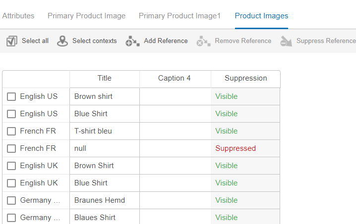
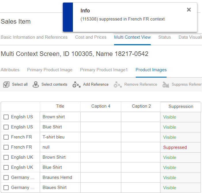
- Suppress and unsuppress references - If suppression functionality is enabled, then users will have Suppress Reference and Remove Suppression icons in the action toolbar. Also, the table on the tab will include a Suppression column.
To suppress or unsuppress references individually, select a row by clicking the checkbox shown to the left of the context name. To select multiple rows, either click on additional rows or use the Select all action. As soon as a row selection is made, the Select all icon switches to a Clear all icon. Use this to clear all selections or just click a checkbox again to deselect a particular row.
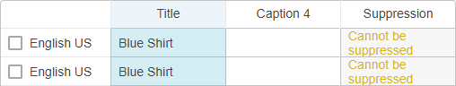
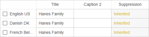
When a reference is suppressed, the word 'Suppressed' displays in the Suppression column. The word 'Visible' displays when references are not suppressed. If a reference cannot be suppressed, the applicable Suppression cell is disabled with the words 'Cannot be suppressed' or 'Inherited' displayed.
'Cannot be suppressed' means that the reference type is not dimension dependent.
'Inherited' means that the reference is inherited from a parent object; therefore, it is not suppressible.
A notification regarding the suppression status will display on the screen. The message displayed to users upon removing a suppression confirms that 'Suppression was removed' and displays similarly to the suppression confirmation shown below.
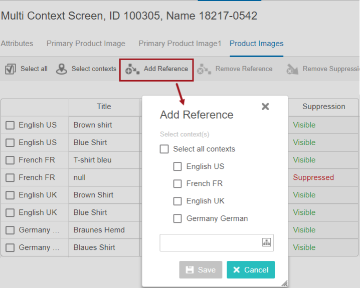
- Add a reference - Click the Add Reference action and then make a context selection within the 'Add Reference' dialog. Click the Node Picker icon to select a reference, and then click Save.
- Remove a reference - Make a row selection and then click the Remove Reference action icon. Confirm you want to remove the reference when the 'Remove References' dialog appears. A message displays at the top of the screen confirming the successful removal of the reference.