When working with product or entity objects in Web UI, there are two components you can use to display and edit data containers. Users are encouraged to incorporate these components into their Web UI in a way that best fits their needs.
Data Container / Attribute Maintenance
Components that are available for displaying and maintaining data containers in Web UI:
- Globally Configured Data Container (superseded)
- Globally Configured Multi Edit Data Container
- Globally Configured Unfolding Data Container
The Data Container Table View Editor has been superseded by the Globally Configured Multi Edit Data Container. Additionally, there is a withdrawn data container component called the Data Container Attribute View Editor, which is detailed at the end of this topic.
Globally Configured Data Container (superseded)
Important: The Globally Configured Data Container has been superseded with the 2025.2 update. Users are instead encouraged to transition to the Globally Configured Unfolding Data Container for an enhanced user experience.
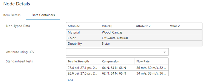
The Globally Configured Data Container component allows users to edit attribute values for data container attributes, edit references for data container references, and add / delete data containers on an entity or product object.
The editor can be configured as a Node Editor child component, set up to display on a Tab Page within a Node Details screen. For information on configuring the Globally Configured Data Container component, refer to the Globally Configured Data Container (superseded) in the Web User Interfaces documentation.
To configure which attribute values / references display in this component and under what conditions they should be displayed, refer to the Global Data Container Representations section of the Web User Interfaces documentation.
To edit an existing data container, click on the relevant data container from the component. To add a new data container to the object, click the Add link below the component display. Regardless of how you access the editor dialog, options to edit existing data containers and add new ones will be available.
The Globally Configured Data Containers dialog is split into several different sections:
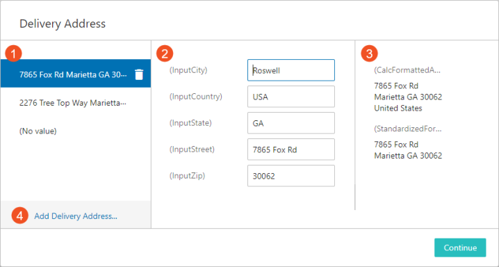
- The data container selector on the left-hand side of the dialog displays all of the data containers of a specified type that are currently on the object. The specific data container type is defined in the component configuration. The name of the data container is derived from the Display Attribute parameter, configured on the Global Data Container Representations component, and is typically comprised of different attribute values that define the data container. Newly added data containers appear on this list and can be removed by clicking the 'trashcan' icon.
Note: Viewing inherited data containers is not possible in the Globally Configured Data Container popup dialog. Instead, a 'No Existing Entries' message displays on the left-hand side of the dialog.
- The selected data container's editable attributes / references are listed in the middle section of the dialog. Each attribute value or reference can be edited in their respective fields. The attributes / references that appear in this section are derived from a list of attributes / references specified by the Editable Attributes and References parameter in the Global Data Container Representations component.
- The selected data container's 'Read Only' attributes and references are listed in the right-hand side of the dialog. These values cannot be edited. The attributes and references that appear in this section are derived from a list of attributes / references specified by the Read Only Attributes and References parameter in the Global Data Container Representations component.
- To add a new data container, click the Add link in the bottom left-hand corner of the dialog.
- Once finished, click Continue.
Data Container Table View Editor
The Data Container Table View Editor component allows users to edit attribute values for data container attributes, and add / delete data containers on an object. Unlike the Globally Configured Data Container component, these data containers appear as rows on a table.
Note: References cannot be displayed using this component.
The editor can be configured as a Node Editor child component, set up to display on a Tab Page within a Node Details screen. For information on configuring the Data Container Table View Editor, refer to the Data Container Table View Editor topic of the Web User Interfaces documentation.
Note: The Data Container Table View Editor is not compatible with the Global Data Container Representations component, and therefore uses its own configuration settings.
To edit an existing data container, click on the relevant data container from the table. To add a new data container to the object, click the Add link below the table. Regardless as to how you choose to access the editor dialog, options to edit existing data containers and add new ones will be available.
The Data Container Table View Editor dialog is split into several different sections:
- The data container selector on the left-hand side of the dialog displays all of the data containers of a specified type that are currently on the object. The specific data container type is defined in the component configuration. The name of the data container is derived from the Display Attribute configured on the component, and is typically comprised of different attribute values that define the data container. Newly added data containers appear on this list and can be removed by clicking the 'trashcan' icon.
- The selected data container's editable attributes are listed in the middle section of the dialog. Each attribute value can be edited in their respective fields. The attributes that appear in this section are derived from the attribute group specified by the Editable Attributes parameter in the configuration.
- To add a new data container, click the Add link in the bottom left-hand corner of the dialog.
- Once finished, click OK.
Data Container Keys
When a data container object type is initially created in the workbench, users have the option to create a data container key. A data container key is a unique identifier for the data container object type, and is based on the values of selected attributes and/or the target object IDs of selected reference types. For some users, a data container key is more useful as an identifying label than a standard alpha-numeric key because the data container key contains information specific to that data container. Additionally, data container keys can be used to identify data containers when they are imported (e.g., from an external system that cannot identify an internal STEP ID) and to ensure that duplicate data containers are not created.
When a new data container is created based on a data container object type that has a configured data container key, users must provide values for the attributes and/or reference types that make up the data container key in order for the data container to be saved. The attributes and/or reference types that make up a data container key are clearly identified during the data container creation process.
In the example below, the attributes 'PM_ID,' 'PM_Name' and the reference type 'Product Packaging' are part of the data container key; therefore, values must be provided for these attributes and reference types before the data container can be saved.
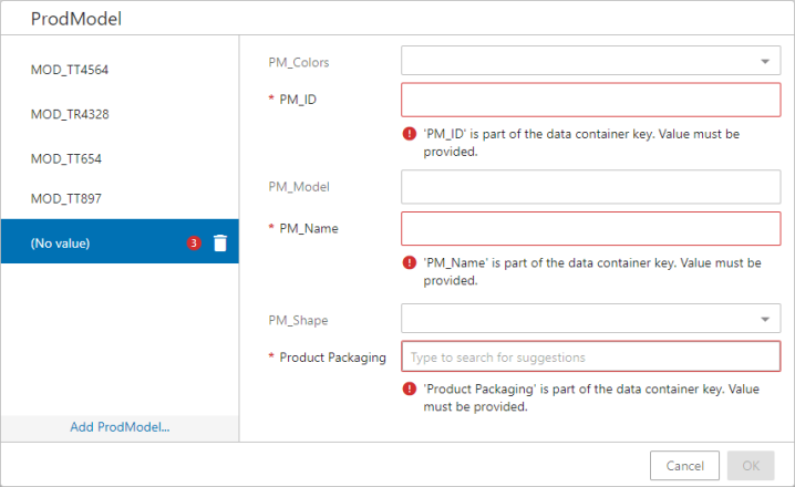
Note: Only users with the 'Edit Data Containers' privilege can make edits to the attributes /reference types after they have been assigned to data containers. It is recommended that only select admin users have this privilege added to their user profile and that this privilege be used sparingly to avoid creating duplicate keys. For more information regarding privileges, refer to the User Actions and Error Descriptions topic in the System Setup documentation.
For more information regarding data container keys, refer to the Data Container Keys topic in the System Setup documentation
Additional Web UI Functionality
There are other areas of Web UI in which users can view data containers and their associated attributes as read-only. It is expected that working with objects that have data containers is like working with any other object, keeping in mind the functionality list and the limitations outlined in the Data Containers introduction in the System Setup documentation.
Depending on the screen / component you are working with, there are Data Container components that can be used when you look at entities in various situations. Additional functionality may be described in greater detail in relevant topics and the bullets below do not represent an all-inclusive list nor do they show end-user functionality.
- Data Container Value Header and Data Container Value Group Header (to be used within a Node List in Multi Edit or Table display modes; read only)
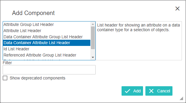
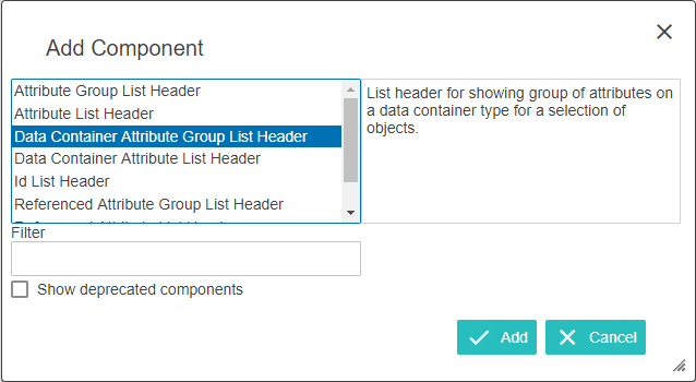
- Data Container Attribute List Header and Data Container Attribute Group List Header (to be used within a Dialog List Screen used to display a list of results for template selection and finding similar objects using Find Similar / Find Existing actions).
Refer to the Web User Interfaces topic for more information regarding how to configure and use Web UI screens and components.
It is possible to change the visual sorting order of the attributes in a Data Container in Web UI. From the STEP Workbench, navigate to the parent folder of the data container with the associated attributes. Notice in the following image that the attributes are listed alphabetically because the 'Manually Sorted' option is unchecked.
Note: The Globally Configured Data Container component ignores this function and sorts attributes / references based on the order they appear in the global representations settings.
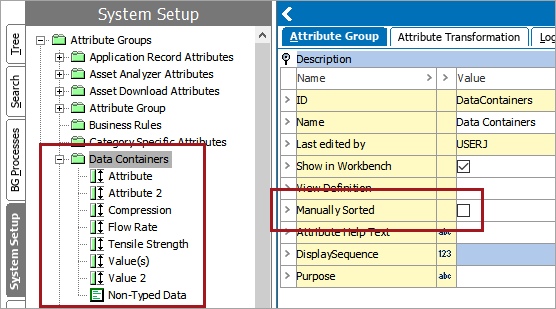
In Web UI, the Data Container for this object shows the attributes in this alphabetical order.
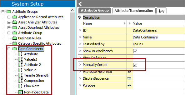
Once the 'Manually Sorted' option is selected and the attributes are rearranged in the desired order, the results will appear like so in the workbench.
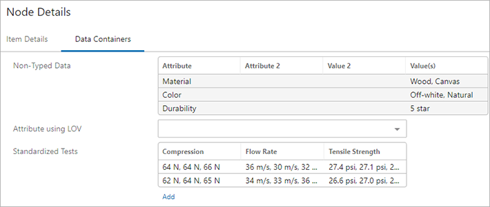
In Web UI, the order mimics how it was set in the workbench.
Note: This changing of order only affects the order in Web UI. The alphabetical order is maintained no matter what is done in the workbench.