Summary
The following enhancements and changes have been made to the Web User Interface:
-
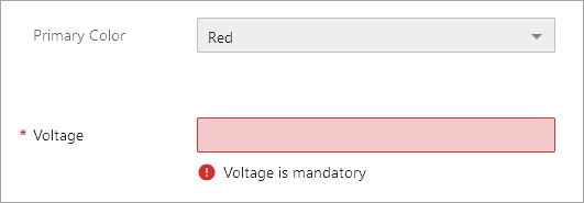
New mandatory, read only, and hidden options for attributes and references.
-
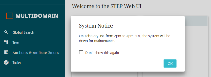
System announcement messages will be displayed after the user successfully logs into the system.
-
A number of improvements to the Referenced Asset Representation component.
-
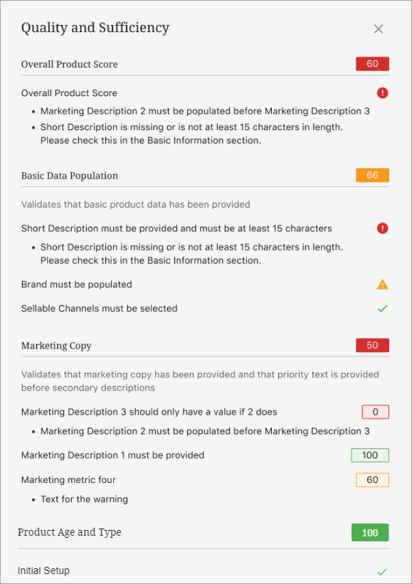
Sufficiency scores can now be evaluated for entity objects and displayed on the Sufficiency Card, increasing a user’s insight into data quality for both products and entities.
-
Product Summary Card and Sufficiency Card supports both Breadcrumb Type parameters.
-
A number of styling improvements in Sufficiency Panel Metric messages provides a better user experience.
-
A new ECLASS Advanced Editor Screen supersedes the ECLASS Advanced Screen to allow editing in the Web UI.
Details
New mandatory, read only, and hidden options for attributes and references in the Web UI
A new business condition allows super users to mark attributes and references as either mandatory, read only, or hidden in the Web UI. This ensures that only the relevant data is available, the mandatory data is visualized, and read-only data cannot be modified.
For additional documentation, refer to the Data Validation in Web UI topic in the Web User Interfaces documentation here.
For more information on this functionality, click the video below:
System announcements moved in Web UI and enabled for SaaS systems
In the Web UI, system announcement messages are displayed after the user successfully logs in to the system. The message can popup on any screen with the dialog displaying the system announcement as configured by the administrator. Previously, the system announcements were displayed on the login page and the SaaS environment and Single Sign-On (SSO) users did not get to view the announcements on the login page. Additionally, the application server no longer needs to be restarted when the announcement file has been updated with a new message.
For more information, refer to the Adding Announcements topic in the Web User Interfaces documentation here.
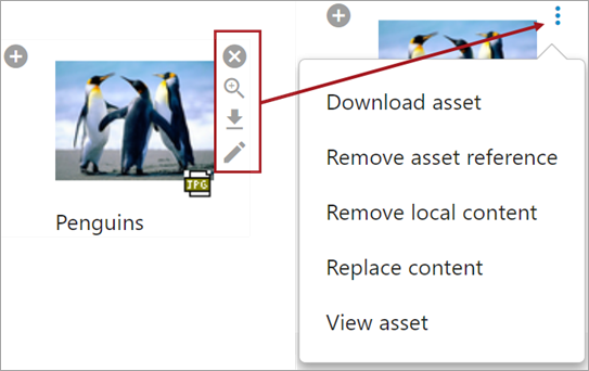
Enhanced Referenced Asset Representation
A number of improvements in the Referenced Asset Representation component have been implemented, enabling users to have a better user experience. They include the following:
-
The icons displayed on the right of the thumbnail image are now transformed into a single menu button which shows the actions in a pop-up window based on the configuration done in the Web UI designer.
-
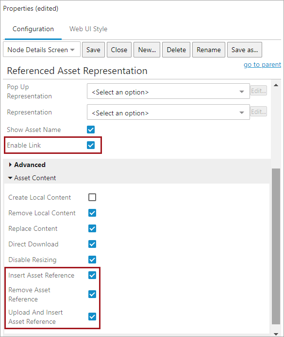
In Web UI Design Mode, administrators have more granular control to give users access to only what they need. The new parameters include enabling or disabling the functionalities below:
-
Allow users to insert an asset reference.
-
Allow users to upload a new asset and then insert it.
-
Allow users to remove an asset reference.
-
Allow users to navigate to a pre-configured asset management screen.
-
New parameters can be found under Asset Content (as shown below).
-
When Enable Link is selected, the user can navigate to the pre-configured screen showing the details of the asset. This allows users to inspect additional details and/or metadata, and also provides consistency across the UI as most places allow a clickable navigation link.
-
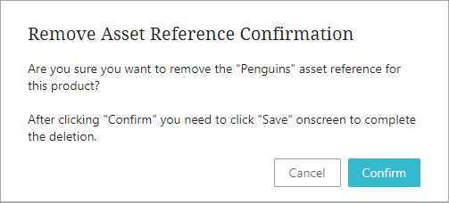
To prevent accidental unlinking, when the Remove Asset Reference is enabled, users will get a pop-up message to confirm, before the asset reference is deleted.
-
For assets with long names, the name is displayed to the full width of the asset and then is truncated. Hover to view the full name.
For more information, refer to the Referenced Asset Representation topic in the Web User Interfaces documentation here.
Sufficiency Card now supports products and entities
The 'Product Sufficiency Card' is renamed to 'Sufficiency Card' with the new support for entity objects, in addition to existing support for product objects. After configuration, selecting a product or entity object on a Node Details screen displays the sufficiency scores on the Sufficiency Card (via the Below Title child component). The Sufficiency Panel now also includes messages for both product and entity objects.
Although a single sufficiency cannot be used for both products and entities, to implement the functionality for products and entities simultaneously, a business condition must specify the relevant object type and be applied to all sufficiencies. For details on configuration, refer to the Sufficiency Scores for Product Data Quality and Completeness topic in the Data Governance documentation here.
Product Summary Card and Sufficiency Card support both 'Navigation' and 'Copy and Share'
In the Web UI, a new Breadcrumb Type parameter is available in the Product Summary Card and the Sufficiency Card, giving users the option to either use the breadcrumb as a navigable link or to copy the breadcrumb to clipboard so that it can be shared.
The default parameter for Product Summary Card is 'Navigation' and for Sufficiency Card the default parameter is 'Copy and Share.'
When 'Navigation' is selected the user will be able to navigate using the breadcrumb by clicking on it and when 'Copy and Share' is selected the user will be able to copy the product hierarchy path by clicking on it.
For more information, refer to the Below Title Product Summary Card topic in the Web User Interfaces documentation here.
Styling improvements in sufficiency panel metric messages
A number of styling improvements in the Web UI have been implemented, enabling users to have a better user experience. They include the following:
-
The Success, Warning, and Error text is now replaced by respective icons.
-
In the workbench, the Newline placeholder is introduced in the metric configuration which will add a line break for better visibility of error messages.
-
Spacing between metric titles and messages are aligned.
For more information, refer to the Sufficiency Panel topic in the Data Governance documentation here.
New ECLASS Advanced Editor Screen for editing ECLASS data
The ECLASS Advanced Editor Screen gives users of this product classification taxonomy the ability to maintain ECLASS Advanced data from the Web UI. This new screen improves upon and supersedes the view-only ECLASS Advanced Screen, which will be deprecated and withdrawn in a future release. For more details, refer to the Data Exchange Enhancements and Changes release note here
Explore further by clicking the video below. If it does not play as expected, it is also available in the Customer / Partner Communities and may also be accessible within Stibo Systems Service Portal.