The Product Summary Card child component on the Below Title component provides users with a collection of product information that displays just below the screen title on a Node Details screen.
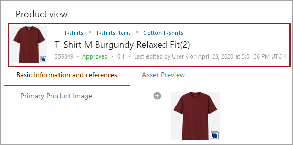
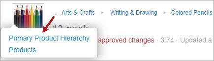
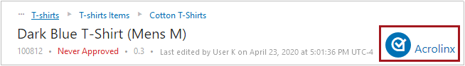
The Product Summary Card can be configured to show either a pre-selected grouping of product information, or a series of data points configured by the user. When the user selects the 'Description Card' option (an example of which is displayed in the screenshot above), the Product Summary Card will display the following information: a breadcrumb (shown in blue text in the screenshot above), name, ID, approval status (shown in green text above), revision number, and information related to the most recent update to the product, including the name of the user who last edited the product (or the user ID if no name is configured). When the 'Attribute Card' option is selected, users may tailor the card to display different values.
For details on the Below Title component, refer to the Below Title Component topic.
Configuring the Product Summary Card
To configure the display of the Product Summary Card, follow the instructions described below.
-
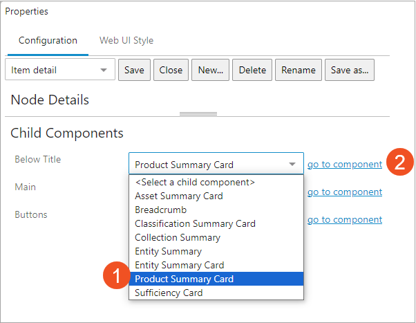
Access the designer on the Node Details screen mapped to the relevant product object type. Under 'Child Components', select the 'Product Summary Card' from the 'Below Title' dropdown. Then click 'go to component'.
-
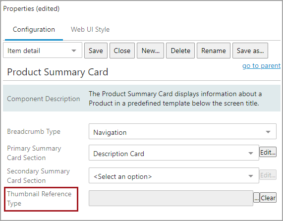
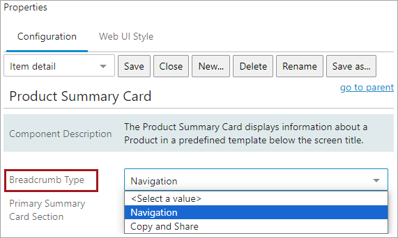
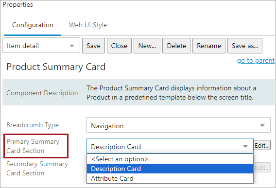
On the 'Product Summary Card Properties' screen in the designer, choose a 'Breadcrumb Type' option.
Note: A breadcrumb selection will only display when the Description Card option is chosen for 'Primary Summary Card Section'.
-
Navigation - (default) users click on any element in the breadcrumb path to auto-navigate to that element. Click the ellipsis at the beginning of the breadcrumb to show and navigate to hidden hierarchy levels.
-
Copy and Share - users click the breadcrumb to copy the entire hierarchy path to the clipboard.
-
-
Select one of two options from the 'Primary Summary Card Section': 'Description Card' or 'Attribute Card.'
-
Description Card - When selected, this option will display the following information in the Summary Card section of the screen: a breadcrumb (shown in blue text in the screenshot at the top of the page), name, ID, approval status (shown in green text ), revision number, and information related to the most recent update to the product. No further configuration is required with this option. Once selected, save the configuration and close the designer to activate the Summary Card on the screen.
-
Attribute Card - When selected, users may configure which data points to display in the card. To do this configuration, first select the 'Attribute Card' option, and then click the 'Edit...' button to the right of the dropdown. When this option is selected, the breadcrumb information does not display.
-
-
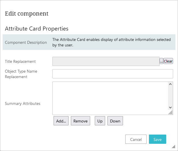
To configure the 'Attribute Card' option, users may add values to the fields that display in the 'Attribute Card Properties' pop-up.
-
Title Replacement - Click the ellipsis button (
 ) (located to the right of the field) to display a Node Picker that enables users to select an attribute whose value can be displayed in place of the product's name. If no attribute is selected, the product name will display. If no value has been set for the product's name, the product ID will display. It should be noted that if a multi-valued attribute with multiple values is selected to display in place of the object's name value, then all attribute values for that multi-valued attribute will display separated by the text, '<multipsep/>'.
 -
Object Type Name Replacement - Text added to this field will display in place of the product's object type name. In both cases, the value displays in capital letters.
-
Summary Attributes - The attribute values for the attributes selected in this field will display in the Summary Card section of the configured Node Details screen. When users click the 'Add...' button, an Add Component dialog displays that allows users to add either an Attribute component or a Data Container Attribute component.
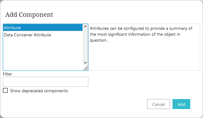
Select the component based on the kind of attribute required, and click Add. A pop-up displays. If an Attribute component is selected, the dialog pictured below displays.
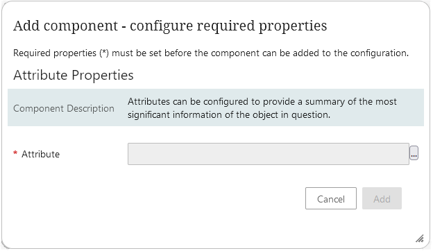
Click the ellipsis button (
) to display a Node Picker window from which users can select the desired attribute to display in the Attribute Card.If the Data Container Attribute component is selected, the dialog pictured below displays.
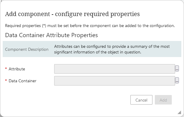
Click the ellipsis button (
) for the Attribute parameter to display a Node Picker window from which users can select the desired attribute to display in the Attribute Card. Click the ellipsis button () for the Data Container parameter to display a Node Picker window from which users can select the desired data container type to display in the Attribute Card.Only one attribute or data container attribute can be added per 'Add...' action. It is important to note that the selected attributes must be both valid for and linked to the product object type in order for the values to display.
-
-
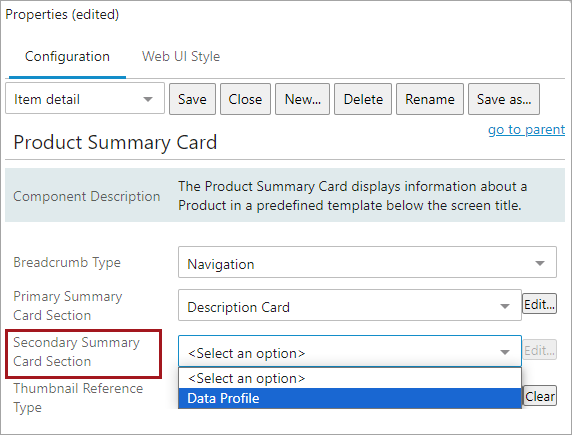
The 'Secondary Summary Card Section' can display additional information in the Product Summary Card dependent on which, if any, supplementary components have been configured for the system. Two options display for this parameter regardless of configuration: 'Data Profiling' and 'Acrolinx.'
If data profiling has been enabled on the product object, users may opt to add a 'Profile Findings' counter to the Summary Card that displays a number relevant to the data profiling configuration. To add the counter, select 'Data Profile' from the 'Secondary Summary Card Section' dropdown.
If the Acrolinx Sidebar has been enabled on your system, users may opt to add an Acrolinx button that will display to the right of the primary card information.
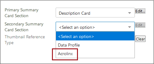
If 'Acrolinx' is selected, the Acrolinx button will display in the Product Summary Card as pictured below.
Note: The commercial license for Acrolinx is no longer available. The documentation is still available in the Acrolinx Sidebar topic.
This functionality has been deprecated and is no longer supported and/or available for new installations. This documentation is retained as a reference only for customers already using the functionality and for whom it remains available in the current state. The functionality will be removed in the future so customers using this should make plans to transition away from their implementation of it.
If a business analytics component has been configured for your system through PowerBI, an 'Analytics' option will display in the dropdown for the 'Secondary Summary Card Section' parameter. For more information on this, refer to the Power BI Flyout Panel topic in the Analytics documentation.
-
For Thumbnail Reference Type, select the desired image reference type of the image that you want to display in the Product Summary card. The image will display to the far left of the card information. Click the ellipsis button (
) to the right of the field to choose a reference type from the Node Picker dialog that displays. If a multi-reference reference type is selected, the first referenced image will display.