To edit components, select the desired screen and then configure the component properties shown. The properties that are available for each component vary depending on the component type. Configuration options may include the ability to enable / disable parameters based on checkboxes, make displayed component title changes, choose table sorting options, and much more. Configurations may be done by selecting checkboxes, using dropdown menus and node selector buttons to make selections, or by entering text into free-text fields.
For descriptions of the components available within the Web UI Designer, refer to the 'Web UI component configuration reference' available at [system]/webui/docs.
Prerequisites
The directions given in this document are simple examples on how to use the properties screens. Before beginning any steps, anyone editing components should be familiar with the Design Mode Basics topic and the Selecting Components topic.
Properties Area
The parameters that are available for each component varies depending on the component type.
- In design mode, select the component to edit.
- On the screen, the Designer displays the available properties that can be maintained for the component.
- The main parameters, those required or used most often, are shown automatically when the properties window opens. They also have a green background.
- Some parameters are optional and grouped together under headings (e.g., Validity, Advanced, Label Texts, and Selection Screens). These can be accessed by clicking the arrowhead icon next to the heading name.
- Changes made to the properties may be displayed directly on the screen as changes are made or will become applicable after saving the Properties screen.
Important: Some properties include a Title parameter, before entering a custom title, it is important to know if the title parameter offers i18n key functionality. Presence of an i18n key indicates that the field can be included in extraction for external translation, and that a value has not been manually populated. Once a value has been manually populated within the designer, it is no longer available for extraction, unless the manual value is removed and the configuration saved, closed, and then reopened. Customers planning to pursue or utilize Web UI translations should not overwrite i18n values manually in the designer, and should instead populate texts within the Web UI locales files on the application server. For more information, refer to the Localization topic in the Administration Portal documentation.
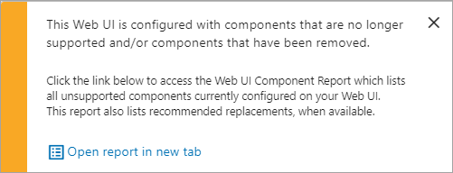
Note: If you enter design mode and have invalid settings (e.g., unsupported components), a pop-up will appear, and you will be able to access the Web UI Component Report so that you are able to update and/or remove the parameters / components that are not valid for your data structure. For more details about the report, refer to the Web UI Component Basics topic.
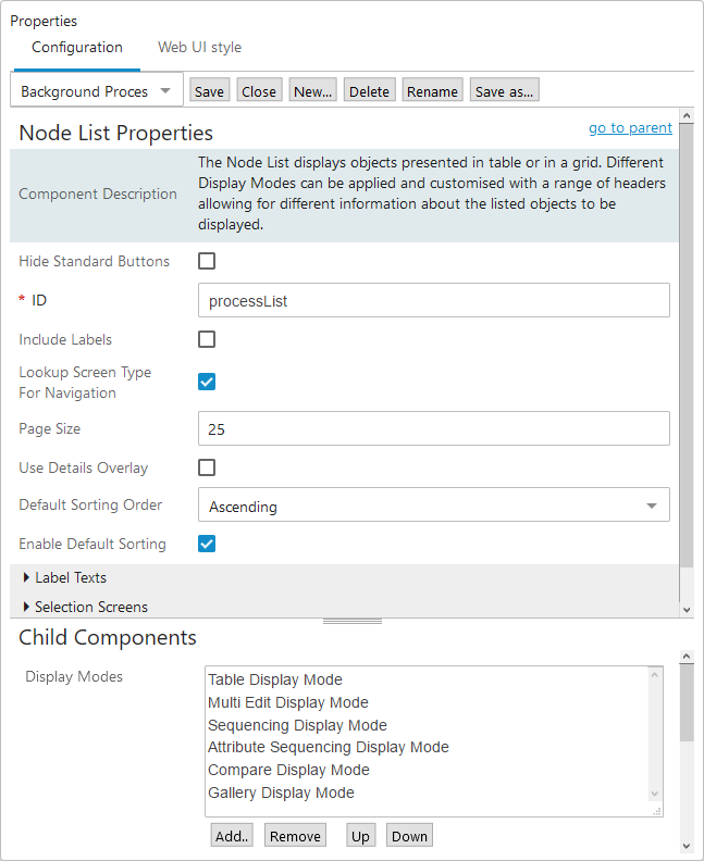
Child Components
Some Web UI components, called master components, can contain child components. Child components allow a user to drill down further into component configurations. These are maintained in the Child Components area in the Designer. Using the previous screenshot as an example:
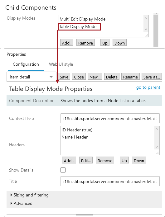
- Select the master component (Node List) you want to edit as described in the Properties Area section of this document.
- In the Child Components area, the child components that have been added to the master component (Table Display Mode) are shown. Remove or add more child components or change the sequence of the child components using the Up and Down icons.
Adding and Configuring a Child Component
- In the Child Components area, click the Add button, and a list of possible child components will be displayed in an 'Add component' dialog box.
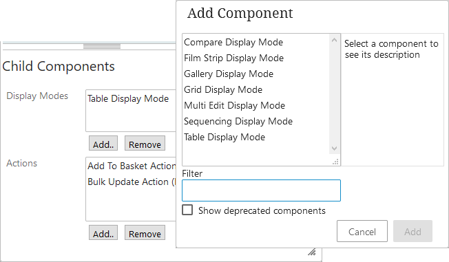
- Click on a component to make a selection, and then click Add.
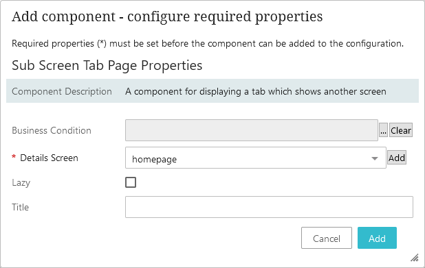
- If the chosen child component has a mandatory parameter that must be defined or verified before it can be displayed properly, a dialog will automatically show and selections / changes can be made. As an example, in the screenshot that follows, a user can change the default Details Screen before adding the child component—or leave the default 'homepage' selection and just click Add.
- If a dialog is not automatically displayed, no immediate component decisions need to be made or verified. The component will be added to the child component list and can be selected / maintained as any other component. To configure the component, double-click on the component name within the child component list and a properties screen will be displayed. Make selections as needed.
- Click Save on the properties screen before exiting design mode.
Changing the Sequence of Child Components
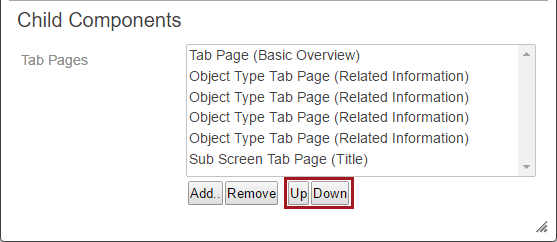
- In the child component area, click to select the child component to be re-sequenced. In the next screenshot, 'Tab Page (Images and Documents)' is selected.
- Click the Up or Down button to change the sequence of the selected child component.
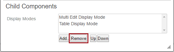
Removing a Child Component
- In the child component area, click to select a child component. In the next screenshot, 'Multi Edit Display Mode' is selected.
- Click the Remove button. The child component is removed from the screen.
Help Text
Context help is available for each component in both the Properties area and the Child Components area, and provides users with a brief explanation about the purpose of the component and/or parameter. This is especially helpful if the user is fairly knowledgeable about a configuration but needs a little guidance completing a step, enabling a specific parameter, or understanding a new component.
Access help text by placing the cursor over the component / parameter name. A circle icon with an 'i' inside of it will show. Click the icon and a dialog box displays with descriptive help text. To remove the help text box, click the 'x' in the top right corner of the box.
Invalid Properties
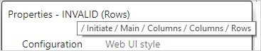
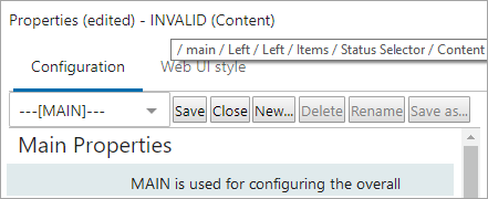
If you enter design mode and the Properties dialog indicates that there are invalid settings, you need to update and/or remove the parameters / components that are not valid for your data structure. For troubleshooting, the Properties dialog header identifies INVALID settings.
Hovering over the INVALID text displays the path to the parameter / component where there is a problem. Once the initial issue is fixed, additional errors may exist and need to be fixed. 'INVALID' will no longer display when validity is restored.