From a configuration perspective, the Web UI is largely a framework comprised of various components. Components can be built upon other components, which in turn form a foundation upon which still more components can be built. A good illustration of this concept would be a Node Details screen as a base component, a References component built on that, and then a Node Picker component built on that. As the Web UI continues to evolve from update to update, new components are introduced that may either solve for new business cases, or address existing business cases in a more efficient way. This means that components that have been replaced with newer, better ones, must enter the first stage of an established component removal process.
The stages of the component removal lifecycle are:
- Superseded - The first phase of the component removal lifecycle. Superseded components already configured will remain, and new instances of the component can be added if desired. The only change that occurs is that, in a component list where the relevant component is listed, the component description will indicate that the component is superseded and will list the component recommended to be used in its place.
- Withdrawn - The second stage of the component removal lifecycle. Withdrawn components already configured will remain and function as always, but if removed, users are unable to add new instances of the component.
- Deleted - The final stage of the component removal lifecycle. Deleted components that are configured on a system will be removed (no longer render or be shown) in the Web UI.
From the moment a component enters the 'Superseded' status to when it is finally deleted from the system represents approximately 12 months, or two release cycles.
There is also one additional phase or 'Status' that customers may view: 'Replaced.' The 'Replaced' status means that the system, when upgraded, will seamlessly exchange the replaced component for a new and improved component without requiring user action. This can be done if the stored configuration for both components have overlapping parameters. This way the replacing component can be loaded with the exact same parameters that have been stored for the old component. A good example of this is the 'Primary Navigation' component, which was replaced by the 'Global Navigation Panel' component. The 'Primary Navigation' component is automatically replaced upon upgrading, requiring no additional work for an admin user.
Depending on metrics collected regarding usage of components in the Web UI, some outgoing components may skip the withdrawal step and be deleted directly. For example, if a component has dropped out of usage entirely because the functionality exists in a different component, Stibo Systems may delete the component outright. The standard lifecycle applies to most components, but there may be exceptions depending on customer impact.
Web UI Component Report
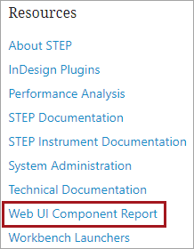
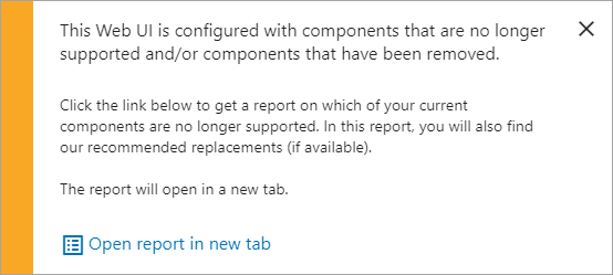
To help admin users manage their Web UI configurations more efficiently, the Web UI Component Report is available to admin users. Accessible via the Start Page and when accessing the designer in the Web UI, the Web UI Component Report lists all end-of-lifecycle components configured on all Web UIs added on a given system. The components shown in this report are components configured on a Web UI that have been deleted entirely (will not render), withdrawn (if removed, cannot be added again), or superseded (will work as usual, but a new and improved component is available). When available, the recommended replacement component is listed alongside the unsupported component; this gives the admin user ready access to information about which parts of their Web UI configuration have improved and require action, and also speeds the process of updating the Web UI for those components that require it.
The Web UI Component Report can be accessed in one of two places:
- clicking the 'Web UI Component Report' button at the top-right of the system Start Page
- clicking the link in the popup that displays when accessing the Web UI designer
All Web UIs configured on a system are listed along the left side of the screen in alphabetical order. Clicking any one of the Web UIs will auto-scroll the user to the position on the page where the selected Web UI's unsupported components are listed.
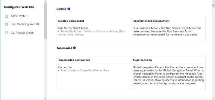
Each Web UI that contains unsupported components will list those components in alphabetical order in one of the three lifecycle status groups, (when applicable): deleted, withdrawn, and superseded. Each component in these groups will be listed in a column with the location of the configured component displayed in gray text below. A second column called 'Recommended replacement' lists the component best suited to replace the unsupported component. Refer to the Example section below for instructions on resolving the reported components.
The same privilege that allows users to enter Web UI Design Mode also allows users to log in and access this report. If users do not have this privilege, then upon entering their STEP username / password and clicking Login, they will view a 'You do not have privileges to access the Web UI Component Report' message.
Example
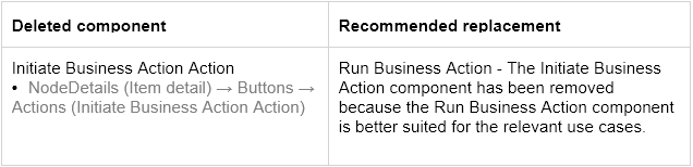
For the sample Web UI, the following deleted Web UI component is detected.
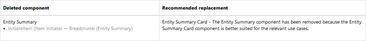
Open this Web UI, enter design mode, and go to the 'Item Initiate' screen. The Breadcrumb parameter is in the Child Components section.
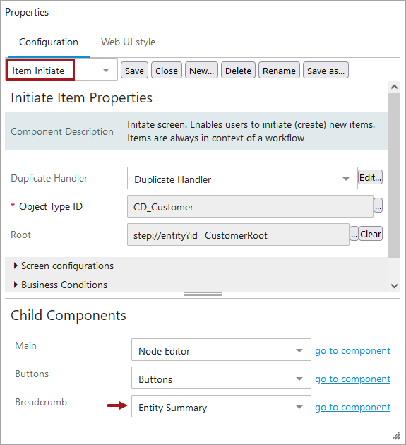
Configure the Breadcrumb component correctly per the Recommended replacement from the report.

Save the Web UI and refresh the Web UI Component Report to verify that unsupported component is no longer reported for this Web UI.
Global Navigation Panel Conversion
For users with Stack Panel components configured, which has been withdrawn, a 'Start Conversion' button will display in the Component Report for each applicable Web UI.
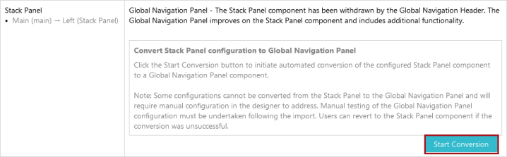
When the 'Start Conversion' button is clicked, the system automatically converts all Stack Panel and Corner Bar components that are compatible with the Global Navigation Panel.
These are the Stack Panel components that will convert to the Global Navigation Panel by clicking the 'Start Conversion' button:
Links Widget, Search Panel, Smart Sheet Export, Status Selector Sidebar Widget, Screen Navigation, Navigation, External Navigation, Node Navigation, Clear Basket Functionality. Smart Sheet Import Action. Vertical Panel components can be converted, depending on which components have been configured within those Vertical Panels. Status Selector Sidebar Widgets, for example, will not convert if configured on a Vertical Panel within a Stack Panel.
In addition to Stack Panel and Basket Stack Panel Items, the following Corner Bar components will also automatically be converted to their corresponding components for the Global Navigation Panel: Global Header Search, Corner Bar Search, Corner Bar Simple Search, Corner Bar Links Folder, and the Corner Bar Screen Navigation Action.
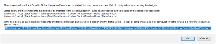
When the migration is complete, a message will display in the Component Report. Any components that cannot be automatically migrated will be listed in this notification message, along with a configuration path describing where the components were configured in the Web UI. Users may easily copy the path so they can paste it into a file to be used as reference when reviewing the configuration in the designer. In the example below, two Status Selector Sidebar Widget components that were configured on a Vertical Panel component cannot be converted and will need to be manually configured as components on the Global Navigation Component.
In all instances, administrative users are advised to review the converted Global Navigation Panel to confirm proper display. Once confirmed, admin users can safely delete the Stack Panel component, which will remove the 'Start Conversion' button from the Component Report for that Web UI.