The Links Widget can contain a series of direct links to various elements in the Web UI. A link can be configured in this widget that can, for example, import Smartsheets, display static text, or navigate the user to a specific product in the hierarchy or to a specific screen. This widget is especially useful when establishing direct links to commonly accessed areas or functionality.
Adding and Configuring a Links Widget
For more on adding widgets to the homepage, refer to the Adding Widgets to a Homepage topic.
To configure a Links Widget, follow the steps described below:
- In the 'Widget Grid Properties' in the designer, create a 'Links Widget.'
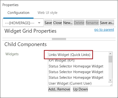
- To add links that will populate the widget, navigate to the 'Links Widget Properties' in the designer. On the 'Rows' field under 'Child Components,' click 'Add'.
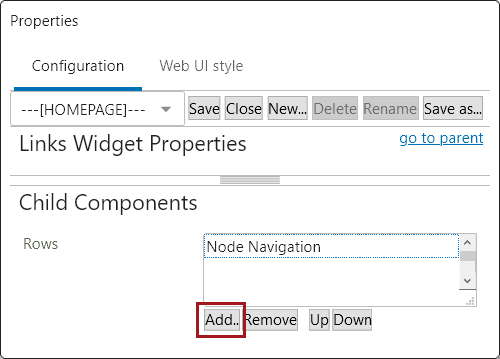
- In the 'Add Component' dialog, users may select a links component to configure.
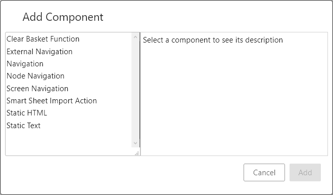
Links Widget components
The Links Widget components that can be applied and configured are listed and described below.
Some Links Widget components described in this topic will only display on a system based on which licenses have been applied to a system; application of those licenses is determined by customer need. If there are components described in this topic that are not available on your system but you feel they should be, contact Stibo Systems for more information.
Clear Basket Function
When added, the 'Clear Basket Function' allows users to click the link and clear the contents of the Basket component. Display of this component is dependent on applying the appropriate license.
GDSN Create RFCIN Link Action
Enables configuration of a link that allows the user to create a GDSN RFCIN message. Display of this component is dependent on applying the appropriate license.
External Navigation
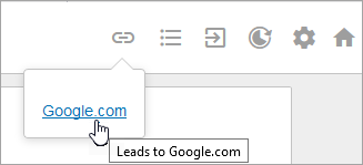
The External Navigation component enables a web link that navigates the user away from the Web UI to an external URL. In the example below, clicking the External Navigation-enabled link takes the user to Google.com.
When adding the External Navigation to the Links Folder, the External Navigation Properties configuration screen displays. All fields contained in this window are described below the screenshot:
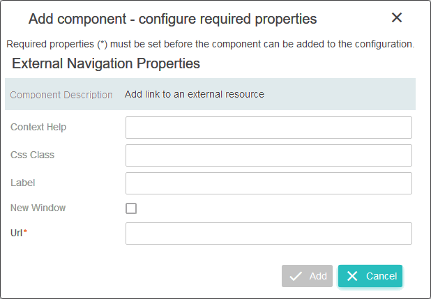
Context Help: Text entered will display when the cursor is placed over the link. This text can give the user additional information about the link. An example of this is shown in the first screenshot for this component. The Context Help has been configured to read, "Leads to Google.com". If left blank, the URL will display.
Css Class: Enter an optional name of a CSS-style to be set as the primary style for the component. The relevant license must be applied to make use of this field.
Label: Text entered in this field will display as the text of the hyperlink. In the first screenshot for the External Navigation section, the hyperlink text has been configured to read as, 'Google.com.'
New Window: Check the box for this parameter if the link should open the designated website in a new window rather than the window currently viewed.
Url: This is the only mandatory field. Enter the web address that the user will be taken to when they click the link.
Navigation
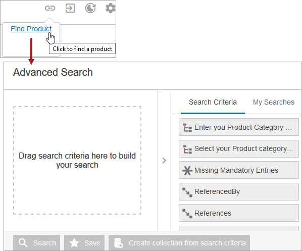
The Navigation component enables admin users to configure a direct link to a configured screen. In the example below, clicking 'Find Product' brings the user to an Advanced Search screen.
When an admin adds the Navigation link to the Link Widget, the Navigation Properties configuration screen displays. All fields contained in this window are described below the screenshot:
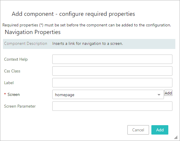
- Context Help: Text entered will display when the cursor is placed over the link. This text can give the user additional information about the link. An example of this is shown in the first screenshot for this component. The Context Help has been configured to read, "Click to find a product".
-
Css Class: Enter an optional name of a CSS-style to be set as the primary style for the component. The relevant license must be applied to make use of this field.
-
Label: Text entered in this field will display as the text of the hyperlink. An example of this is shown in the first screenshot for this component in which the hyperlink text has been configured to read as, 'Find Product'.
- Screen: This is the only mandatory field. Choose the screen to which the link will take the user. Alternately, admin users can click the Add button to create a new screen that the link will take users to.
- Screen Parameter: This parameter is used when navigating to a Batch Admin screen within a within a Navigation component. Add the batch ID to this field, which is the ID of the batch classification folder which is set via System Settings and then Web UI settings.
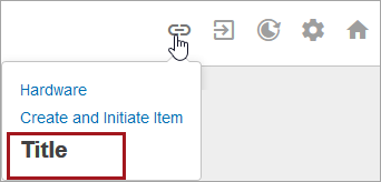
Node Navigation
Important: A configured and mapped Children of Types Screen must be in place for this component to work. For more information, refer to the Children of Types Screen topic.
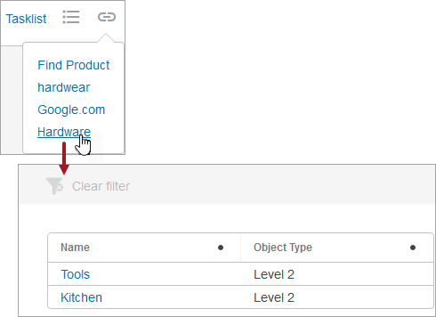
Clicking the Node Navigation link will bring you to a configured and mapped Children of Types Screen. You can view, at a glance, child objects of a specified object type or types.
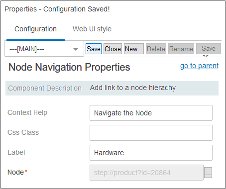
In the example below, the top node configured is called 'Hardware,' and clicking this displays its children.
When adding the Node Navigation, the Node Navigation Properties configuration screen displays. All fields are described below the screenshot:
-
Context Help: Text entered will display when the cursor is placed over the link. This text can give the user additional information about the link.
- Css Class: Enter an optional name of a CSS-style to be set as the primary style for the component. The relevant license must be applied to make use of this field.
- Label: Text entered in this field will display as the text of the hyperlink. An example of this is shown in the first screenshot for this component in which the hyperlink text has been configured to read as, 'Hardware'.
- Node: This is the only mandatory field. Click the ellipsis button (
 ) next to the field and select the desired node to which the user will access when clicking the link.
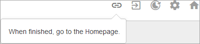
Screen Navigation
The Screen Navigation link brings you to the desired screen in the Web UI. It is primarily used for creating designated object types with the option of initiating them into workflows using the Initiate Item Screen. For more on creating and item initiating, refer to the Initiate Item Screen topic.
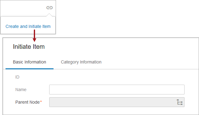
In the following example, clicking on the 'Create and Initiate Item' link displays the Item Initiate Screen.
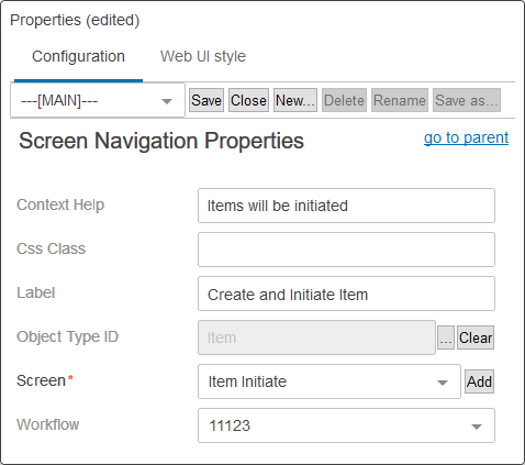
When adding the Screen Navigation, the Screen Navigation Properties configuration screen displays. All fields are described below the screenshot:
-
Context Help: Text entered will display when the cursor is placed over the link. This text can give the user additional information about the link.
- Css Class: Enter an optional name of a CSS-style to be set as the primary style for the component. The relevant license must be applied to make use of this field.
- Label: Text entered in this field will display as the text of the hyperlink. An example of this is shown in the first screenshot for this component in which the hyperlink text has been configured to read as, 'Create and Initiate Item'.
- Object Type ID: Select the object type that is to be created, initiated, or both.
- Screen: This is the only mandatory field. Choose a screen from the dropdown, or click the Add button to create a new screen.
- Workflow: Select the desired workflow from the dropdown menu for the designated object type to be initiated into.
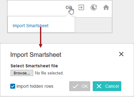
Smart Sheet Import Action
The Smart Sheet Import Action is used to import product data into STEP. Smart Sheet Import Action shows a dialog and does not require the user to select an import configuration.
For more on importing Smartsheets, refer to the Smartsheet Import Action topic.
When adding the Smart Sheet Import Action, the Smart Sheet Import Action Properties configuration screen displays. All fields are described below the screenshot:
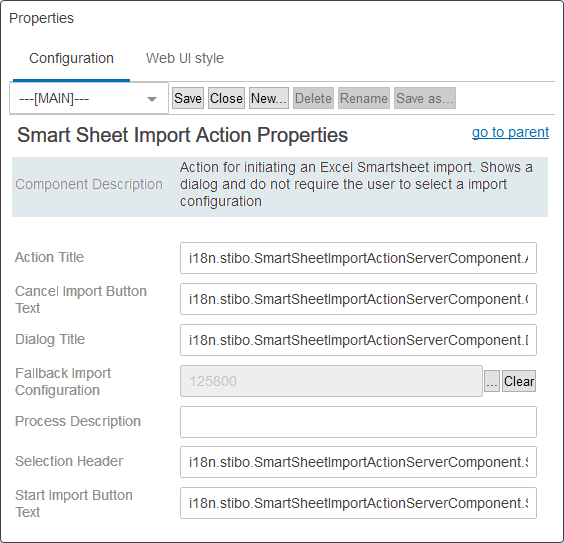
Note: All messages, titles, or labels in this configuration are displayed from the translation i18n keys that reside on the server. For more information about i18n keys, refer to the Localization topic in the Administration Portal documentation.
- In the Action Title parameter, enter a name for the action.
- In the Cancel Import Button Text parameter, enter the displayed text for the cancel button.
- In the Dialog Title parameter, enter a title for the import dialog.
- In the Fallback Import Configuration parameter, click the ellipsis button () and select an existing import configuration to apply to all Smartsheet imports where no import configuration was specified in the export configuration.
- In the Process Description parameter, enter a template for the process description.
- In the Solution Header parameter, enter a label for the select file prompt.
- In the Start Import Button Text parameter, enter the text that should appear for the start import button.
Static HTML
The Static HTML component is capable of displaying an html-block defined in screen configuration.
In the example below, the html tag '<h2>Title</h2>' was used.
When adding the Static HTML component, the Static HTML Properties configuration screen displays. All fields are described below the screenshot:
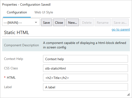
- Context Help: Optional help text for component to show in client (only applied in label+value view on an editor screen). Text entered will display when the cursor is placed over the static html. This text can give the user additional information about the text.
- CSS Class: Enter an optional name of a CSS-style to be set as the primary style for the component. The relevant license must be applied to make use of this field.
- HTML: This is the only mandatory field. HTML added to this field displays as an HTML block. As an example, if '<h2> Title</h2>' is added to this field, the word 'Title' displays styled as a secondary header.
- Label:Text entered in this field displays as the parameter label for the 'Static HTML' component when added to a Node Editor.
Static Text
Static Text is a component that displays text that is defined in screen configuration.
In the example below, directions are given to the user.
When adding the Static Text component, the Static Text Properties displays. All fields are described below:
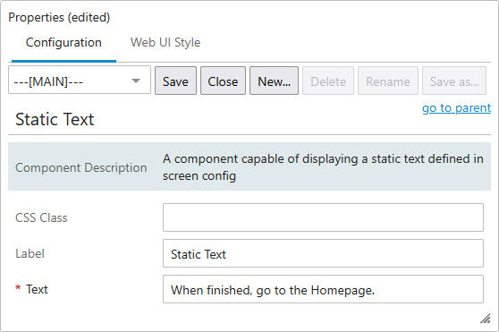
- CSS Class: Enter an optional name of a CSS-style to be set as the primary style for the component. The relevant license must be applied to make use of this field.
- Label: Text entered in this field displays as the parameter label for the 'Static Text' component when added to a Node Editor but does not display when 'Static Text' is applied to any other component in the Web UI.
- Text: This is the only mandatory field. Text entered in this field displays as-is on the component to which it has been applied.