Table settings are formatting options that are applied to tables either as global default settings on table object types in System Setup or as local settings on table definitions in the Tree. These settings not only include style tags, colors, and rules, but other formatting options such as table width, column width, row height, cell rotation, text alignment, table orientation, and image scaling options.
When applied globally in System Setup, the settings apply to table object types—table types, column types, and row types. When applied locally, these settings apply to table definitions—tables, rows, columns, and cells.
Global default settings inherit to the associated table types, column types, and/or row types wherever they are used in STEP. Using global settings lowers the amount of maintenance needed on tables that need similar formatting.
Local settings are applied if an exception is needed to the global settings, since local settings will override global settings. Another reason to use local settings is if you do not want to be locked into global default settings in the first place. Local settings can still be created once and used many, through inheritance. They can be applied to table definitions at a higher node in the product hierarchy and inherited by child nodes in the Tree below.
Note: Style tags, colors, and rules must be created in System Setup before they can be applied to table types and table definitions. For more information, refer to the Configuring Table Formatting in System Setup and InDesign topic.
Available Table Settings
The following table lists the available table settings and the table elements from which they can be accessed.
| Setting | Availability | |||
|---|---|---|---|---|
|
|
Table & Table Type |
Row & Row Type |
Column & Column Type |
Cell |
|
Width |
Yes |
No |
Yes |
No |
|
Height |
No |
Yes |
No |
No |
|
Text Style |
Yes |
Yes |
Yes |
Yes |
|
Background Color |
Yes |
Yes |
Yes |
Yes |
|
Yes |
Yes |
No |
Yes |
|
|
Yes |
Yes |
No |
Yes |
|
|
Yes |
No |
Yes |
Yes |
|
|
Yes |
No |
Yes |
Yes |
|
|
Vertical Alignment |
Yes |
Yes |
Yes |
Yes |
|
Cell Rotation |
Yes |
Yes |
Yes |
Yes |
|
Yes |
Yes |
Yes |
Yes |
|
|
Yes |
Yes |
Yes |
Yes |
|
|
Cell Image Scale |
Yes |
Yes |
Yes |
Yes |
|
Table Orientation |
Yes |
No |
No |
No |
|
Keep With Next |
No |
Yes |
No |
No |
For more information on how to apply these settings to the relevant table elements, refer to the following subtopics within this documentation section:
- Configuring Settings for Table Types and Tables
- Configuring Settings for Column Types and Columns
- Configuring Settings for Row Types and Rows
- Configuring Settings for Cells
Descriptions of Table Settings
Descriptions of all available table settings are as follows:
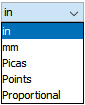
Width
When set on a table or table type, this setting defines the width of the entire table. When set on a column or column type, this setting defines the width of the column. Available units are inches, millimeters, picas, and points.
Also included in the dropdown is Proportional, which is used with columns. This setting provides the option to specify proportionality to other columns in the table.
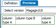
Example: When Table X is mounted, then column type B will be twice as wide as column type A. The proportion is 2 to 1.
| Table X | |
|---|---|
|
Column Type A |
Proportional is set to 1 |
|
Column Type B |
Proportional is set to 2 |
Proportional is set to 1 for Column Type A and Proportional is set to 2 for Column Type B. Column type B will be twice as wide as column type A, as illustrated in this screenshot from the Preview tab in STEP:
To prevent having to select a unit every time a width is set, a default unit can be set in System Settings under Users & Groups. Refer to the Table Defaults topic for more information.
Height
Only available for rows. Defines the height of the specified row type or row. Available units are inches, millimeters, picas, and points.
To prevent having to select a unit every time a height is set, a default unit can be set in System Settings. Refer to the Table Defaults topic for more information.
Text Style
Defines the text style for the table, column, row, or cell. Contents of the dropdown list are populated by style tags created in System Setup.
Background Color
Sets the background color of the table, column, row, or cell. Contents of the dropdown list are populated by table colors created in System Setup.
Rule Above
Controls which line style is used as the top border of the table, row, or cell. Contents of the dropdown list are populated by table rules created in System Setup.
Rule Below
Controls which the line style is used as the bottom border of the table, row, or cell. Contents of the dropdown list are populated by table rules created in System Setup.
Rule Left
Controls which line style is used as the left border of the table, column, or cell. Contents of the dropdown list are populated by table rules created in System Setup.
Rule Right
Controls which the line style is used as the right border of the table, column, or cell. Contents of the dropdown list are populated by table rules created in System Setup.
Vertical Alignment
Controls the vertical alignment of cell contents (text and images) as follows:
| Alignment | Description | Example |
|---|---|---|
|
Top |
Aligns contents to top |
|
|
Center |
Centers contents vertically |
|
|
Bottom |
Aligns contents to bottom |
|
|
Justify |
Aligns content evenly from top to bottom |
|

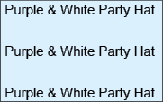
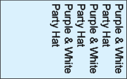
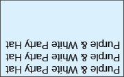
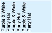
Cell Rotation
Controls the orientation of cell contents (text or images). Cell contents can be rotated 0, 90, 180, or 270 degrees, as follows:
| Cell Rotation | Example |
|---|---|
|
0 |
|
|
90 |
|
|
180 |
|
|
270 |
|
Process Flag
Nothing is typically available in this dropdown list. This area is sometimes used to store custom table settings.
Cell Story Direction
Determines whether the contents of the cells in the table (text and images) are displayed horizontally or vertically.
| Cell Story Direction | Direction |
|---|---|
|
Horizontal (default) |
Sets the text direction to horizontal: |
|
Vertical |
Sets the text direction to vertical: |


Cell Image Scale
Controls the size of images linked into the cell. Images may be scaled from 25% to 500%.
By default, the Cell Image Scale field is blank. If this field is left blank, and a width or height has not been set on the column or row containing the image, the image will mount at 100% (actual size). If a scale value is entered, the image will mount at the specified size, even if a width or height has been set on the column or row.
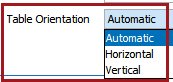
Table Orientation
Determines how STEP calculates cell values based on the placement of the data providers (e.g., products) and data selectors (e.g., attributes) in the table. This setting enables more predictability in cell values after transformations are applied.
Note: This option is only available when defining settings for table types or tables.
The available Table Orientation options are:
- Automatic: This is the default setting. The Automatic orientation calculation treats a table as horizontal if it encounters a data provider in a row, and vertical if it encounters a data provider in a column.
- Horizontal: When set to Horizontal, STEP calculates the cell value based on the assumption that the data provider is in the row and the data selector is in the column.
- Vertical: When set to Vertical, STEP calculates the cell value based on the assumption that the data provider is in the column and the data selector is in the row.
Data Providers and Data Selectors
The following table explains which content definitions are considered Data Selectors and which content definitions are considered Data Providers. For full details on these content definitions, refer to the Content Definitions topic.
Keep With Next
Only available for rows. Check this box if rows, or rows of the row type, should remain with the next row in the table if the mounted table splits across a column or page. (A table will split across a column or page if it is too large to fully mount in a single column or page.) The row will be mounted onto the following column or page in order to keep it with the next row.
Considerations and Limitations
The following settings are not visible in the STEP Tables Preview:
- Vertical Alignment
- Cell Rotation
- Cell Story Direction
To preview these settings in the table, you must either use the Proof View in the workbench or Web UI; or mount the table in InDesign.
For more information, refer to the Print Proof View topic and the Mounting Pages in Print Publisher topic, both in the Publisher (Adobe InDesign Integration) documentation.