Summary
The following enhancements have been made to the Web User Interface:
- Forgot Password functionality now available on Web UI login screen.
- Admin users now have the ability to assign a new or existing user to a user group in the Web UI.
- Users can now manage attributes and attribute groups in the Web UI by adding and deleting attributes to/from attribute groups.
- Attribute and reference inheritance indicators now display in tabular views.
- Older Web UI components are entering new phases of the component lifecycle.
- The Data Issues Report bind now supports improved error handling on attributes and references on Node List screens in the Web UI.
- Multiple exports from the Export Action and Custom Export options can now be distinguished by a unique date / time stamp in the file name, which is also now part of the background process name.
- The new Export menu on the Search Screen includes Export Current View, which allows users to export data selected on the search screen.
- Objects can now be opened from a Task List and display on a new tab in a web browser.
- The Sequencing Display Mode in Web UI has been extended to support classifications and products within classifications.
- A variety of improvements have been made on the Search Screen.
- The 'elasticsearch-integration' component used for the faceted Search Screen supports Version 7.9.3 of Elasticsearch and Kibana.
- There is now a new header for tables on a Node List that uses business functions.
- The usability of the Sufficiency Panel within Web UI has been improved.
- Users are now able to change the locale of the Web UI being viewed without having to log out of the Web UI first.
- User notifications in the Web UI involving workflow warnings and errors have been improved for greater clarity.
- Object names now display instead of their IDs in four commonly used Web UI components, including the name of the Web UI in the browser tab.
- A series of configuration updates have been made to the 'Run Business Action' component that significantly improve its utility and functionality.
- The flexibility of the 'Run Business Action' component has been updated to support localized messages shown to users based on the selected locale.
- Summary Cards now display the user name of the user who last edited the product, asset, entity, or classification being viewed.
- The Simple Import Widget has been updated to allow users to map incoming LOV values to the corresponding LOV value and/or the value ID.
- The 'References' and the 'ReferencedBy' criteria in the Web UI Advanced Search have been updated to include a new 'Search Below' option.
- Defining targets in the References component can now be done using a business function.
- The 'Does not contain' filter condition is now updated to accurately account for multi-valued cells.
- An enhancement has been added to the Custom Export Action component that improves export clarity in specific scenarios.
Details
Forgot Password feature for Web UI
Users can now easily reset forgotten passwords in the Web UI.
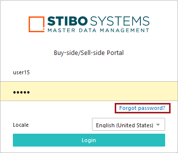
By clicking the 'Forgot Password?' link located beneath the login fields, users will be redirected to a page where they are asked to supply their username and email address.
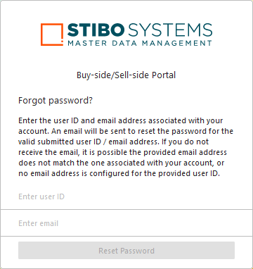
If the information provided matches the user data accessible in the Users & Groups node on the workbench, the system sends an email to the submitted email address that includes a link. When clicked, the user is taken to a page where they can then change their password. When complete, the user is directed back to the login page where they can enter their new password and obtain access to the Web UI. Previously, users relied on admin users to re-establish Web UI access. This method gives users the ability to independently manage their passwords and allows admin users to focus on other priorities.
It is important to note that this feature does not extend to system implementations using single sign-on (SSO) or Lightweight Directory Access Protocol (LDAP) to access the Web UI. The 'Forgot Password' option is not displayed for those users.
For more information on the Forgot Password feature in Web UI, refer to the Accessing a Web UI topic in the Web User Interfaces documentation here.
Adding users to groups in Web UI
When admin users create new user profiles in the Web UI via the 'User List' screen, they can now also select which user group or groups the new user will be added to. Previously in the Web UI, there was no ability to determine which user groups a new user was assigned to.
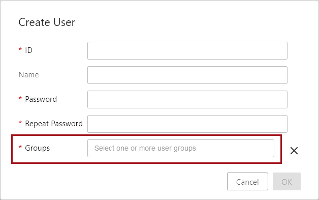
Based on an admin user's privileges, clicking into the new 'Groups' parameter (as shown in the screenshot above) will display a dropdown of either all user groups configured on a system or just those to which the logged-in user belongs.
The new functionality respects privileges. Suppliers and vendors will be restricted from adding new users to any non-supplier / vendor user groups.
Additionally, a new 'User Groups' component can now be added to 'User Details' screens. This gives admin users the ability to edit user groups for existing users.
For more on the User List screen, refer to the User List Screen topic in the Web User Interfaces documentation here.
Adding and deleting attributes to/from attribute groups in Web UI
Using the Attribute Management screen in the Web UI, users now have the ability to manage which attribute groups a given attribute is part of. With the addition of this feature, the ability to effectively manage attributes in the Web UI has taken a significant step forward. Data stewards and product managers now have the flexibility they need to effectively manage attributes and attribute groups in the Web UI.
The new 'Attribute Group(s)' parameter, provided by default on new Attribute Management screens, enables this flexibility by displaying all attribute groups an attribute is part of, and allows users to both remove an attribute from an attribute group, or add an attribute to an attribute group.
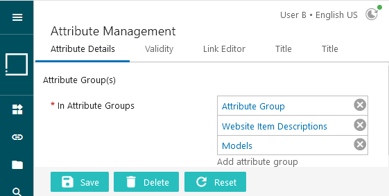
Users may also add the new field to existing Attribute Management screens by adding the new 'Attribute Groups' parameter in the designer.
If a user is not properly privileged to manage attributes in the Web UI, the list of attribute groups to which the attribute is linked will continue to display, but the edit functions (add and delete), will not be active.
For more information, refer to the Attribute Management Screen topic in the Web User Interfaces documentation here.
Inheritance indicators in Node Lists and tabular display components
Attribute and reference inheritance will now be displayed to users working on data in tables via inheritance indicators. This update helps give data stewards a clearer picture of how inheritance affects their data, allowing them to more easily manage and act on the information provided.
Users working on Node Lists (viewed in Multi Edit View Mode), Multi Revision screens, and Multi Reference screens will have one of two inheritance indicators display in relevant cells on these screens:
| Inherited from context |
Red arrow |
| Inherited from hierarchy | Green arrow  |
| Inherited from context and hierarchy |
Green arrow |
As demonstrated in this table, there are two inheritance scenarios indicated with the same green arrow.
To view which of the two scenarios is applicable, users can hover the cursor over the green arrow. Doing so will display a small information window that describes which inheritance applies to the attribute or reference in question. In the example below, the attribute is inherited from another context and from the hierarchy. Similar descriptive pop-ups will display when hovering over any of the inheritance-indicating arrows.
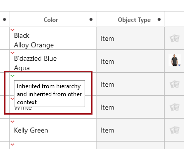
If a multi-attribute or multi-reference cell includes a mix of inheritance types, only one inheritance indicator arrow will display. This means that only one arrow will display even if both types are represented in the cell. The rules governing this are as follows: context inheritance (red arrow) will display over hierarchical inheritance (green arrow), and a reference that is inherited both from context and hierarchy (green arrow) will display over all other types of inheritance.
Additionally, when multiple references display in a cell under the 'References' header, each reference object will now display on cards, as shown in the screenshot below. This update enhances table display and makes multi-reference presentation clearer by defining where one reference object ends and the next one begins.

For more information on inheritance via the product hierarchy, refer to the Inheritance in the Product Hierarchy topic in the Getting Started documentation here. For more information on inheritance via context, refer to the Maintaining Contexts topic in the System Setup documentation here.
Web UI Component Lifecycle Updates
Continuing with the effort undertaken with the 10.0 release, some older components are entering new phases of the component lifecycle with the 10.1 release. The purpose of moving underused or obsolete components through this lifecycle process is to ease some Web UI configuration challenges, increase the support team's focus on the most utilized components, and to introduce more predictability into system upgrades as they relate to the Web UI.
For more information on this process, refer to the Web UI Enhancements and Changes release note from the 10.0 release here.
The following components are being withdrawn:
Initiate Business Action Action
Stack Panel
Withdrawn components already configured will remain and function as always, but if removed, users are unable to add new instances of the component.
The following components are being deleted:
Advanced Merge Data Container Header (AdvancedMergeDataContainerValueHeader)
Asset Mid Sized
Asset Thumbnail
Attribute Link Completeness Header
Attribute Link Editor
Background Process Detail
Background Processes
Check Duplicates Action
Corner Bar Simple Search
Data Container Attribute View Editor (DataContainerAttributeViewEditor)
Deduplication List Tab Page
Entity Summary (EntitySummary)
Move Action
Node Hierarchy
Referenced By
Referenced By Tab Page
Run Server Script Action
Smart Sheet Export
Status Selector
Status Selector Widget
Template Title Header
Deleted components that are configured on a system will be removed (no longer render or be shown) in the Web UI.
For a full list of components that are entering these phases, and additional information regarding how to manage the transition away from these components following an upgrade to 10.1, refer to the 10.1 Upgrade Guide here.
Extended error handling for Node Lists using the Data Issues Report bind
The Data Issues Report bind now supports improved error handling on attributes and references on Node List screens in the Web UI. This update advances the ability of the Data Issues Report bind to bring timely messages into the Web UI precisely when they can be acted upon most effectively.
When used with the Run Business Action, Submit, Bulk Update, Approve, or Initiate Business Action Web UI components, the Data Issues Report bind now indicates cells in either warning or error status. Warnings will use a yellow triangle and an error will use a red circle. Users may hover over the cell to view a popup display containing the warning or error message, or they can review the warning or error message in the Warning Notification Panel. This panel is accessible by clicking the Warning Notification Panel button in the Message Area, as shown in the screenshot below.

Previously, warnings and errors triggered by running business rules that use the Data Issues Report bind were only compatible with Node Editor screens.
Specific Node List cells with warnings are shaded orange with a yellow caution triangle icon in the upper right-hand corner of the cell.

Specific Node List cells with errors are shaded red with a dark red circle icon in the upper right-hand corner of the cell.

Alternatively, the entire row can be shaded either orange or red depending on whether an error or warning is applicable.
When users hover over an affected cell that contains multiple attribute values or referenced objects, the first relevant warning or error message displays. If there are additional messages, users may click the message text to expand the popup to show all relevant messages.

Alternatively, hovering the cursor over the cell that contains errors will cause a popup to display that lists the errors.

Warnings and errors prompted via the Data Issues Report bind are visible on Node Lists only when viewed using the Multi Edit Display Mode.
For more information on the Data Issues Report bind, refer to the Data Issues Report Bind topic in the Resource Materials documentation here. For more information on the components mentioned in this release note, refer to the Action Buttons topic in the Web User Interfaces documentation here.
File name template updates for Export Action and Custom Export Action
Previously, by default, all data exports using Export Action or Custom Export Action created files with the same name. Now, the default template for each exported file includes a unique date / time stamp for both the file name and the background process (BGP) name. Having a unique file name that is also associated with the BGP simplifies tasks like error troubleshooting and correction for both administrators and end users. Saved export configurations are available when configuring the Export Action button and allow for static text (such as 'TakeAction' shown below) to be included in the file name as well as the BGP name. Export files can be distinguished from one another and identified based on the BGP. Links for exported files in the Web UI include a 'Save As' option on the right-click menu, allowing users to further improve the file name on local copies of exported files as needed.
This constitutes a change in functionality. If a downstream system that consumes the exported data requires the previous default file name, manual updates must be made to the configuration to overwrite the new default and restore the expected file name.
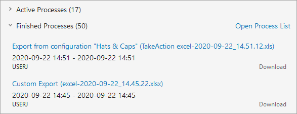
For more information, refer to the Action Buttons topic in the Web User Interfaces documentation here.
Export Current View available in Search Screen
Users can now easily export the data selected on the Search Screen as an Excel file for quick reporting via a background process. No export configuration is required for the new Export Current View option on the Export menu. This new option mirrors the Custom Export Action and exports the information included in the Define View setting for the selected objects.
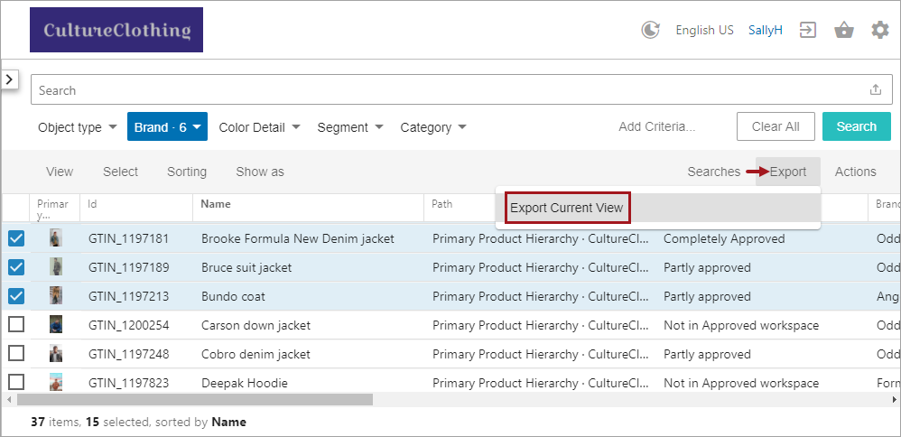
The Search Screen is activated by the Faceted Search User Experience commercial license. Contact your account manager or partner manager to begin the process of enabling a license or licenses for your system.
For more information, refer to the export option in the Search Screen Actions topic in the Web User Interfaces documentation (here), which shows updated functionality introduced with release 10.3-MP4.
Open an object from a Task List in a new tab
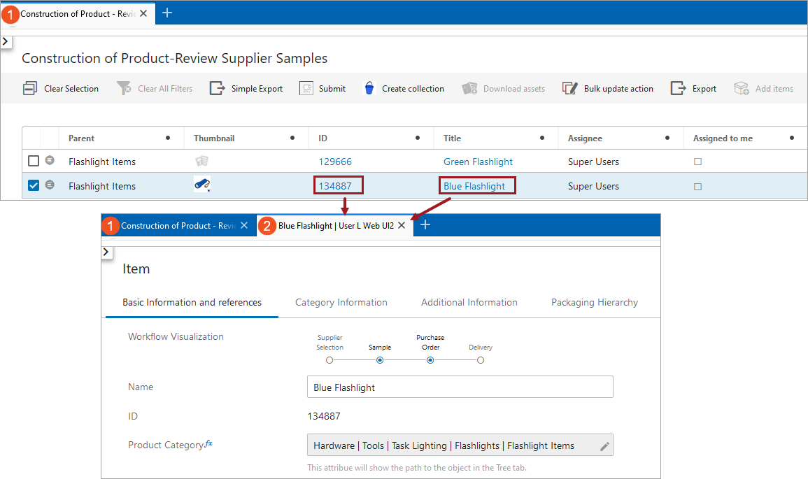
It is now possible to open an object from a Task List in a new tab by pressing Control and left-clicking the ID or the Title link in the Task List. Mac users press Command and left-click the ID or Title link. The new tab opens and becomes the tab of focus.
This new feature which allows for navigation between tabs is helpful for users who want to keep the Task List open but also want to work on an object or multiple objects in a Task List simultaneously.
Sequence Display Mode now supports classifications
The Sequence Display Mode on a Node List in Web UI is now extended to support classifications. After setting the Manual Sort option on the object type of the classifications to 'yes' in workbench, users may order the classification folders as well as any products within these folders with the Sequence Display Mode in Web UI. Any changes made to the sequence display in Web UI will also be reflected in workbench.
Previously, this component only worked with products and attributes.
Enabling Sequencing Display Mode to work with classifications permits users to order their products for the desired output on websites and in catalogs.
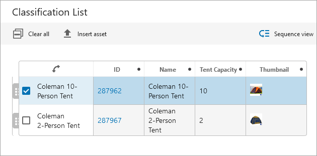
For more on the Sequence view in Web UI, refer to the Node List Component topic in the Web User Interfaces documentation here.
Faceted Search Screen improvements
The following improvements on the faceted Search Screen give users easier access to objects that require enrichment and give administrators more control over search results:
- Static facets on the faceted Search Screen now include a '(Blanks)' option which allows users to search for items that have no value. Additionally, users can now view and work on a list of items that have missing data. Refer to the Search Screen Static Facets topic (here), which shows updated functionality introduced with release 10.3-MP4.
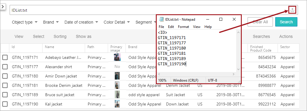
- The name of the uploaded file is now included in the recent search suggestions instead of listing the IDs being searched. Users can now repeat the file upload process without having to know the IDs included in the file. Refer to the Search Screen Search Bar topic (here), which shows updated functionality introduced with release 10.3-MP4.
- New options in the sharedconfig.properties file give administrators more control over the fuzzy search settings. A fuzzy search returns items when they do not exactly match the search criteria, allowing for typos and near matches. By default, the Elasticsearch.Query.Fuzziness option is set to AUTO as recommended by Elasticsearch. The Elasticsearch.Query.FuzzyPrefixLength option was previously set to two (2) characters but is now set to three (3) characters by default. The prefix indicates the number of starting characters that must match for an item to be included in the returned search results. Refer to the Search Screen Search Bar topic (here), which shows updated functionality introduced with release 10.3-MP4.
The faceted Search Screen is activated by the Faceted Search User Experience commercial license. Contact your account manager or partner manager to begin the process of enabling a license or licenses for your system.
For more information, refer to the Web User Interfaces documentation topics identified above.
Elasticsearch and Kibana version 7.9.3 supported
The 'elasticsearch-integration' component has been verified to perform successfully with Version 7.9.3 of Elasticsearch and Kibana. Additionally, Elasticsearch and Kibana Version 7.1.0 continues to be supported. Regardless of the supported version in use, the same version must be used for both Elasticsearch and Kibana. The Elasticsearch database search engine populates data for the faceted Search Screen search results. Kibana is an administrator tool that can be used to troubleshoot searched data issues. For more information, refer to the Elasticsearch Setup topic in Web User Interfaces documentation here.
The faceted Search Screen is activated by the Faceted Search User Experience commercial license. Contact your account manager or partner manager to begin the process of enabling a license or licenses for your system. It is recommended that customers consult with Stibo Systems Technical Services to implement this solution.
New table header to return a node from a business function
When viewing an item in a table in the Web UI, there is now a business function table header that enables users to retrieve the title of a single related node, such as a parent or child, where there is only a single relation of that type. If this related node is mapped, a user can click on the related item, view or make edits to the related item, and then return back to the table. This Business Function to Node table header can be applied to any table on a Node List.
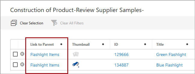
For more information, refer to the Node List Headers topic in the Web User Interfaces documentation here.
Sufficiency Panel error messages correspond with related metrics in Web UI
To further enhance the clarity of sufficiency scores in the Web UI, any returned error messages are now clearly aligned with the metrics to which they belong. Previously, error messages were grouped together below the Data Sufficiency title. This update will make it easier for users to quickly identify and correct any potential issues with data quality and completeness, leading to more accurate and timely product data.
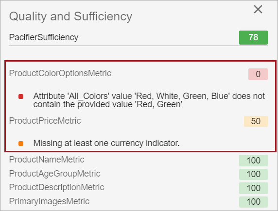
For more information regarding data sufficiencies and the Sufficiency Panel in the Web UI, refer to the Sufficiency Panel topic in the Metrics documentation here.
To access sufficiency scores within the Sufficiency Panel, the add-on component 'data-sufficiency' must be enabled. Instructions for installing components can be found in the SPOT Program topic in the System Administration Guide found in Downloadable Documentation.
Users can select or change locale while in Web UI
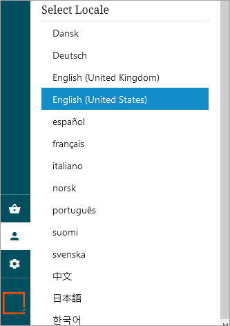
Users are now able to change the locale of the Web UI being viewed without having to log out of the Web UI first. Previously, the only way to change locale was to log out of the Web UI, select the desired locale from a dropdown on the login screen, and then log back into the Web UI. While this option is still available, this new way to select locale, which does not require any configuration and is available through the Global Navigation Panel, enables users to easily switch between locales by clicking on the User Settings button and scrolling down to the Select Locale section of the User Settings column.
Additionally, this new locale selector enables users who normally bypass the Web UI login screen, such as for systems configured with Single Sign On (SSO), to select a locale different from the browser’s preferred language. The selected locale will be highlighted, and each time a new locale is selected, the Web UI will refresh signaling that the new locale has taken effect. There are thirteen locales that come standard with each Web UI: Danish, German, English, Spanish, French, Italian, Norwegian, Portuguese, Finnish, Swedish, Chinese (simplified), Japanese, and Korean.
For more information, refer to the Global Navigation Panel topic in the Web User Interfaces documentation here.
Improved messages for workflow errors
User notifications in the Web UI involving workflow warnings and errors have been improved for greater clarity.
Now, Web UI users who:
- submit an object from a Task List only to find the object has already been submitted,
- click on an object in a Task List only to find the object has already progressed to the next workflow state, or
- submit an object in a workflow from a Node Editor when that object has already been submitted to that workflow
will now be presented with new warning and error messages that more clearly describe the reason why those actions cannot be completed as intended.
For example, users working on a Task List who attempt to submit an object that has already been submitted receive this warning message:

Users who click on an object on a Task List in which the object has already been submitted by another user will receive an error message like the one pictured below:

Users who submit an object from a Node List into a workflow when that object has already been submitted will receive a warning message like the one pictured below:

Implementation of clear warning and error messages for workflows reduces confusion on enrichment teams, and facilitates collaboration that can help move products to market more efficiently.
For more information on managing workflow tasks, refer to the Moving Tasks Through a Workflow in Web UI topic in the Web User Interfaces documentation here.
More consistent display of names in Web UI
To apply additional consistency in how Web UI elements are labeled, object names will now display instead of their IDs in four scenarios described below. Despite an internal standard that the name of an object should display in place of its ID, there were still instances where the ID displayed when the name would provide more helpful information to the user.
The following display scenarios have been updated with this release:
- When logged into a Web UI, the browser tab will now display the name of the Web UI rather than the ID.
- On the Start Page, the Web UIs configured on a system will now display in alphabetical order by the name of the Web UI rather than ID.
- On Revision Headers configured on Node Lists, the user listed as having made the last revision will now have their name display rather than their ID.
- When Revision History is enabled on a Node Editor, the name of the user who last revised the object will display rather than the ID.
If no name for a Web UI or user is configured, the ID will display.
It should be noted that following an update to 10.1, these changes go into effect for all users.
Run Business Action component enhancements
A series of configuration updates have been made to the Run Business Action component that significantly improve its utility and functionality:
- Admin users now have the ability to configure the Run Business Action component with a confirmation dialog that will display after a business action has been initiated but before it is executed. Enabling this new 'Include Confirmation Dialog' parameter can help prevent inadvertent execution of resource-intensive or far-reaching business actions via the Run Business Action button.
- Run Business Action components configured as toolbar actions on Node Lists can now be configured to be made active (i.e., clickable) without requiring the user to first make a selection from the Node List. To enable this feature, users can uncheck the checkbox for a new 'Disable for Empty Selection' setting, which is defaulted to be enabled. This setting allows admins to keep a Run Business Action button active regardless of whether a selection has been made. For example, business cases in which executing a Run Business Action will create a new product, the Run Business Action button will be active and clickable without a selection.
- The Run Business Action component configuration, 'Business Condition To Show Or Hide Button,' allows an admin to determine under what conditions a specific Run Business Action button will display through application of a business condition. For example, if only those users in a specific user group should have access to the button, or if only those users viewing a specific product should have access to the button, a business condition can be written and applied to the Run Business Action button that will restrict display of the button unless those conditions are met. In this way, high-impact Run Business Action buttons will only be accessible to those users who require access. The condition will run on the current node, which can be the current selection or the current user. In cases where there is no current selection when the screen is loaded (e.g., Task Lists), the current user must be used. This feature will eliminate an existing workaround to restrict access to the Run Business Action button that required duplicate screens to be maintained.
For more information on the Run Business Action component, refer to the Run Business Action Component topic in the Web User Interfaces documentation here.
Messages used with Run Business Action component now localizable
The flexibility of the 'Run Business Action' component has been updated to support localized messages shown to users based on the selected locale.
An updated 'showAlert' method for the Web UI Context bind now enables admin users to configure the Run Business Action with translated messages shown to users based on the selected locale. Previously, messages configured on a Run Business Action could only show a single message, regardless of locale. Localized messages shown in the Web UI can be added by editing the relevant business rule in the workbench via the business rule editor.
This update expands the utility of localization and enables Run Business Action buttons configured with messages to be meaningful to all users.
For more information on the Run Business Action button, refer to the Run Business Action Component topic in the Web User Interfaces documentation here.
Additional information in Summary Card descriptions
Summary Cards now display the user name (or ID if no name is present) of the user who last edited the product, asset, entity, or classification being viewed. Previously, user details were not listed in the 'Last edited' content, only a timestamp marking when the last edit was made. With this added detail now easily visible in the 'Last edited by' section of the Summary Card, data stewards will be better informed about which object information to update, and who to contact with questions about a given product, asset, entity, or classification.
For more information on Summary Cards, refer to the Below Title Component topic in the Web User Interfaces documentation here.
Improved mapping of LOVs in Simple Importer Widget
The Simple Importer Widget has been updated to allow users to map incoming LOV values to the corresponding LOV value and/or the value ID. In Import Manager and IIEPs, users can select whether the supplied value should be mapped to the LOV value or the value ID, and now the Simple Importer Widget includes this feature as well. Previously, this selection option was not available, allowing users to map only to LOV values.
When users map incoming data from an import file and select an LOV, users are now presented with a checkbox called 'Match value ID in LOV.' This checkbox only displays when an LOV has been selected.
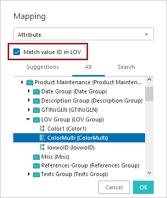
When the user checks this box, users can map incoming attribute values to an existing LOV by the value ID. Leaving the checkbox empty will restrict the mapping to LOV values only, meaning if the incoming value does not match one of the LOV's values by name, users will receive an error for that unmatched value.
For more information on the Simple Importer functionality in the Web UI, refer to the Simple Importer Widget topic in the Web User Interfaces documentation here.
Reference criteria in Advanced Search updated
The 'References' and the 'ReferencedBy' criteria in the Web UI Advanced Search have been updated to include a new 'Search Below' option.
When the 'Search Below' option is checked, the 'References' and 'ReferencedBy' search expands to include any nodes beneath the node selected in the 'Enter source' (ReferencedBy) or 'Enter target' (References) field. The 'Search Below' setting is enabled by default whenever the 'References' or 'ReferencedBy' search criteria is added to an Advanced Search screen.
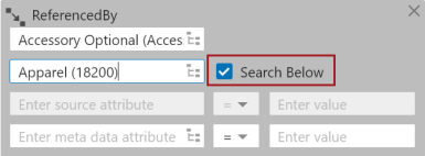
Previously, when an object was added in the 'Enter Source' or 'Enter Target' field, the search would only find reference objects for the specified object, and there was no option to also include reference objects either referencing or referenced by the children of the specified object.
Additionally, collections can now be selected in the 'Enter Source' and 'Enter Target' fields in the 'ReferencedBy' and 'References' search criteria with all objects within a collection acting as sources or targets, respectively. Selecting a collection as the searched object enables admin users to search for reference objects within a search, bringing the Web UI Advanced Search more in line with workbench's search capabilities. When users generate a collection, they are narrowing down a group of objects based on one or more search filters. By then applying a References or ReferencedBy search to that collection, product managers and data stewards leverage the flexibility and granularity of collections to enable more powerful searches of product data in the Web UI.
For more information on Advanced Search in the Web UI, refer to the Advanced Search topic in the Web User Interfaces documentation here.
Define available targets in References Web UI component using a business function
We have added the ability to customize the search that finds possible reference targets for the References Web UI component. Previously, the search could be customized by writing a Java search plugin or by using one of the existing search plugins. Now, a reference target search can be written as a Business Function in JavaScript using the Query API and provides the user with only the reference targets that are valid on the reference. For more information, refer to the Custom Reference Target Search topic in the Web User Interfaces documentation here.
Table filtering using 'Does not contain' updated
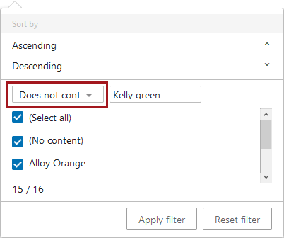
The 'Does not contain' filter condition, which is accessible when filtering on columns in Web UI tabular views for which 'Enable filtering' has been activated, is now updated to accurately account for multi-valued cells.
For example, when users enter the dialog for column filtering and select the condition 'Does not contain,' values entered into the condition field, (in the example shown below the value is 'Kelly green'), will now be considered in the filtering action even if the specified value is contained in a multi-value cell. Previously, multi-value cells were handled by this condition in a way that could result in filtered rows featuring multi-value cells that contained excluded values.
Enhancements to Custom Export Action Component
An enhancement has been added to the Custom Export Action component that improves export clarity in specific scenarios.
When mapping a column to display in the custom export, users who select the 'Value on Reference Target' or 'Metadata Value on Reference' mapping options will have the option to include the reference type name in the column header along with the target attribute name.

This is done by checking the box for 'Include reference type in header,' as shown in the screenshot below.

Previously, users who mapped two different reference types in two different columns, but selected the same attribute for both, would be unable to differentiate between the two columns. Adding the reference type name to the column header helps clarify where each attribute value originates.
For more information on the Custom Export Action component, refer to the Custom Export Action topic in the Web User Interfaces documentation here.
