Summary
It is important for customers to know that many legacy Web UI components are progressing through their lifecycle. This means that previously superseded components are now moved to withdrawn, and all withdrawn components have now been removed (deleted). Alternate components have previously been announced, and it is very important for customers to make sure they are using those alternate components before upgrading. Refer to the 10.0 Upgrade Guide for specific component details here.
Additionally, the following enhancements have been made to the Web User Interface:
- Additional information about the updates to components' lifecycle status, including descriptions of the various statuses, the benefits these changes provide customers, and some additional detail regarding the component removal process.
- The Search Screen now includes a 'Show related results' button which allows the user to broaden the result set by including items that closely match the search criteria.
- Improvements to the Search Screen make it easier to understand and manage the search result data and to efficiently work on a list of results. Search Screen improvements include displaying a count of each value within a facet and saving the user's place in search results while working with other Web UI screens.
- A default search can now be set on the Search Screen, and users can save and share searches. This functionality displays the results of the desired search query when opening the Search Screen and enables the user to share a set of search criteria with others.
- The Elasticsearch database drives the faceted Search Screen results and improvements have been made to the configuration setup and maintenance. Now, a workbench wizard makes configuration easier and eliminates the need to modify a JSON file.
- A new configurable index name suffix solution is available to make deployment of Elasticsearch for faceted search easier.
- Target history on references and links can now be viewed in Web UI, improving data auditing and reporting capabilities.
- The new Compare Records screen allows admin users to configure display of a product and multiple reference objects in a single view.
- Partial approval is now available in the Web UI; users can approve specific attributes, references, and data containers on an object without fully approving the object itself.
- Users can now use the Web UI to revert to previous versions of objects without opening the workbench.
- Admin users can now configure help text to display on reference components in the Web UI.
- The Hide Equal and Mark Different functionality is now available on Node Lists using specific Web UI view types.
- The Data Issues Report bind now supports improved error handling on references and metadata in the Web UI.
- Advanced Search screens in the Web UI now support the ability to restrict which attributes end users can select when searching via the 'Attribute' criteria.
- The Parent Selector can now be added to any Node Editor for use with products, entities, and classifications.
- Copying from one cell and pasting to many is now possible in Node Lists (where applicable), eliminating the need to open a value editor to paste / apply to selected cells.
Details
Web UI component lifecycle updates
A series of older components are entering new phases of the component lifecycle with this release, easing some Web UI configuration challenges, increasing the support team's focus on the most utilized components, and introducing more predictability into system upgrades as they relate to the Web UI.
With each release, Stibo Systems introduces new components. Some of these components perform the same tasks as existing components, but with additional functionality or other improvements. When possible, old components are automatically migrated into the new ones as part of an upgrade, but when the new component requires configuration, the older components are often kept in the system for subsequent releases. This is to ensure customers have adequate time to transition to the new components.
Over time, however, some components have persisted in the Web UI for more releases than our lifecycle typically prescribes. In an effort to bring our list of components into compliance with our lifecycle standard, many components are entering new phases with the 10.0 release.
The benefit to users of this lifecycle update effort is threefold:
- The process of configuring the Web UI is now more streamlined as users have only relevant components to choose from. In addition to decluttering the configuration windows, moving components out of active selection also removes some potential confusion stemming from similarly named components.
- With a more streamlined software solution, implementation questions and component maintenance / support are no longer needed for components that already have a substitute, benefiting both partners and customers.
- This lifecycle enforcement effort increases the platform's predictability and reliability; when a component enters the superseded status, users know roughly how long they have to make the needed adjustments, allowing them to plan more effectively.
Once a component has been replaced with a new component (provided the component cannot be automatically migrated into the new component), the older component enters the first part of a three-phase lifecycle. Below is a description of each phase:
Superseded - The first phase of the component removal lifecycle. Superseded components already configured will remain, and new instances of the component can be added if desired. The only change that occurs is that, in a component list where the relevant component is listed, the component description will indicate that the component is superseded and will list the component recommended to be used in its place.
Withdrawn - The second stage of the component removal lifecycle. Withdrawn components already configured will remain and function as always, but if removed, users are unable to add new instances of the component.
Deleted - The final stage of the component removal lifecycle. Deleted components that are configured on a system will be removed (no longer render or be shown) in the Web UI.
From the moment a component enters the 'Superseded' status to when it is finally deleted from the system represents approximately 12 months, or two release cycles
Not often used, there is also one other phase or 'Status': Replaced. Replaced is a status that will seamlessly exchange one component with another without requiring any user action. This can be done if the stored configuration has exact overlapping parameters so that the replacing component can be loaded with the exact same parameters that has been stored for the old component. When this status is used there are no work to be done to update configuration as the system does this automatically.
Depending on metrics collected regarding usage of components in the Web UI, some outgoing components may skip the withdrawal step and be deleted directly. For example, if a component has dropped out of usage entirely because the functionality exists in a different component, Stibo Systems may delete the component outright. The standard lifecycle applies to most components, but there may be exceptions depending on customer impact.
For a full list of components that are entering these phases, and additional information regarding how to manage the transition away from these components following an upgrade to 10.0, refer to the 10.0 Upgrade Guide here.
Faceted Search screen new 'Show related results' button
A precise search experience helps users to accurately find products using the faceted search powered by Elasticsearch. When search results are displayed but additional results are available that nearly match the search criteria, the new 'Show related results' button is presented at the bottom of the screen. This feature allows the user to control when the result set should be broadened beyond the exact matches of the search criteria.
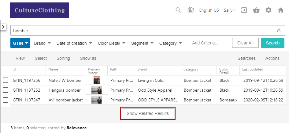
For more information, refer to the Search Screen Search Bar topic in the Web User Interfaces documentation here, which shows updated functionality introduced with release 10.3-MP4.
Search screen enhancements
The Search screen has been improved with the following functionality, making it easier for users to work with search results.
- Displaying a facet now includes the number of results available for each value. This change allows the user to anticipate the impact on the search result set when including a value.
- The Search screen is now initially loaded with the user's favorite saved search, or in the absence of a 'favorite' search, with the available data based on the user's access privileges. Setting a favorite search enables the user to generate a list of required objects quickly without having to configure the search criteria each time.
- Working on a list of products from the Search screen is now easier since the scroll position is retained when returning to the Search screen. This improvement allows the user to review or modify data, for example on the Product Editor screen, without losing their place in the Search result set.
For more information, refer to the Search screen elements defined on the Search Screen Details topic in the Web User Interfaces documentation here, which shows updated functionality introduced with release 10.3-MP4.
New save and share searches functionality
The new save and share options on the Search screen provide a personalized search experience for each user based on their role. Save and share options improves productivity by allowing users to work more efficiently and to collaborate with others on a task list with ease.
- After performing a search in the Search screen, a user can copy the URL and share it with other Web UI users. This ability allows the selected search criteria to be reproduced by other users without recreating the search. Once a shared URL has been run, the search criteria can be saved by the user for their own Web UI login.
- Creating the ideal search can be an involved process, and once achieved, saving the search stores the search bar text and the facet selections. A saved search allows the user to run the search again without having to reconfigure the criteria. The Searches menu includes all saved searches for the current user as well as the 'favorite' search. Marking a saved search as the 'favorite' runs it automatically each time the user opens the Search screen. Loading data based on the user's favorite search enables each user to control the starting point for their Web UI work on the Search screen.

For more information, refer to options in the Search Screen Search Configuration topic in the Web User Interfaces documentation (here), which shows updated functionality introduced with release 10.3-MP4.
New faceted search (Elasticsearch) configuration wizard
Previously, using Elasticsearch with the Web UI faceted Search screen involved manually modifying a JSON file. This requirement often produced unexpected search results due to misconfiguration. The new workbench Elasticsearch configuration wizard provides the administrator with an interface that is similar to the Event Processor wizard. Required elements are identified, and successfully completing the wizard publishes the data for faceted search to the Elasticsearch database. Once published, Elasticsearch results are available on the faceted Search screen in Web UI.
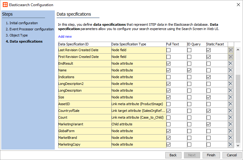
For more information, refer to the Creating an Elasticsearch Configuration topic in the Web User Interfaces documentation here, which shows updated functionality introduced with release 10.3-MP4.
New configurable index name suffix solution for Elasticsearch
For faceted search, when using one Elasticsearch server instance for multiple non-production systems, a new property (Elasticsearch.IndexNameSuffix) is available and can be added to the sharedconfig.properties file. By default, it is empty. Admins can set this to prevent users from overwriting indexes by creating specific ones for their environment, and — most importantly — prevent product data from being overwritten. The index name is a combination of a prefix (defined in configuration), contextID, workspaceID and a suffix. For example, Elasticsearch.IndexNameSuffix=staging produces this index name: '{prefix}-{workspaceID}-{contextID}-staging'.
For more information, refer to the Initial Setup for Elasticsearch topic in the Search Screen section of the Web User Interfaces here.
New ability to view history on references in Web UI
The ability to easily view history information where references and links have been referenced to has been added to Web UI. This greatly streamlines the process of data auditing and reporting of revision changes by easily displaying this information to users in a similar fashion to that used for attribute revision history. Previously, this information could only be accessed in the workbench by using revision mode and in Web UI by using the Multi Revision Screen.
The following Web UI components, which are available as child components within Node Editors, have been updated to allow admin users to enable the option to view reference and link revisions via the 'Display Target History' parameter:
- Reference Value
- References
- Referenced Asset Representation
- Classification Links
- Classification Product Links
Revision history can be found by clicking the history icon that appears to the right of the component field. The hyperlink Target values take users to the configured screen for that target.
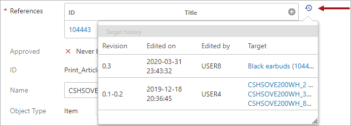
For more information, refer to the References and Links Target History topic in the Web User Interfaces documentation here.
Compare Records screen
A new Web UI screen type is now available called the Compare Records screen. This screen enables users to create a single comprehensive side-by-side view of a selected object and any objects the selected object either references or is referenced by. While the screen supports this generic use case, it also supports a more targeted use case in which customers require a single view of an enrichment record and the associated golden records, or a sell-side item and the associated buy-side items. Previously, this functionality was only available for users with a customer-data focus.
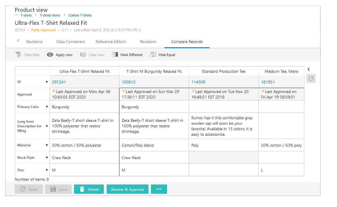
The first column displays information specific to the selected item, and is locked in place: users cannot scroll to the right and cause the column to scroll out of display. This is done to ensure the screen's efficacy as a comparison tool, with emphasis placed on the selected object.
As one example of how this screen might be applied, a product steward is tasked with editing an internal data record for a t-shirt product. To do so, the steward must reference the various supplier records that auto-populate the internal data record. Because the internal data record updates the t-shirt product page on the website, the product steward must simultaneously reference the supplier and golden records to make informed changes to the internal data record, which in turn updates the website. The Compare Records screen gives the product steward an efficient way to compare and maintain the internal source record against the other contributing objects.
The Compare Records screen supports user configurable views, to provide even greater control over which data is displayed on the screen, as well as 'Hide equal' and 'Mark different' functionality. Additionally, auto-save is enabled on the Compare Records screen by default, so changes made in this screen are saved without having to click a 'Save' button.
For more information on the Compare Records screen, refer to the Compare Records Screen topic in the Web User Interfaces documentation here.
Partial approval in the Web UI
The ability to partially approve objects in the Web UI has been implemented with the 10.0 release. Previously, similar functionality only existed in the workbench. Partial approval gives users the ability to approve just the attributes, attribute link data, data containers, and references that make up an object, rather than enforcing a single approve action on the entire object. In addition to further building out the Web UI's range of functionality with this important feature, adding Partial Approve to the Web UI now makes it easier for customers to transition their users to the Web UI.
The new 'Partial Approve' button (the default button text is 'Review & Approve') can be added to the bottom of Node Details screens.

Following a click on the 'Partial Approve' button, a full-screen overlay displays:
- all unapproved changes to attributes, attribute link data, data containers, and references
- the object type of the changed object
- the name of the specific object
- the new value
- information related to the user who made the change, including the user's name and a timestamp of when the change was made
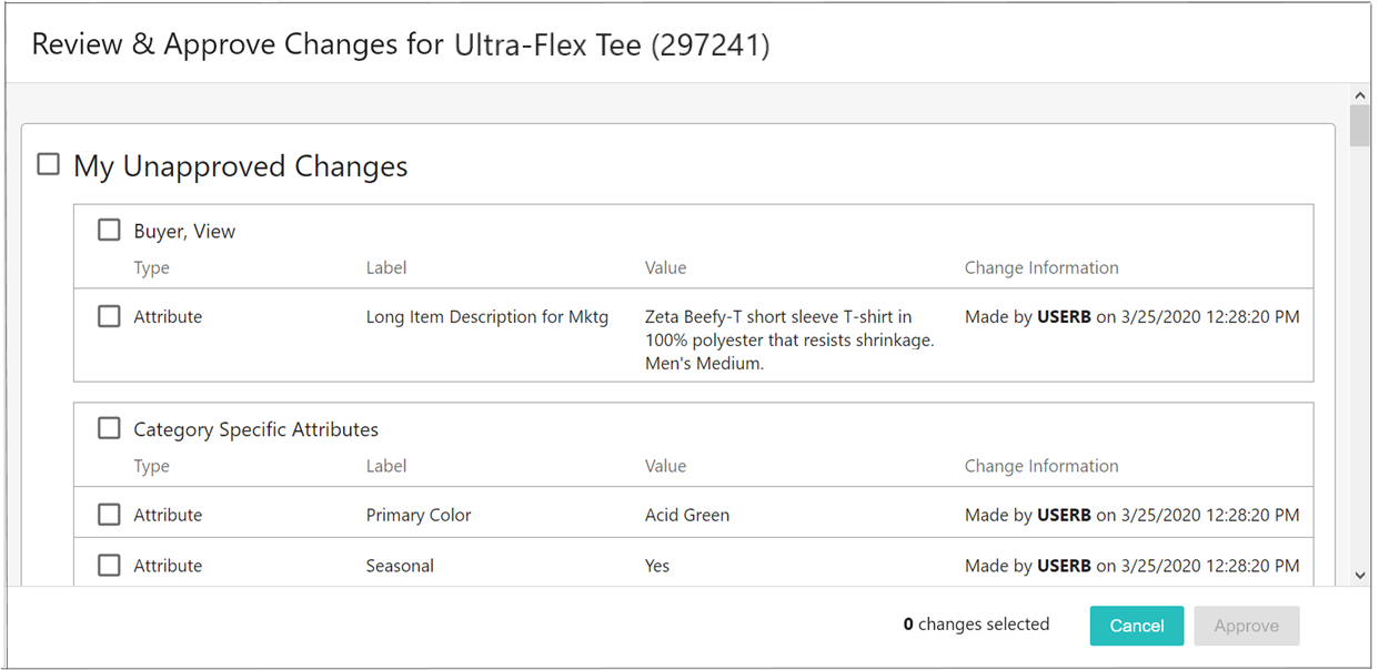
Users can select all of the unapproved changes and either approve all changes displaying on the screen, (which moves the object to full approval), or select and approve a group of changes to approve, or approve each change one-by-one. Once the users make their selections and click 'Approve', the approved changes will display in the approved workspace.
This feature can be used in a broad variety of applications; for example, if a workflow sends a fully approved product directly to a customer-facing website, it can be beneficial if users from different departments are allowed to approve only those product attributes over which they have authority, as it may not fit within a company's workflow to have any one department given approval rights for an entire product. This provides customers another tool to better align their Web UIs with their established workflows.
For more information on the Partial Approve button, refer to the Action Buttons topic in the Web User Interfaces here.
Ability to revert objects to previous versions in Web UI
Users can now use the Web UI to revert to previous versions of objects. This allows users to return an object to a previous version of itself without opening the workbench. This functionality can be added via a new 'Revert to' toolbar action which can be enabled via parameter selection when configuring a new or editing an existing Multi Revision screen.
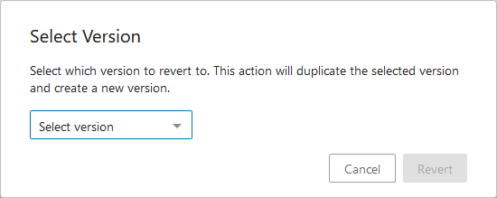
By clicking the 'Revert to' toolbar action button, a dialog displays enabling users to select any previous version of that object to overwrite the current version. Once reversion is complete the object displays with the values and references associated with that selected version.
The 'Revert to' functionality will default to enabled on Multi Revision screens following an update to 10.0. If this functionality should not be enabled for users, admins must go into the designer to disable this setting.
For more information on reverting to previous versions in the Web UI, refer to the Multi Revision Screen topic in the Web User Interfaces documentation here.
Context help on references
Admin users now have the ability to configure help text to display on reference components in the Web UI via configuration of the reference type in the workbench. Applying consistency to this functionality enables admins to assist their users with timely guidance in the Web UI.
The components themselves have not changed with this release; however, the most commonly used reference components now support context help via a metadata attribute added to the reference itself. By adding a universal help-text attribute to the basic reference object type, and then adding custom help text to that attribute on the specific single-reference reference type, admin users can enable context help to automatically display in the Web UI for references. It should be noted that this method of adding context help to references aligns with the method already available for attributes.

Context help has been enabled in the Web UI for the following Node Editor reference components: Reference Value, References, Referenced Asset Representation, and Classification Product Links. On the Node List, the Reference Header component now supports context help.
For more information on help text on references in the Web UI, refer to the Reference Help in Web UI topic in the Web User Interfaces documentation here.
Add Hide Equal and Mark Different to Node Lists
The 'Hide Equal' and 'Mark Different' functionality in the Web UI has been expanded and is now available on Node Lists using the 'Table,' 'Compare,' and 'Multi Edit' views. The 'Hide Equal' and 'Mark Different' actions enable users to easily highlight differences between objects by obscuring columns in which all values are equal, and highlighting columns that contain dissimilar values. Previously, these buttons could only be added to a select number of screens, but now users can add them to all Node Lists to solve for a wide range of business cases.
The 'Hide Equal' and 'Mark Different' buttons can now be added either together or separately. Previously, these buttons were added automatically (on specific screens, like Multi Context) when any other toolbar action was configured.

Because running this comparison task can tax system resources, these buttons are only active when 25 or fewer objects are displayed. The 25-object maximum prompts the user to filter an object list down to a more manageable size before running the 'Hide Equal' or 'Mark Different' processes.
On the Multi Revision and Multi Workspace screens, 'Hide Equal' and 'Mark Different' can be added via a checkbox in the designer by checking the parameters for 'Show Hide Equals Button' and 'Show Mark Different Button', respectively. For the Display Children, Task List, Collection List, Collection Content, and Multi Selection screens, the 'Hide Equal' and 'Mark Different' buttons can be added as toolbar actions in the designer.
For more information on this functionality, refer to the Comparing Data Using Hide Equal and Mark Different topic in the Web User Interfaces documentation here.
Extended error handling for references and metadata using the Data Issues Report bind
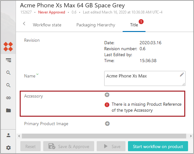
The Data Issues Report bind now supports improved error handling on references and metadata in the Web UI. When used with either the Run Business Action (previously called the Business Action with Web UI Bind component), Submit, Approve, or Node Details Validation components, the Data Issues Report bind now enables users to view error messages at the point of greatest impact: directly below the relevant on-screen component, or within the relevant table.
For instance, error and warning messages generated from running the Data Issues Report bind within business rules on Node Details screens now display under the References component (as shown in the screenshot below). Previously, this bind could only be applied to attribute data. The Data Issues Report bind can also be used to configure business conditions that run in the background to, for example, perform validation checks on references and metadata.
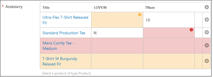
For the References component showing reference metadata, the Data Issues Report Bind can be used to show errors directly in the Reference table. As shown in the screenshot below, specific cells with errors can be shaded orange with a yellow caution triangle icon in the upper right-hand corner of the cell (for warnings) or shaded pink with a red circle icon in the upper right-hand corner of the cell (for errors), or the entire row can be shaded depending on whether an error or warning is applicable.
For more information on the Data Issues Report bind, refer to the Data Issues Report Bind topic in the Resource Materials documentation here.
For more information on the components mentioned in this release note, refer to the Web User Interfaces documentation here.
Improved attribute selection restriction in advanced search
Admin users configuring Advanced Search screens in the Web UI now have the ability to restrict which attributes end users can select when searching via the 'Attribute' criteria.
Previously, when searching for an attribute using the 'Attribute' criteria, all configured attributes could potentially display in search results, including attributes not relevant to the user. With the addition of a new parameter on the 'Attribute' criteria called 'Restrict to Attribute Groups,' admins can now select the appropriate attribute groups to which an 'Attribute' search will be limited. If a user attempts to select a restricted attribute, an error message displays explaining why the attribute cannot be searched. If all attributes should be accessible to end users, administrative users can simply leave the new parameter blank.
For more information on configuring advanced search in the Web UI, refer to the Advanced Search Initial Configuration topic in the Web User Interfaces documentation here.
Parent Selector updates
The Parent Selector, a Web UI component that allows users to move the current object to a new parent object of their choosing, has been expanded for the 10.0 release.
The Parent Selector can now be added to any Node Editor, and can be used with products, entities, and classifications. Previously, the Parent Selector could only work when added to an Item Initiate screen as part of a workflow. Though this supported a prime use case for this component, the Parent Selector could not easily be deployed for other requested business cases.
Additionally, the Parent Selector now features the standard Node Picker component, which has more powerful configuration capability. Previously, the Node Picker included only the ability to select a specific node from which the desired parent could be selected.
For more information on the Node Picker component, refer to the Node Picker Dialog topic in the Web User Interfaces documentation here.
Added ability to copy and paste one cell to many
In Web UI Node Lists, it is now possible to copy from one cell and then paste into multiple cells for any header types where copy / paste of one cell to another was previously supported.