(Component name: Multi-Reference. Available on a Tab Page, Node Editor, or as a child to a display mode.)
The Multi Reference Web UI component can be used to display references with multiple reference types and classification link types in the same table. It can be configured with a list of reference types and/or classification link types to narrow the references (links) that are shown in the table.
Additionally, it can be configured to display either forward references or reverse references (referenced by mode).
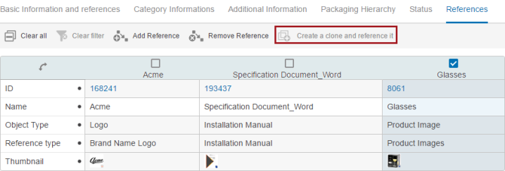
The Multi Reference component is pre-configured with a Node List in Multi Edit Display Mode with the 'Add' and 'Remove Reference' toolbar actions shown. It can be inserted where a container component can be inserted (e.g., as the content of a Tab Page or as content of the Split Panel or Columns components).
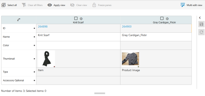
Since the Multi Reference component is based on the Node List component and the Multi Edit Display Mode, sorting and filtering of the header component values are supported. This allows for multiple reference types to be shown in the same table with the column filtering capabilities. Also, the number of reference items shown in the configured table is displayed under the table, allowing a user to view how many references there are without having to scroll through the data.
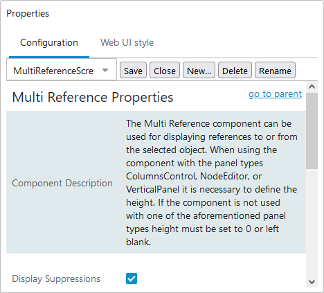
Multi Reference Properties
Each parameter features help text, accessible by clicking the info icon to the right of each parameter name.
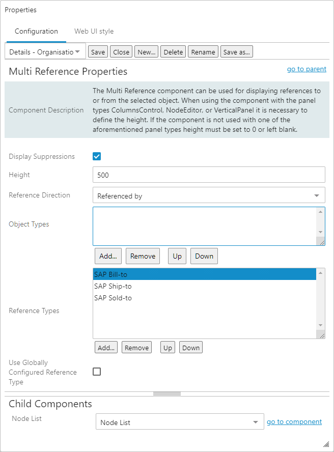
Display Suppression
- When enabled, any suppressed references in the current context will be listed in the Multi-Reference Editor.
- If disabled, any suppressed references in the current context will not be listed in the Multi-Reference Editor.
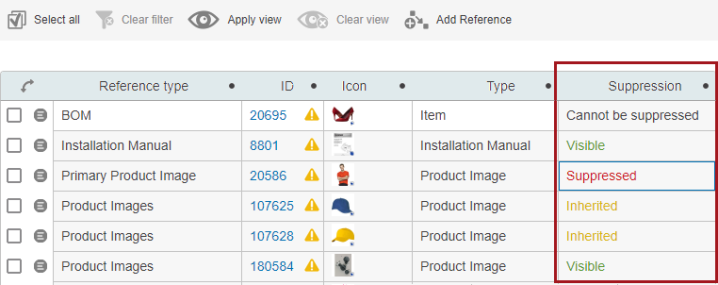
For more information on Reference Suppression, refer to the Suppressing References in the Multi Reference Editor topic.
Height
When using the component with the panel types Columns Control, Node Editor, or Vertical Panel, it is necessary to go into Design mode and define the Height parameter found on the properties screen. If the component is not used with one of these panel types, then the height must be set to 0 (zero) or left blank.
Reference Direction
With the Reference direction parameter it is possible to choose the direction of the displayed references:
- References where the selection is the source (References)
- Reverse references where the selection is the target (Referenced by)
Object Types
Adding object types in this field allows admin users to apply additional criteria to manage display of referenced objects based on their object type. Users can add valid object types of source side (or target side, depending on the direction of the reference / link defined in the Reference Direction parameter) that are allowed to be displayed in the Multi-Reference editor. The objects that do not belong to the object type(s) added to this field will not be displayed on the Multi-Reference editor. In addition, this parameter also ensures that no new reference to invalid objects can be established through the Add Reference Action component.
Note: Adding a reference source or target via the typeahead in Add Reference Action will display an error.
Reference Types
Select specific reference type nodes using the Reference types parameter Add button. Reference types can be re-ordered and removed, as needed.
Use Globally Configured Reference Type
Check this field and set Reference Direction to 'References' to pull configuration information from the Global Reference Representations component in [--MAIN--]. This will cause the 'Add Reference Action' to use the target search function present in the configuration. The number of type-ahead suggestions will also use the global configuration.
When this is checked, any Search Plugins on the 'Add Reference Action' in the Node List will be ignored for Reference types that have a business function search defined in the global configuration.
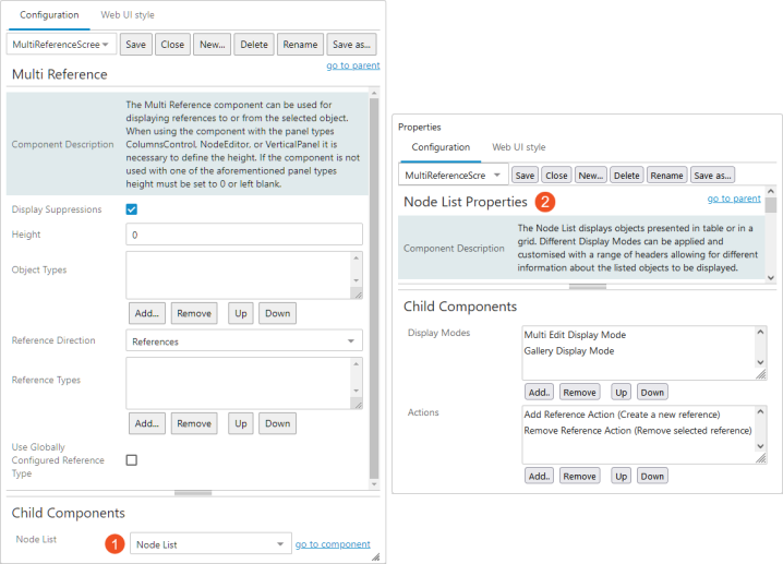
Node List
On Multi Reference Properties under Child Components, select Node List. Click on 'go to component,' and the Node List Properties screen will display.
Node List Properties
Each parameter features help text, accessible by clicking the info icon to the right of each parameter name.
Additional information about the node list properties can be found in the Node List Component topic.
In the Child Components section of the properties screen:
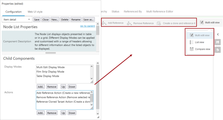
Display Modes
Click the Add button to select display modes. Each display mode has a corresponding button that displays above the Node List. Re-order the list or remove unneeded display modes.
One option is Multi Edit Display Mode, and it comes pre-configured on this particular Node List. As the name implies, you can edit multiple objects and multiple object attributes on the same screen and save the changes automatically (using the 'Use Immediate Save' parameter) or manually. For details, refer to the Auto-Save in the Web UI topic.
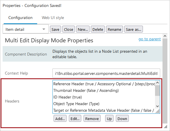
Table Headers
While configuring the headers in Display Mode properties, a user can choose to set up the table sort order based on a specific header. By editing a particular header's properties, sorting order (ascending or descending) can be designated using the dropdown next to Table Sorting. Once the properties are saved, the table will re-sort itself based on the new header settings, and the Display Mode properties will be retained until configured differently.
The Table Sorting designation can only apply to one header at a time. It has to be removed from one header before set up on another. Additionally, if 'Enable Default Sorting' is enabled / selected in the Node List properties, selecting a header to sort by overwrites this setting.
Below are some header examples. The bullet under each header explains what is displayed in that header column. Additional headers may be used (e.g., Name, ID Shared Target, Attribute Value, Attribute Value Group). When adding headers, you can read a description of each before adding them to the Headers field.
Note: It is suggested that the ID Shared Target Header be used in place of the ID Header to prevent unintended data changes to shared objects. When used, a visual indicator ( ) appears in the ID cells for objects that are referenced by two or more other objects.
Reference Metadata Value Header
- The value of a metadata attribute on the reference / link
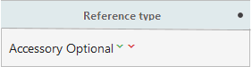
Reference Type Header
- The title of the reference type or the classification link type for the reference / link in the table
Reference Visibility Header
- The contexts in which the reference or classification link is visible
Actions
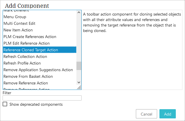
A number of action buttons can be added to a screen to be used with a Node List. These are all added and configured within the Actions field on the Node List Properties screen. The Add Reference Action and the Remove Reference Action come pre-configured. These actions and the Reference Cloned Target Action are described below. Other actions may be appropriate for you to use.
After you click Add, you can view action component descriptions in the 'Add component' dialog.
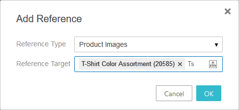
Add Reference Action
The Add Reference Action component (  ) opens an 'Add reference' dialog with Reference type and Reference target (or Reference source depending on the reference direction) options.
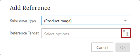
When a user clicks on a node picker icon (as shown in the screenshot above), they are presented with standard Browse and Search tabs to use when selecting or multi-selecting an existing object or objects to reference. The 'Reference target' and 'Reference source' value fields support typeahead (by name) functionality, which allows users to easily add and remove references without having to click through various hierarchies and/or folders.
Additional functionality can be configured that allows users to create new objects using existing objects as a template, search for existing objects in an effort to avoid duplicating data, or narrow the available nodes in the node picker to aid efficient reference object selection. For more details regarding how to fully configure the properties for the Add Reference Action component, refer to the Add Reference Action topic.
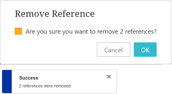
Remove Reference Action
The Remove Reference Action ( ) is enabled when a reference is selected in table. When clicked, it will show a dialog with a warning asking if you want to remove the references and telling you how many references are about to be removed. A success message displays upon removal.
Remove References Action
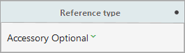
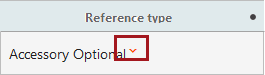
The Remove References Action ( ) allows a user to remove multiple references to target objects from multiple objects in a Node List. For example, if a series of stereo products all reference one particular headphones product, and that headphones product is discontinued, users can use the 'Remove References Action' to remove all headphones references from the stereo products with a single action.
Once added to a Node List, initiating this action will display a menu that shows all configured reference types for which there are references, along with the objects referenced using that reference type.
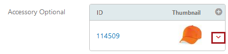
In the screenshot below, the selected objects in the Node List reference objects using only one of the configured reference types, Accessory Optional. Listed beneath the reference type are the objects referenced using that reference type, along with the number of times that object is referenced.
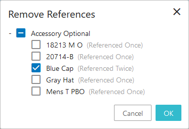
To remove all references of the listed reference type from the selected object(s), check the box beside the reference type name. Doing so automatically checks all references displaying beneath the reference type. Click 'OK' to remove all selected references. To select specific references to remove under a given reference type, check the box beside the referenced object(s) to which all references should be removed, and click 'OK'. To remove all references to a specific object referenced using multiple reference types, that object must be selected for each reference type used to reference that object.
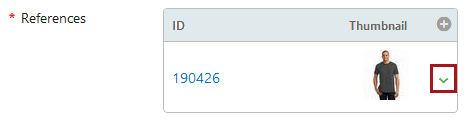
Reference Cloned Target Action
The Reference Cloned Target Action ( ) allows a user to select an existing reference target and duplicate / clone it, creating a new object that includes the original attribute values and references. This is particularly useful in making sure a user does not inadvertently edit shared data that could have implications to other objects with the same reference. When a user needs to make changes to data that is shared (e.g., the object is referenced by multiple objects), they can clone the existing object and freely edit the data on the clone, without fear of impacting the other objects with references to the original object. An example is shown below.
Note that users can only clone one object at a time, and objects being cloned must use auto-generated IDs.
Important: Asset References cannot be cloned.
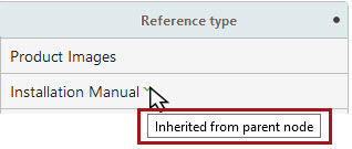
Display of inheritance in reference components
References inherited from a parent object or parent context will display with colored arrows to visually indicate their inheritance.
Inherited from parent
If a reference is inherited from a parent object, a green arrow will display next to the reference type in the 'Reference Type Header' on a Node List.
When a 'References' component has been configured on a Node Editor, references inherited from a parent object will display with a green arrow to the right of any configured columns, as in the screenshot below.
Inherited from context
If a reference is inherited from a parent context, a red arrow will display next to the reference type in the 'Reference Type Header' on a Node List.
When a 'References' component has been configured on a Node Editor, references inherited from a parent context will display with a red arrow to the right of any configured columns, as in the screenshot below.
In instances where a reference is inherited from both a parent object and a parent context, the green and red arrows will display together, side by side.
In all instances, when the cursor is placed over either a red or green error, a text box displays with information about why the arrow is displaying. In the example below, the reference is inherited from a parent node.
For more information on inherited references, refer to the Inheritance in the Product Hierarchy topic in the System Setup documentation.
Considerations and Limitations
-
The Multi-Reference Editor is not compatible with the Target Value Header.
-
The Multi-Reference Editor cannot be used with the Split panel display mode.
-
The Multi-Reference Editor does not indicate if a reference type is mandatory. If this is a requirement, consider using the References component, which allows you to configure only one reference and will display a red asterisk if the reference type is mandatory.
-
The Multi-Reference Editor does not take the setting on a mandatory / hidden context from business rules into account.