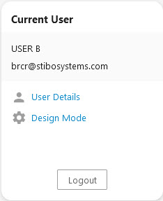
The User Widget allows users to quickly access basic administrative functions in the Web UI, such as confirming the system user currently signed into the Web UI and the email address associated with that user, accessing a configured User Details screen via a link, and logging out via a 'Logout' button. It should be noted that appearance and access to elements in the User Widget may differ than the graphic below depending on the user's administrative privileges.
Prerequisites
Because basic concepts for working with the designer are not covered in this section, it is recommended that users configuring homepage widgets be familiar with the Web UI designer. For more information on the basics of working in the designer, refer to the Design Mode Basics topic.
Details on how to add a widget to a homepage can be found in the Adding Widgets to a Homepage topic in the Getting Started documentation.
Configuring the User Widget
When adding the User Widget to the widget grid, choose the 'User Widget' in the 'Add Component' window, and then click 'Add'.
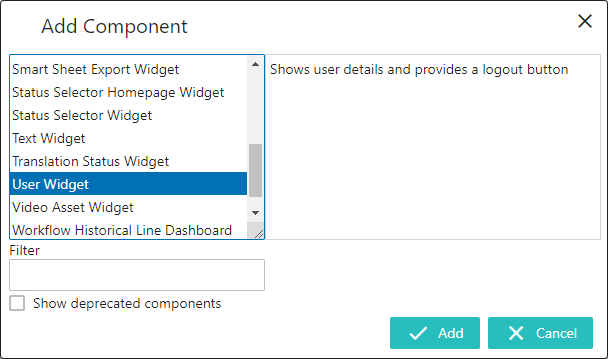
A 'User Widget Properties' window then displays in which the user can configure the User Widget.
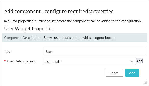
The two configurable parameters are:
- Title: In this field, add a title that will display as a header at the top of the User Widget. If the field is left blank, the default title 'Current User' will display on the User Widget. In the above example, the Title 'User' has been added.
- User Details Screen: Select the User Details screen from the dropdown and then click the 'Add' button at the bottom of the window. For information regarding configuration of the User Details screen, refer to the User Details Screen topic.
Note: Clicking the 'Add' button to the right of the 'User Details Screen' field allows users to select from a larger list of screens. This function is used to create and configure a new User Details screen.
Using the User Widget
Once configured, the User Widget will display on the Web UI homepage. In the screenshot below, all elements that can be displayed on a User Widget are shown with a number. In the numbered list below the screenshot, each element is described based on its corresponding number.
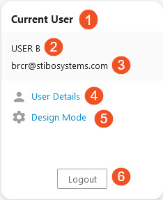
- Title: Displays the title added by the user. If no title text was added, 'Current User' will display.
- Current User's Name: Shows the currently signed in user's 'Name'.
- Current User's Email Address: Shows the email address added for the currently signed in user.
- User Details: Clicking this link takes the user directly to the designated User Details screen.
- Design Mode: Clicking this link opens the designer.
- Logout: Clicking this button logs the user out of the Web UI.