The Run Business Action button can be added to any Node List as a toolbar action (a button accessible above the table) and to any Node Details screen as a standard action button (a button accessible below the table).
To add the Run Business Action button to a Node Details screen as a standard action button, navigate to the relevant 'Node Details Properties' screen in the designer. Under 'Child Components', click the 'go to component' link next to the 'Buttons' parameter. Click 'Add' and then find, select, and add the 'Run Business Action' component.
To add the Run Business Action button to a Node List screen as a toolbar action button, navigate to the relevant Node List component in the designer. In the 'Child Components' section, click the 'Add' button below the 'Actions' field. In the 'Add Component' screen that displays, find, select, and add the 'Run Business Action' component.
Depending on whether the Run Business Action component is configured as an action button or toolbar action button, the options displayed in the designer will differ slightly. Which options are available for which type of configuration is outlined in the description of designer parameters below.
Displayed in the screenshot below is the Run Business Action properties screen as it displays when being configured for a Node List screen. The properties screen for this component when being configured for a Node Details screen will have slight differences, which will be outlined in the parameter descriptions located below the screenshot.
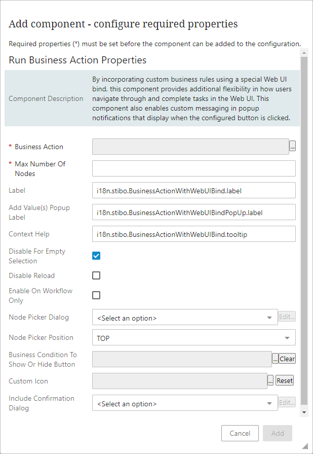
- Business Action. By clicking the
 button to the right of this mandatory field, users can select which pre-configured business rule will be run when the button is clicked. If no business action has yet been configured, set up of this button cannot be completed. For information on how to configure a business rule for this component, refer to the Run Business Action Use Cases topic. For general information on business rules and conditions, refer to the Business Rules topic.
 - Max Number of Nodes. Enter any integer to specify the maximum number of nodes on which the rule should execute. This is required to reduce potential performance impacts and the complexity of the rule must be carefully considered when setting this number. A highly complex rule should have a low maximum, while a simple rule may have a larger one. Keep in mind that the rule executes on all nodes in a single transaction and performance does not scale linearly based on the number of nodes on which it is executing. This parameter is only available when configuring this component on a Node List. For components already configured on Node Lists, the default for this parameter is set to 50.
- Label. When configuring a standard action button, the text entered in this field will display on the button. When configuring a toolbar action button, the text entered in this field will display beside the button.
- Add Value(s) Popup Label. If the selected business action includes Attribute Validated Parameter binds and / or a Node Picker is configured, the text entered will display as the title of the Add Value(s) popup.
- Context Help. Enter the text that will display in a small informational popup message when the cursor is placed over the button.
- Save Before Executing. When checked, the button will save all on-screen information prior to executing the configured business action. Note that this setting will not be applied when configured as a toolbar action. This parameter is only available when configuring this component on a Node Details screen, so it is not pictured in the above screenshot, which shows a configuration screen for this component in a Node List component.
- Disable for Empty Selection. Available for Run Business Action components configured on Node Lists. When this parameter is checked, the Run Business Action button will only activate when a selection is made. When no selection is made, the button will display as inactive. If left unchecked, the button will be active regardless of whether a selection has been made. Defaults to checked.
- Disable Reload. Available for Run Business Action components configured on Node Lists. When checked, the automatic reloading of a Node List following a user action is disabled.
- Enable on Workflow Only. When checked, the button will only be available when the item is being viewed through a workflow state.
- Node Picker Dialog. Select 'Node Picker Dialog' from the dropdown if a Node Picker element is required for the business action configured for the Run Business Action component. For more information on configuring Node Picker components, refer to the Node Picker Dialog topic.
- Node Picker Position. If a Node Picker is configured in the business rule and in the designer, selecting 'TOP' places the field containing the Node Picker at the top of the Add Value(s) Popup, and selecting 'BOTTOM' places the field at the bottom of the popup.
- Icon. Select from (Google) Material icons combined with Stibo Systems proprietary icons. If choosing from the ICON_AND_TEXT or ICON button types (explained below), then this icon will display on the action button. This parameter is only available when configuring this component on a Node Details screen, so it is not pictured in the above screenshot, which shows a configuration screen for this component in a Node List component.
- Button Type. Select from ICON_AND_TEXT, ICON, and TEXT using the dropdown. The text shown for the ICON_AND_TEXT and TEXT options is 'Initiate Business Action.' This parameter is only available when configuring this component on a Node Details screen, so it is not pictured in the above screenshot, which shows a configuration screen for this component in a Node List component.
- Business Condition To Show or Hide Button. This parameter, available when configuring the button as a toolbar action on a Node List or as a standard action button on a Node Details screen, enables users to determine under what conditions a specific Run Business Action button will display through application of a business condition. The condition will run on the current node, which can be the current selection or the current user. In cases where there is no current selection when the screen is loaded (e.g., Task Lists), the current user must be used.
- Custom Icon. This parameter, only available when configuring the button as a toolbar action, enables users to upload a custom icon (or select a previously loaded custom icon) that will display in the toolbar in place of the default icon.
-
Enforce Validity. Only available when configuring a Node Editor. When checked, this parameter disables all buttons configured at the bottom of the Node Editor when errors and warnings are detected on the page. When unchecked, missing mandatory content warnings will not disable these buttons, but any error detected on the page will. If specific errors are identified that should not prevent the user from using the 'Run Business Action,' 'Save,' or 'Approve buttons, for example, then users should configure the business rule so those errors are ignored and processed instead as warnings.
- Include Confirmation Dialog. Enables users to add and configure a confirmation dialog that displays a customized message to users after a business action has been initiated but before it is executed. To create the customized \confirmation dialog, users may add a message 'Headline' that serves as the message header, and 'Details' content that provides the bulk of the message to the user. These two text elements display together in a popup dialog that prompts the user to either confirm the initiated business action should move forward, or that it should be canceled. This feature is best used for resource-intensive business rules that may be disadvantageous to run inadvertently.
When configuring more complex business rules to be linked to the Run Business Action component, there are binds that are frequently used. Described below are three of these binds:
Web UI Context bind -- The Web UI Context bind acts as a bridge between business actions and the Web UI that enables business actions to initiate changes in the Web UI. For more information on the Web UI Context bind, refer to the Web UI Context Bind topic in the Resource Materials online help documentation.
Attribute Validated Parameter bind -- Enables users to configure specific attributes to display and be interacted with in the Web UI when a business rule is run. For more information on the Attribute Validated Parameter bind, refer to the Parameterized Business Actions in Web UI topic.
Data Issues Report bind -- The Data Issues Report bind allows users to insert custom messages related to attribute issues into the Web UI through business actions and conditions. Configured error and warning messages display beneath the affected field on Node Details screens and in the Warning Notification Panel located in the Message Area. If no Warning Notification Panel is configured, error messages will display beneath the field and in a pop-up at the top of the screen. On Node Lists, error messages will display when the user hovers over the yellow triangle icon in the cell (for warnings) or the red circle within the cell (for errors). For more information on the Data Issues Report bind, refer to the Data Issues Report Bind topic in the Resource Materials online help documentation.