Introduction
The purpose of the Supplier Web UI is to enable users to initiate and maintain products and entities through a workflow. The users could be external supplier users or internal users. Each workflow state has a dedicated screen with selected fields that can be maintained.
This guide contains information about how to use the Supplier Web UI, which can be accessed via a web browser.
Homepage Widgets
The following widgets were created for the Supplier MDM Web UI.
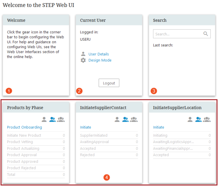
- Welcome - This widget can be customized to give Supplier users instructions on the Web UI that they use.
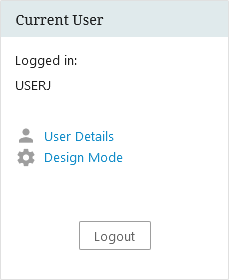
- Current User - This widget shows the user currently logged into this Web UI and allows for the user to change details, enter the Design Mode, or log out.
- Search - Finds nodes with an ID or name matching the search phrase.
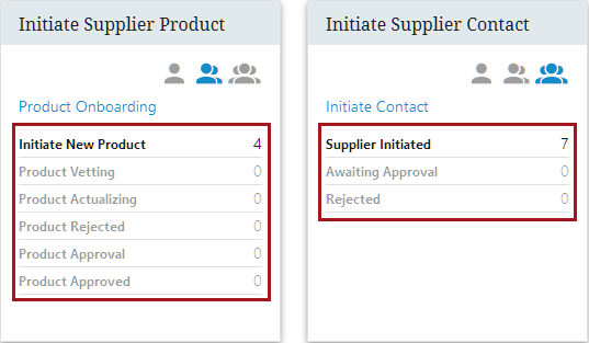
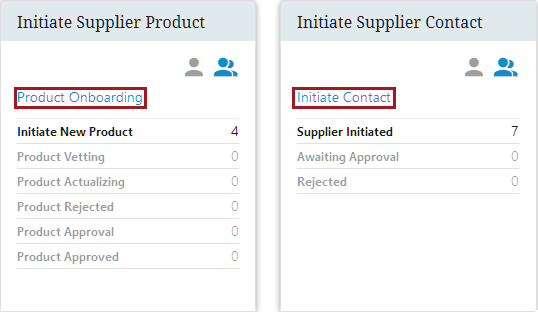
- Workflow Widgets - These configured widgets will track products or entities that have been onboarded as well as Supplier contacts and the locations.
Logging In
To log in to the User Web UI you must enter a valid username and password. Then click the Login button.
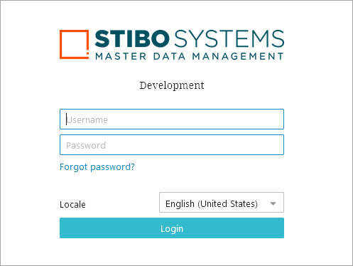
You will now be logged in to the Supplier Web UI and be able to view, edit, and save product information based on the privileges applied to you by your administrator.
Workflow and States
The Supplier Web UI is based on a workflow that lets the users select products and entities in a particular state, maintain products and entities, and subsequently submit products and entities to another state.
Note: In a workflow, supplier users can only view objects that are directly linked to their supplier classification. Objects that are children to blue folders within a classification folder are not available to supplier user workflow tasks. For more information, refer to the Moving Tasks through a Workflow in Web UI in the Web User Interfaces documentation or the topic Moving Tasks through a Workflow in STEP Workbench in the Workflows documentation.
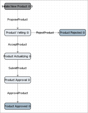
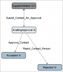
The follow examples are default workflows for products and entities. These examples are able to be customized per the users' needs.
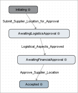
Initiating a Supplier Product Workflow
Initiating a Supplier Contact
Initiating a Supplier Location
The Status Selector Homepage widgets on the home page screen shows the number of objects for each state.
The idea is that a supplier user initiates a product, another (possibly internal) user enriches the product with additional information, a third user (internal marketing employee) updates marketing relevant information. The final state is 'Remove_Object_From_Workflow' meaning that the product has successfully been transitioned and maintained through the workflow using the Supplier Web UI.
Each state can be restricted to a specific User Group meaning that only this User Group can view and maintain products in that state.
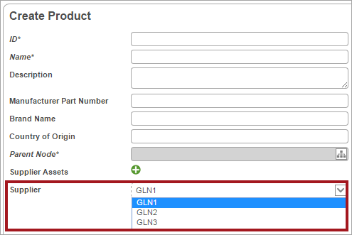
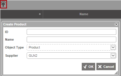
Initiating Products
To initiate a new product, click 'Create new...' in the state selector box. This will give you an edit screen where you must supply some basic information such as ID, Name and placement of the product. Optionally you can also enter some descriptive text and/or add the product to a batch.
Save
Clicking the  button saves the product in the data base and the product is submitted into the first state in the workflow.
All-View Across Multiple Suppliers
If a supplier user is a member to more than one supplier group and the setting 'Enable all-view for users that are a member of multiple suppliers' is set to Y(es) the supplier user will have to choose to which supplier group the created product should be created to. Refer to the Supplier Web UI Setup Guide topic.
When adding images the supplier user will have to choose to which supplier group the image should be added to or if the asset should be added to all accessible supplier groups.
Note: If a supplier user with access to more than one supplier adds an asset to a product only supplier users with access to the same product AND access to the same asset, the user will also be able to view the asset on the product.
It is also possible for a supplier user to create products when standing in the blue hierarchy using CreateSupplierProductToolbarAction:
In the object type selector it is possible to choose among all valid object types for where in the blue hierarchy the user is invoking this toolbar action.
And supplier users having access to more than supplier group will have to choose to which supplier group it should be made available.
Likewise it is possible to add assets to a supplier group when standing in the blue hierarchy with the CreateSupplierAssetToolbarAction component.
Maintaining Products
To maintain products within the Supplier Web UI you must first select a state in the State selector box.
This will give you the list of products currently in the selected state.
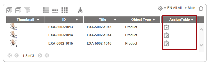
Notice the column 'AssignToMe.' Each task has an icon that allows the user to assign the task to himself ( ) or assign it back to the previous task owner or default group (
 ), if the icon is clicked.
Click the ID of one of the products to get the maintenance screen for that state.
Example of a maintenance screen
Maintenance screens are highly configurable and are explicitly designed for a specific state. The following example of a maintenance screen for the Enrich state illustrates the idea of the maintenance screens.
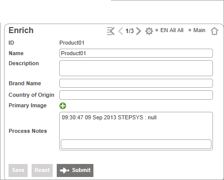
You can change the name of the product and optionally add a Process Note.
Process Notes
A process note is a text that you can enter to describe or explain something that you find relevant for the current product in the current state. The process note can be viewed in the following states in the workflow and can thus be used to give a message to users that will maintain the product in following state.
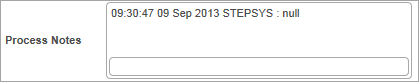
- Enter some text in the text field.
- Click the Save button.
- The text entered will now be displayed in the message area tagged with date, time and user. You can also click the Save and Submit button to save the Process Note.
Primary Image
One or more images can be uploaded and/or referenced to a product.
Reference an image from your hard drive
- Click the green plus icon. A pop up box with two choices appear.
- Select 'Upload and Insert Image(s)'. A file chooser appears that lets you browse to the image(s) on your hard drive.
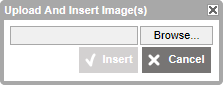
- Browse to the image you want to upload, select it and click the 'Open' button.
- Repeat step 3 if you want to upload more than one image.
- Click insert. The select image(s) will now be uploaded from your hard drive to the screen.
Reference an image from the database
- Click the green plus icon. A pop up box with two choices appears.
- Select 'Insert.' A dialog appears showing you the available images in the database.
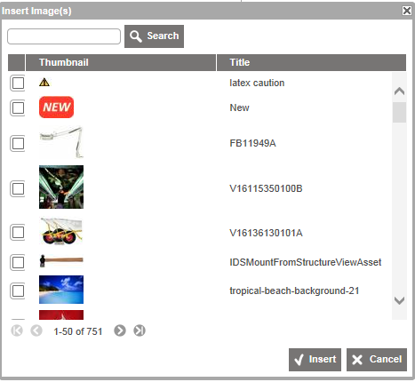
- Select one or more images.
- Click insert. The select image(s) will now be inserted to the screen.
- To view the image in full size, click the magnifying icon next to the image thumbnail.
- To delete the image, click the red cross button next to the image thumbnail.
- To view and edit details on the image click the pen button next to the image thumbnail. This will take you to a separate image screen.
Buttons
Save button
Clicking the button will save the values of the current product to the data base.
In the Initiate screen, it will submit the product into the first state in the workflow.
Reset button
The  button lets you reload the product values from the server.
Submit event button
The  button is placed within screens tied to states in a workflow. Clicking the button will save the values of the current product to the data base and move the product to the next state in the workflow.
Excel Integration
The supplier Web UI enables you to initiate and maintain products or entities in a Smartsheet for Excel. This can be very useful when you have to maintain or initiate many products or entities at a time. You can download multi-level product data to an interactive Excel file, maintain or add new product data in Excel, and then upload the Excel file to the Supplier Web UI again. You can also use the Smartsheet component to initiate multiple new products or entities using a pre-defined template in Excel to set up the products or entities.
Using Excel Smartsheet
To be able to use Smartsheet, you have to specify the export configurations in the Export Manager, and then associate them with the relevant template widgets and export actions in the Supplier Web UI. From the Export Manager, you can either export data to a Smartsheet or you can export a template that you can use when you want to initiate new products or entities.
For more information, refer to the Smartsheet Data and Template Configurations topic of the Data Exchange documentation.
For information on how to configure Smartsheets in the Supplier Web UI, refer to the Smartsheets in Web UI topic.
Download a Smartsheet with Data
- In the workflow widget, click the relevant state. A table containing the products that are currently in the selected state appears.
- Select the products you want to export to the Smartsheet file.
- Click the Download Smartsheet icon. If more download icons are available, hover the mouse over the icons to locate the appropriate icon.
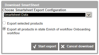
- In the Download Smartsheet dialog, choose the relevant export configuration and then select the relevant products for export.
- A download job starts, and you are taken to the download job page
- When the download job is finished, click Download, and then save the file to your hard drive.
When you have downloaded the file with data, you can start maintaining the data.
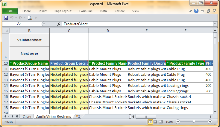
Enter Data in a Smartsheet
- In Excel, open the Smartsheet that will be edited. The Smartsheet opens on the Cover tab, which contains information about the download date and the color codes used in the Smartsheet. A Security Warning is displayed saying that macros have been disabled. However, macros must be enabled for the Smartsheet to work properly.
- Click Options, then select Enable Macros.
- On the workbook, click the second tab, which has the name of the node selected during the export process.
- Enter the product data.
- Click Validate sheet in the top left corner. The Serverside validation dialog opens.
- Select whether changed products only or all products should be validated, then click Start.
- In the Login dialog, enter the relevant STEP username and password.
The system validates the changes. The Serverside Validation window displays if the validation succeeded or if there are errors that need to be corrected. Errors can be located via Next Error to locate and them fix them.
- Save the file.
Note: Some fields, such as node pickers, will prompt the user for a STEP username and password. The system will only prompt for these credentials once.
You can now upload the data to the Supplier Web UI.
Upload a Smartsheet to the Supplier Web UI
- On the home page screen, in the Quick links widget, click Upload Smartsheet.
- In the Smartsheet upload dialog, click Browse, navigate to the relevant Smartsheet file, click Open, and then click OK.
- The upload process starts, and the upload process screen displays.
- When the upload process is completed, the products in the Smartsheet file have been uploaded to the Supplier Web UI, saved, and submitted to the first state in the STEP Workflow.
Note: If errors occur during an import, a Smartsheet file with the products that failed from the import process page can be downloaded. The error messages are displayed as screen tips in the Smartsheet file when the pointer is rested on an error cell. Next Error can be used to work a set of errors. When the errors have been corrected, the file can be imported again. However, there is limited support for this type of re-import. Some cells will be locked and consequently skipped during import.
Searching
You can search for products or entities that are currently in a state within the workflow.
- Go to the 'Search' widget on the home page screen.
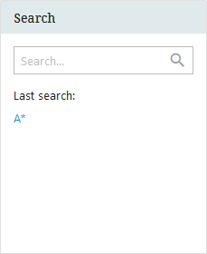
- Enter the ID or the Name of the product you want to find. The search result will be displayed on the right hand side:
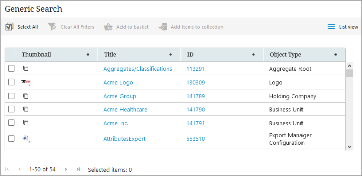
- Select a product in the search result list by clicking the workflow in the column to the right. This will take you to the product in its current state.
Global Navigation Panel
The Global Navigation Panel is a centralized task and navigation hub for the Web UI that is located to the left of the Web UI screen.
Using the Global Navigation Panel, users can do the following:
- navigate to any node in the hierarchy
- display workflow states or the tasks within
- access design mode
- log out of the Web UI
- access user information
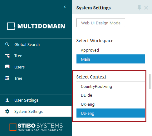
- select different contexts
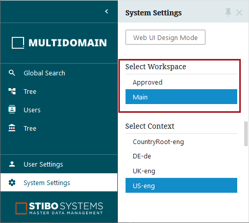
- select different workspaces
- access user impersonation
Changing context
To change the context, in the Global Navigation Panel, click System Settings and select a context from the list.
Changing workspace
To change the workspace click System Settings and select a workspace from the list.
User Details
The User Details screen allows logged in users to change their username, email, password, and exit permission groups. To access this screen, from the homepage, select 'User Details' on the Current User homepage widget.
Once selected, the User Details screen will load.
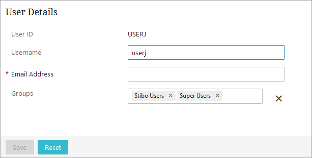
Users may change their user name or e-mail on this page and save the changes. Any changes will require that users also provide an e-mail address.
Log Out
To log out of the Web UI you must click the 'Logout' button on the Current User widget on the homepage screen.
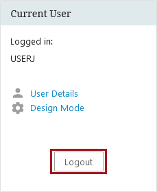
This will log you out and take you back to the login screen.