Summary
The following enhancements and changes have been made to the Web User Interface:
-
Customer-driven branding customization options have been expanded in the Web UI.
-
The User List screen now supports management of configured users, including adding, editing, and deleting system users.
-
New header components have been added to enable more powerful user searches.
-
The look and feel for workflow states in Tasks on the Global Navigation Panel is now in alignment with styling throughout Web UI.
-
Typeahead List Of Values are now dynamic when users can add values, and a scroll bar appears for ten or more values in a list.
-
On a Node Details, the breadcrumb is now blue to indicate they are links.
-
A new table-based editor for Data Containers is now available that improves upon and supersedes the Data Container Table View Editor.
-
A new Browse tab on a Node Picker Dialog called 'Node Selector Function' enables users to select a business function.
-
The Embedded Analytics Platform solution is no longer available for STEP.
-
Summary cards can now have a thumbnail of an image referenced by the object.
Details
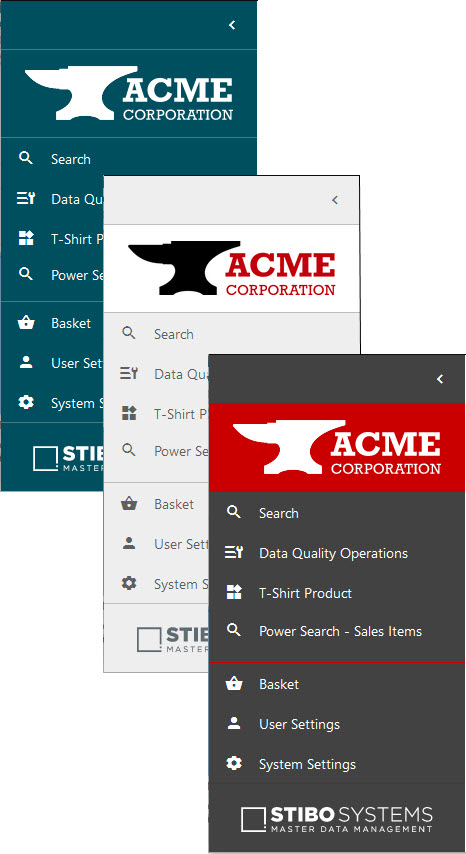
Customer-driven Web UI branding
The ability to incorporate your company's logo and colors into the Web UI has been expanded, enabling product managers to design and customize their Web UIs with additional precision. Prompted by significant interest from users, this update provides admins with the tools needed to create Web UIs that better conform to their company aesthetic, are pleasing to the eye, and give visual primacy to the customer's brand.
Via the Web UI Style tab in the designer, the Web UI can now be customized in the following ways:
-
A white background can be chosen to display behind the logo image at the top of the Global Navigation Panel in both the collapsed and expanded versions of the panel.

-
One of three color schemes can be selected for the Global Navigation Panel to better align the Web UI visual design with your selected logo image: the default Skagerrak blue, light gray, and dark gray. The color scheme chosen affects not only the Global Navigation Panel color, but also how table headers and homepage widget headers are shaded. With Skagerrak blue selected, those headers display with a light blue color; with light or dark gray selected, those headers display with a light gray color.
-
With either the light gray or dark gray color scheme selected, the appearance of action buttons throughout the Web UI can be adjusted to display as 'Bright' (the default option), which is turquoise,

or 'Muted,' which is a dark cyan color.

-
Select any color to serve as either the background for your logo at the top of the Global Navigation Panel, the lines that divide the various sections in the Global Navigation Panel, or both.
It should be noted that the Stibo Systems logo that displays at the bottom of the Global Navigation Panel is fixed in place and cannot be replaced or removed.
For more information on configuring a global style for your Web UI, refer to the Designer Web UI Style Tab topic in the Web User Interfaces documentation here.
For additional information about these updates to styling options in the Web UI, click on the video below:
User List screen improvements
The capabilities of the User List screen have been expanded to better empower admins to manage their users in the Web UI.
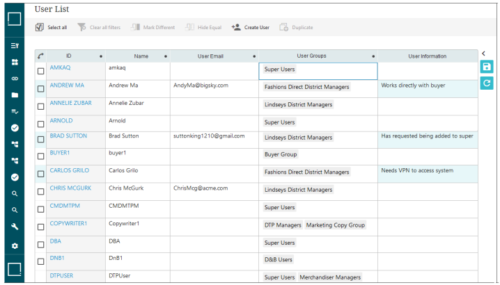
The updates to the User List screen are:
-
Admins can now configure the screen. By adding the new User List Global Representation component to the Global Representation List, admins can add and configure desired toolbar actions to the top of the table (including business actions and the ability to remove users via a 'Delete' button), and add additional user-specific attributes to display in a configurable display of columns. In the screenshot above, the column 'User Information' has been added.
-
All columns displaying on the User List screen now allow for column re-sizing, table sorting, and table filtering. This gives admins the ability to more clearly display user data, and more easily locate specific users, thus speeding the time required for admins to complete user-related tasks in the Web UI.
-
Data displaying in the default attribute columns for the User List screen—ID, Name, User Email, and User Groups—can now be edited within the screen. Additional attribute columns configured for the table are also editable.
-
The 'Create User' button is now found by default in the toolbar above the table, and allows admins to also add the new user's email address when creating a new user.
-
The Hide Equal, Mark Different, and Duplicate from Grid action buttons are now added to the toolbar by default.
-
A new 'User List Link' component enabling one-click access to the User List screen is now available via the 'Links' component. This component can be added to the Links Widget on the homepage, and the Links component in the Global Navigation Panel. This provides users with easier access to the User List screen than the link available via the System Settings option.
All users who update to 11.0 will have the updated User List screen described above. In order to add additional attribute columns and toolbar action buttons to the table shown on this screen, admin users must first add the User List Global Representation component to the Global Representation List and then configure the component.
For more information on the User List screen, refer to the Web User Interfaces documentation.
For additional information about these changes to the User List screen, click the video below:
New header components to improve user searches
Two new table header components, User Email Header and User Groups Header, are now available to be configured on Node Lists via these display modes: Table, Multi Edit, Compare, Grid, and Sequencing.
These new components can enable, for example, configuration of the User Email and User Groups columns in the Advanced Search screen, thus allowing a search of users to display results that include these important data points.
For more information on Node Lists and the various display modes, refer to the Node List Component topic in the Web User Interfaces documentation here.
For more information on the Advanced Search screen, refer to the Advanced Search topic, also in the Web User Interfaces documentation here.
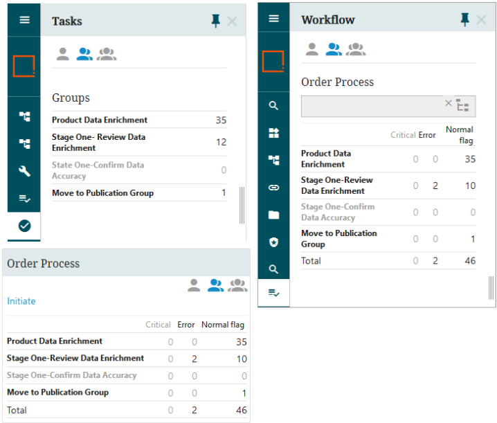
Workflow state alignment in Tasks on the Global Navigation Panel to Web UI Styling
The look and feel for workflow states in Tasks on the Global Navigation Panel, is now aligned with the Status Selector on the Global Navigation Panel and the Status Selector Homepage Widget for font size, weight, color, and word wrapping. Additionally, if a workflow state is empty, the state name and count displays consistently with other disabled text throughout Web UI.
For more information on workflows in Web UI, refer to the Workflows in Web UI topic in the Using a Web UI section of the Web User Interfaces documentation here.
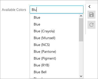
Typeahead List Of Values are now dynamic when users can add values
For an attribute with List Of Values (LOV) validation where the LOV is set to allow users to add values, the displayed values list will adjust once the third character is entered, and will continue to adjust as more values are typed.
Additionally, if the LOV has more than ten values, a scroll bar will now display inside the values list, enabling users to navigate through the list easier. If the LOV does not have more than ten values, it will adjust accordingly. These changes enable users to work quickly and more effectively when filling out information on products.
For more information on creating and maintaining attributes, such as LOV attributes, refer to the Attribute and LOV Creation and Maintenance in Web UI topic in the Using a Web UI section of the Web User Interfaces documentation here.
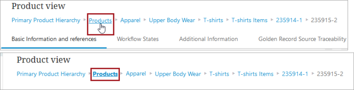
Updated link view for Breadcrumb and Tab indication
A Breadcrumb, which is added to a Below Title parameter located under Child Components on a Node Detail screen, is now blue to indicate that there are clickable links, and when hovered over with a mouse, an underline appears underneath the link in focus. Additionally, when a user lands on a page and presses the Tab button, the breadcrumb link in focus is underlined and in bold. Previously, the links in a Breadcrumb were gray and would only turn blue with an underline if the link was in focus. Turning all of the links blue now shows users they are navigable links, and there is clear indication as to which link is in focus.
For more information, refer to the Below Title Component (here) and the Below Title Breadcrumb (here) topics in the Using Web UI section of the Web User Interfaces.
New table-based data container editor
A new Web UI table-based editor for data containers called 'Globally Configured Multi Edit Data Container' provides a more streamlined and user-friendly experience for end users. This component can be applied to both entities and products where users can view, edit, add, or delete the records with an entity or product selected. It also supports editing multi-valued attributes and features like sorting / filtering along with other standard table-based features. This new component improves upon and supersedes the 'Data Container Table View Editor' component, which will be deprecated and withdrawn in a future release.
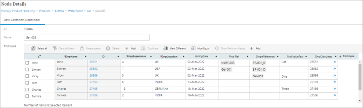
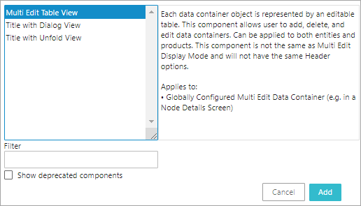
The Globally Configured Multi Edit Data Container component can be added to a Node Details screen. The table columns are configured using the 'Multi Edit Table View' component, also new with the 11.0 release, located within 'Global Data Container Representations'.
Multi Edit Table View component is not the same as Multi Edit Display Mode and will not have the same header options.
For more information, refer to the Globally Configured Multi Edit Data Container topic in the Data Containers in Web UI section of the Web User Interfaces documentation here.
For additional information about these updates, click the video below:
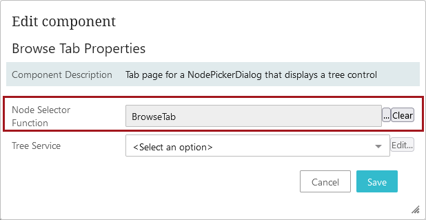
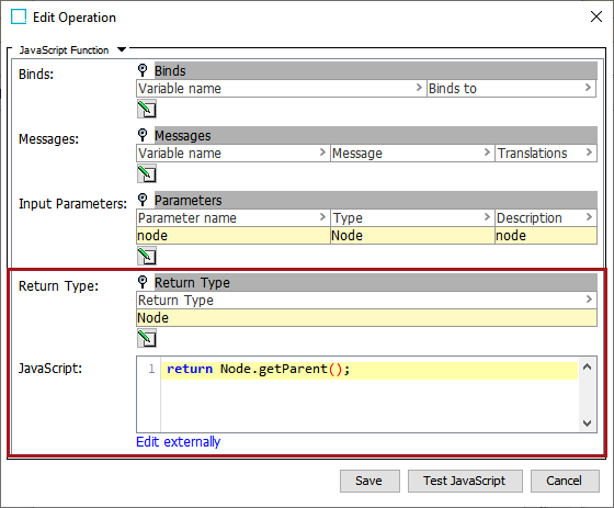
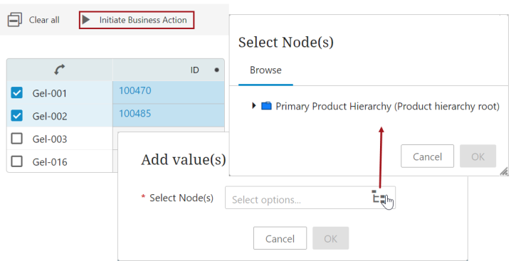
New Browse Tab business function
A new parameter field for the Browse tab on a Node Picker Dialog called 'Node Selector Function' enables users to select a business function that brings the user directly to the desired node.
The ability to select a business function that returns a specific node aids users who need to make numerous references throughout their work day. Being brought directly to the relevant node saves valuable time and enables them to complete their tasks more efficiently instead of having to navigate to the desired node each time.
To enable, users must select a business function for the 'Node Selector Function' written in JavaScript that has a Return Type of 'Node.'
The business function selected in the 'Node Selector Function' field will be executed only if the user has selected one object and the starting node exists.
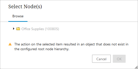
If the business function configured in the Node Picker Dialog returns a node that does not exist in the static root node hierarchy, a warning message displays, and the user can manually navigate to the desired node.
If more than one object is selected, the 'Node Selector Function' field will be ignored and the top-most node in the hierarchy will display.
For more information on the new 'Node Selector Function' parameter, refer to the Node Picker Dialog topic in the Web User Interfaces documentation here.
For additional information about this feature, click the video below:
Embedded Analytics Platform components withdrawn
The Embedded Analytics Platform (EAP), powered by Sisense, solution is no longer available, and the corresponding components have been withdrawn from Web UI:
-
Embedded Analytics Platform Widget
-
Embedded Analytics Platform Screen
-
Embedded Analytics Platform Flyout Panel (configured as an 'Analytics' button on a Node Details screen)
If a customer has Power BI, they can still configure the Power BI Analytics Flyout Panel (configured as an 'Analytics' button on a Node Details screen). It is only the Sisense version of the Analytics button that has been withdrawn. For more information on our existing analytics offerings, refer to the Analytics section of documentation here.
Additional feature in summary cards
Summary cards for products, classifications, and entities can now have a thumbnail of an image referenced by the object being worked on.

The new parameter, found in the summary card properties in the designer (shown below), is 'Thumbnail Reference Type.' When an image-based reference type is selected, a thumbnail of that image displays in the leftmost part of the summary card. If there are multiple images linked to the same reference type which is selected in the summary card, the image thumbnail will select the first image linked to the product, entity or classification. If no reference type is selected, no image thumbnail will be displayed. The thumbnail can be clicked to view a full size image.
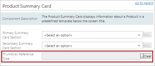
Additionally, the Product Sufficiency Card has also been updated and now enables display of a thumbnail image.
For more information on summary cards, refer to the Below Title Component topic in the Web User Interfaces documentation here.