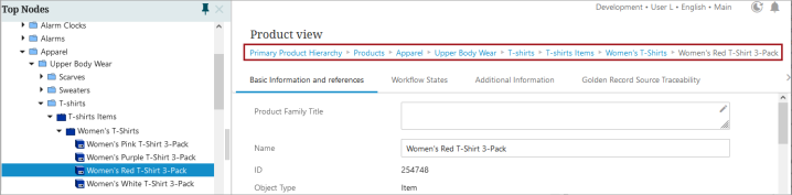
The Breadcrumb child component on the Below Title component describes where in the hierarchy the object resides. A breadcrumb is also available in the 'Description Card' option on the Summary Card components, but in the event only a breadcrumb should display under the title, the Breadcrumb option is optimal. Once configured, a breadcrumb describing the hierarchy path from the current node up to the nearest node of the specified root type will display. Each breadcrumb node is clickable unless the Readonly parameter is selected.
For details on the Below Title component, refer to the Below Title Component topic.
Configuring Breadcrumb Properties
To configure display of the Breadcrumb component, follow the instructions described below.
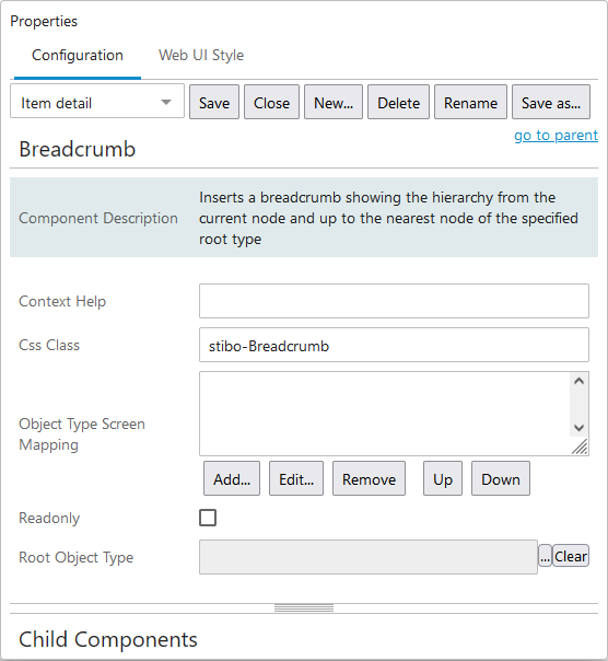
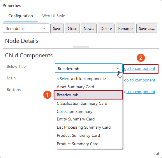
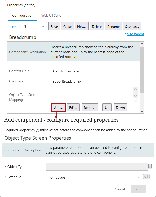
- Access the designer on the Node Details screen mapped to the relevant Asset object type. Under 'Child Components', select the 'Breadcrumb' option from the 'Below Title' dropdown. Then click 'go to component'.
- Populate the configuration parameters for the component. Each component is listed and described below.
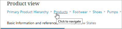
- Context Help- Text added in this field displays when the cursor is placed over any element in the breadcrumb navigation path. In the screenshot below, the Context Help field has been populated with the text ‘Click to navigate’.
- Css Class- Enter the name of a CSS style to be set as the primary style for the component.
- Object Type Screen Mapping- This field is an optional screen to map. When the Add button is clicked, an Object Type Screen Properties popup displays. In this window, the Object Type and Screen ID must be selected.
- Read Only- When checked, the elements that make up the breadcrumb navigation path will not be hyperlinked.
- Root Object Type- By defining the Root Object Type, the breadcrumb will display the navigation path from the current node back to the nearest node of the root object type specified in this field.