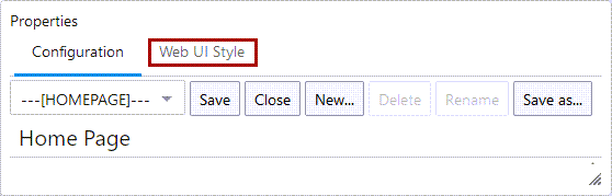
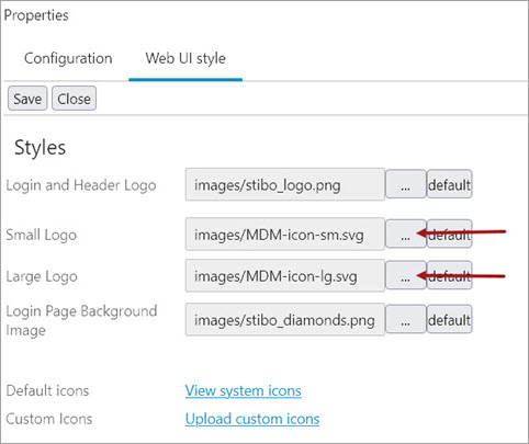
The settings available on the Web UI Style tab allow the admin user to make specific global changes to the look and feel of the Web UI. To access these parameters, click the 'Web UI Style' tab found at the top of the designer panel, as shown in the screenshot below.
Prerequisites
It is expected that anyone configuring visual elements of the Web UI via the Web UI Style tab is familiar with the Web UI Designer, as basic concepts for working with the designer are not covered in this section. In addition, the user must have appropriate privileges to access the designer. Additional information can be found in the Designer Access topic.
Configuring the Web UI Style tab
The configuration parameters listed in the Web UI Style tab primarily affect the appearance of the Global Navigation Panel. Visual elements in the panel that can be customized include the panel's color scheme and the logos that display at the top of both the panel's expanded and collapsed versions. Admin users can also select one of two color styles for the action buttons that display throughout the Web UI, and upload new icons to be made available when configuring the display of action buttons.
The available parameters on the tab are listed and described below, along with information about how to configure them.
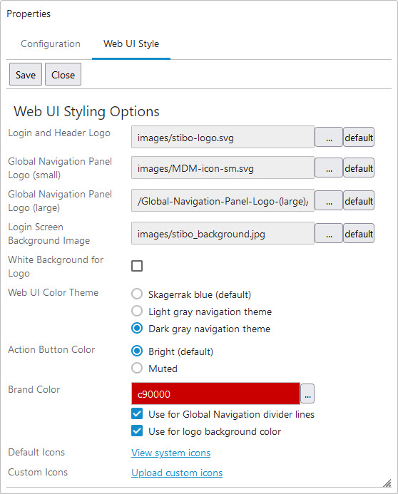
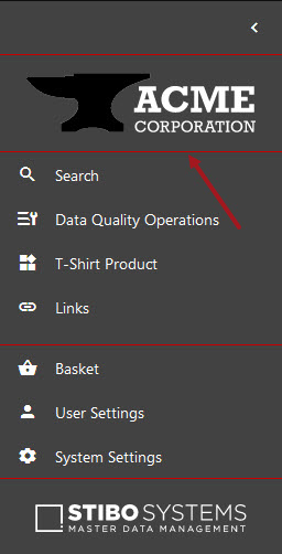
Global Navigation Panel Logo (small) - The logo image selected will display at the top of the Global Navigation Panel when the menu is collapsed (narrow view). The image must be no larger than 265kb in size. Svg, png, or jpg are acceptable file formats. Recommended dimensions are 32px in width (or less) and 72px in height (or less). If using the default color scheme, Skagerrak blue, it is recommended that admins select logo images that stand out against the dark blue background.
Global Navigation Panel Logo (large) - The logo image selected will display at the top of the Global Navigation Panel when the menu is expanded (wide view). The image must be no larger than 265kb in size. Svg, png, or jpg are acceptable file formats. Recommended dimensions are 208px in width (or less) and 56px in height (or less). If using the default color scheme, Skagerrak blue, it is recommended that admins select logo images that stand out against the dark blue background.
It may be useful to select a larger version of the same image selected for the 'Global Navigation Panel Logo (small)' parameter. When the user toggles between the collapsed and expanded versions of the Global Navigation Panel, the logo image switches between the 'Global Navigation Panel Logo (small)' and the 'Global Navigation Panel Logo (large)'. If two differently sized versions of the same image are used, the resulting effect of expanding and collapsing the Global Navigation Panel is a smooth enlargement / reduction animation.
White Background for Logo - Check the box to change the background color for both Global Navigation Panel Logos (small and large) to white. Leave the box unchecked to retain the color selected in the 'Web UI Color Theme" parameter as the background color.
Web UI Color Theme - Select one of three options for the Global Navigation Panel background color. If Skagerrak blue, the default option, is selected, additional custom color branding options accessible in the 'Action Button Color' and 'Brand Color' parameters will not be available. However, those parameters will be available and configurable if either the 'Light' or 'Dark gray navigation theme' options are selected. The selected color theme determines the color of the Global Navigation Panel as well as how the table and homepage widget header are shaded: if Skagerrak blue is selected, the table and widget header will display in a light blue color; if either the 'Light' or 'Dark gray navigation theme' is selected, the table and widget headers will display in a light gray color.
Action Button Color - Select one of two color themes for the action buttons that display throughout the Web UI. 'Bright,' the default option, enables a more vibrant appearance for action buttons, shading active buttons a light turquoise color. 'Muted' provides active buttons with a more subdued appearance, shading active buttons a dark teal color. If 'Skagerrak blue' is selected for the 'Web UI Color Theme' parameter, these options will not be accessible, and the 'Bright' setting will be enabled by default.
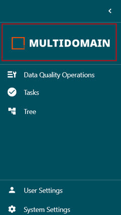
Brand Color - Select a custom color that will display as either the background color for the Global Navigation Panel Logo, the divider lines separating sections in the Global Navigation Panel, or both.
Check the 'Use for Global Navigation divider lines' box to apply the selected color to the divider lines that separate the various sections of the Global Navigation Panel.
Check the 'Use for logo background color' box to apply the selected color to the background of the logo images selected for the small and large Global Navigation Panel Logo parameters.
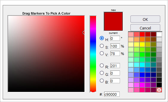
Click the ellipsis button to bring up the color selection window, shown below. Select the color to apply to the Global Navigation Panel logo background or divider lines via a color picker, an HSV or RGB number, or a hex code.
Default Icons - When 'View system icons' is clicked, a window displays showing all available system icons. This is a reference feature only as no icons can be selected or applied to Web UI elements from this window.
Custom Icons - Click 'Upload custom icons' to bring up a dialog that allows users to upload image files from their machine directly into the stock of available system icons. Images loaded will not display in the 'Default icons' window, but will be available when selecting custom icons throughout the Web UI.
Important: Logo files can be svg, png, or jpg formats unless indicated differently above. Pixel recommendations are shown per logo. Use caution uploading high-resolution Web UI Style tab image files, as this may cause Web UI pages to load more slowly.
Using custom icons
In order for the icon to appear consistently in all Web UIs within a clustered environment, users must first add the files to the server either manually or via the 'Custom Icons' process described in the previous section. The default path to the file system location where custom images are located is webui/custom-theme/icons.
To change the default file location, add the case sensitive property WebUI.Theme.Images to the sharedconfig.properties file on the STEP application server. The property needs to point to an existing directory in which the server should pull the stored logos. For example:
-
Small logo example:
WebUI.Theme.Images=webui/custom-theme/images/Small-Logo
-
Large logo example:
WebUI.Theme.Images=webui/custom-theme/images/Large-Logo
Once the path is in the sharedconfig.properties files, open the designer and navigate to the Web UI Style tab. From there, the desired icon can be browsed for by click the ellipsis button ( ). Choose the logo from the 'Select Existing' tab and click OK.
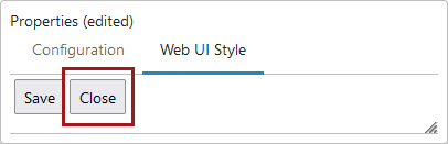
When finished with all Web UI style changes, click the Save button, and then the Close button to exit the designer.