Search results product card view
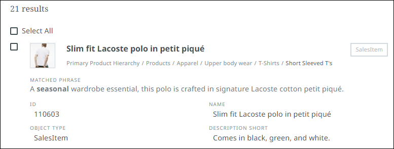
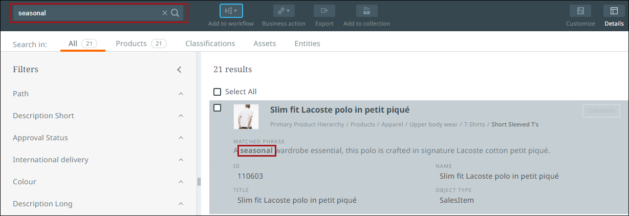
When searching for objects, you need to be able to identify them quickly when reviewing the results. The search cards which display the search results, provides you with enough information within a card view to identify the objects being returned while also allowing you to validate your search.

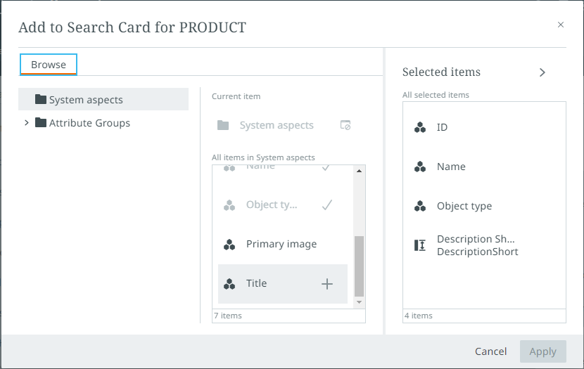
Search cards display up to four attributes per card. The attributes that are configured to show on the card view are the same attributes that will be displayed as columns if creating a new perspective with these results. These attributes can be changed by clicking the customize button via the toolbar and selecting the desired attributes from the "Add to Search Card" menu. Only the first 4 items listed will appear on the search card. Refer to the Item picker topic for more information.

Any relevant matched phrases appear in bold on the search card.

GraphQL queries have been created to retrieve search attribute configuration settings and to update attribute configuration settings. Administrators can get the information to run these queries from the Creating default collection perspective columns topic.
Details panel
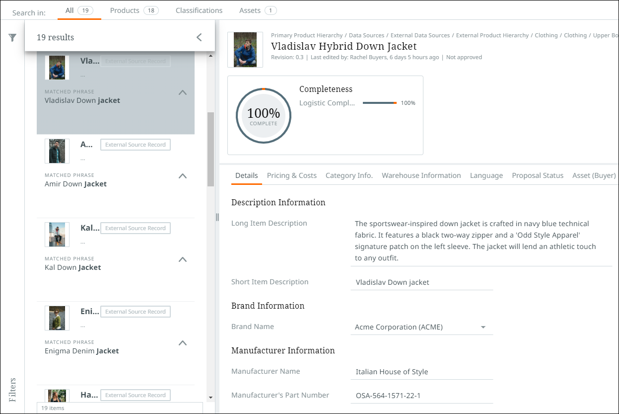
If you wish to view the details of a search result, select a card or click the details button via the toolbar to open up a details panel on the right-side of the screen. Information provided in this panel is identical to the details pane found via task and browse perspectives. For more information, refer to Details view.
To return to the search results screen, click the details button in the toolbar.
