Summary
Navigation in the Web UI is now faster and more focused on content with the new Global Navigation Panel. The Global Navigation Panel maximizes the Web UI's working space by displaying inessential on-screen elements only when needed, and unifies much of the Web UI functionality into a single, easily accessible location. The Global Navigation Panel makes content the center of attention by allowing the panel to expand to show a full list of data objects, or collapsed to display only a narrow ribbon configured with navigation and action buttons. Additionally, the Global Navigation Panel is now closely aligned, both in form and function, with the navigation component in the Product Data Syndication (PDS) tool, which makes switching between tools seamless.
Details
Development of the Global Navigation Panel was prompted by our customers: they wanted to use the Primary Navigation Panel component instead of the Stack Panel, but could not easily make the change because the Primary Navigation component was missing features they needed. With the introduction of the Global Navigation Panel, all functional features from both the Stack Panel and Primary Navigation components are now available in Global Navigation, along with extra features like direct navigation, search, and menu groups.

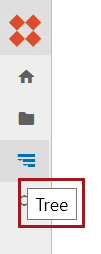
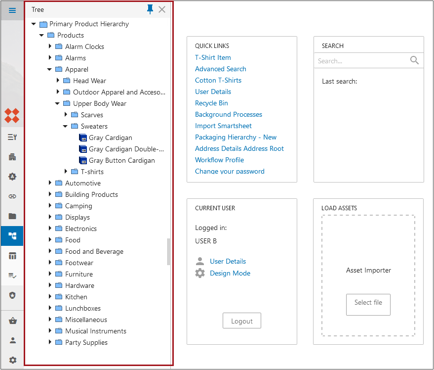
As shown in the screenshot above, the new Global Navigation Panel displays as a narrow ribbon flush to the left side of the screen. A constant presence in the Web UI, display of the panel persists regardless of which screen is being viewed. By hovering the cursor over a button in the collapsed panel, the configured button label displays.

Web UI behavior when a user clicks on a button in the Global Navigation Panel depends on the button itself. For example, clicking a configured 'Search' button displays a new column with a search field at the top. When search terms are added to the search field, search results display in a list beneath the field. Clicking a 'Direct Navigation' component set up to take a user to the homepage, for example, navigates the user to the Web UI homepage without opening a new column.
At the bottom of the Global Navigation Panel are a set of default buttons that will display on all Web UIs for which a Global Navigation Panel has been configured. They are 'User Settings' (![]() ), 'System Settings' (
), 'System Settings' (![]() ), and, provided the system has the appropriate component added to their system, 'Basket' (
), and, provided the system has the appropriate component added to their system, 'Basket' (![]() ). The ability to log out of the Web UI is accessible by clicking the 'User Settings' button, and the ability to access the designer, change the viewed workspace or the viewed context is accessible by clicking the 'System Settings' button.
). The ability to log out of the Web UI is accessible by clicking the 'User Settings' button, and the ability to access the designer, change the viewed workspace or the viewed context is accessible by clicking the 'System Settings' button.
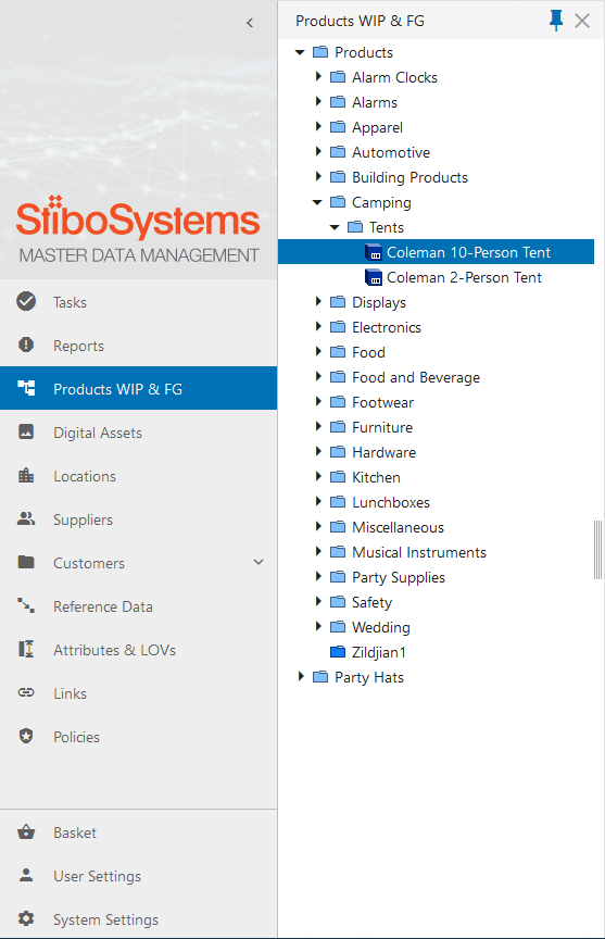
Users can configure a Tree Navigator component to display in the Global Navigation Panel by adding the Tree Navigator to a 'Menu Group' component. When clicked, the Tree Navigator will show the configured part of the hierarchy in a column to the right of the Global Navigation Panel, and will default as pinned, meaning it will not collapse when the user starts working in the screen. Clicking the blue pin button at the top of the column disengages the pin, which will cause the column to retract when the user begins work on the current screen.

Previous to this release, the 'Stack Panel' component would display a browsable hierarchy at all times. It could be collapsed but would not display at all when minimized, so it was most often used fully expanded. This resulted in a significant reduction of screen space available to display screen content. Now, the Global Navigation Panel works to show users only what they need in the moment, while providing more flexibility in determining what displays on-screen.
Stibo Systems encourages all customers to start migrating to the Global Navigation Panel as all other components that manage navigation will be gradually phased out.
Other considerations
With the introduction of the Global Navigation Panel, users updating to 10.0 can expect some additional changes related to navigation functionality in the Web UI:
- Web UIs with the Stack Panel component configured have that component persist following an upgrade to 10.0. To enable the Global Navigation Panel, an admin user must take action to configure that component. If users have both a Stack Panel and a Global Navigation Panel component configured, the Web UI disregards the Stack Panel and displays the Global Navigation Panel.
- The Primary Navigation Panel has changed into the Global Navigation Panel with the release of 10.0. Web UIs with the Primary Navigation Panel configured have an automatic migration of their configurations from the Primary to the Global Navigation Panel upon upgrading to 10.0, requiring no additional action from an admin user. Customizations made to the Primary Navigation Panel (such as color and logo) may be lost; admin users should review and make any configuration changes via the Web UI style tab in Web UI Design Mode.
- The Global Header is deprecated for 10.0. Users with the Global Header Panel component configured on their Web UIs will retain that component following an upgrade to 10.0, but are encouraged to transition to the Global Navigation Panel in the near term.
- Much of the functionality available in the Corner Bar component has shifted to the Global Navigation Panel. For instance, access to the designer is available in the Corner Bar when no Global Navigation Panel is configured, but is available under the Settings button when a Global Navigation Panel is configured for a Web UI.
- The Warning Notification and Background Process panels remain accessible in the same section of the screen as before; if the Global Navigation Panel is added, the Warning Notification and Background Process panel buttons will display.
- Though the Home button has been removed from the Corner Bar for 10.0 regardless of whether a Global Navigation Panel is configured, a Direct Navigation component can be configured as a Home button in the Global Navigation Panel; additionally, the logo image at the top of the Global Navigation Panel, if configured, can also navigate the user to the homepage.
- For additional items for consideration (e.g., PLM configuration), refer to the 10.0 Upgrade Guide here.
For more information on the Global Navigation Panel, refer to the Global Navigation Panel topic in the Web User Interfaces documentation here.
For more information on Web UI issues to consider when upgrading to 10.0, refer to the 10.0 Upgrade Guide: Web UI topic here.