The Grouping component allows admin users to configure attributes to display on a Node Editor contingent on a value entered for a source attribute. For instance, if a product manager selects 'Yes' for the 'HAZMAT' attribute, the Grouping component can be configured so that a series of additional, or contingent attributes, display. If the user selects 'No,' or leaves the field blank, those contingent parameters will not display. If additional layers of attribute display restrictions are desired, a second Grouping component can be configured on one of the contingent attributes hidden by the first Grouping component, so that if a specific value is saved for one of the attributes that only displays when 'HAZMAT' has the 'Yes' value, a new set of contingent attributes will display. In this way, the Grouping component can be used to restrict the number of fields to only those that end users need to view, and can help streamline data entry tasks.
The steps described in this topic will enable admin users to add and configure one or more Grouping components to their Node Editor screens.
Prerequisites
It is expected that anyone configuring the Grouping component is familiar with the Web UI Designer, as basic concepts for working with the designer are not covered in this section. In addition, the user must have appropriate privileges to access the designer. Additional information can be found in the Designer Access section of the Web User Interfaces documentation.
Add a Grouping Component to a Node Editor
The first step to enable the Grouping component is to add it to a Node Editor screen.
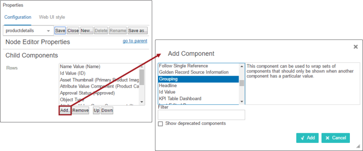
- Open the designer and navigate to the relevant Node Editor screen.
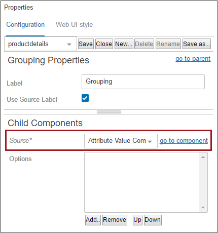
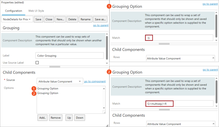
- On the Node Editor Properties designer window, under Child Components (shown in the screenshot above-left), click the Add button below the field for the 'Rows' parameter.
- On the 'Add Component' dialog, select the Grouping component, (as shown in the screenshot above-right).
- Click the Add button.
Configuring Grouping Properties
Next, the Grouping component must be configured. To configure the Grouping component, admins must take the following steps:
-
Assign a source attribute to Grouping properties
-
Add options to Grouping properties
-
Configure Grouping option properties
Assign a source attribute
The attribute configured on the 'Source' parameter is important because specific values provided for this attribute determine whether contingent attributes display or remain hidden.
The steps required to assign a source attribute are described below:
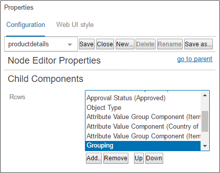
- Go to the Node Editor Properties > Child Components > Rows.
- Double-click the Grouping component to open its configuration properties designer window.
A new window called 'Attribute Value Component Properties' (shown below) displays. Using the Node Picker, select the source attribute whose value will determine whether additional attributes (to be configured later in this topic), will display or remain hidden.
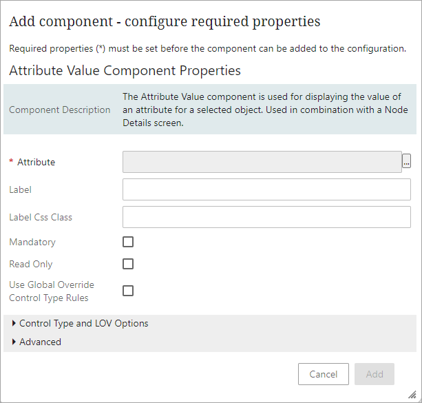
- On the 'Attribute' parameter, click the ellipsis button (
 ) and select the desired source attribute.
- Click the Add button.
The Attribute Value Component Properties window will close, and the Grouping Properties designer window will display with the 'Source' parameter populated with the 'Attribute Value Component' selected. Admin users returning to the Grouping component to edit the source attribute can access the 'Attribute Value Component Properties' again by clicking the 'go to component' button to the right of the 'Source' field, as shown below.
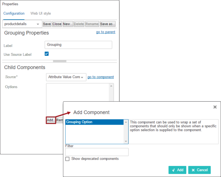
Add Grouping component to Options
With the source attribute configured, admins can now add a 'Grouping Option' to the 'Options' field. This is the intermediary step between adding the component and defining the source attribute value and the contingent attributes that will display or remain hidden based on that value.
The steps required to add the 'Grouping Option' are described below:
- Under the field on the 'Options' parameter, click the Add button. The 'Add Component' dialog will display.
- On the 'Add Component' dialog, select the Grouping Option component.
- Click the Add button, and the dialog will close.
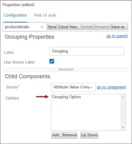
The Options parameter will now list the newly added Grouping Option.
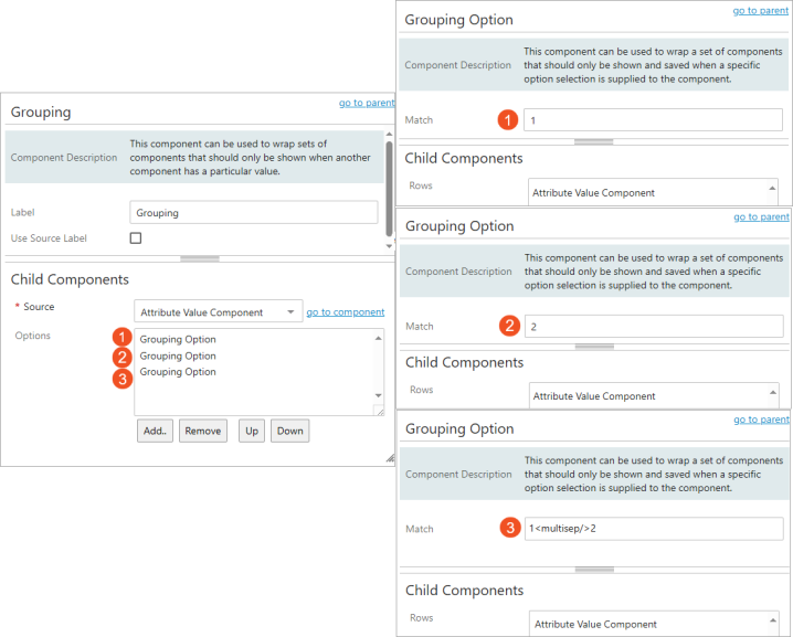
Configuring Grouping Option properties
Now the Grouping Option component can be configured to define the source attribute value that, if entered, will prompt display of contingent attributes.
The steps required to configure the Grouping Option properties are described below:
- Double click the Grouping Option component that has been added to the 'Options' field. The Grouping Option Properties designer window displays.
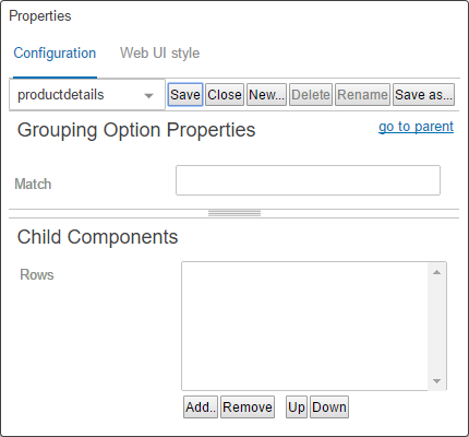
- Match: In this field, enter the precise value that must be added for the source attribute to unlock display of one or more contingent attributes. If the attribute value entered is different from the value entered in this field, the contingent attributes will not display. Because the 'Match' value requires a precise match, it is recommended that admins consider using an attribute with an LOV validation base type for the source attribute, as this disallows users from adding values that may be variations on the correct value, but not a precise match. For instance, if 'Y' is added when 'YES' is what is required to prompt display of contingent attributes, the contingent attributes will not display.
- Rows: In this field, enter the 'contingent' attribute(s) that should display if the 'Match' value is provided for the source attribute. Single attributes or entire attribute groups can be added in this field.
The steps required to add the contingent attributes in the 'Rows' field are described below:
- Under the field on the 'Rows' parameter, click the Add button. The Add Component dialog will display.
- Select the required component. Commonly used components are the Attribute Value Group Component and the Attribute Value Component.
- Click the Add button, and the 'Add Component' dialog will close.
- Once the desired configurations have been made, click the Save and Close buttons on the designer.
If more than one Grouping is needed, apply the above steps as many times as needed. Each Grouping component added to the 'Rows' field on the Node Editor designer window will display as the bottom-most instance of 'Grouping,' and will need to be configured.
Adding additional Grouping components
In some instances, admins will require that a specific value added to a contingent attribute should prompt display of yet another set of contingent attributes. The Grouping component supports this 'nested' approach as well, allowing for multiple layers of grouped attributes.
In the Child Components section on the 'Grouping Option Properties,' in the 'Rows' field where the Attribute Value or Attribute Group Components have been configured, add a new 'Grouping Option' component.
On the 'Grouping Option Properties' designer window, add a 'Grouping' component to the 'Rows' field. Click into the 'Grouping' component to configure a match value and contingent attributes.
On the 'Grouping Properties' designer window, define the 'Source' attribute as described in the 'Assign a source attribute' section above. In the 'Options' field, add a new 'Grouping Option,' and double click to access. In the 'Grouping Option Properties' designer window, add the match value for the new source attribute, and then in the 'Rows' field, add the new contingent attribute(s) that will show when the match value is entered as a value for the new source attribute.
Save and close the designer, and the second Grouping component will be operable.
Repeat these steps to add additional tiers of Grouping components.
Important: To avoid issues related to display in the Node Editor, be sure that the source attribute and contingent attributes are valid for the object type being viewed and have been instantiated on the relevant product hierarchy. If this is not done, the Grouping component will not work as expected.
Use Case Examples
Use Case 1: Conditional display based on multiple 'Color' LOV attribute values
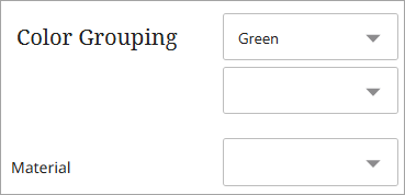
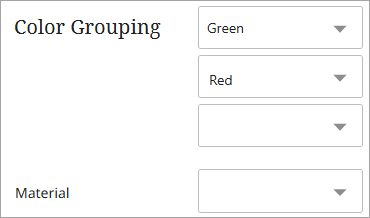
In this use case, the 'Color' LOV attribute has two selectable values: 'Green' (LOV Value ID = G) and 'Red' (LOV Value ID = R).
Requirements
-
When the user selects 'Green', the 'Material' attribute is displayed.
-
When the user selects both 'Green' and 'Red', the 'Material' attribute is displayed.
When multiple 'Color' value combinations should trigger the conditional display of the 'Material' attribute, a Grouping Option must be created for each of the combinations.
Grouping Option 1: Selecting only 'G' (Green) in 'Color Grouping' displays the 'Material' attribute.
Grouping Option 2: Selecting both 'G' (Green) and 'R' (Red) in 'Color Grouping' displays the 'Material' attribute.
Configuration
To include multiple values, use the <multisep/> tag without spaces between each value (e.g., G<multisep/>R).
Important: Configuring multiple Grouping Options may negatively impact screen loading performance.
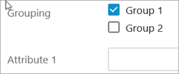
Use Case 2: Conditional attribute display based on group selection
This use case involves displaying different attributes based on group selections. Three Grouping options are created.
-
Grouping Option 1: Selecting the value 'Group 1' displays ‘Attribute 1’.
-
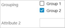
Grouping Option 2: Selecting the value 'Group 2' displays 'Attribute 2'.
-
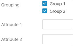
Grouping Option 3: Selecting both 'Group 1' and 'Group 2' displays both 'Attribute 1' and 'Attribute 2'.
Configuration
To include multiple values, use the <multisep/> tag without spaces between each value (e.g., 1<multisep/>2).