The Sufficiency Card option available on the Below Title component displays sufficiency and metric information, in addition to breadcrumb data and a thumbnail image, below the screen title on a Node Details screen.
Configuring the Sufficiency Card enables display of the Sufficiency Indicator and Sufficiency Panel.
-
The Sufficiency Indicator displays a preview of sufficiency information for products or entities.

-
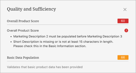
The Sufficiency Panel (also called the Sufficiency Inspector) is accessed by clicking the Sufficiency Indicator. Doing so displays an expanded set of sufficiency information. The following image is part of the data described in the Sufficiency Panel topic in the Data Governance documentation.

The Sufficiency Card is not impacted by privilege rules. If sufficiency scores are configured for a screen, they are visible for all users.
For details on the Below Title component, refer to the Below Title Component topic.
Configuring the Sufficiency Card
To configure the display of the Sufficiency Card, follow the instructions below.
-
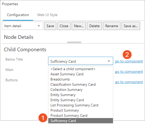
Access the designer on the Node Details screen mapped to the relevant object type. Under Child Components, select the 'Sufficiency Card' from the Below Title dropdown. Then click 'go to component' to display the Sufficiency Card properties screen in the designer.

-
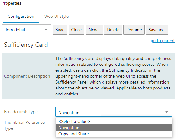
For the 'Breadcrumb Type' parameter, select an option:

-
Navigation - (default) users click on any element in the breadcrumb path to auto-navigate to that element. Click the ellipsis at the beginning of the breadcrumb to show and navigate to hidden hierarchy levels.

-
Copy and Share - users click the breadcrumb to copy the entire hierarchy path to the clipboard.
-
-
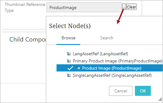
For the 'Thumbnail Reference Type' parameter, click the ellipsis button (
 ) and select the desired image reference type from the Select Node(s) dialog. If a multi-reference reference type is selected, the first referenced image displays.
Click the 'Clear' button to remove the selected reference type image from the Sufficiency Card.

A thumbnail image of the selected reference type for the object displays to the far left of the card information.
