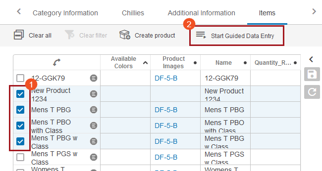
To use Guided Data Entry in the Web UI, users must first have configured a screen-by-screen progression, or 'stepper' object,' in the workbench, and then added the 'Start Guided Data Entry' toolbar action in the Web UI on a Node List. Information on this can be found in the Guided Data Entry sections of the Web User Interfaces documentation here.
- On a Node List in the Web UI, select which products should be entered into Guided Data Entry. Once the desired products are selected, click the 'Start Guided Data Entry' toolbar action button. Placing the cursor over the toolbar action icon or text will bring up a tooltip that displays the name of the selected stepper object that was configured and named in the workbench. That configuration process is outlined in the Configuring Guided Data Entry section of the Guided Data Entry documentation here.

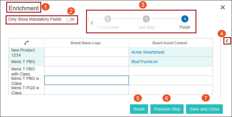
- The Guided Data Entry screen displays. A list of the selected products will display, as well as the attributes or reference types configured to display on the first step of Guided Data Entry. The various elements that make up the Guided Data Entry screen are numbered in the screenshot below. A list corresponding to those numbered items can be found below the screenshot.

- Title: The name entered in the 'Title' field, found in the 'Start Guided Data Entry Properties' screen in the designer, will display.
- Only Show Mandatory Fields: A switch that, when activated, will show only those attributes or reference types that have been designated as mandatory. It is set to inactive as default.
- Progress tracker: The titles of all the steps that make up the 'stepper' display beneath the number of the step which displays in a circle. The number of the step will be highlighted blue when selected. Users may navigate between the steps by clicking on either the step number or step labels that display. For steppers with more steps than can be displayed all at once in a Guided Data Entry window, a left arrow and right arrow display at either end of the progress tracker which can be clicked to navigate a user to any step in the Guided Data Entry stepper.
- Expand Edited items arrow: When users click this arrow, a panel expands rightward into the Guided Data Entry window and lists all objects that have been edited in the current Guided Data Entry step.
- Reset: This button will revert any entered value in the current step to the last saved value. This button is only applicable to data that has been entered on a given step. Clicking this button will not reset all entered data on all steps of the Guided Data Entry stepper.
- Previous Step: This button will navigate the user to the previous step in the Guided Data Entry window. It is inactive on the first step of Guided Data Entry. Clicking the 'Previous Step' button will move the user backward one step in the Guided Data Entry stepper, and will not cause any newly entered data to be removed.
- Next Step / Save and Close: On any step that is not the final step, a button labeled 'Next Step' will display. Clicking the 'Next Step' button will move the user forward one step in the Guided Data Entry stepper, and will not cause any newly entered data to be removed. If users have added any data to any step in Guided Data Entry, on the final step the button in the lower right-hand corner of the Guided Data Entry window will be labeled 'Save and Close.' Clicking this button is the only way to ensure that data added into the Guided Data Entry window is saved. If no data has been added to the Guided Data Entry stepper, this button will be labeled only 'Close.' As stated previously, users may safely navigate between the steps in Guided Data Entry without losing unsaved entries, but users should not exit Guided Data Entry without first navigating to the final screen and clicking the 'Save and Close' button.