The Globally Configured Unfolding Data Container component allows users to display data container attribute values within an expanded view on a Node Details screen. The component facilitates the creation of new data container instances with attributes and references, and users can efficiently edit existing data containers and remove them as needed.
The Globally Configured Unfolding Data Container increases the user’s ability to author and maintain data in a fast and accurate way as it is an efficient tool for streamlining data entries that helps to ensure that the data is valid and of high quality.
Prerequisites
Anyone configuring the Globally Configured Unfolding Data Container component must be familiar with the Web UI designer, as basic concepts for working with the designer are not covered in this section. In addition, the user must have appropriate privileges to access the designer. Additional information can be found in the Designer Access section of the Web User Interfaces documentation.
Additionally, before adding the Globally Configured Unfolding Data Container component, data containers and their associated attributes must already be set up. For details, refer to Setting Up Data Container Types in Workbench in the System Setup documentation.
Adding a Globally Configured Unfolding Data Container
The Globally Configured Unfolding Data Container component must be created on a Node Editor child component within a Node Details screen. These steps are outlined in the Globally Configured Unfolding Data Container Component topic in the Data Containers in Web UI section of the Web User Interfaces documentation.
Before adding the Globally Configured Unfolding Data Container in the Node Editor, the 'Title with Unfold View on Node Details' component should be configured within the Global Data Container Representations component located in the Main properties > Global Representation List.
Configuring the 'Title with Unfold View on Node Details' within Global Data Container Representations
-
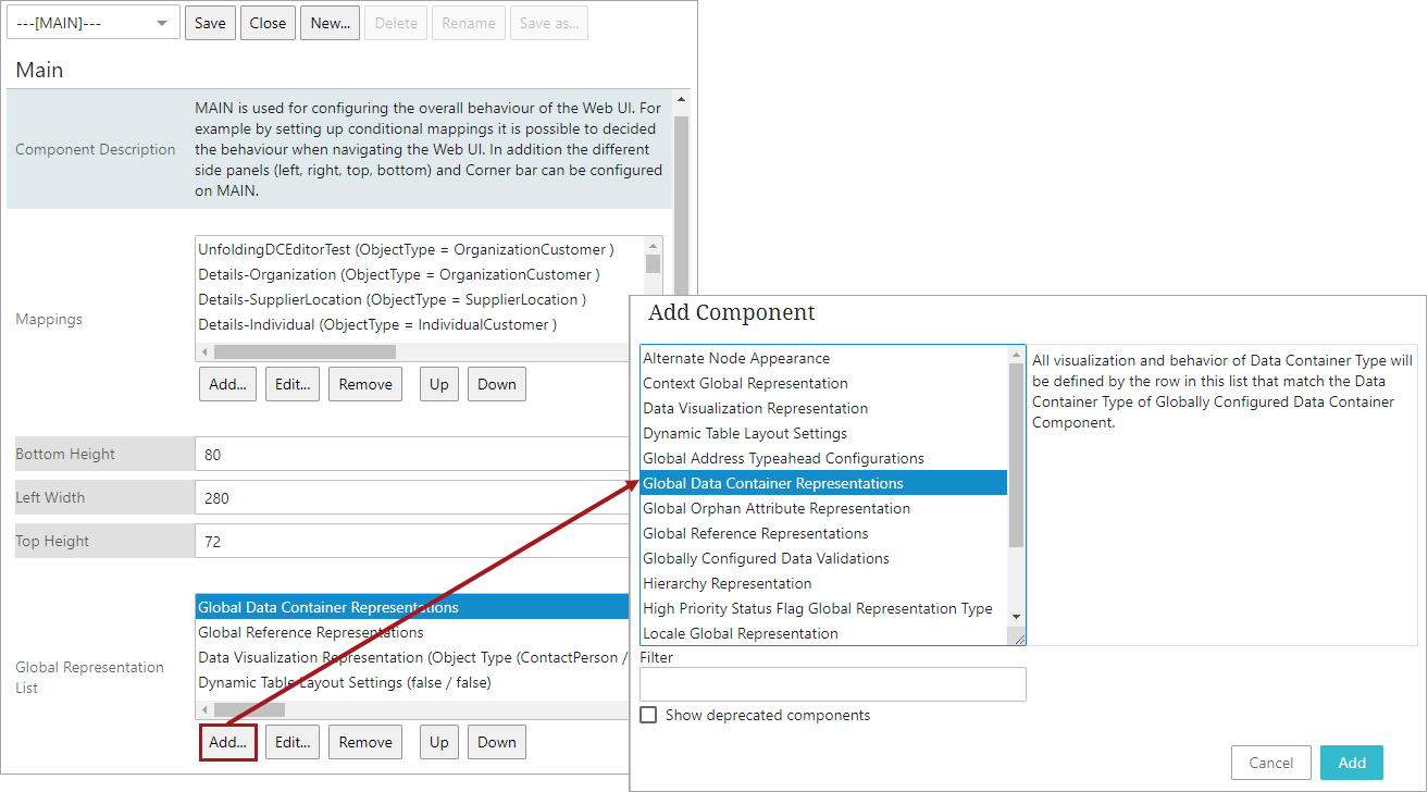
Select 'Global Data Container Representations' from 'Global Representation List' and click Add.
-
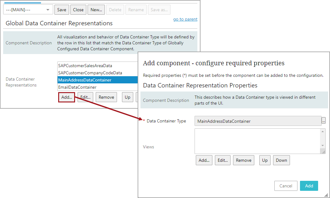
Select the 'Data Container Type' and click Add to select 'Views'.
-
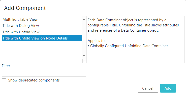
Select 'Title with Unfold View on Node Details' and click Add.
-
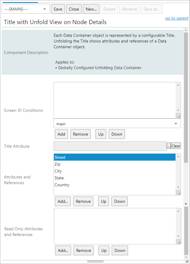
The 'Title with Unfold View on Node Details' opens for the user to enter valid information.
-
For the 'Screen ID Conditions' parameter, if the configured data container view is restricted to display on specific Web UI screens, add them to this field by selecting the relevant screens from the dropdown list. Web UI screens not in this list will not have this data container configured for display on that screen. If no screens are added, then the configured view applies to all screens.
-
For the 'Title Attribute' parameter, Click the ellipsis button (
 ) to select the attribute to display as the title of the data container. If no attribute is selected, then the ID of the data container will be used as the title.
 -
In the 'Attributes and References' parameter field, add the attributes and references to display when the data container is unfolded by clicking the Add button under the field. In the example above, five address attributes have been added to the data container.
-
The 'Read Only Attributes and References' parameter allows users to add attributes and references that should be displayed as 'read-only' when the data container is unfolded. The read-only parameters can be viewed by users, but are restricted from editing.
Attributes and references added in the ‘Read Only Attributes and References’ field will be displayed last. However, the order of display can be rearranged by also adding them in the ‘Attributes and References’ field above. If the attributes and references are added in both fields, they will be displayed as read-only, but the display order is retained, and they can be sorted as required.
Note: Attribute values that contain inline references will be displayed as read-only. For more information about inline references, refer to the topic Inline References in Attribute Values in the Getting Started documentation. Values that contain tags will not be displayed as rich text but as editable text.
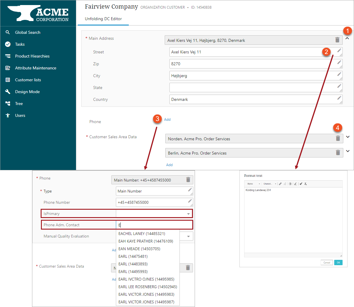
The Globally Configured Unfolding Data Container displays data container attribute values on the configured Node Details screen, where the user can unfold the view and edit the attribute values and references, add more data containers, or delete the instances.
In the example below, the three data container instances ‘Main Address,’ ‘Phone,’ and ‘Customer Sales Area Data’ have been configured within the Globally Configured Unfolding Data Container and are displayed on a Node Details Screen.
-
To unfold a data container, click the expansion icon (
 ), and all the configured attributes / references will display as shown above.
 -
To edit the information in the data container, click the edit icon (
 ), which will open the 'Format text' dialog. Mandatory selections are marked with a red asterisk (*) and/or a dropdown icon.
 -
Click the 'Add' link below the component display to add a data container. Some of the fields, such as ‘IsPrimary’ in the example shown, have an LOV dropdown from which the user can select values. Others show suggestions when the user starts typing, for instance, the ‘Phone Adm. Contact’ name.
-
To delete data containers, click the delete icon (
 ).
).
Click Save to save the changes to the data container instances.