Users select objects within Web UI tables by using checkbox selection. Clicking a checkbox is a straightforward way for users to select items, and also makes deselection much easier and more obvious to the user. The checkboxes are applicable to most tables within Web UI (including Node List component, Mass Creation screen, and Attribute Link Editor screen) with the main exception being those tables in which no toolbar actions are available.
Checkboxes and Selection Dependent Actions
When working with objects in Web UI, some objects shown in tables and different Node List views (as described in this topic) require a checkbox selection before an action can be taken on that object. Some toolbar action buttons are inactive, or grayed out, until a checkbox selection is made. These are user actions that are dependent on a selection being made before the action can be performed. Any action not dependent on a selection will show as active (black text) in the toolbar. If objects are not able to be selected (no user actions available), then checkboxes are hidden from view.
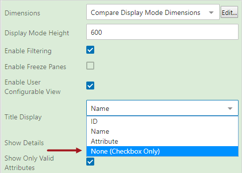
Additionally, the Title Display parameter, specific to Multi Edit Display Mode and Compare Display Mode, allows designers to make a 'None (Checkbox Only) selection,' which means that a checkbox, if applicable, will display in front of each row or on top of each column and no other identifying information (object name, ID, or attribute value) will display.
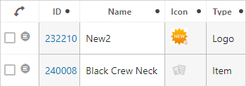
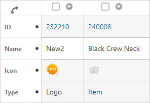
This is the same table with the orientation transposed.
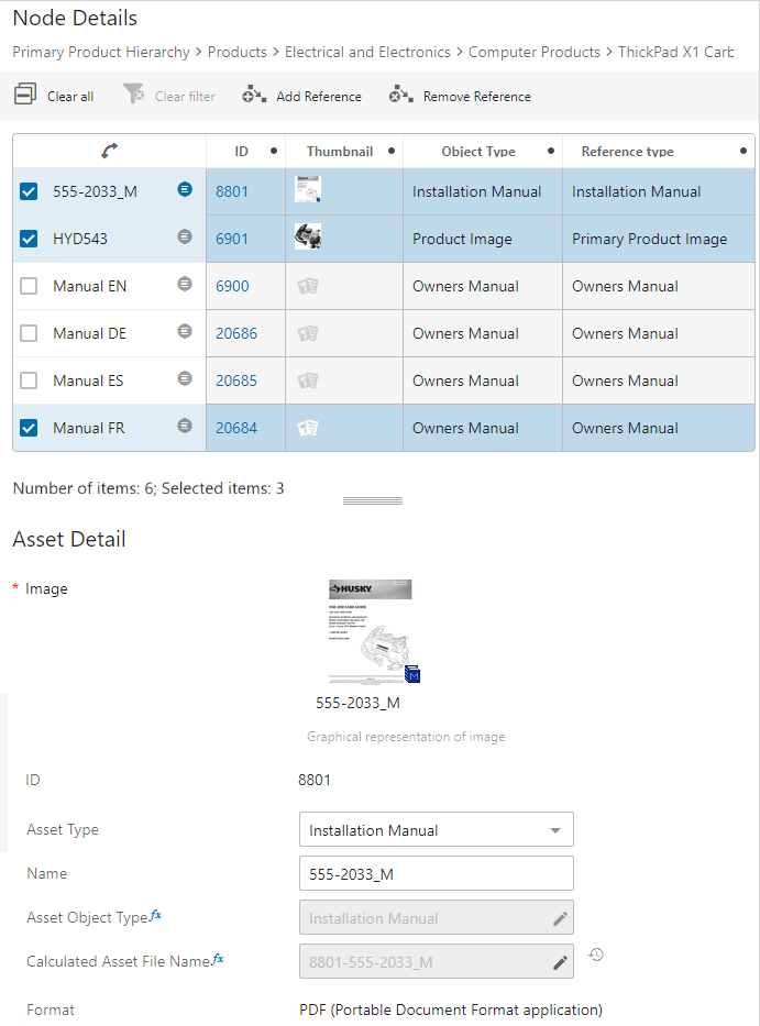
The following example shows a Multi Reference Editor with a Node List in Multi Edit Display Mode. Within the display mode properties, the Title Display parameter is set to None (Checkbox Only), and the Show Details parameter is enabled. By default, the toolbar includes standard actions plus the user-added Add Reference action. No checkbox selection is required to add a reference, so the button displays as active without a checkbox selection.

Details Icon
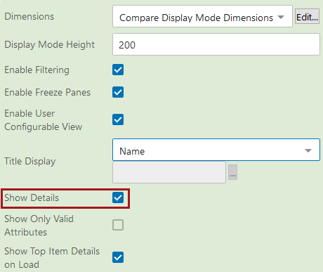
Along with checkboxes, many of the Node List display modes can be configured to display a details icon so that users can manually choose to display a details panel for that object instead of having the panel open automatically upon checkbox selection. This gives more control to the end user in determining what should display on-screen to help them complete their work. This icon is activated by enabling the Show Details parameter within the display mode properties. It is not advisable to use a multi selection screen as a mapping choice / selection screen when opening the details panel with the details icon.
The Show Details parameter is found under the Advanced header within the properties.
Important: The details icon works independently of the checkboxes and can be configured to display even when checkboxes are not applicable.
The details icon displays for table rows within the Workflow Profile screen. No configuration is required as the icons are displayed, where applicable, by default.
The icon is shown directly to the right of the label (if a label is shown).
To configure automatic display of a Node List's topmost item's details when a Node List screen first loads, users can activate the setting for 'Show Top Item Details on Load'. This removes the requirement that a user must first click an object's details icon to display an object's details in the details panel.

This parameter is available on the Multi Edit, Compare, and Table Display Modes. Automatic display of the top item's details upon load also requires the 'Show Details' setting be turned on, and that either a mapping be created for display of objects in the Web UI, or the relevant Node List has a screen configured under the 'Selection Screens' dropdown, dependent on the object type displayed in the Node List.
Examples
Example 1: Multi Reference Editor > Node List in Multi edit view; the Show Details parameter is enabled within the Multi Edit Display Mode Properties, and the details icon is selected for object 555-2033_M.
Example 2: Workflow Profile screen; the details icon displays when applicable to the selected profile. There is no additional configuration required to display the icon. The details icon is selected for the Start task.
![]()
Example 3: Multi Reference Editor > Node List in Gallery view; the Show Details parameter is enabled within the Gallery Display Mode Properties, and the details icon is selected for object RP-4100.
![]()