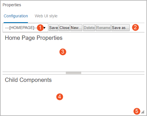
The Web UI Designer Graphical User Interface (GUI) is divided into four main areas plus a drag handle for window resizing:

- Screen dropdown: Select which screen / component to review and edit.
- Action icons: Icons that can be clicked allow users to save changes to the properties configuration, close / exit the properties window, create a new screen, rename a screen, or save a configuration as new screen ID. Each option is explained in greater detail in this documentation.
- Properties area: The main component properties of a selected screen are displayed and can be edited.
Parameters are grouped together on the component properties screens for easier understanding of parameter interactions. Parameters that are required, as well as those frequently used, are shown immediately when opening a properties page. Additional optional parameters are grouped by topic and displayed when the user clicks the arrowhead preceding the group.
- Child components area: This is the area where child components can be edited, deleted, and created. The area only displays information if the selected component can contain child components. If unavailable, the area under the Child Components header is empty.
- Resizable window: By dragging the lower right corner of the design window, users can adjust the screen to easily view all available content. The component fields within the window adjust in size to match the size of the window.
There are also two main tabs in the designer that the user can work in to make changes to the Web UI. The tabs are called:
-
Configuration
-
Web UI style
For more information on the functionalities of each tab, refer to the Designer Configuration Tab (here) and the Designer Web UI Style Tab (here) topics in this documentation.