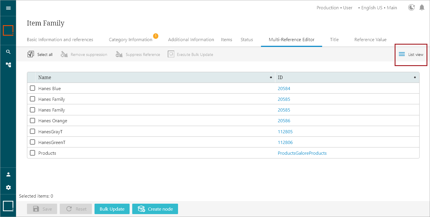
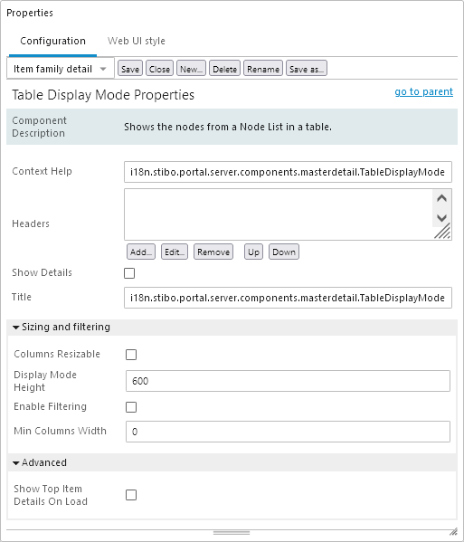
Shows objects from a Node List as a configurable list with vertical columns. Hide Equal / Mark Different is available for this view type.
Note: When setting this display mode up in the Web UI Design Mode, it is shown as 'Table Display Mode.' However, when selecting which display mode you wish to use, this display mode is shown as 'List view.'
For more information regarding display modes, refer to the Node List Component topic here.

Configuring Table / List Display Mode Properties

- Context Help: The context help shown when hovering over the List View icon.
- Headers:The headers that show in the Table / List Display Mode table.
- Show Details: Check if the detail panel should be visible below this view.
- Title: The text displayed on the button that selects this view mode.
Sizing and filtering
- Columns Resizable: Check if the user should be able to drag / resize column widths.
- Display Mode Height: The height of the top half of the screen in pixels (px) where the items are displayed. Only applicable when Show Details is true. Default value is 600 px.
- Enable Filtering: Enables filtering of the data when checked.
- Min Columns Width: The minimal width in pixels (px) of the columns. If the value of this parameter is greater than zero (0), a horizontal scroll bar will be added and columns will not be auto adjusted to page size. Also, if preferred column width in dimension's list is less than this parameter, this column will be resized to the minimal width.
Advanced
- Show Top Item Details On Load: If set, details for the first items will be opened on load.