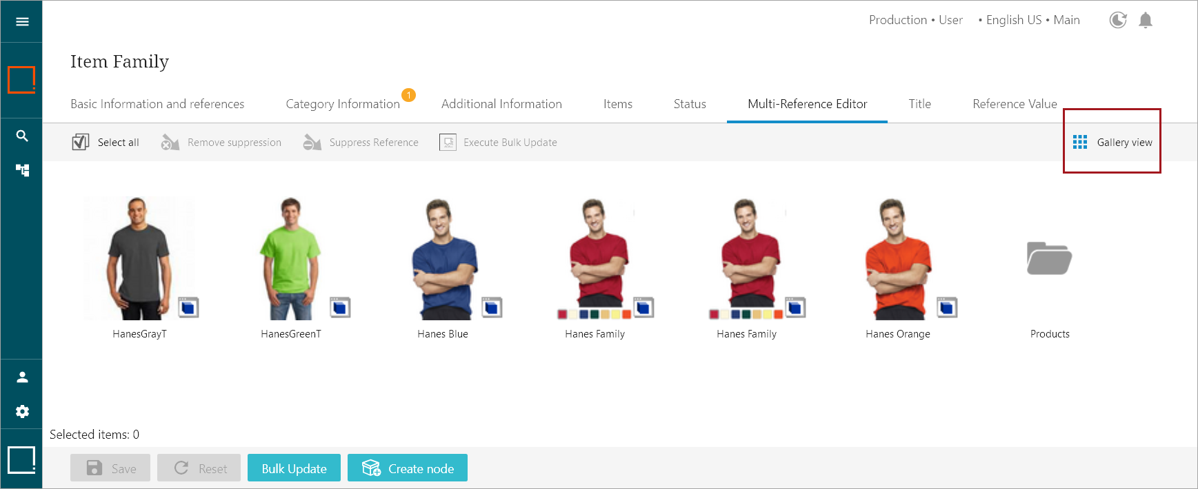
Shows objects from a Node List as a grid with icons / images displayed as objects. This is typically used for lists of image assets.
For more information regarding display modes, refer to the Node List Component topic here.

Configuring Gallery Display Mode Properties

To configure the parameters in the Properties, refer to the help text that follows:
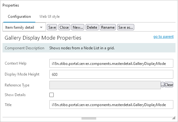
- Context Help:The context help shown when hovering over the gallery icon.
- Display Mode Height:The height of the top half of the screen in pixels (px) where the items are displayed. Only applicable when the Show Details checkbox is selected. The default value is 600 px.
- Reference Type:The asset reference type to use for the image display.
- Show Details:Check if the detail panel should be visible below the Gallery view.
- Title:The text displayed on the button that selects this view mode.