Summary
The following enhancements have been made to the Web User Interface:
- The new ECLASS ADVANCED Screen enables users to view their ECLASS data structures in a clear and intuitive interface.
- When using the create actions on a Node List, object types can now be specified.
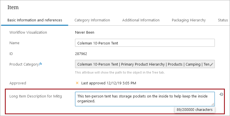
- The text box and rich text editor on Node Editor screens, as well as the inline editor and multi-value text attribute on Node Lists, now feature a remaining character count display in the text editor.
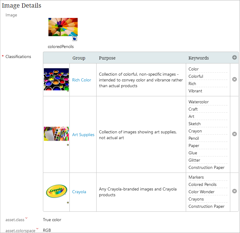
- Asset curators are now able to view and manage the classifications the asset is linked to through the new Asset Groups component.
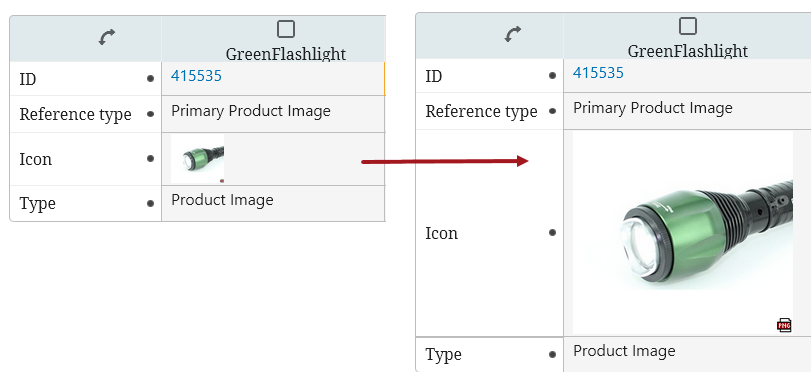
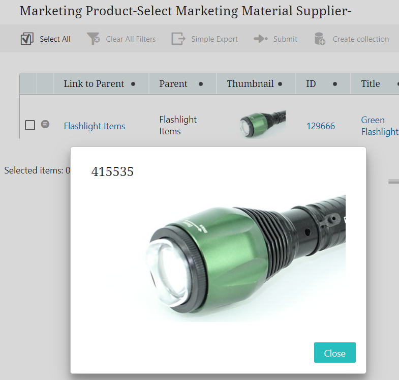
- The image default size for the Thumbnail Header and the Target Thumbnail Column now fill the entire table cell according to image ratios, and the image popup is larger.
- Custom reference target search is now available in more Web UI components.
- A number of updates were made for an improved user experience in Web UI and other login screens.
- In accordance with new branding guidelines, updates in Web UI have been implemented.
- Elasticsearch now respects additional STEP privilege settings for faceted search by default.
- Elasticsearch publication performance improvements for faceted search include specifying a business rule to define which contexts will be published and retrieving dimension independent attribute values once for all contexts.
- New icon and button display options for the Run Business Action button when configured on a Node Editor screen.
- Business actions can now be applied to incoming objects when using the Mass Creation Screen.
- The new Export Current View toolbar action enables one-click export of all table data into an Excel spreadsheet.
- The Custom Export Action button now allows users to export the name of a referenced object.
- The filtering menu that displays on Node Lists has been updated to improve usability.
- The PDS Export Wizard Screen has been removed as a selectable component within the 'Add Screen' dialog in the Web UI designer.
Details
New ECLASS ADVANCED Screen
Customers who use the ECLASS ADVANCED classification system now have a new option to view products in the context of an ECLASS ADVANCED data structure in a clear and intuitive interface. The new ECLASS ADVANCED Screen gives Data Officers, Regulatory Managers, and Project Managers the ability to visualize, and therefore validate, product data that has been formatted and contextualized for the relevant industry. By including this read-only screen in the suite of Web UI screens available in the Web UI, ECLASS ADVANCED customers have a one-stop shop to view their data, which can enable higher productivity, improve efficiency, minimize redundancy, and help users stay in compliance with the latest standards.
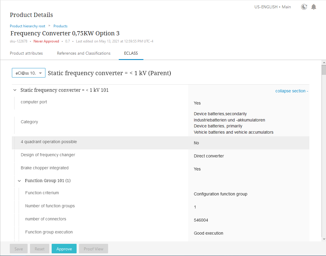
For STEP systems that hold the ECLASS ADVANCED taxonomy, the ECLASS ADVANCED Screen can display that data in the Web UI. The elements of ECLASS ADVANCED data—aspects, blocks, polymorphisms, and cardinality, for example—are shown on the screen via nested groups of data; each group displays beneath arrow buttons that, when clicked, can expand or collapse the display of the data group as needed.
To access the ECLASS ADVANCED Screen, the ECLASS ADVANCED commercial license is needed. This license allows for the enablement of a new 'X.ECLASSADVANCED' system license and eclass-advanced add-on component required to access the functionality (in addition to the normal update procedures for 10.2). Contact your account manager to get any additional commercial licensing for your system.
For more information on the ECLASS ADVANCED Screen, refer to the ECLASS ADVANCED Screen topic in the Web User Interfaces documentation here.
Restricting the object type in the create action
When configuring actions such as Create Asset, Create Classification, Create Entity, or Create Product, an admin user is now able to restrict the object types that appear when the action is selected by configuring the 'Object Types Allowed' parameter in the Web UI designer. This update results in a cleaner and clearer user experience, where only object types appropriate for the screen are displayed. Previously, when adding one of these actions on a Node Details screen or on a Node List, it was possible to select any valid child object type from the parent node.
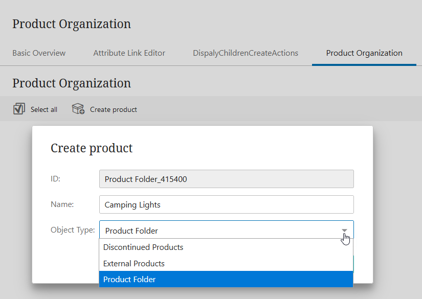
For backwards compatibility, if no object types have been configured in the 'Object Types Allowed' parameter, then all valid object types below the current node will be displayed.
For more information, refer to the Action Button Configuration on a Node List topic in the Web User Interfaces documentation here.
New text editor count display on Node Details and Node List
In Web UI, the text box and rich text editor on a Node Editor as well as the inline editor and multi-value text attribute on a Node List now have a text editor remaining count display. This notifies users the maximum number of characters allowed within the text field and how many characters they have already input.
Below is an example of a text box on a Node Editor screen.
New Asset Groups component
With the introduction of the new Asset Groups component on a Node Editor, asset curators are now able to view the classifications that the asset is linked to, view and edit metadata on the classifications the asset is linked to, navigate to a linked classification from the asset, add the asset to other classifications, and remove the asset from classifications to which it is currently linked. This allows asset curators to freely categorize assets and organize them to best fit the needs for their businesses.
For more information, refer to the Asset Groups topic in the Web User Interfaces documentation here.
Larger default image size on Node Lists and Node Editor
Now, the image default size for a Thumbnail Header on a Node List or for a Target Thumbnail Column on a References component on a Node Editor fills the entire table cell according to image ratios and table maximum, and the image responds to changing cell sizes.
Additionally, the default image popup on a Thumbnail Header is now enlarged.
For more information on a Thumbnail Header on a Node List, refer to the Thumbnail Header topic in the Using a Web UI section of the Web User Interfaces documentation here.
For more information on a References component, refer to the References Components topic in the Using a Web UI section of the Web User Interfaces documentation here.
Expanded use of the custom reference target search
Custom reference target search (originally available in release 10.1) is now available in additional Web UI components. This improvement means that when selecting a reference type in Web UI, the list of options can be limited beyond valid reference types. Now, in addition to the References component, the reference target search can be assigned on Node Editors (Globally Configured Data Container Editor, Globally Configured References Editor, Parent Selector, Reference Value, Referenced Asset Representation, Classification Links, Classification Product Links), Node Lists (Reference Header), Multi Reference Editors (Add Reference Action), Merge Golden Record Clerical Review Task Lists (Advanced Merge Reference Header, Reference editor in Advanced Merge), and for the Run Business Action component.
For more information, refer to the Custom Reference Target Search topic in the Web User Interfaces documentation here.
Login screen design updates
A number of updates were made for a more improved user experience while working in Web UI and when accessing other Stibo Systems Enterprise Platform (STEP) login screens. The updates are as follows:
-
The username input field is automatically selected when the About STEP, Web UI Component Report, and Web UI login screens load.
Additionally, the following items have been updated in accordance to new branding guidelines and to better align with Product Data Exchange (PDX) login screens:
-
About STEP login screen
-
About STEP pages
-
STEP System Administration login screen
-
Web UI Component Report login screen
-
Web UI Component Report pages
-
Web UI Forgot Password screen
-
Web UI login screens
-
Workbench Launchers
Improvements to align the interface with branding guidelines
In accordance with Stibo Systems' branding guidelines, the following updates in Web UI have been implemented:
-
Updated the text styling for all heading levels, column headers, and dialog titles using the Noto Serif font.
-
Updated the appearance and usability of the Web UI designer. The designer displays in the Stibo Systems branding colors, is now positioned towards the middle right for easier expandability, and is wider for better readability.
-
Updated the appearance of the Global Navigation to better align with Product Data Exchange (PDX) and the brand guidelines.
-
The 'Accent' and 'Navigation' color customization properties are no longer available in the 'Web UI style' tab to provide an optimal user experience by ensuring consistency with the Web UI semantic coloring scheme and alignment with latest brand guidelines. If a Web UI was using custom colors prior to 10.2, they will be converted to the Stibo Systems default color scheme after upgrading. While customers can use their own custom styling instead of being automatically converted to the Stibo Systems-defined default values if a Custom CSS License is signed, customers should be aware that the option of overriding the existing Cascading Style Sheet classes is not supported. Customizations could cause issues for customers with each feature release and/or patch update.
Faceted search (Elasticsearch) respects additional STEP privilege settings
In the continuing effort to honor STEP user privileges in the faceted Search Screen, by default the STEP data available to Elasticsearch is now filtered based on more user group privilege settings via the 'Elasticsearch Permissions and STEP Privileges' option. The new default setting is 'true' for the case-sensitive Elasticsearch.FeatureToggle.UserGroupPermissions property in the sharedconfig.properties file (It was originally available with a default setting of 'false' in release 10.1 MP1). A 'true' setting enables an administrator to provide access to relevant information by user groups, including attribute groups, so that users are presented with only the data they need. Previously, only classification privileges were considered. The Elasticsearch faceted Search Screen now respects STEP user privileges applied on action set, object type, and dimension points to display products and classifications. Although attribute group user privileges are not included in this list, attribute group permissions can be applied on the Elasticsearch Configuration 'Data Specification' step.
To activate this functionality in existing systems and for details on the option, refer to the Elasticsearch Searchable Data Setup Options topic in the Web User Interfaces documentation here.
Elasticsearch is used by the faceted Search Screen and is activated by the Faceted Search User Experience commercial license. Contact your account manager or partner manager to begin the process of enabling a license or licenses for your system.
Faceted search (Elasticsearch) publication performance optimization
The following faceted search performance improvements have been made:
-
The case-sensitive 'Elasticsearch.FeatureToggle.PublishingBusinessCondition' property in the sharedconfig.properties file now defaults to 'true.' This feature toggle was originally available with a default setting of 'false' in release 10.1 MP4. A 'true' setting on this property allows users to prevent publishing contexts to the Elasticsearch database for which there is no relevance, for example, contexts that contain no values. When the business condition in the Elasticsearch Configuration object returns 'true,' the identified context for the node is published to the Elasticsearch database. A 'false' return means the context in which the node is not valid to be published to the Elasticsearch database.
To activate this functionality in existing systems and for details on the option, refer to the Initial Setup for Elasticsearch topic in the Web User Interfaces documentation here.
-
Elasticsearch indexing now retrieves dimension independent attribute values only once for all contexts. This improves the performance of the indexing process, especially for Elasticsearch configurations with a significant percentage of dimension independent attributes in the 'Data specification' section. For more information, refer to the Creating an Elasticsearch Configuration topic in the Web User Interfaces documentation here.
Elasticsearch is used by the faceted Search Screen and is activated by the Faceted Search User Experience commercial license. Contact your account manager or partner manager to begin the process of enabling a license or licenses for your system.
Icons on Run Business Action buttons
The display of Run Business Action buttons installed on Node Editor screens is now fully configurable. Users may now:
-
Select which icon will display on the Run Business Action button
-
Toggle display of an icon on the Run Business Action on or off
-
Determine whether the text and the icon display together, or if one or the other displays alone on the Run Business Action button
Previously, the Run Business Action button always displayed with an arrow icon, which could prohibit admins from assigning a more visually relevant icon to the Run Business Action button. Because the Run Business Action component can be deployed to handle a wide range of business cases, flexibility with respect to button icons can help end users quickly select the correct button.
For more information on configuring the Run Business Action component, refer to the Configuring the Run Business Action Component topic in the Web User Interfaces documentation here.
Mass Creation Screen improvements in Web UI
To maximize user flexibility when onboarding objects via the Mass Creation Screen, users can now apply a business action to incoming objects via this screen. Previously, only a business condition could be applied, which could determine whether incoming products could be added to STEP, but did not allow for a business action to be executed, like moving products into a workflow based on the results of a condition, for example. This update broadens the range and flexibility of object onboarding the Mass Creation Screen can undertake, allowing suppliers to auto-create products via the Mass Creation Screen while applying rules to those products via business actions.
For more information on configuring the Mass Creation Screen, refer to the Configuring a Mass Creation Screen topic in the Web User Interfaces documentation here.
Export Current View Action toolbar action now available
A new toolbar action called Export Current View Action has been introduced with this release. Available for Node Lists, the Export Current View toolbar action enables one-click export of all supported table data into an Excel spreadsheet. This toolbar action gives users the ability to quickly generate spreadsheets with current data, allowing product managers to quickly gather relevant information from disparate sources to help speed product enrichment or progress through a workflow.
Additionally, this feature previously existed within the Custom Export Action component, but it has been removed from that component with this release to be made into the standalone Export Current View Action component described above.
For more information on the Export Current View Action, refer to the Export Current View Action topic in the Web User Interfaces documentation
Custom Export updates
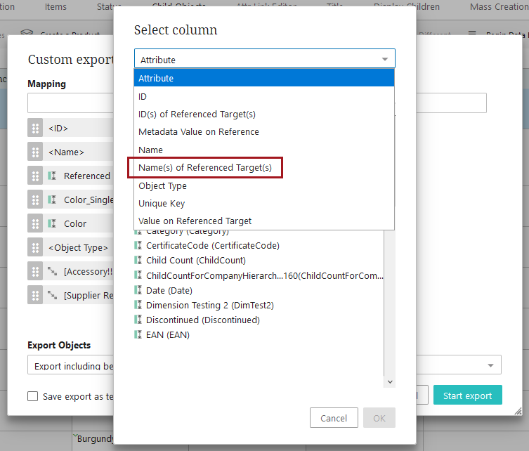
The Custom Export Action feature available on Node Lists has been enhanced to allow users to include a referenced object's name in the custom export file. With the new 'Name(s) of Referenced Target(s)' column type option, users for whom an ID is not the primary way of classifying objects now have the ability to include the name of the referenced target in a custom export. This change makes the data available on a custom export spreadsheet more relevant and helps stakeholders review and process information more quickly.
For more information on the custom export functionality, refer to the Custom Export Action topic in the Web User Interfaces documentation here.
Changes to table filtering
The table filtering options menu for Node Lists has been amended with visual changes to aid usability. Displaying the filtering options this way removes ambiguity about which parts of the filter work together and which work independently. These changes create a more intuitive and easy-to-use interface to better meet user expectations.
The new look of the filtering options is displayed below. The numbered items in the image are described below the screenshot.

The changes are:
- The filtering menu option that allows users to select a filtering condition displays in its own section called 'Filter by condition.' The first field in this section is a dropdown from which the desired condition, like 'Does not contain' or 'Begins with,' can be selected. The second field is where users may enter values that will, in concert with the selected condition, filter the table to produce the desired results.
- The column values are now listed in a section called 'Filter by values.'
- Directly beneath the section heading are two options in blue: 'Select all,' and 'None.' Clicking 'Select all' ensures all listed values are checked (as they are by default), and clicking 'None' removes checks for all listed values, allowing the user to select just those values they want to include in filtered results.
- The 'Clear filter' button replaces the 'Reset filter' button.
- The 'Clear filter' and 'Apply filter' buttons have swapped positions.
The filtering options are now arranged in a way that enables users to more easily filter tables, find the information they need, and speed enriched data through to the end of the workflow.
For more information on filtering in Node Lists, refer to the Node List Component topic in the Web User Interfaces documentation here.
PDS Export Wizard Screen component has been removed
Configuring the PDS Export Wizard Screen to display which PDX channels are available to receive published data from the Search Screen basket is no longer necessary, and as a result, the PDS Export Wizard Screen component has been removed as a selectable option when creating a new screen in the Web UI designer.
For more information on publishing data to PDX channels via the Search Screen basket, refer to the Search Screen Basket topic in the Using Web UI documentation here.