The Status Selector child component in the Global Navigation Panel is for users who want to work with a workflow in Web UI. The Status Selector child component displays within the Global Navigation Panel, and its main purpose is to show states and the number of tasks in each state in a particular workflow. Upon clicking one of the displayed states, users will be navigated to a screen in which they can work with an individual task or multiple tasks. The screen that a user accesses to work with the tasks depends on how the Status Selector child component in the Global Navigation Panel was configured. There are a number of possibilities, including the Task List screen, a Workflow Screen, or an Advanced Search screen.
Since each Status Selector Child Component is configured for a single workflow, multiple Status Selectors can be set up and used as needed. Each Status Selector Child Component in the Global Navigation Panel is highly configurable. If configured properly, a user can initiate tasks into a workflow, track tasks, and view what status flags they have (if applicable).
If interested in using a widget that has the same functionality but is displayed on the homepage, refer to the Status Selector Homepage Widget topic.
Note: From this point on, it is assumed that the workflow the Status Selector child component will interact with is already set up in the workbench.
Adding a Status Selector Child Component
To add the Status Selector child component:
-
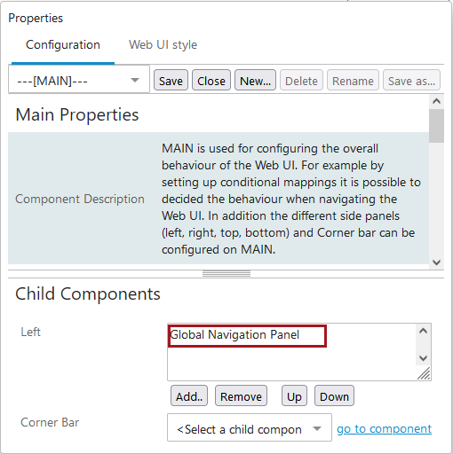
Go to --[MAIN]-- > Child Components > Left > add the Global Navigation Panel child component.
-
Double click on the Global Navigation Panel to be brought to the Global Navigation Panel Properties.
-
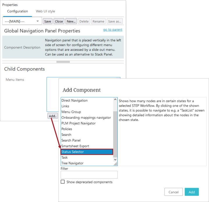
Go to > Child Components > Menu Item > add a Status Selector.
Setting up the Status Selector Properties
The Status Selector Properties screen is shown below:
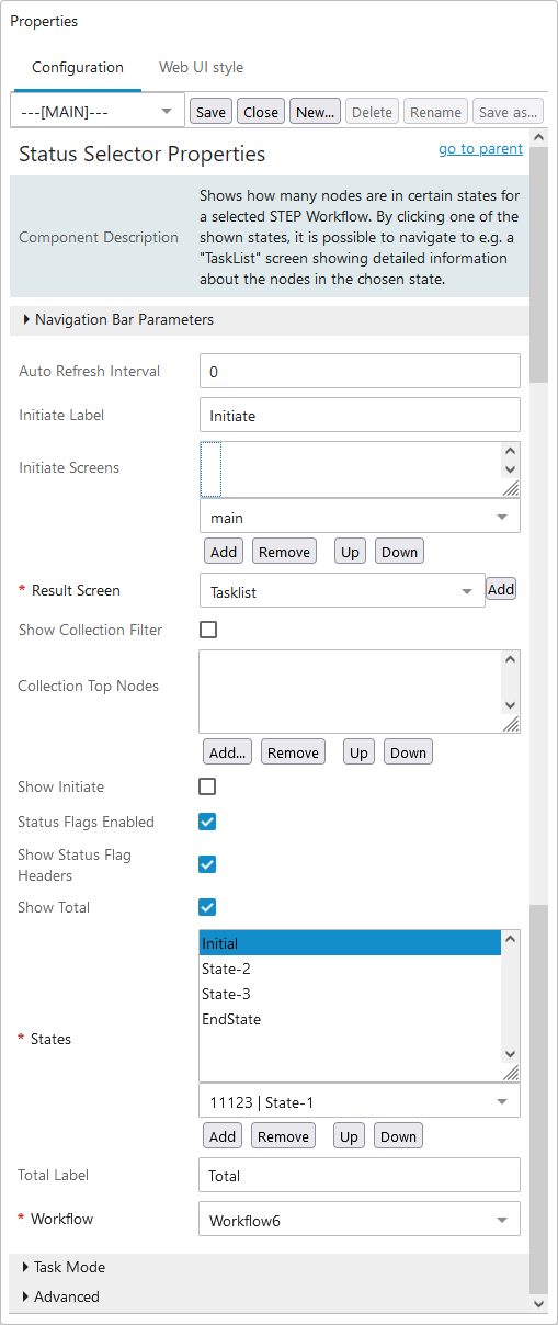
Status Selector Properties can be saved as long as the workflow, the results screen, and at least one workflow state is configured. Below, the steps to set up these required parameters are listed first and then the remaining parameters go in order from top to bottom as listed within the properties.
Required Parameters
- Towards the bottom of the properties, you will find the Workflow* parameter. Using the dropdown select the ID of the workflow you will be working with using the Status Selector.
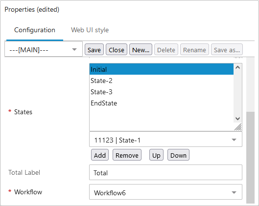
- Next, for States*, click the dropdown to view all the states within all workflows, which are listed by workflow ID and then the state ID. Look for the states that are in the workflow you selected in Step 1. Once you have selected a state, click the Add button. Continue this process until all the states you need are added. Use the Up and Down buttons to reorganize the states as they will display within the Status Selector in the order they are listed in the Properties (top to bottom).
In the screenshot below, the workflow ID is Workflow6 and the applicable states are 'Initial,' 'State-2,' 'State-3,' and 'EndState.'
- Use the Results Screen* dropdown to select the screen, Task List, or Advanced Search that users will be navigated to upon clicking a workflow state.
If the desired screen has not been created yet, click the Add button to the right of the field and follow the typical steps for creating a new screen. The screen ID of the newly created screen will be selected once the process is complete.
If using an Advanced Search screen and wanting to further filter the task list, you can designate a specific (previously saved) search to use when navigated to the Advanced Search screen upon state selection. Click the ellipsis button ( ) and select a search from the saved search dropdown. Save the selection.
Click Save in the designer window to save the changes you have made up to this point
Additional Parameters
- Set an Auto Refresh Interval, if desired. Enter, in seconds, how much time should pass before the Status Selector is automatically updated. Enter 0 to disable automatic updates. If you leave the field blank, it defaults to 0 upon saving the Properties.
Disabling the functionality means that you will only view updates to the number of tasks in each state when the Web UI screen is refreshed (logging in and out; navigating to another page and then back) versus automatic updates to the info displayed on the Status Selector without user intervention.
- If you want an initiate object button to display in the Status Selector as a way for user to create / initiate objects into the designated workflow, then enable the Show Initiate parameter. Also, insert text to be used for the button in Initiate Label. If you leave the label field blank, then 'Initiate' will automatically populate the field after saving the Properties.
If the Show Initiate option is enabled (checked), a selection needs to be made for Initiate Screens using the dropdown. Make a selection, and then click Add. Repeat the process to add additional screens. The screen links will appear in order (top to bottom). Use Up and Down to reorganize as needed.
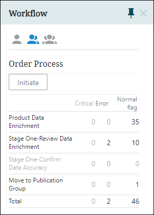
- Click the Status Flags Enabled checkbox if you use Status Flags and want to the task count within the Status Selector to be grouped by Status Flag (columns) in addition to states (rows).
Additionally, if you want the headers to display above the columns, enable Show Status Flag Headers.
- Enable the Show Total checkbox to add a row below all the workflow states that totals all the tasks. Also, the Total Label defaults to 'Total' upon save and can be kept as-is or alternate text can be entered into the parameter field.
- Click the Task Mode heading bar to display three checkbox parameters that pertain to which of the three task mode icons -- User, Group, and All
 -- can be accessed by the user in the Status Selector child component in the Global Navigation Panel. The three parameters that display in this section are 'Show All', 'Show Group', and 'Show User'. How these three fields are checked determine which task modes are accessible by the user. All three parameters default to checked when accessed in the designer. When all are checked, all three task modes () are enabled for display, depending on the user's privileges. If the user unchecks all options, no icons display and only the tasks for the user and the group to which the user belongs will show.
When configuring the 'Task Mode' parameters for users without admin privileges, it is important to note that the 'All' task mode icon may not display in the Status Selector for non-admin users, regardless of configuration. As a result, if all three parameters are checked, only the 'Group' and 'User' icons will display. If 'All' and one of the other two task modes are checked, no icon will display and the tasks specific to the other checked task mode ('User' or 'Group') will be shown. If only 'Group' is checked, no icon will display and the tasks for the user and the configured group to which the user belongs will show. If only 'User' is checked, no icon will display and the tasks for the logged-in user will display. The same will be honored by the ‘Default Task Mode’ configuration as well.
Note: By selecting the Group icon, users that have the 'View task assigned to other users in my group(s)' privilege are able to view their assigned tasks, as well as any tasks assigned to others and any unclaimed tasks within any group in which they are a member. For more information about workflow privileges, refer to the Workflows section of the Setup Actions and Error Descriptions topic in the System Setup documentation.
-
Click the Advanced heading bar to display the Use Content Indicator parameter. Clicking the checkbox, will cause the component to show a clickable content indicator instead of the exact task count.
Again, click Save in the designer window to save the changes you have made up to this point
Setting up Collections Viewing
Collections are containers for storing sets of objects, and collection groups are containers that can hold collections or other collection groups. A collection can be applied as a filter limiting the available objects to the ones present in the chosen collection. Collections are typically used in relation to Bulk Update functionality.
To make use of Collections Filtering in Web UI, initial setup needs to take place in STEP Workbench and be in place before starting the next steps. Permissions for viewing and working with collections are also configured in the workbench. For more on collections, refer to the Collections topic of the System Setup documentation.
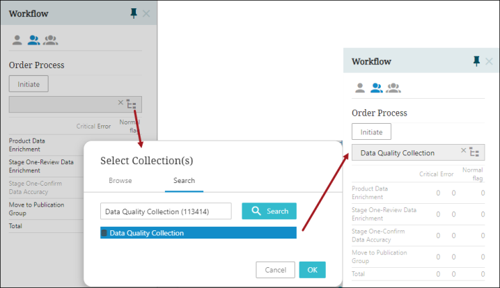
- Select Show Collections Filter to show collections.
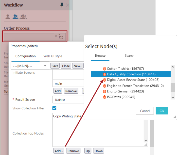
- Add any Collections Top Node Filters to further narrow down the collection or collections accessible to users. Click Add, and make a selection or selections, and then click OK. The selections can be reorganized as needed.
Save the changes and Close the designer window.
Only collections available to the user or user group will be shown when configured properly. The user can then filter the states based on the collection or collection group selected.
For more information on end-users tasks such as initiating objects into a workflow and working with states and tasks within the Status Selector child component in the Global Navigation Panel, refer to the Working with Tasks in Workflows topic in the Workflows documentation.