The References component, which is applied to a Node Editor, is used to view the references a product belongs to, add new references, remove references, view and edit metadata on the reference the product is linked to, and navigate to a linked reference from the selected product.
References Component Setup
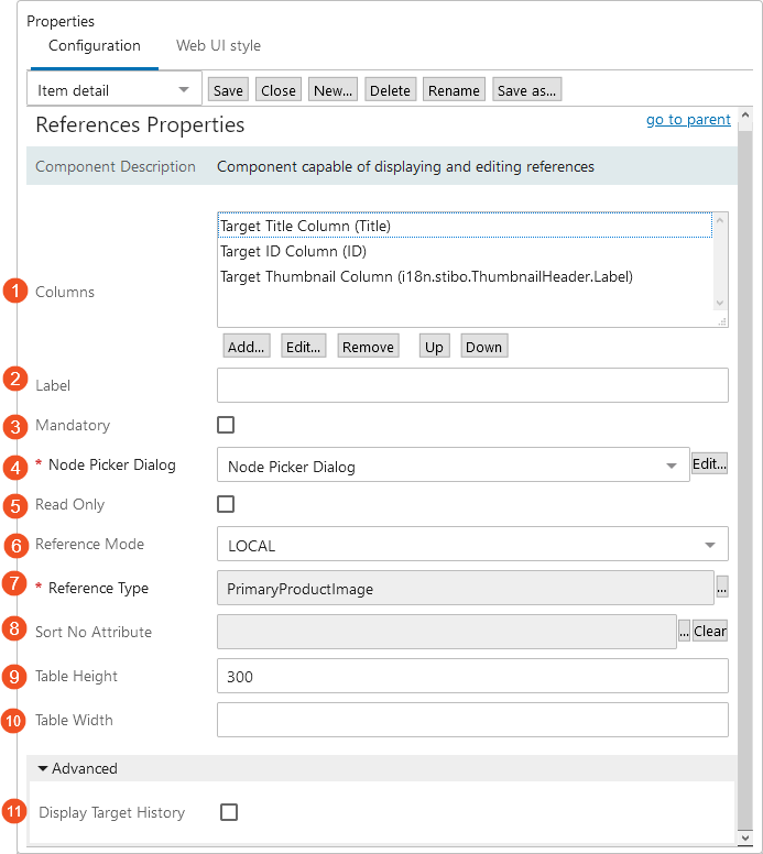
There are only two mandatory parameters to configure the Reference Component: Node Picker Dialog and Reference Type. Configuration for the Reference Component is as follows:
-
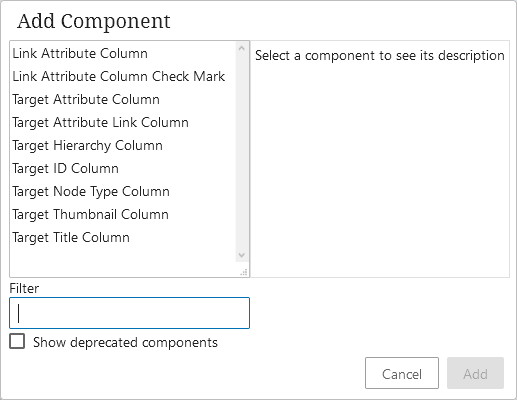
Columns: There are several columns that can be added as needed.
-
Link Attribute Column: Displays the attribute on the link / reference.
-
Link Attribute Column Check Mark: Displays a Boolean attribute on a link / reference as checkmarks. Adding this column allows for the showing (and editing) a meta-attribute of a Boolean characteristic. This means an LOV with values 0 and 1, which could be an LOV with values 0/1 or an LOV with ID where IDs are 0/1.
-
Target Attribute Column: Displays the attribute from the target. Depending on privileges and how this attribute was created, the user can edit the metadata on this attribute.
-
Target Attribute Link Column: Displays an attribute value from the target as a link.
-
Target Hierarchy Column: Displays the hierarchy of the reference target.
-
Target ID Column: Displays the ID of the target asset classification.
-
Target Node Type Column: Displays the target node type icon.
-
Target Thumbnail Column: Displays the primary image that was configured to display with this target classification.
-
Target Title Column: Displays the classification title.
-
-
Label: The title given to the Asset Group in Web UI when displaying the classifications the asset is linked to.
-
Mandatory: If selected, at least one reference must be selected.
-
Node Picker Dialog: This field is mandatory. It is a customizable picker that is used to find new classifications.
-
Read Only: If enabled, the classifications and the values displayed by the Asset Group component can not be modified.
-
Reference Mode: Indicates what references should be shown, for example: ALL, INHERITED, LOCAL, etc.
-
Reference Type: This field is mandatory. It indicates what reference type is displayed by the component. The name of this reference will also be the name of your reference group in Web UI.
-
Sort No Attribute: If set, the order of the classifications is based on and saved back to this numeric attribute.
-
Table Height: The maximum height of the table before scrolling. If not specified, it will default to 300 Pixel.
-
Table Width: An optional width in pixels for the component. If no value is provided, or the provided value is equal to or below zero, it will span the primary frame.
-
Display Target History: Controls whether reference target history should be displayed.
Using References
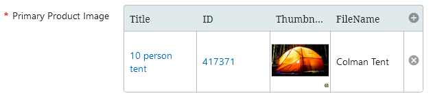
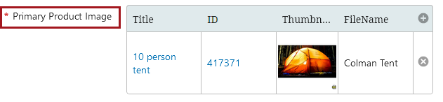
Once you have the References component configured, navigate to the desired product and locate the Reference group.
-
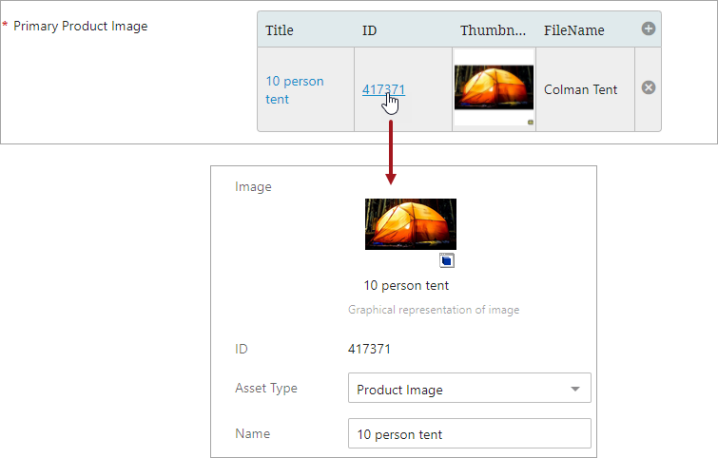
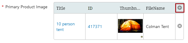
In this example, the Primary Product Image is the name of the reference group. To add a reference, click on the plus sign.
-
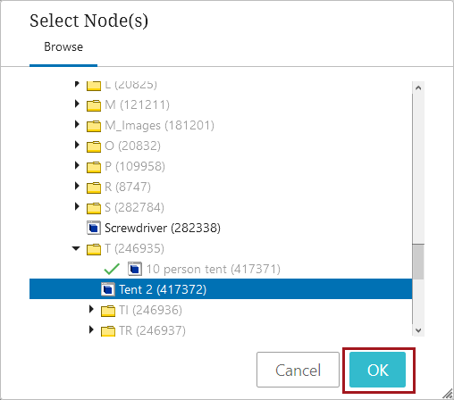
Navigate via the Node Picker to select the desired reference, and click OK. Click Save on the Node Editor to save any changes.
-
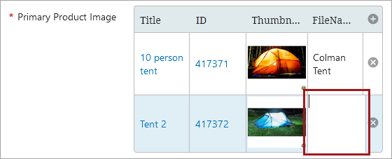
Once added, edit any necessary fields by double-clicking inside of the cell. Click Save on the Node Editor to save changes.
-
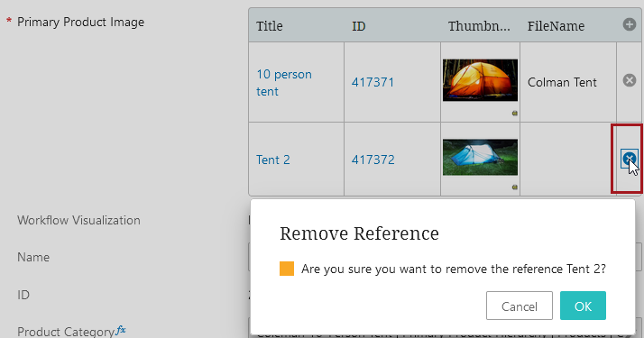
To delete a reference, click on the 'x.' A popup will appear asking to confirm the deletion of the reference. Once deleted, click Save on the Node Editor to save changes.
-
To navigate to one of the references from the reference component, click the blue link in either the Title or ID column. In this example, the ID has been selected.