The Asset Summary Card child component on the Below Title component provides users with a collection of asset information that displays just below the screen title on a Node Details screen.
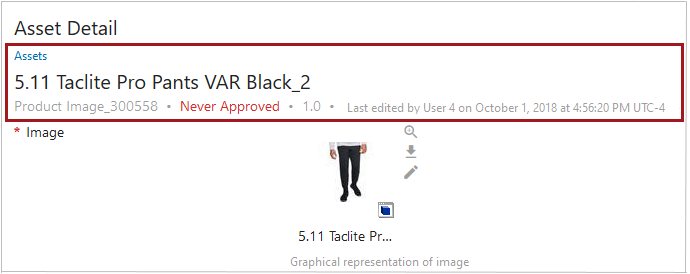
The Asset Summary Card can be configured to show either a pre-selected grouping of asset information, or a series of data points configured by the user. When the user selects the 'Description Card' option (an example of which is displayed in the screenshot above), the Asset Summary Card will display the following information: a breadcrumb (shown in blue text in the screenshot above), name, ID, approval status (shown in red text above), revision number, and information related to the most recent update to the asset, including the name of the user who last edited the asset (or the user ID if no name is configured). When the 'Attribute Card' option is selected, users may tailor the card to display different values.
For details on the Below Title component, refer to the Below Title Component topic.
Configuring the Asset Summary Card
To configure display of the Asset Summary Card, follow the instructions described below.
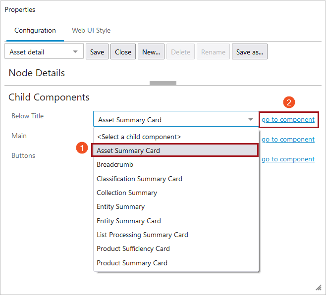
- Access the designer on the Node Details screen mapped to the relevant Asset object type. Under 'Child Components', select the 'Asset Summary Card' from the 'Below Title' dropdown. Then click 'go to component'.
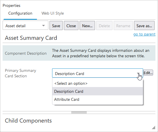
- In the 'Asset Summary Card Properties' screen in the designer, select one of two options from the 'Primary Summary Card Section': 'Description Card' or 'Attribute Card'.
- Description Card - When selected, this option will display the following information in the Summary Card section of the screen: a breadcrumb (shown in blue text in the screenshot above), name, ID, approval status (shown in red text above), revision number, and information related to the most recent update to the asset. No further configuration is required with this option. Once selected, save the configuration and close the designer to activate the Summary Card on the screen.
- Attribute Card - When selected, users may configure which data points to display in the card. To do this configuration, first select the 'Attribute Card' option, and then click the 'Edit...' button to the right of the dropdown.
- To configure the 'Attribute Card' option, users may add values to the fields that display in the 'Attribute Card Properties' pop-up.
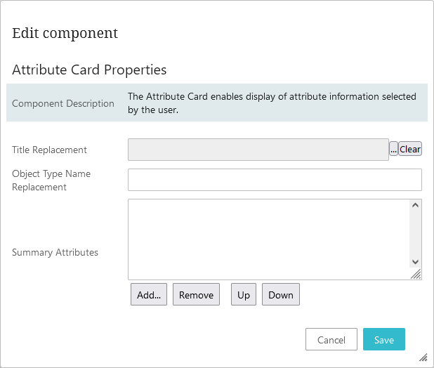
- Title Replacement - When the
 button (located to the right of the field) is clicked, a Node Picker displays that enables users to select an attribute whose value can display in place of the asset's name. If no attribute is selected, the asset name will display. If no value has been set for the asset's name, the ID will display. It should be noted that if a multi-valued attribute with multiple values is selected to display in place of the object's name value, then all attribute values for that multi-valued attribute will display separated by the text, '<multipsep/>'.
 - Object Type Name Replacement - Text added to this field will display in place of the asset's object type name. In both cases, the value displays in capital letters.
- Summary Attributes - The attribute values for the attributes selected in this field will display in the Summary Card section of the configured Node Details screen. When users click the 'Add...' button, a Node Picker pop-up will display showing the available attributes. Users may select an unlimited number of attributes, though only one per 'Add...' action. It is important to note that the selected attributes must be both valid for and linked to the asset object type in order for the values to display.