Modules are pre-formatted layout blocks consisting of text, images, or a combination of the two. They can be used either by themselves or in conjunction with other modules to build content and create a layout in a Template for a Dynamic Record, or to be used to create a layout in a Static Record. While this topic does not aim to discuss each module option offered individually, it describes some features a user may encounter on some selected modules.
Interacting with Images on Modules
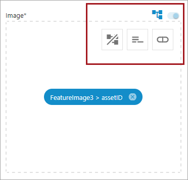
Not all modules have image fields, but for those that do, some of these options might be available on the image, depending on the module, the data selected, and if the image is being viewed from a Template or a Dynamic Record. Below is an example of where the icons will appear on an image, though not all icons in the table below are represented in this example image.
|
Picture |
Icon Name |
Description |
Definition |
|
|
Crop |
Gray square with two white mountain inside of square |
Clicking this opens up the Image Editor where the image can be cropped. Refer to the Dynamic Record Tab Offerings for more information. |
|
|
Edit |
Gray Pencil |
Click this to edit the image selected on a Dynamic Record. |
|
|
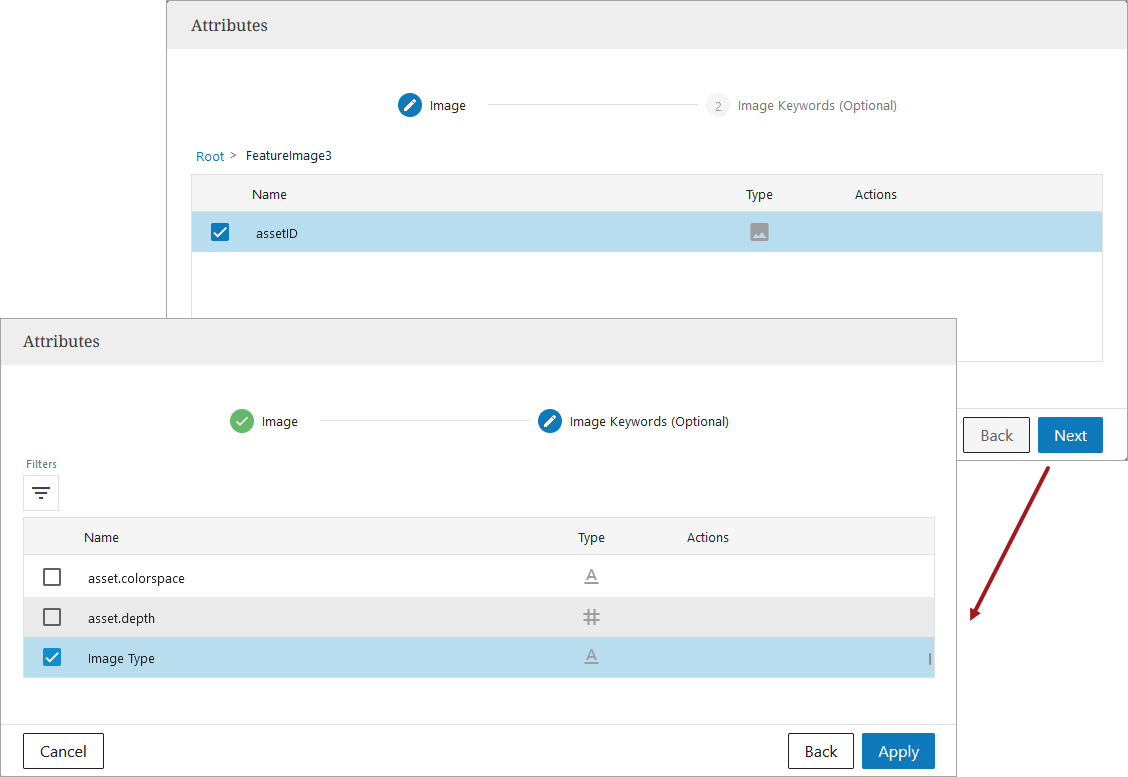
Edit Metadata |
A square made out of smaller gray squares. |
Clicking this bring ups the Attribute value selection dialog. Select the image that should display for this particular Dynamic Record. Refer to the Dynamic Record Tab Offerings for more information. |
|
|
Field Mapped |
Blue squares connected by lines. |
The field's value mapping is related to the mapping of another field. - This displays often when there is an Image Keyword field that is related to the uploaded image. |
|
|
Map an Attribute |
Gray sideways oval with a line down the middle. |
Clicking this allows a user to select an image attribute already in the system, and map it to the Template. |
|
|
Remove Field's Value Mapping |
Gray squares connected by lines with a gray slash mark through it. |
Clicking this removes a field link between an image and an image keywords field. It will also remove the image keywords mapping. |
|
|
Set Image Selection Rules |
Horizontal gray lines of various lengths stacked on top of one another. |
For composite attributes, these rules enable users to narrow options down by defining the eligible imagery available for selection for each Dynamic Record. Refer to the Linking Images and Applying Rules topic for more information. |
|
|
Show Metadata |
Gray Eye with a slash mark through it |
The gray eye with a slash mark through it does not show any metadata on the image. When clicked, the slash mark disappears and the image metadata is visible. Refer to the Dynamic Record Tab Offerings for more information. |
|
|
Trash |
Gray trashcan |
Clicking this removes the image from the field. |
|
|
Unlink Template Field |
Blue slide button that turns light gray when the field is no longer linked to the Template. |
This slide button is blue when active on the Template and gray when it is no longer linked to the Template and is now an active field on a Dynamic Record. |


Using Master Data Image Keywords in Templates
Image keywords stored as composite sub-attributes can be used to populate image keywords in Amazon and retailer agnostic channels. When adding an image that has keywords stored on it, the dialog provides an opportunity to select the keyword to populate the field.
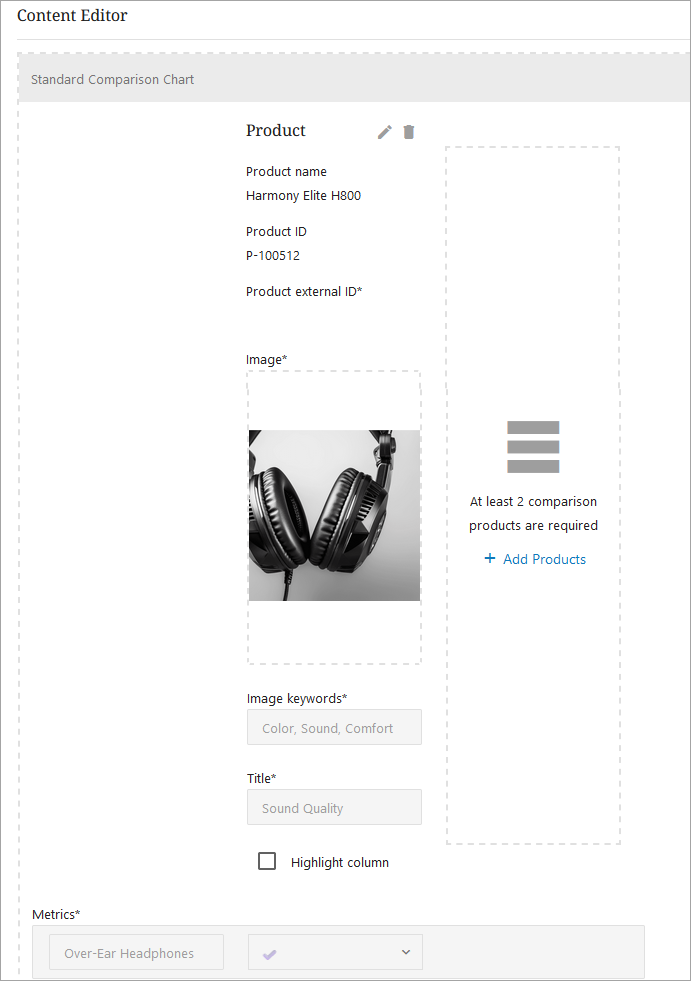
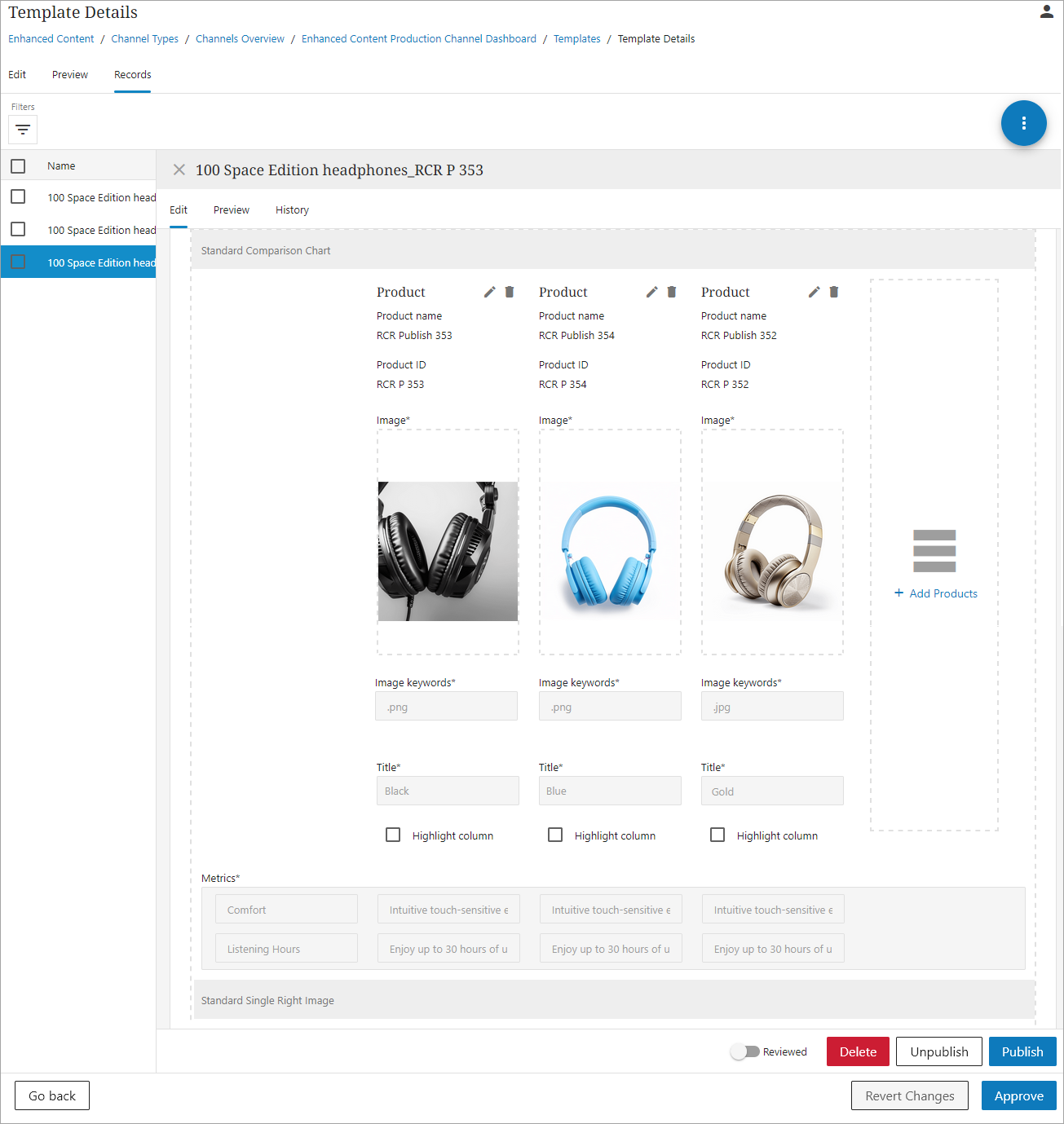
Standard Comparison Chart
The Standard Comparison Chart module enables users to build a chart that compares products. Users can select multiple products at once, selecting up to six products for comparison. Should they choose, they are also able to delete all of the products from the comparison chart as they make adjustments and edits for the content record.
-
Add the Standard Comparison Chart module to the Template.
-
Select the desired image attribute and image keywords (optional), or enter in keywords manually.
-
Fill out the Title and any other needed metrics.
-
When ready, approve the Template and navigate to the Records tab.
-
On the Records tab, select the desired Record, and scroll down to the Standard Comparison Chart. The chart will look like the following:
-
Add up to 6 comparison columns by clicking "+Add Products."

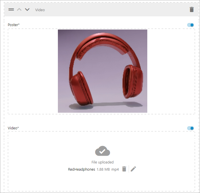
Videos for Retail Agnostic Content
Retailers can configure the Video module in retailer agnostic channels, and map or upload MP4 videos. Additionally, they can also choose the preview image that displays before the video is played, ensuring that the image is attention-grabbing. Videos help show a product in action and let consumers see exactly how a product works or what benefits it provides.
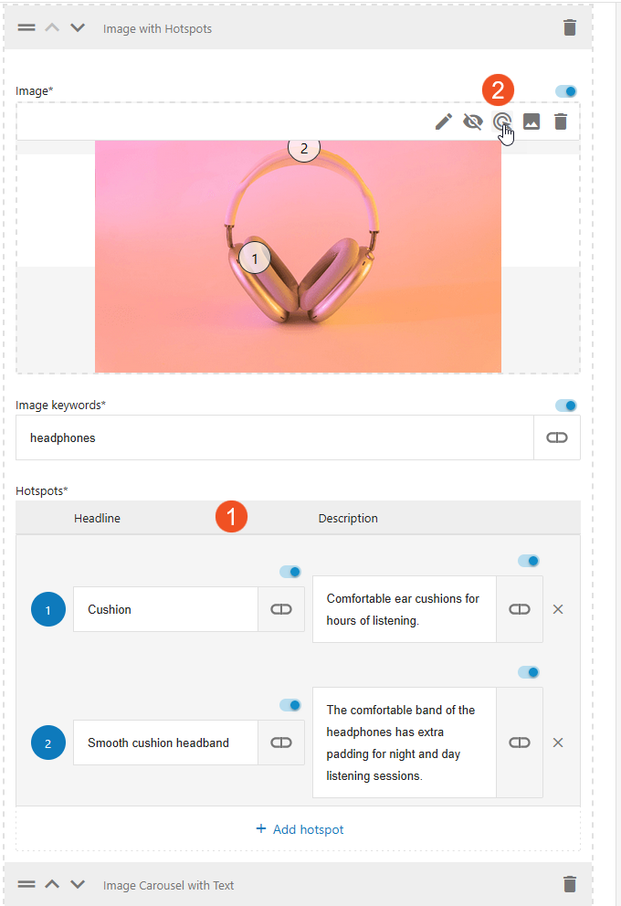
Hotspot Module for Retailer Agnostic Content
Hotspots transform static images into interactive elements where retailers can add a number of spots to overlay the image that provide additional information. When customers interact with these spots, they are presented with the additional information. The hotspot module can direct users' attention to specific details that might otherwise be overlooked, and it provides a way to give more information to the user without taking up more screen space.

To add a hotspot to an image:
-
Add up to ten Headline and a Description "Hotspots," then click on the Hotspot Configuration icon.
-
In the Hotspot Configuration dialog, decide where you want each hotspot to be placed on the image by clicking that part of the image. Click Apply when finished.
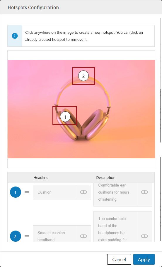
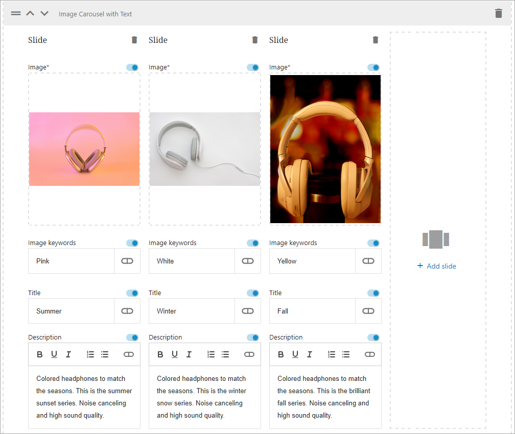
Image Carousels for Retailer Agnostic Content
A module that supports image carousels is available for retailer agnostic content. For each image in the carousel, retailers can provide a title, slide description, and image keywords, all of which can be mapped, uploaded, or manually typed. Image carousels can help retailers show customers different product views and angles, product variations, product highlights, etc. Image carousels help with customer engagement.